
Monday, 3:43am
26 November 2012
Busy doing nothing
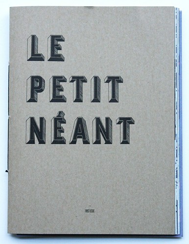
Le Petit Néant, a new annual drawing magazine, is designed to heighten ambiguity and avoid categorisation.
Le Petit Néant is an earnest name for a drawing magazine. French for ‘The Small Nothingness’, the title reeks of existential inquiry, writes Elizabeth Glickfeld.
The tendency in the past with the naming of such projects has been to liken the pencil to the sword. The connotations of introspection which the title Le Petit Néant invites are markedly different from the weaponry-inspired monikers of preceding independent drawing collectives such as Bazooka or Le Gun. The language of militant revolt and resistance, it seems, has been superceded.
The words, however, are beside the point. Le Petit Néant, like Le Gun before it (which began in 2004) originates from the School of Visual Communication at the Royal College of Art, a department which over the years has garnered a reputation as an incubator prioritising self-experimentation and development over immediate market demands. Conceived by second-year illustration student, Miguel Angel Valdivia under the mentorship of tutor Andrzej Klimowski (see ‘Theatre of dreams’ in Eye 14), and realised in conjunction with graphic design compatriot Giulia Garbin, the new annual magazine showcases drawings from all over Europe and also from Mexico and China.
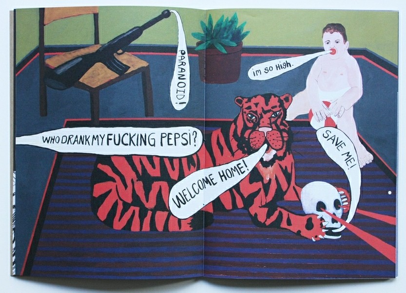
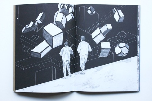
Right and top: uncredited spreads from the first issue of drawing magazine, Le Petit Néant, edited by Miguel Angel Valdivia and designed by Giulia Garbin.
With little evidence of computer-generated imagery, Le Petit Néant is a veritable compendium of mark-making in all manner of pencil and ink. Garbin has orchestrated the predominantly black and white spreads into a rhythm of light and dark. Some of the black marks colonise the page in their crispness; others seem to emerge from the depths in nuances of shading.
Apart from the title, Le Petit Néant eschews paratextual conventions. The paratext according to French theorist Jean Genette refers to any peripheral text which acts as a formula of presentation or instructions for use as to how a book should be received or read. Le Petit Néant has no page numbers. There are no captions to the illustrations and while a list of the artists / illustrators is included, it has been purposefully concealed inside the gatefold of the front cover. None of the works is attributed.
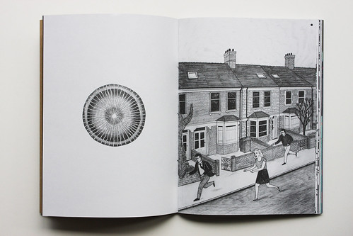
Right and below: uncredited spreads from the first issue of Le Petit Néant.
Words and galleries are mediating structures and Le Petit Néant has been designed so as to avoid anything which will frame the drawings’ reception, fix their meaning, fit them into any genre or category, or pre-empt their value. The images are accordingly presented full bleed.
Added to this, with a cover akin to kraft paper and pages which are untrimmed for creep, as an object Le Petit Néant resembles a pile or folio of drawings casually folded in half. This accentuates the sense of immediacy. This being said, Le Petit Néant is by no means ad hoc. The production values are high and turning its pages one almost expects the residue of graphite to rub off on one’s thumbs.
 The editor’s and designer’s reluctance to slot the magazine into any context combined with the emphasis on works executed by hand accedes to the idea that drawing and its immediate relationship to the body offer unimpeded access to an authentic self and unfettered imagination.
Yet being human, it is impossible to approach an image with complete innocence, to separate our apprehension of forms, motifs and symbols or to disentangle the act of looking from the act of reading. As either a producer or viewer, to engage with an image is to associate and to forge connections with the sum total of our memory and experience. As such one can’t look at Le Petit Néant without tying it to certain traditions, for instance, to the dream worlds of Surrealism or in some cases to distinctly cinematic perspectives.
 Single figures in nondescript or empty interiors feature, as do bodies with obscured or missing faces. The double-page spread also proves a convenient vehicle for the mirror image. They are formal meditations on repetition and difference on reflection and the desire for interaction.
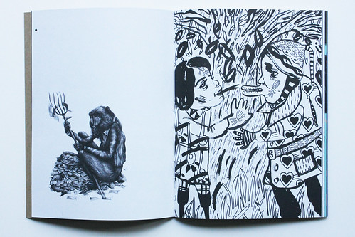
A baboon crouching upon a pile of banknotes holding a pitchfork elegantly rendered in the style of Victorian illustration is the closest Le Petit Néant comes to biting commentary. Playful but sombre, more searching than vehement, as a statement of independence, Le Petit Néant has a different mood from its anarchic predecessors. By on the whole rejecting the well worn strategies of irony and cool detachment, it instead seems to be feeling its way towards independence.
Le Petit Néant launches Tuesday 27 November 2012 at the Royal College of Art.
Eye is the world’s most beautiful and collectable graphic design journal, published quarterly for professional designers, students and anyone interested in critical, informed writing about graphic design and visual culture. It is available from all good design bookshops and online at the Eye shop, where you can buy subscriptions, back issues and single copies of the latest issue. You can also browse visual samples of recent issues at Eye before You Buy. The latest issue, Eye 84, is on its way to subscribers worldwide.