
Wednesday, 7:00pm
22 September 2021
Books received #47
The IBM Poster Program; This is What Democracy Looked Like; Flag Waves

Here is a selection of titles that caught our attention in recent weeks.
Though many associate IBM’s identity with the ‘white shirt and tie’ era of heroic Modernism, the famous computer company had a thriving design department in ‘rebellious, anti-establishment’ Boulder, Colorado. The IBM Poster Program (Lund Humphries, £29.95) commemorates the posters of three in-house designers, Ken White, John Anderson and Tom Bluhm, who over a period of fifteen years produced work of quality and originality. The posters were largely aimed at fellow IBM employees throughout the corporation’s vast workforce, urging them to give blood or take part in family events; to strive for excellence and to avoid stress.
Cover of the The IBM Poster Program (Lund Humphries), written and designed by Robert Finkel and Shea Tillman, 2021.

Spread from The IBM Poster Program with Give Blood poster, 1974, designed in-house by Ken White.

Posters promoting ‘Equal Opportunity’ are sharp and timeless. A conversation with Bluhm and photographer Roger Ewy cheerfully puts the work in context. ‘Paul Rand said that the most important work a designer can do is “attending to the pedestrian”,’ says Bluhm, who credits the quality of the printed posters to Fred Jurado’s family print shop in Denver. Ewy fondly remembers the Design Center as ‘a special place’. Bluhm says that half the posters on display were lifted by employees to take home or to put in their offices – ‘the best compliment one could ask for.’
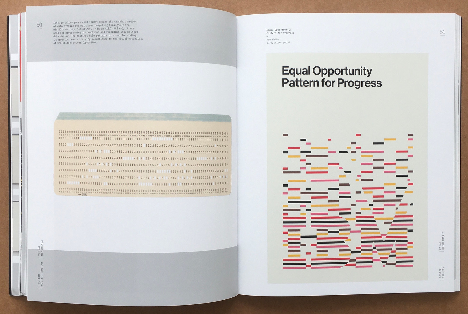
Spread from The IBM Poster Program showing an IBM punch card (left, see ‘Niche of a niche’ in Eye 101) and Ken White’s 1971 poster Equal Opportunity: Pattern for Progress.
Spread from The IBM Poster Program with Ken White’s 1973 poster Equal Opportunity / Color Blind, which pastiches the Ishihara eye tests that Eric Kindel wrote about in ‘The test of time’ (Eye 68).

In her opening essay to This is What Democracy Looked Like: A Visual History of the Printed Ballot (Princeton Architectural Press, $29.99 / £25), Alicia Yin Cheng writes that a collector once described election ballots as ‘the most fugitive ephemera’, since a ballot is a piece of print designed to be destroyed by law. The short life expectancy of these sometimes elaborately designed pieces of paper makes the existence of the collections shown in this book all the more remarkable.
Many examples come from the Huntingdon Library in San Marino, California, augmented by items from the New York Public Library, the American Antiquarian Society, the California Historical Society, and others. Covering the period 1786-2018, but with a focus on the decades following Civil War, the carefully photographed ballots, largely printed letterpress apart from the occasional lithograph, form the bulk of this fascinating record of an exhibition held at Cooper Union, New York in late 2020.
Cover of This is What Democracy Looked Like by Alicia Yin Cheng, 2020. Design: MGMT.

A smaller array of items from 1930-2018 rounds out the visual narrative, and both collections are bookended by two essays; ‘The Most Fugitive Ephemera’ by editor Alicia Yin Cheng and ‘New Anxieties and Old Friends’ by Victoria Bassetti, who reminds readers of the nail-biting tension and aftermath of the 2000 Presidential elections, when George W. Bush apparently beat Al Gore by 537 votes, and also the 1948 election when Lyndon B. Johnson won the Texas vote on a ballot paper that included more than 200 entries entries written in the same handwriting.
Spread from This is What Democracy Looked Like with a poorly printed Republican ticket from 1864

Spread from This is What Democracy Looked Like which shows ballot backs from the late nineteenth century.

Cheng, a principal in New York design practice MGMT (which designed the book) has compiled a powerful and eccentric collection of eye-popping ballot designs that remind us of both the importance of voting, the fragility of democracy and the everyday craziness of politics, with ballot tickets attacking corruption, and in support of candidates like C. C. O’Donnell (ca. 1876) who promised to deport Chinese-Americans within 24 hours of taking office.
Spread from This is What Democracy Looked Like.

You don’t have to be interested in vexillology (the study of flags) to appreciate the unique collection of nautical flag designs presented in Flag Waves (Four Corners Books, £20). Written by Sue Prichard, Senior Curator of Arts at the National Maritime Museum in Greenwich, London, the book compiles more than 120 examples of flags flown on vessels as varied as rubber dinghies, large passenger ferries and container ships. Produced between 1872 and 1989, these striking, predominantly hand-sewn designs were precursors to sophisticated brand identities – flown at ports rather than open waters, they signified each boat’s owner in highly congested spaces.
Clothbound cover of Flag Waves: House Flags from the National Maritime Museum (Four Corners Books) by Sue Prichard, 2021. Design: Claire Mason, flushleft.co.uk.

Introductory essay by Sue Prichard.

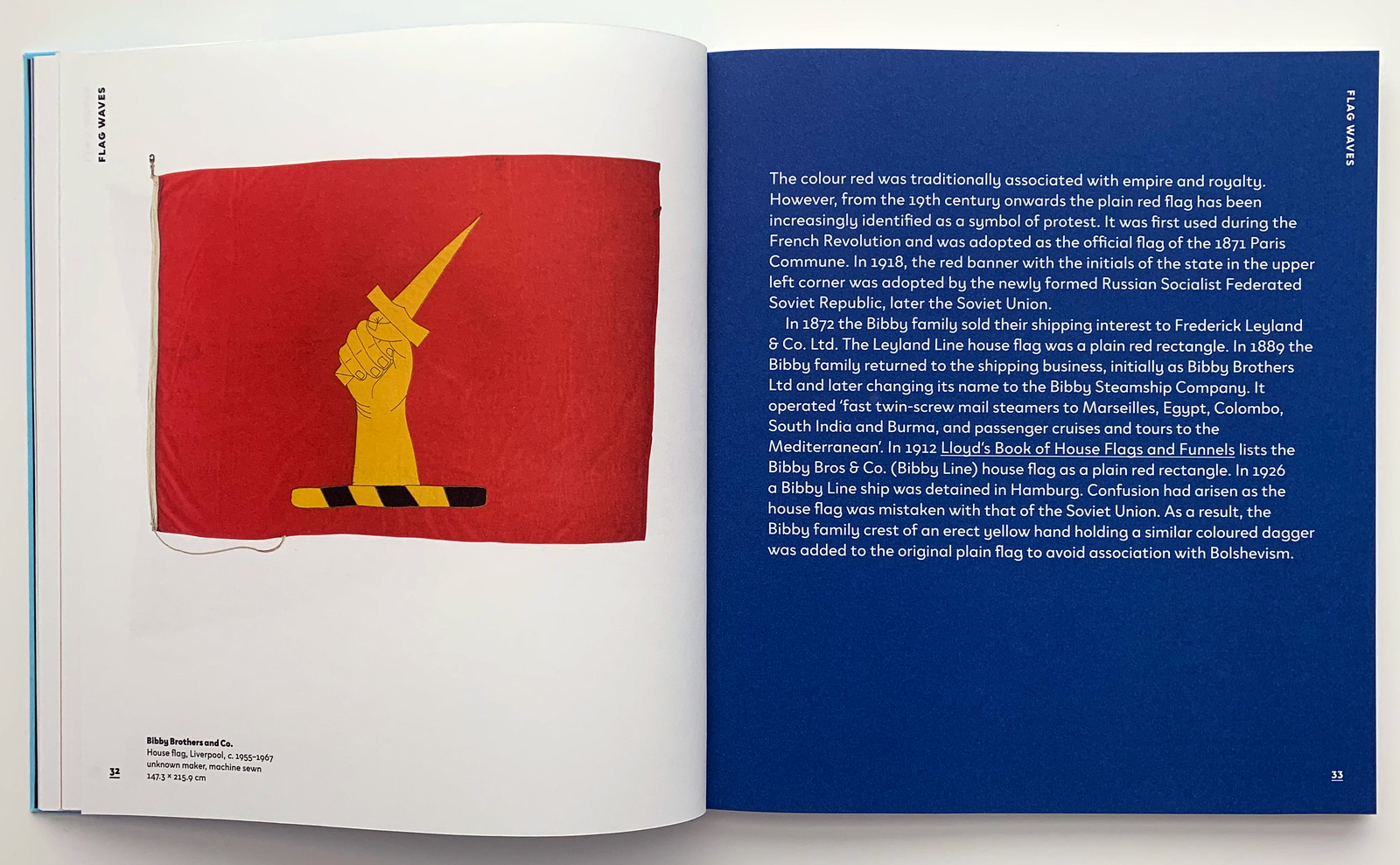
Prichard lists the stylistic categories of the flags; designs drawn from heraldry; geometric forms; initials of the company / shipowner; corporate logos; a rebus form of pictograms relating to the activity of the company; an adaptation of a pre-existing flag, such as ensign. This charming, clothbound book exhibits the flags in alphabetical order, revealing material information for each, and occasionally providing design details and back stories. One such anecdote is about Bibby Brothers and Co.’s plain red house flag: in 1926 in Hamburg, their ship was detained when the flag was mistaken for that of the Soviet Union. Soon after, the Bibby family introduced a new motif to the design – a yellow hand with a dagger – to avoid the Bolshevist association.
Spread from Flag Waves featuring the house flag of Bibby Brothers and Co.
Spread from Flag Waves featuring the flags of the Larrinaga Steamship Co. (left) and Link Line.

Eye is the world’s most beautiful and collectable graphic design journal, published quarterly for professional designers, students and anyone interested in critical, informed writing about graphic design and visual culture. It is available from all good design bookshops and online at the Eye shop, where you can buy subscriptions and single issues.