
Monday, 9:59am
10 April 2017
Bubbles black as ink
For the past 28 years, Barrie Tullett has been making a typographic Dante, a project to illustrate all 100 Cantos of the Divine Comedy with letterpress, typewriters and Letraset. He is still in Purgatory … and on show in Dublin.
Appropriately enough, my love affair with typography began with a Lonely Hearts Ad, writes Barrie Tullett.
In my first year at Chelsea (in 1987, now part of University of the Arts London), we were given an induction into the composing room and set a letterpress project. We were asked to typeset a small piece in (what was then) the very common vernacular of a ‘Would Like to Meet’ advert.
I found the whole process absolutely magical. The direct link between writing, craft and printing; the opportunity for visual and literary wordplay; the immediacy of the results; the opportunities for expression… I was entranced. So much so that I think I made about fifteen different adverts, rather than just the one that was required. In my second year I carried on making monthly editions of letterpress cards based on comments I had overheard or read, posting them out as part of my interest in mail art networks.
By my third year, I wanted to make something more ambitious and expressive. Something that went beyond a series of experiments for their own sake, something with a core narrative that I could illustrate. At the time I was actually studying illustration, even though I spent all my time drawing on location or typesetting, printing and dissing in the Caseroom.
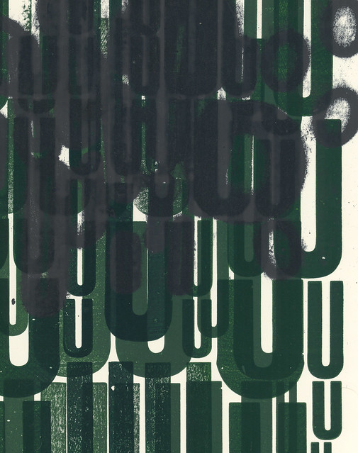
The images are from Barrie Tullett’s project to illustrate each of the 100 Cantos of Dante’s Divine Comedy using a different ‘obsolete’ technology. The 34 Cantos of The Inferno are realised using letterpress; the 33 Cantos of Purgatory are made on a typewriter; and the 33 Cantos of Paradise will be in Letraset.
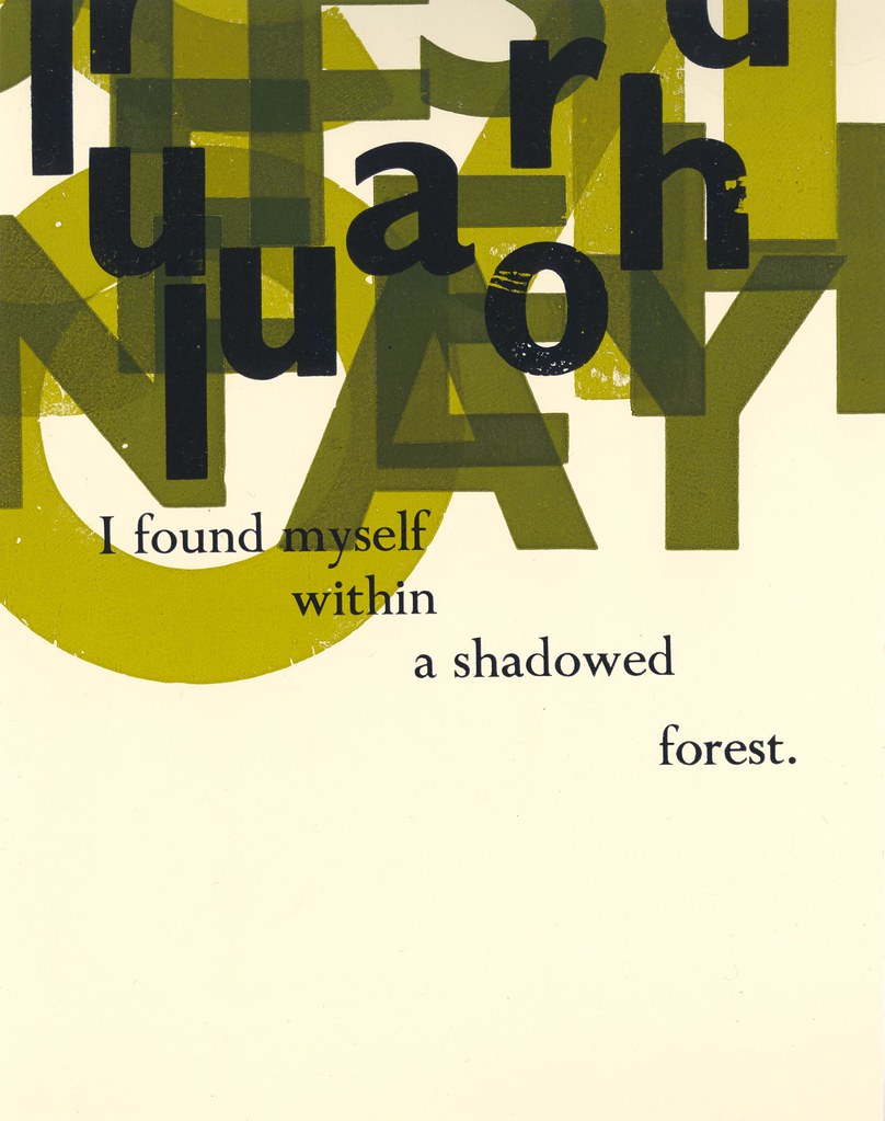
Top: Inferno, Canto I: The Dark Wood, letterpress, 1989.
‘Midway this way of life we’re bound upon / I woke to find myself in a dark wood / Where the right road was wholly lost and gone.’
Right above: Inferno, Canto XVII: The Violent Against Art. letterpress, 2012. ‘And when we stood by Geryon’s side, I noticed / a little further on, some people crouched / in the sand quite close to the edge of emptiness.’
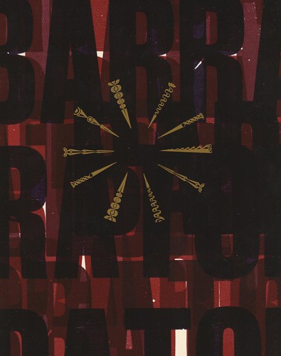
Right below: Inferno, Canto XXII: The Barrators, letterpress, 1991. ‘Nothing; only great bubbles black as ink / Would rise and burst there; or the seething tide / Heave up all over, and settle again and sink.’
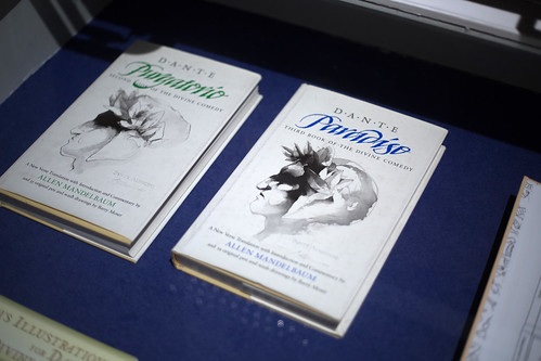
I had long been interested in Dante’s Inferno, from about the age of thirteen, although my early readings were informed by pop culture (Advanced Dungeons & Dragons, Marvel comics and the science fiction of Larry Niven and Jerry Pournelle), but, by that time I had finally read the Dorothy L. Sayers translations and had collected several versions of the text while studying at Chelsea. Barry Moser’s wonderful illustrations for Allen Mandelbaum, and Tom Phillips’s own illustrated translation (which included letterpress typography by Ian Mortimer) spring to mind.
By the winter of 1989, I must have read something about the forthcoming TV Dante by Tom Phillips and Peter Greenaway – due to be broadcast in the summer of the following year – as I had been looking at Phillips’s Inferno illustrations again, and was struck by the way his work explored completely new ways of interpreting the texts. These were as eye-opening and innovative to me as Rauschenberg’s drawings had been when I saw them for the first time.
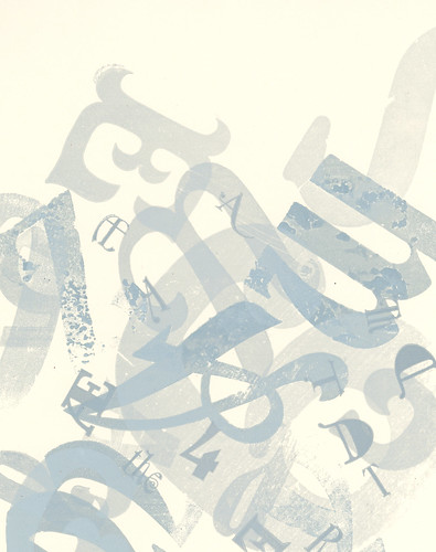
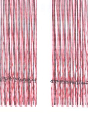
Purgatory, Canto XIX: The Covetous, typewriter, 2010.
‘Emerging on the open ledge, I found, / On the Fifth Cornice, people stretched out here / Weeping, their faces turned towards the ground.’
Purgatory, Canto XXVII: The Lustful, typewriter, 2010.
‘I leaned across my clasped hands, staring hard / Into the fire, picturing vividly / Sights I had seen, of bodies burned and charred.’
That must have been when my decision was made – I have an old notebook full of project ideas and drawings of people on the tube, and there, on one of the pages, among a series of Final Major Project ideas, is a wee sketch of a piece of paper being lifted from a block of wood type, and the five words ‘Dante’s Inferno. There’s your book!’
Working with that book, and the two others in the Divine Comedy, has taken me 28 years now, and as I’ve only just finished the illustrations for Inferno, and am still climbing the mountain of Purgatory, I am guessing it will last me a few years yet. (I would like to point out that I have been busy doing other things in the meantime).
The work has just had its most high profile exposure in the National Print Museum in Dublin. This is a beautiful venue, and an exceptional exhibition space for the prints. I cannot thank Brenda Dermody (of the Dublin School of Creative Arts) enough for conceiving of the show and championing the work with the Museum, or Carla Marrinan for all her help and support in making the exhibition happen.
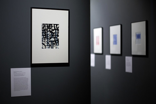
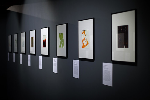
Installation views from the National Print Museum, Dublin, 2017.
Allen Mandelbaum’s Dante aka ‘The California Dante’, with illustrations by Barry Moser, 1980-84.
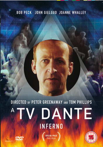
DVD cover of A TV Dante by Peter Greenaway and Tom Phillips, first broadcast in 1990.
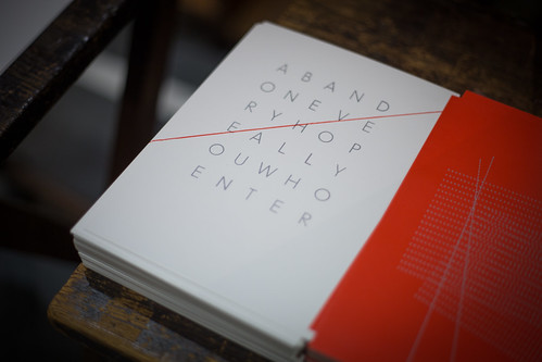
Brenda also created a series of postcards and a folder of posters for the show, with the intention of making new works rather than colour reproductions of the originals. Her ‘remixes’ of my work have given me a fresh insight into pieces that have long been familiar to me. Our ambition is to develop this aspect of the project in parallel with the main body of work, in order to create a separate interpretation with its own unique voice.
The exhibition gave me the focus I needed to advance the project to a point where I have all the remaining illustrations for Purgatory planned out. I can almost see Paradise.
It was such a long while ago that I awoke to find myself in that dark wood – and so much has changed since I first opened my sketchbook and sat down with stencil sets and coloured inks in order to plan that first print. Each illustration now has such a weight of expectation for me. Perhaps Jack Zipes (in From Enchanted Forests to the Modern World) says it best:
‘Inevitably they find their way into the forest. It is there that they lose and find themselves. It is there that they gain a sense of what is to be done. The forest is always large, immense, great and mysterious. No one ever gains power over the forest, but the forest posses the power to change lives and alter destinies.’
Barrie Tullett, designer, artist, publisher, educator, Lincoln
Inferno, Canto XXIV: Consumed and Restored, letterpress, 2012. ‘… and then, these ashes scattered on the ground / began to come together on their own / and quickly take the form they had before.’
Publicity material for the exhibition, designed by Brenda Dermody, 2017.
Eye is the world’s most beautiful and collectable graphic design journal, published quarterly for professional designers, students and anyone interested in critical, informed writing about graphic design and visual culture. It is available from all good design bookshops and online at the Eye shop, where you can buy subscriptions and single issues.