
Tuesday, 7:21am
26 May 2009
Cheesy, but in a good way
Somers Town gives product placement a monochrome makeover
Now that the annual hullabaloo of D&AD has kicked off (nominations announced; awards dinner, 11 June), it’s all too easy to forget that for the majority of the populace, outside the industries of ‘persuasion’, advertising is a shadowy concern, writes Liz Farrelly.
Ad people aren’t household names or top of the ratings
(fictional – Mad Men – glimpses aside); neither are they widely acclaimed for their cultural contributions, save for the rare moment when a super-cool sock monkey or drum-playing gorilla is taken to our collective heart. That ad men feel the need to create ‘longer-form entertainment’ is, perhaps, a reaction to being ignored.
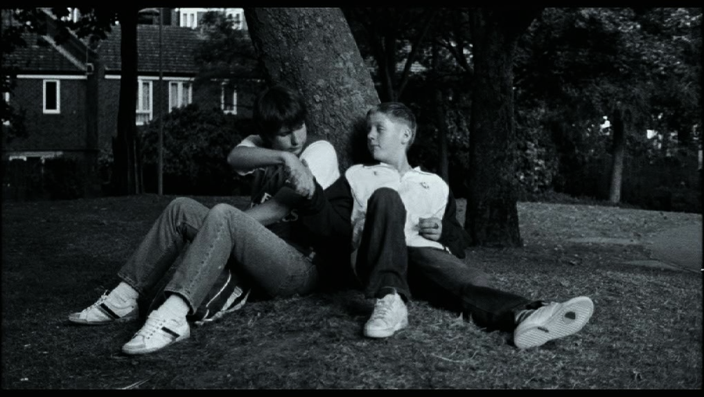
Somers Town is maverick agency Mother’s first foray into full-length feature film production, via Mother Vision. Helmed by creative director, Al MacCuish, this spin-off venture aims to nurture creative projects across moving and print media. And with director Shane Meadows on board, the movie has garnered a lot of interest.
But, unlike Meadows’ previous films, This is England or A Room for Romeo Brass, which mix dark humour, brooding menace and an inhospitable Midlands locale, Somers Town isn’t truly a ‘full-on’ Meadows venture; he directed it, but didn’t write it (he usually writes or co-writes the films he makes).
This screenplay is by Paul Fraser, who was hired by Mother Vision to work with their in-house team. Fraser is Meadows’ childhood neighbour, a long-time friend and collaborator, and his script is the reason Meadows agreed to participate. That said, Somers Town is more entertaining, easier to watch and less confrontational than ‘pure’ Meadows fare.
Much cyber-ink has been spilt and a lot of misinformation been put about concerning the fact that Eurostar financed this movie (see the film’s IMDB message board). Questions and conjecture abound ... how clever of Meadows to track down an organisation with such deep pockets, and why wouldn’t he get his film made by any means necessary; but did he comprise his vision to do so; was he forced to show the logo, the train, the station; could this is a new way of funding the UK Film Industry; will clumsy product placement be a thing of the past or are we entering a new era of sponsored movie making?
Surely, producers of all ilk, from Hollywood to Soho, include industrialists and corporations of all shades in their fund-raising Rolodex; Vans co-produced Dogtown and Z-Boys (2001), the acclaimed skateboarding documentary and now an alt. culture classic. Skating and Vans are a natural fit, though, with Van’s classic model, in navy blue, featuring on the feet of all the major players, in nearly every scene of footage, vintage and contemporary…(if they’re wearing any shoes at all).
What’s really intriguing about the discussions around Somers Town, Mother and Eurostar, is that Mother is not even Eurostar’s agency; Fallon is. The idea to make a short film, a new kind of non-branding, came up during a pitch for the account, which failed. But, personnel in both sides liked the concept and kept it alive, even though Mother aren’t the official ‘brand guardians’.
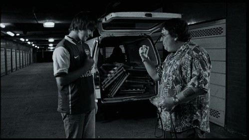
On the DVD release, which includes a menu of interviews, Meadows explains all, stating up front that didn’t generate this idea, but was approached by Mother / Eurostar, and agreed after reading Fraser’s finished script. At that point the film was still a short, but it turned into a feature thanks to the spontaneity of Meadows’ working method: he encouraged the actors to improvise dialogue, and was pleased by the results, especially by the juvenile leads.
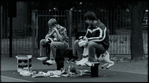
That dialogue, in my opinion, saves the film from plumbing the schmaltzy depths of so many other offerings in the ‘coming of age / buddy’ genre. Somers Town resists that fate by delivering believable dialogue, ripe with the faulting bravado of adolescence, and the haphazard humour of a growing friendship.
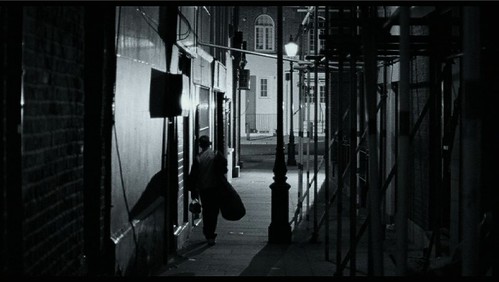
I’m not going to tell you what happens – no spoilers – but from a purely visual point of view it’s a (low key) treat. Shot in black and white, the cool tones of overcast London grey spell reality without resorting to ‘gritty’ clichés. The end section bursts into a slightly faded ‘Kodachrome moment’. Presented as a montage of holiday snaps, from the gleaming terminal at St Pancras, along high-speed tracks, to the city of romance, it’s cheesy in a good way, and the closest the film comes to being an ad. I can see it now, playing on screens at the departure gate ... and if it isn’t it should be.
Somers Town
DVD and Blu-ray/PAL
2008-09
Optimum Home Entertainment
72 minutes
Eye is the world’s most beautiful and collectable graphic design journal, published quarterly for professional designers, students and anyone interested in critical, informed writing about graphic design and visual culture. It is available from all good design bookshops and online at the Eye shop, where you can buy subscriptions and single issues.