
Friday, 2:42pm
16 April 2010
Cool for (copy) cats?
Design education
Design history
Graphic design
Illustration
Music design
Posters
Visual culture
Similarities: from plagiarisation and rip-offs … to homage and inspiration
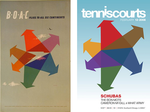
This seemingly effortless poster by Abram Games, along with its ham-fisted imitator, is one of a riveting set of graphic design images assembled by Bob Caruthers, writes Sally Jeffery.
Some of them are iconic, and each is paired with a doppelgänger betraying anything from cheerful recycling to evidence of crime. The man clearly has an awesome visual memory. He is modest about it, and says he started his collection while professor of graphic design at West Texas A&M University. ‘Before the internet, there were only a few sources from which students could plagiarise — Graphis, CA, Print. Oddly, there weren’t a lot of students who attempted to submit plagiarised work, but when they did, if I didn’t recognise it right away, one of the other students more than likely would and slip a Xerox copy of the original under my door. Usually, the copied work came from the current issue of a magazine. The students didn’t bother looking in the older issues, probably because they were housed in the Library thus requiring effort to be put forth.’
Top: Abram Games poster (1956); concert poster (2008).
Below: Rafal Olbinski (1982); concert poster (2002).
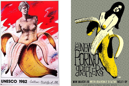
Half banana / half woman (distant and disreputable relative of Half Man Half Biscuit?) could be a case of two designers having the same fantasy independently – Caruthers says that he makes no judgements. He does, though, offer a scale of culpability, from accidental similarity to outright plagiarism. Somewhere in between lies inspiration, where ‘the errant designer was well aware of the original source and used it as the basis of their design, but changed it enough to sorta make it their own. Some are more “inspired” than others.’ He cites this repurposed Bob Gill design.

Above: Bob Gill (1962); concert poster (2009).
‘Homage’ is a notorious defence, whose credibility hinges on whether the original is universally known. Caruthers gives the Elvis Presley and Clash album covers as an honest example. (Both of these being old friends now, presumably nature has taken its course and at least one more generation of knee-bending exists somewhere.)
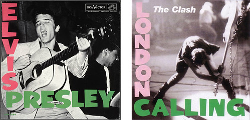
Above, right: Homage to the King (1956) designed by Ray Lowry, 1979.
Music features strongly in this collection. Students learn by looking, and they also design a lot of gig posters – but not all gig posters are done by students, and a grown-up passing-off habit looks like just another attempt to grab free money. The music business has its own homage / rip-off entanglements, with the court cases to prove it, and academia routinely runs written submissions through anti-plagiarism software. Questions of ownership are not always straightforward, but if it looks like a rip-off it probably is. If your motives are honourable why not add a credit? ‘Designed by —— after ——’ would do it.
And if you don’t, one day Bob Caruthers will find you.
(With thanks to Sally, Bob and all the designers featured in ‘Similarities’.)
See Bob Caruthers’ ‘Similarities’ Flickr photostream.
Eye, the international review of graphic design, is a quarterly journal you can read like a magazine and collect like a book. It’s available from all good design bookshops and at the online Eye shop, where you can order subscriptions, single issues and classic collections of themed back issues.