
Tuesday, 7:01am
28 January 2014
Sale of the century?
Antique or academic resource? Dan Rhatigan considers a dilemma: the disposal of type design archives once consigned to the scrapheap
On 5 January 2014, an episode of BBC Television’s popular Antiques Roadshow caught the attention of many typographers and lovers of type, writes Dan Rhatigan.
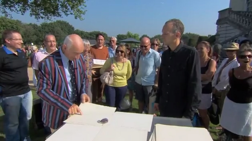
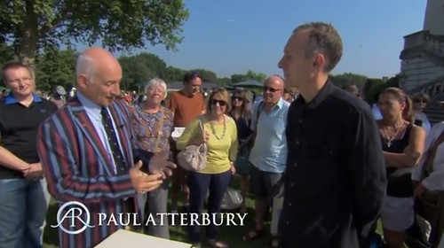
Paul Atterbury, one of the long-running show’s many presenters, inspected a small pile of papers, briefly explaining a bit about type to describe the pencil drawings of individual letter outlines before him. He was speaking with the operator of a salvage company based in the defunct Linotype & Machinery plant in Altrincham, South Manchester, who revealed that these were just part of a collection of about 100,000 such drawings – a number that drew laughs of surprise from the crowd around them at the Royal Ballet School in Richmond Park. Atterbury suggested that the drawings might sell for £5 per drawing, or perhaps for about £3000 as a set.
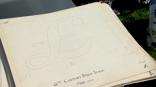
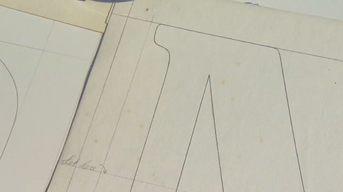
Drawing from the salvaged Linotype archive: Century Bold Italic. Top: frame from the BBC’s Antiques Roadshow, with host Paul Atterbury in striped blazer.
In fact some drawings from this collection have been fetching much higher prices than that, popping up throughout the past year in market stalls, online shops, and now even London branches of Anthropologie for as much as £40 each.
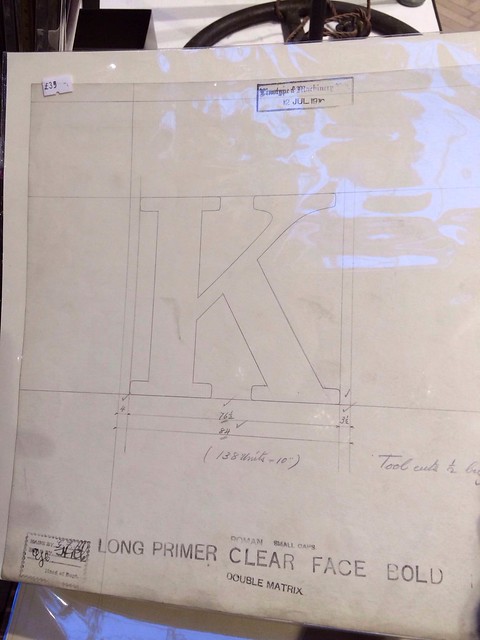
‘K’ from Long Primer Clear Face Bold, selling for £35 at Anthropologie (courtesy of Kalapi Gajjar-B’owkr).
The current owners of the Linotype drawings are the Font Archive, and they have been making the material available for resale for some time. The Font Archive promises that the sale of the collection helps to fund its safe storage and digital archiving (all its scanned material is being shared with the Department of Typography at the University of Reading), but the appearance on Antiques Roadshow has caused some debate about whether disseminating the collection like this is a way to share it – or a way to ruin it.
Frame from BBC1’s Antiques Roadshow.
Some people have questioned the legality of selling such drawings of Linotype designs, but everything is above board. The typefaces themselves live on as intellectual property, protected as trademarks and copyrighted as font software. The papers, though, are artefacts of an obsolete industrial process, abandoned when Linotype ceased manufacturing its machines for casting molten lead into printable lines of typeset text.
When Linotype closed the Altrincham plant and sold off its assets, drawings like these – used as guides for creating the brass matrixes into which lead was pumped for casting type – were not considered valuable material, just detritus of an industry that had moved on first to photographic equipment and then computers.
An even larger collection of drawings was similarly abandoned by Mergenthaler Linotype in the US when they closed their facility in New York. (The American drawings were rescued and are now in the care of the Museum of Printing in North Andover, MA.) Linotype’s German office, brought under the wing of Monotype a few years ago, kept a small, incomplete collection of its own, but also jettisoned material from time to time (such as drawings and documents for Arabic and Indic typefaces, now preserved at Reading).
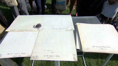
Detail of Linotype drawing.
There is much to be said for saving the Linotype drawings from the scrap heap altogether. They are fascinating images created with incredible precision, and for those who love typography there is a real beauty in them. They are tangible souvenirs of an era of industrial craftsmanship that resonate with those of us who create and use type as digital information. The availability of such a vast inventory of unique, handmade pieces of artwork is a compelling opportunity for potential buyers and sellers alike.
The similar collections that exist in North Andover and Reading – along with Monotype’s archive of its own type drawings – make it quite clear, however, how much information is lost to posterity by scattering the drawings individually or in mixed batches. A typeface is a collection of many small, related decisions. A typeface design is the sum total of all the letters of the alphabet and all the other characters.
However for type cast in hot-metal, there would also be adjustments made for each physical size of the type that could be produced. Without having an entire set of glyphs available for the comparison and analysis of these variations on a theme, the understanding of the full design – the system of decisions – is incomplete. For students, designers, and historians of type, that is a lost opportunity to understand the design.
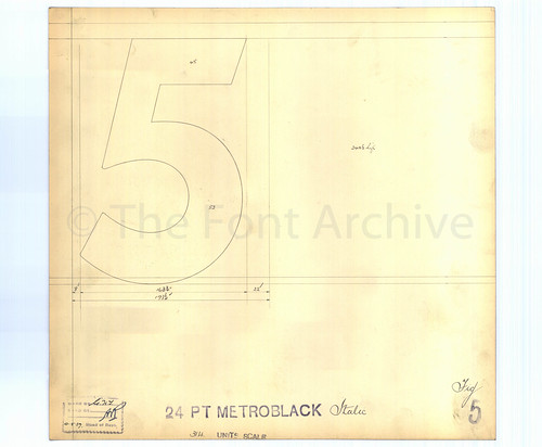
Number 5 from Metroblack, drawing produced by Linotype & Machinery in Altrincham (courtesy of The Font Archive).
Number 5 from Metroblack, drawing produced by Mergenthaler Linotype in Brooklyn, NY (from the Museum of Printing, North Andover, MA).
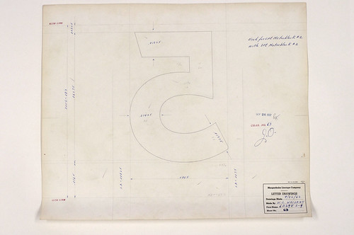
Production drawings like these also feature details about the way hot-metal type was manufactured, knowledge as vital to type history as the designs themselves. Even a cursory comparison of Mergenthaler Linotype’s American drawings to their British counterparts shows that the different factories used different methods of preparing and replicating its typefaces. When American designs were redrawn in Altrincham – and vice-versa – details were likely changed in the the process.
While the Font Archive’s digital scans of the drawings will be of great value for capturing some of this history, they will not capture the subtler details of the paper, barely visible pencil and stylus marks, or what may have appeared on the back of a given sheet.
The sale of the Linotype drawings poses a dilemma: is their history better honoured by sharing small pieces of it with more of its admirers, or by preserving it intact for study by only a few?
Dan Rhatigan, head of design, Monotype, New York and London.
See the BBC’s Antiques Roadshow website (NB The episode may not be available in some territories and after a certain time has elapsed. The Linotype segment begins approx. 18'40" into the programme.)
Linotype drawings at the Museum of Printing Frank Romano showing the American Mergenthaler Linotype Co. font drawings that were saved from the archives of the company in Brooklyn, New York. There are an estimated 300,000 drawings in the collection.
Dan Rhatigan, type director, Monotype, London and New York.
Eye is the world’s most beautiful and collectable graphic design journal, published quarterly for professional designers, students and anyone interested in critical, informed writing about graphic design and visual culture. It is available from all good design bookshops and online at the Eye shop, where you can buy subscriptions and single issues.