
Friday, 3:30am
7 September 2012
Slow hand
Three elective design courses at New Zealand’s CoCA demonstrate how the pace of physical printing helps the graphic design process.
The manual qualities of printing slow down the creative process, writes Nick Kapica, and provide access to a visual language that can feed back into students core subject areas.
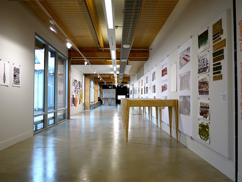
A recent exhibition, More is More, in Te Ara Hihiko, included work from three elective design courses at Massey University College of Creative Arts [CoCA]: Printmaking, Screen Printing for Design and Contemporary Letterpress.
Students from many areas of CoCA – including graphic design, textiles, illustration, fine arts and photography – can elect to take these courses. They provide an experimental space to explore ideas and hands-on techniques that can be applied to other projects. Although the programmes are based around traditional printmaking techniques, the students also employ digital technologies – with equipment such as laser-cutters – to answer the project briefs.
Typography forms a strong component of the Visual Communication Design programme and students expand their typographic knowledge in the Screen Printing for Design and Contemporary Letterpress courses.
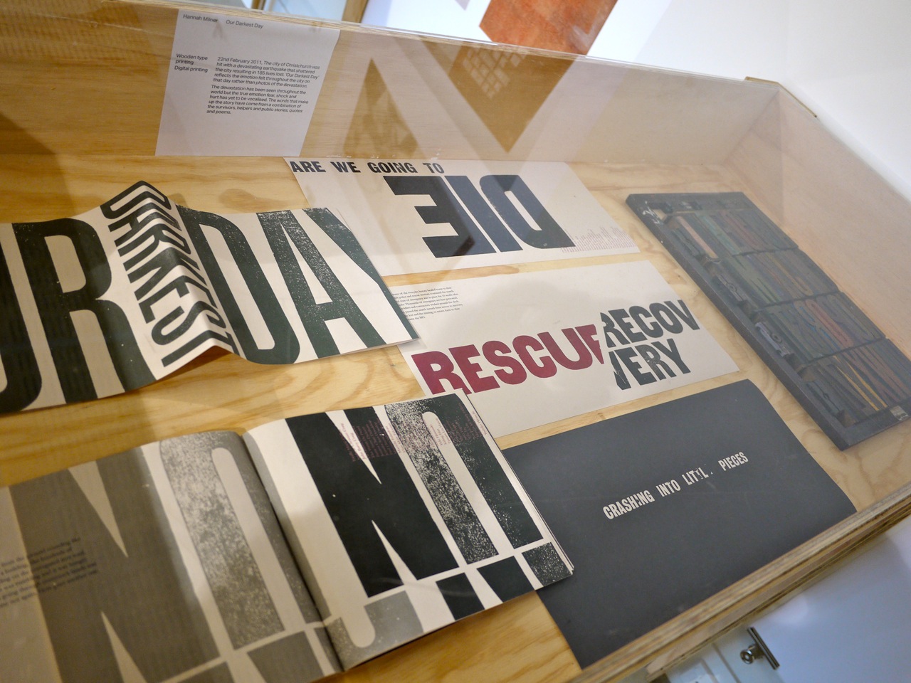
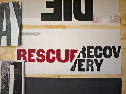
Right: Sarah Harmon: Waiho i Porirua i te Kainga Ururua – The Land of Many People. Wood cuts, laser-cut plate, monoprints, digital layers. Top: Hannah Milner: Our Darkest Day. Wooden type printing, digital printing.
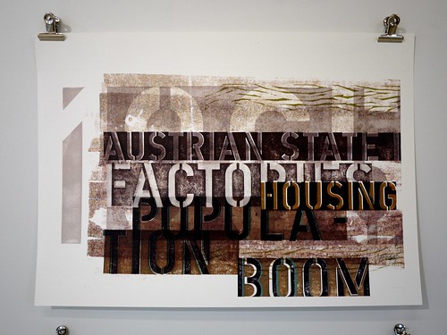
The Printmaking brief Public / Private Self asked students to investigate and explore an interpretation of public and private self through a number of printmaking processes: relief printing, intaglio, dry point, colography, monoprint and monotype, using man-made, natural and typographic approaches.
Kieran Stowers: A Long History of Give and Take.
Photocopying at varying densities, turps release, digital printing.
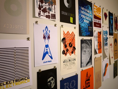
The Screen Printing for Design brief ‘Interpreting Music’ introduced students to a range of screen-printing methods and processes through the exploration and translation of the emotive nature of music. This was demonstrated first through the abstract use of shape, line and colour and then through the introduction of image. Students were asked to develop a visual coding system for a hypothetical music festival that could be used to generate a series of posters that celebrated a specific music genre.
Various students: interpreting music: screen print process work.
Hannah Milner: Our Darkest Day, detail. Wooden type printing, digital printing.
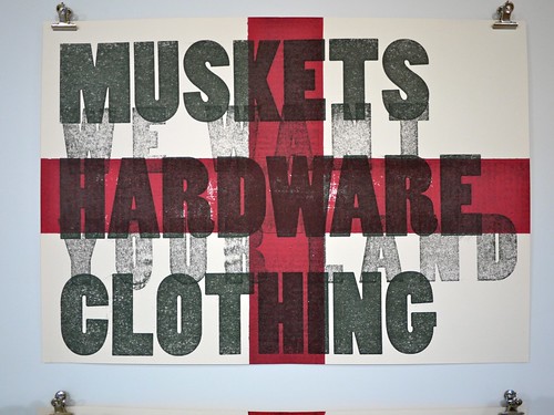
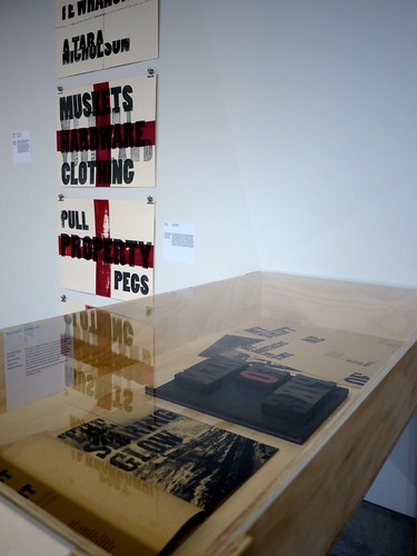
The Contemporary Letterpress brief ‘What is in a name? – What is in a place?’ investigated the combination of hand printing and digital processes. Students began by researching the origins of a local place name which they then expressed in four words using hand printing.
Renee Calder: The Men of Pike. Wooden type printing, handwriting, scanning, digital printing.
Later in the year the best work from the Contemporary Letterpress paper will be submitted to the Student Assessment Scheme of the International Society Typographic Designers [ISTD].
Exhibition: ‘More is More’, Gallery C3, Te Ara Hihiko, Massey University Campus, Wellington, New Zealand.
Website: http://creative.massey.ac.nz/
Exhibition curated by Annette O’Sullivan, Matt Clapham and John Clemens.
Eye is the world’s most beautiful and collectable graphic design journal, published quarterly for professional designers, students and anyone interested in critical, informed writing about graphic design and visual culture. It is available from all good design bookshops and online at the Eye shop, where you can buy subscriptions, back issues and single copies of the latest issue.