
Monday, 12:05am
13 August 2018
Soft sell machines
Heath Robinson’s Commercial Art
Lund Humphries, 2017. Geoffrey Beare. Designed by Nigel Soper. Price £40.00A rare insight into the ‘quietly hilarious’ advertising artwork of William Heath Robinson.
William Heath Robinson (1872-1944) was a prolific artist and illustrator whose name has entered the dictionary as a way of describing excessively convoluted processes using people and machines, writes Andrew Robertson.
His work is a kind of metaphor for the human need to overcomplicate things, and it is also very funny, though it needs time – his humour rarely depends upon one-liners.
These quietly hilarious drawings, which detail vast, precarious production lines of large adults and / or small children wrestling with tiny outcomes, became popular more than a century ago, and have retained the imaginative power and draftsmanship to amuse several generations since his death.
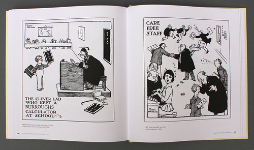
Spreads showing Heath Robinson’s illustrations from Two and Two Make Four, c.1924.
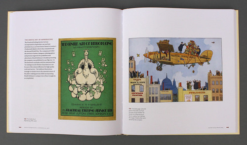
Top: A spread showing Heath Robinson’s illustrations for The Gentle Art of Reproducing, 1931.
The significance of Heath Robinson’s Commercial Art is in the title: his advertising artwork is little known and rarely seen. Author Geoffrey Beare highlights the hopelessness of the ad industry and their commercial clients in documenting visual history, something noted by fellow historians such as Ruth Artmonsky (see ‘Modernist cottage industry’ in Eye 93). Many of the examples in this book, Beare explains, were hard to track down in comparison with the task of tracing illustrations for books and magazines. ‘If companies kept publicity archives or took care of the original artwork, such resources have rarely survived the takeovers, mergers and economy drives of recent years,’ writes Beane.
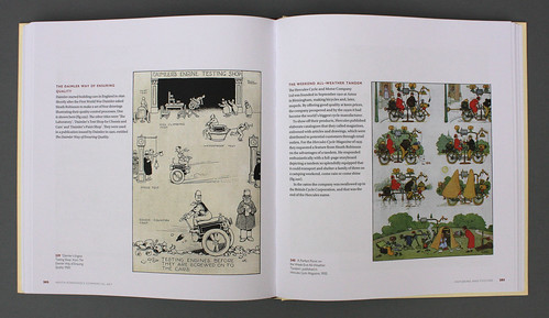
A spread of Heath Robinson’s illustrations from The Dailmer Way of Ensuring Quality, 1920, and Hercules Cycle Magazine, 1935.
The clients who made good use of Heath Robinson’s ingeniously engineered whimsy included the sellers of toffee, tobacco, beer and spirits, stationery, steel girders and asbestos cement. Despite the absence of belly laughs and punchlines, the hovering art directors of that time made use of the illustrations’ copious details to slow down their readers, and keep them looking at one page (and the client’s message) for a long time. In 1915, an Advertising World contributor noted that ‘no man’s work has more power to attract the vagrant eye and rivet the wandering attention of … gentle readers.’ Another journalist stated that his work ‘cannot be skipped … a Heath Robinson must be examined minutely.’ This carefully edited and nicely printed catalogue is a treat for Heath Robinson fans, and a delicious revelation to anyone new to this beautifully executed and entertaining work.
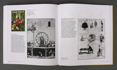
A spread showing Heath Robinson’s various illustrations from Get On With It, 1920.
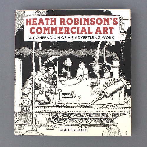
Cover of Heath Robinson’s Commercial Art. Design: Nigel Soper.
Andrew Robertson, writer, London
Eye is the world’s most beautiful and collectable graphic design journal, published quarterly for professional designers, students and anyone interested in critical, informed writing about graphic design and visual culture. It is available from all good design bookshops and online at the Eye shop, where you can buy subscriptions and single issues.