
Monday, 9:00am
28 October 2019
Take the clear line
Kunstal Rotterdam presents a generous survey of work by Dutch illustrator, designer and comic artist Joost Swarte. Jan Middendorp reports
Joost Swarte must be the best known and most appreciated Dutch illustrator, designer and comic artist of his generation, writes Jan Middendorp.
Turning 72 this Christmas, Swarte continues to depict of human (and animal) behaviour with precision and wit. Last month he gave a workshop about drawing your way out of a clamp and on to a silkscreen at the AGI Open conference in Rotterdam. Meanwhile, his all-encompassing exhibition at the same city’s splendid Kunsthal (a venue dedicated to contemporary art, fashion and more) continues to draw a large audience.
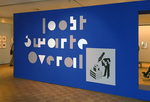
The show is titled ‘Joost Swarte Overal’ (‘Joost Swarte Everywhere’), which aptly describes what it is: a generous survey of his activities in a broad spectrum of fields, and of his presence in many places.
Installation image of ‘Joost Swarte Overal’ at Kunsthal Rotterdam.
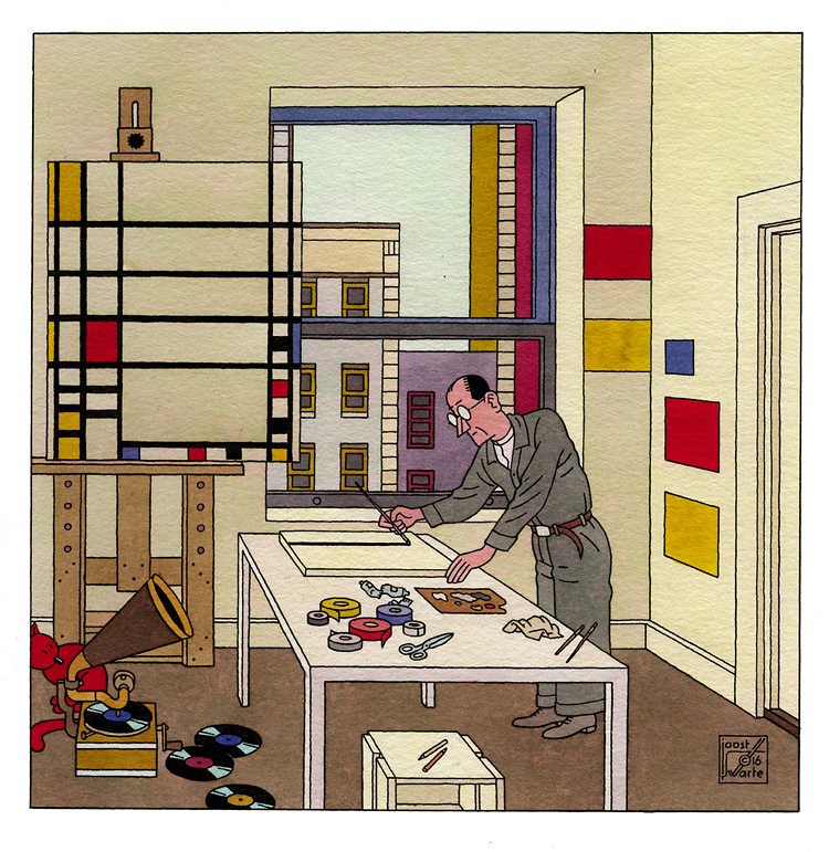
Top. Joost Swarte, Piet Mondriaan, 2017.
Swarte started out in the early 1970s as a writer/ illustrator by publishing comics in Dutch underground magazines and soon became popular in France, Spain and beyond. He diversified into magazine and book illustration as well as poster design, founded his own magazine and publishing company and initiated Stripdagen, a comics festival in his beloved city of Haarlem.
A passionate music lover, he worked with alternative record labels and bands for whom he designed packaging and posters. In the new century he became a regular contributor to The New Yorker. He also translated his ability to imagine cityscapes, buildings and interiors into physical objects, designing furniture and earthenware, as well as stained glass pieces for Dutch public places.
Around 2000 the Toneelschuur theatre in Haarlem – where he had been the main graphic designer for than a dozen years – commissioned him to design their new building (see ‘The theatre that Swarte built’ in Eye 49). His imaginative perspective drawings were turned into architecture by Mecanoo architecten and Swarte designed alphabets for the building’s neon lettering. He later collaborated on the design of the museum dedicated to his hero, the Belgian comic artist Hergé, in Louvain-la-Neuve.
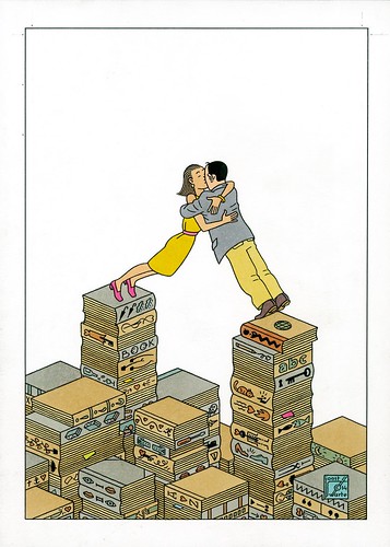
Joost Swarte, Love Stories, 2014.
Which brings us to Swarte’s roots. Having started out as a student of industrial design, Swarte soon found himself at odds with that functionalist discipline. He found a realm of his own by returning to the fascination of his childhood: comic strips. At five, he had been enjoying Disney comics, cutting out the characters and building his own stories on the floor. He discovered Belgian cartoonists such as Hergé (Georges Remi) and Willy Vandersteen, who gave their characters and objects clear-cut outlines and simple colour schemes. In his early years as a comic artist he also absorbed American influences from Disney characters and Felix the Cat to underground comics from Robert Crumb and Art Spiegelman, who became his peers and friends; Swarte’s absurdist early stories were published in Raw the magazine founded by Spiegelman and Françoise Mouly (see ‘Comics for damned intellectuals’ in Eye no. 8 vol. 2). By the late 1970s he had developed a personal style based on the concept of the ‘clear line’ – a term he used to describe Hergé’s approach. Like most kids of his generation he devoured the Tintin series, in which a young reporter and an alcoholic sailor travel around the world, looking for scoops and solving crimes. To the international audience, Swarte and his work became an heir of Hergé’s craft: meticulously drawn locations, absurdist humour and cheerful cruelty.
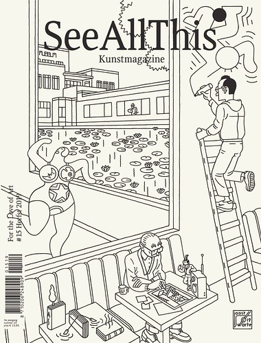
Cover for art magazine See All This, the ‘For the Love of Art’ issue, 2019.
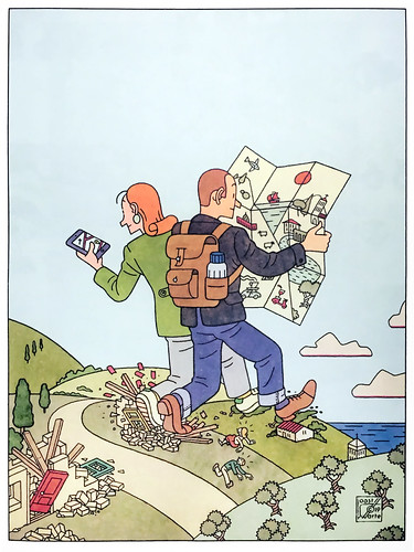
In his review of the exhibition’s opening night Paul Steenhuis, editor at NRC Handelsblad, points out that Swarte ‘obviously relishes devilish pleasure in visualising human shortcomings as clearly and beautifully as possible.‘ Swarte’s recent cover illustration for The New Yorker, in which a couple of giant tourists walk across a tiny exotic village while consulting their map and smartphone, unknowingly stepping on the local’s vulnerable homes, is Steenhuis’ fine example of Swarte’s cheerful accuracy of depicting bluntness.
However, much of Swarte’s work is simply entertaining, charming, lovely and hilarious. It is also very well constructed. In fact, his buildings, interiors and objects always look plausible – he meticulously evokes their three-dimensional structure by establishing the vanishing points of their profiles. And what he learned from Hergé was not only the lucid simplicity of the clear line. Swarte also admires the cinematographic virtuosity of the later Tintin books where framing, changing camera standpoints and shifting perspectives result in filmic storytelling. His fascination for Interwar modernism, as well as his geometric precision, also led to his huge arsenal of geometrically constructed alphabets with Art Deco overtones – one of the latest being The Less, a minimalist alphabet based on rectangles and circles only, used for the exhibition’s identity.
Installation images of the collage of reproductions printed on a banner that runs along the wall of the ‘Joost Swarte Overal’ exhibition at Kunsthal Rotterdam. Photos by Jan Middendorp.


Swarte has probably profited from his short period spent at an industrial design school. His analytical skill in visualising spaces on the flat page must have facilitated his entry into the three-dimensional world of true objects and spaces. It is therefore remarkable that ‘Joost Swarte Overal’ represents the artist’s versatility in a way that is predominantly two-dimensional. The space is divided in sections devoted to a specific themes, underlining the diversity of his activities: Literature, Classics and more. A small selection of objects from sketches to books is displayed in vitrine showcases and a handful of amusing sculptures based on the characters of his early comics are displayed under plexiglass on high plinths. However, dozens of works – from posters and illustrations to packaging, furniture, stained glass and buildings – are only present as part of a collage of reproductions printed on a banner that runs along the wall in a rather randomly structured two-dimensional collage.
‘Joost Swarte Overal’ offers an impressive selection of Swarte’s multifaceted activities, but when leaving the space after visiting each part at least twice, it felt like having read a book instead of being dragged into a spectacle. Having once organised a book presentation in Swarte’s entertaining and impressive Toneelschuur building, what I personally missed was perhaps just that: a dive into the theatricality of his world.
‘Joost Swarte Overal’ continues until 19 January 2020 at at Kunsthal Rotterdam.
Joost Swarte, ‘Power Trip’ cover illustration for The New Yorker, 2019.
Jan Middendorp, designer, writer and author of Dutch Type, Berlin
Eye is the world’s most beautiful and collectable graphic design journal, published quarterly for professional designers, students and anyone interested in critical, informed writing about graphic design and visual culture. It is available from all good design bookshops and online at the Eye shop, where you can buy subscriptions and single issues. You can see what Eye 98 looks like at Eye Before You Buy on Vimeo.