
Wednesday, 6:53pm
23 June 2010
‘We want fresh bread.’
Prizes for Yasuda, Schraivogel, Windlin, etc. at Brno Biennial 2010

Earlier this week I experienced the pleasures and pains of sitting on the international jury of the Brno Biennial 2010, writes John L. Walters. The fun came from looking at lots of interesting international work (nothing from the UK) in the pleasant company of fellow jurors Alan Záruba, Igor Stanisljevic, Koichi Sato, Scott Santoro, Lizá Ramalho of R2, Karel Martens and Petr Babák.
More difficult, however (though it wasn’t painful, to be fair) was the process of coming to a collective decision about the winners. We were asked to choose the winners of five prizes (one of which was open to young Czech designers only) and we also singled out a Czech graphic artist for a ‘Special Mention.’
Here are pictures of the winning projects, with a précis of the jury’s comments under each one in italics (but note that the picture of Windlin’s winning Schauspielhaus identity does not do justice to the look and feel of the project).
Grand Prix of the Brno Biennial 2010 – The Minister of Culture of the Czech Republic Award
CORNEL WINDLIN (ŠVÝCARSKO / SWITZERLAND)
Programme brochures, 2009
spolupráce / collaboration Huber, Gregor – design, typografie / typography, ilustrace / illustration
klient / client Schauspielhaus Zürich
Posters for Schauspielhaus Zürich, 96 x 66 cm, resp. 132 x 97 cm, 2009
spolupráce / collaboration Huber, Gregor – design, typografie / typography, ilustrace / illustration
klient / client Schauspielhaus Zürich

This dramatic identity for a theatre provoked strong responses from the jury: ‘perfectly done, but wrong’; ‘rough but sharp’; ‘cheap but elegant’; ‘modern but timeless’. We admired the way it revealed the process of printing, referring back to the history of graphic design, while remaining authentic and immediate.
Category A – Posters
Main Award
RALPH SCHRAIVOGEL (ŠVÝCARSKO / SWITZERLAND)
Chris Marker – A Farewell to Movies, 128 x 90,5 cm, 2008
client Museum für Gestaltung
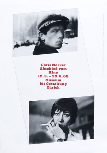
This poster was admired as a new kind of graphic object for the digital era: a three-dimensional object which can be viewed best when put against a glass door, where you can read the white-out text on the reverse. The simple form, created from just a couple of images, two rules and typography (recalling the idea of the ‘TypoFoto’) gives this poster clarity, poetry and power.
Category B – Corporate Identity, Promotional and Advertising Design
Main Award
YASUDA, YUMIKO (JAPONSKO / JAPAN)
A Naturally fermented hand-made bread bakery. Cop of the Earth, 72,8 × 51,5 cm, 2009
collaboration Okazaki, Tomohiro – design; Okazaki, Tomohiro, Matumoto, Maya – typography; Okazaki, Tomohiro, Matumoto, Maya – illustration
client Crop of the Earth (hand-made bread bakery)
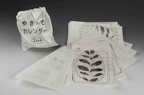
This calendar, for a local organic bakery in Japan, demonstrated a novel way of thinking about visual identity – with no logo. The work is modest – not overloaded with techniques or grand ideas, but in its small way it might make the world a better place through encouraging us to eat fresh daily bread – delicious, and good for you. As the composer John Cage once said, when asked why we bother to make new work: ‘We want fresh bread.’
Special Awards
The Mayor of the City of Brno Award
(for Czech designers under the age of 35)
ADVANCEDESIGN (Petr Bosák, Robert Jansa), (ČESKÁ REPUBLIKA / CZECH REPUBLIC)
Vizuální styl Domu umění města Brna, 2007–2010
client Dům umění města Brna
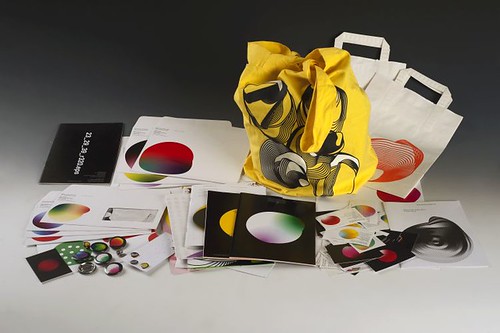
A local Brno gallery commissioned this optimistic new identity to encourage young people to attand and become more involved in their activities. It’s a brave move, and it would be good to see such energetic ideas applied to a national gallery. The use of multiple variations of shape and colour shows the way onscreen design thinking is influencing physical design, from buttons and bags to cards and posters.
The Prague TypoDesignClub Award
CYAN (NĚMECKO / GERMANY) – three posters
Singuhr, 140 x 100 cm, 2008
client Singuhr-hoergalerie, Berlin
Singuhr, 140 x 100 cm, 2009
client Singuhr-hoergalerie, Berlin
Fortschrift [Progress], 140 x 100 cm, 2009
client 89 plakate, Berlin
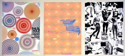
All three of Cyan’s posters could be regarded as using a kind of pattern-making, but their response to a commission from a forum about recent European history takes a jaundiced view of the word ‘Progress’. The pumped-up body-builders could be metaphors for futile attempts at self-improvement, while most of the technology shown in the poster has become landfill.
Special Mention of the International Jury
KVĚTA PACOVSKÁ (ČESKÁ REPUBLIKA / CZECH REPUBLIC)
Games & Talks exhibition, 100 x 70 cm, 2009
client Galerie Hollar Praha
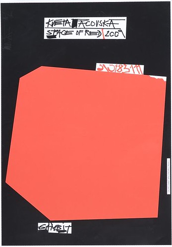
Pacovská’s posters, with their hand-lettering, bright colour and strong composition, look entirely contemporary – in fact ‘younger’ than many contributors born a generation or even two generations after Pacovská, whose work has been consistently strong since the 1960s.
Eye magazine is available from all good design bookshops and at the online Eye shop, where you can order subscriptions, single issues and back issues. The summer issue, Eye 76, will be a music special. You can read a selection of pages on Eye Before You Buy on Issuu.
Student subscriptions are half price worldwide, see bit.ly/EyeStudentOffer.