Spring 2011
Allan Fleming: The man who branded a nation
At a pivotal moment in Canada’s history, Allan Fleming’s typographic designs for stamps, books, advertisements, logos and big civic projects shaped the look of the country, leaving a vital legacy

My father, Allan Fleming, has been called ‘Canada’s first design guru’. He was certainly the country’s foremost graphic designer in the spectacular mid-century moment when the fusion of advertising and typography spawned a riot of raw talent across the continent, when technologies of design became intimate with the design of technologies, and when Canada, spurred by the lure of its centennial year of 1967, formed itself as a culturally literate nation – replete with a Design Council that he helped to instate.
Fleming trained at his own (and my mother’s) expense in the mid-1950s in London and Europe; he honed those skills at the furnace-face of hot metal as creative director (a position then almost unheard of outside Europe) at Toronto’s Cooper & Beatty Type Craftsmen from 1956 to 1962; he burned it all up at MacLaren Advertising (now MacLaren McCann), where he was director of creative services for six years. Finally, in a post created for him, he helped revolutionise the look of scholarly publishing in North America as chief of design at the University of Toronto Press. He died in 1977, aged only 48.
The work was good, sometimes great – but it is as much for his formative contribution to Canada’s high degree of visual literacy that we are in debt to him. Fleming’s design pedagogy – both formal and informal – shaped an entire generation of graphic designers in Canada and was effected in many ways.
Some of the lessons were, quite literally, throwaway. As consultant typographic designer and eventually creative director of Cooper & Beatty (C&B), Fleming produced a large body of memorable though ephemeral work, advertising with great panache the wares and wiles of the typesetting firm to other advertisers.
Much of the material he designed at the firm then headed up by W. E. ‘Jack’ Trevett can be found in Fleming’s own papers at the Clara Thomas Archives of York University in Toronto. Further material from C&B’s corporate archive is in the Thomas Fisher Rare Book Library at the University of Toronto. Both archives are goldmines of innovative mid-century typography and of information about the typographic va-et-vient across the 49th parallel.
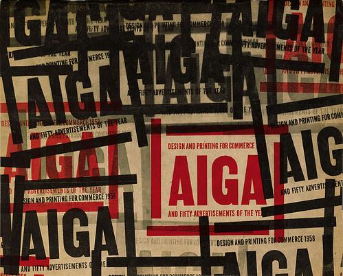
Cover, AIGA Design and Printing for Commerce 1958 and 50 Advertisements of the Year Annual (AIGA, 1958; MF). A one-colour-plus-black cover from a time when repro film was stripped up with Rubylith tape, and all competition material was posted in a brown paper wrapper.
Top: Portrait (1959) of Allan Rob Fleming RCA FGDC FoCA AGI (1929-77). Photographer unknown. Courtesy of Clara Thomas Archives and Special Collections, York University, Toronto. Taken for a Canadian Art magazine feature article reviewing a solo exhibition of Fleming’s work the previous year – a rare accolade for a designer even now.
The Saarinen Tulip chair Fleming sits in is not just ‘of its time’ – he also designed catalogues and ads for Knoll International Canada in the 1950s.
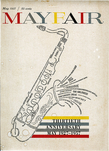
Cover, Mayfair, May 1957 (TFL). Not the British soft-porn mag but an earlier Canadian cultural publication. Fleming’s calligraphic cover reflects his knowledge of jazz and blues as much as his letterforming skills.
A fistful of signs
For a brief period in the late 1950s, Fleming’s advertisements for C&B taught a well structured history and practice of typography: a series for trade magazines on typographic birthplaces covered Amsterdam, Paris, Mainz, London and Philadelphia; another set featured the ‘Languishing Ligature’, the ‘Migrating Kern’, the ‘Swashbuckling Cap’ and the ‘Vanishing Ampersand’. Further display ads outline the functions of typographic signs and punctuation marks such as the fist, the dagger, the comma and the interrogation point. Another series anatomically dissects and personifies the individual piece of metal in the compositor’s hand, from face to beard, from shoulder to back. Finally, a pack of twelve cards laid out the interlocking departments of Cooper & Beatty itself: not only the composing room and the keyboard department but also the casting room, the press room, the fledgling photo-typographic department, the contact men – and his own creative department.
He both wrote and designed these ads, and though many of them are funny and flashy, my favourites are the rather sober and literary ads he made for C&B to appear in Canadian Art. The magazine was at that time art directed by Paul Arthur, the Canadian designer who would go on to revolutionise international wayfinding and signage through his work on Expo 67 in Montreal. Between them, Arthur and Fleming squeezed as much graphic design as possible into what was essentially a fine art magazine; it was the sole critical venue for graphic design appreciation in print in Canada at the time.
Yet the exhibitions and talks that Fleming and Franklyn Smith (C&B’s production director) organised at the company’s downtown Toronto address had a much wider audience than clients alone. Designers Karl Gerstner, Morton Goldsholl, William Golden, Paul Rand, Saul Bass, Beatrice Warde, Hermann Zapf, Leo Lionni and Herb Lubalin all had their work showcased there in the late 1950s and early 60s, and Fleming designed witty and visually literate invitation cards for all of them. The English-language edition of Tschichold’s Asymmetric Typography was also a product of the triumvirate formed by Fleming, Smith and Trevett: initiated by them in 1960, it was finally brought to fruition in 1967 in Ruari McLean’s translation.
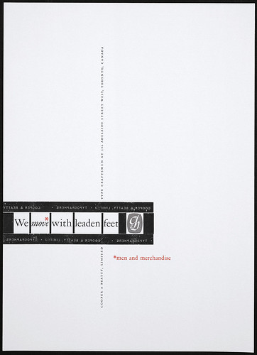
‘We move with leaden feet’ (1958; TFL). Trade ad for Cooper & Beatty.
Fleming’s fascination with type furniture and the mechanics of typographic print production informed his ads for Cooper & Beatty and the Advertising Typographers Association of America (ATA).
Reverence for the mechanics of type
Though Fleming spent most of his time with clients, and designing and calling type, he was also fascinated by typographic furniture. He designed a two-colour print and embossed letterhead for C&B, incorporating his adaptation of Carl Dair’s original logo, and showing the entire shank-to-shoulder height of an individual piece of type.
He produced ads for the Advertising Typographers Association of America (ATA) that featured silhouettes of the shanks that littered their composing room floors. Lock-up frames would appear in places where they would be understood as an in-joke. This abstracted reverence for the mechanics of type goes far beyond the then innovative conviction that the word is an image in itself; Fleming’s austere demonstration of the apparatus has the kind of self-reflexivity normally associated more with early twentieth-century film-makers.
But the word as an image for Fleming was not uniquely something made up of type, as it was for designers such as Herb Lubalin or Robert Brownjohn; he loved to draw letterforms and had an excellent calligraphic hand that he fused with an early training as an illustrator. Canadian typographer Nick Shinn (designer of the text typefaces used in Eye 77) has called this style ‘Verbus’ – a performative extension of the rebus. One virtuoso example of this style, more Marian Bantjes than Blake Stephenson, was Fleming’s cover for Mayfair magazine of May 1957, which also displays his deep knowledge of blues, jazz and other then recherché forms of American music and popular culture. A saxophone composed entirely of hand-drawn names, each signifying a cultural icon, shows the integrity of music with all else of the twentieth century, by then more than half over.
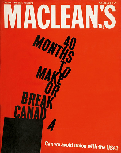
Cover, Maclean’s, 3 November 1962 (MF). A bold typographic cover with constructivist-socialist overtones, in sharp contrast to the one Fleming produced for the 1960 USA issue.
Cover, Maclean’s, 15 December 1962 (MF): a print magazine as good as TV.
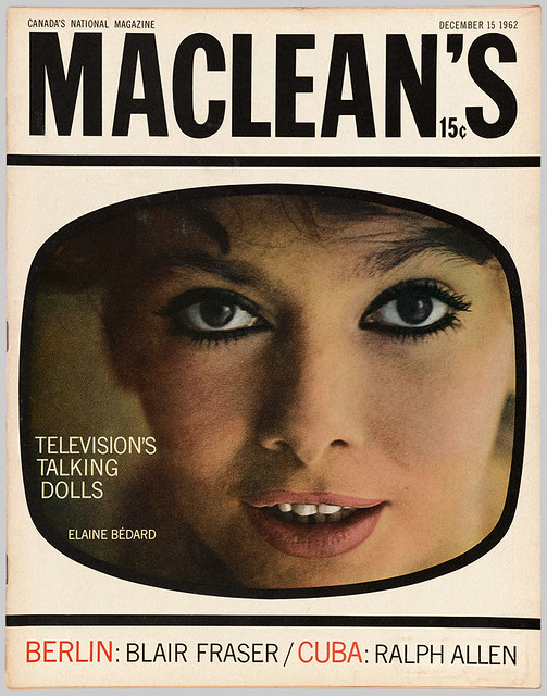
McLuhan and Maclean’s
At the time that this hand-lettered cover appeared, Fleming would also have been creating the Flexitype ‘bendy’ word-images that C&B produced for Explorations, a magazine edited by Marshall McLuhan, then a professor at the University of Toronto. Issue 8, ‘Verbi-Voco-Visual’, appeared in October 1957 and was animated by some 40 text blocks showing off the conceptual capacity of newly introduced film typography made ‘possible only through the co-operation of Cooper & Beatty Ltd of Toronto’. The company was forefront; its creative director unmentioned.
Nominally this issue of Explorations was designed by Harley Parker, who taught colour at the Ontario College of Art where Fleming taught typography. Parker, as display chief of the Royal Ontario Museum, would have also helped install the exhibition Fleming curated there in 1956 to commemorate the 500th anniversary of Gutenberg’s 42-line bible: ‘The Art of Fine Printing and its Influence upon the Bible in Print’.
No doubt this exhibition was itself influential for McLuhan; it was to Fleming he turned in 1958 when he wanted to explore different kinds of typographic self-reflexivity in some of the earliest presentations of his media research. Thus it was in the context of advertising for and by the industry that McLuhan’s work on print first came to light: Fleming designed, and Cooper & Beatty produced, McLuhan’s article ‘Printing and Social Change’ for inclusion in Printing Progress: A Mid-century Report, the showpiece 1959 publication of the International Association of Printing House Craftsmen.
It starts with a set of cinematographic ‘titles’, yet in the body it is only the title that is animated – changing, letter by letter, throughout the text like a flipbook, from Monotype Goudy Text (based on the 42-line bible) to Monotype Twentieth Century in lowercase throughout. A similar materialisation of a typographic revolution can be seen in Fleming’s 1960 ScotiaBank logo for the Bank of Nova Scotia, which moves from a chancery script to a machine-readable font that had only just burst out of computing and into the typographic firmament, auguring the virtual world McLuhan was attempting to articulate theoretically. By the time McLuhan was ready to publish The Gutenberg Galaxy (1962), through the University of Toronto Press, Fleming had left C&B and was designing Maclean’s, Canada’s premier news magazine; he was not to join UTP for another six years.
Before he took over the art-directorship of Maclean’s in November 1962, Fleming had already designed covers for several issues – the 1960 USA special being a chaotic and exuberant example. By 1962, what with the punishing American auto industry lobby and a panoply of rip-off natural resources deals, there was a growing understanding that Canada would have to define itself very clearly in distinction from its southern neighbour: Fleming’s first in-house cover reflects this necessity aesthetically as well as textually.
On a three-page spread in the April 1963 issue, Fleming is again using the furniture of type in the service of information design, for an article about young French Canadian intellectuals, most of whom went on to be significant figures in Canadian politics and business. One singular absence was that of Pierre Elliott Trudeau, then an associate professor of law at the Université de Montréal, who within five years was to be Canadian prime minister. His party, the Liberals, was among MacLaren Advertising’s most important clients, and Fleming, as the agency’s vice-president, became closely involved in the nation-building projects of the 1960s, influencing everything from postage stamps to political campaign design, from the national flag to the Hudson’s Bay Company – once the largest landowner in the dominion of Canada – and the Expo 67 world fair.
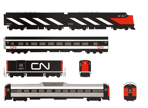
It was work for which Fleming was well prepared: in 1959 he had created a logo for a national corporation that is still seen from coast to coast – CN, the Canadian National Railway. The commission came to him as a freelance project while he was working at C&B: James Valkus had come looking for a uniquely Canadian ‘emblem’ to spearhead his huge corporate design programme for the transport, telecommunications and hotel conglomerate then still owned by the Canadian government.
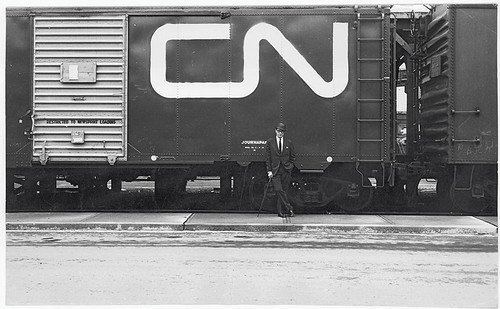
Fleming poses with his logo during a test application on a boxcar outside Toronto’s Union Station (1962; MF). Photographer: Kryn Taconis.
Fleming was commissioned in 1959 to create the central logo of a huge corporate redesign for Canadian National Railways, then government-owned.
CN logo on client presentation materials, as reproduced in Industrial Design, no. 7, July 1961 (MF).

Locomotive of Modernism
The symbol Fleming created for CN was itself like a train driving Modernist design straight through the 1960s in Canada and beyond, and it still adorns countless bridges and trains 50 years later. It makes even the great New Hampshire Railway logo designed by Paul Rand look like something from the nineteenth century.
After that, the work came thick and fast. In 1964, Fleming created a symbol for the state-owned Ontario Hydro, this time in collaboration with industrial designers Hathaway Templeton. Music and calligraphy came together again in the logo he designed in 1965 for the Toronto Symphony Orchestra.
In the run-up to Expo 67, he created a corporate symbol for the government body Design Canada, and he designed the National Film Board’s vast celebratory photobook Canada: A Year of the Land. He was a jurist for the competition for the centennial coins, later advising the mint on typography for the chosen artist, Alex Colville. In 1968, the Ontario Science Centre announced the brave new world, opening under the sign of yet another of Fleming’s successful symbols.
These nation-building ‘special projects’ were effected from inside Fleming’s day job as ‘Vice-President, Creative’ at MacLaren Advertising. Some were more hush-hush than others: when branding meets electoral politics and national symbols, most of the heavy lifting takes place backstage.
In Fleming’s papers are five sketches, all refining the realist, multifoliate maple branch then proposed into something remarkably similar to the bold single-leaf flag now flying over Canada’s parliament. The official story of the flag’s creation by Colonel George Stanley certainly acknowledges that ‘experts’ were consulted, but no one knew better than an advertising man what bad press might be garnered should a nation’s new flag appear to have been produced, even in part, at an agency.
More straightforward – and certainly better documented – was Fleming’s work in steering a review of the national postal service in 1968-69. He assembled a board to look at the entire range of Canada Post products, including philatelic design, and recommended the instatement of a design advisory board, which he chaired for several years. The style guide he drew up defined the look of Canadian stamps for twenty years and more.
Fleming’s contribution to scholarly publishing in North America through his work at University of Toronto Press (UTP) is uncontested but also unexplored.
He had always wanted to design books but, despite recommendations from Beatrice Warde, Stanley Morison and others to whom
he had been apprenticed while living in London from 1953 to 1955, no university press in Canada at that time would take him on. There was simply no understanding there of the difference between a designer and a compositor. Yet, over the years of calling type at Cooper & Beatty and serving corporate masters at MacLaren Advertising, Fleming managed to squeeze in a surprising number of books, including stylish company reports for the Hudson’s Bay Company, catalogues for the Art Gallery of Ontario and the Montreal Museum of Fine Arts, and projects with the National Film Board.
Fleming also had his own press, which allowed him to design entirely to his own taste. And that taste was quite austere. The main productions are bound in rough linen, with the simplest of case titling – almost medieval in their simplicity.
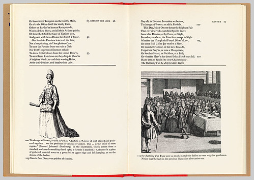
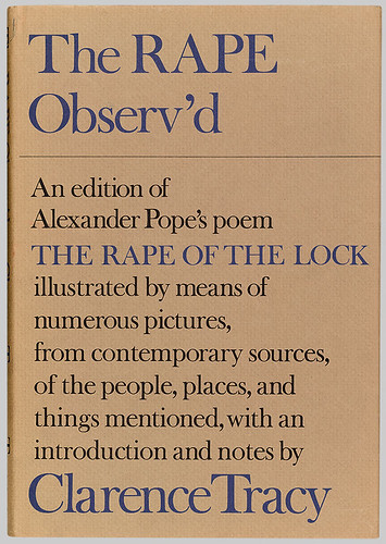
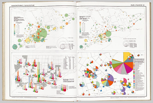
He carried this austerity over into his work at UTP to great effect. The Economic Atlas of Ontario won Leipzig’s Most Beautiful Book in the World award in 1970, and it has about it the scale and modesty of a monastic quire, loaning gravitas to the subject, as if to suggest these maps of Canada were a kind of Domesday book of the provinces. They are still a landmark of information design. Fleming became adept at structuring the scholarly apparatus of textual editors into something that was significant visually. He designed an interpretive edition of Pope’s Rape of the Lock for UTP that radically repositioned word-image relations inside the rhetorics of the academy. He placed the image references in the footnote field, making several points at once: images have always been part of the intellectual worldview of great thinkers, and hence these images are also epistemological touchstones to understanding those worldviews and their continuing relevance in the present.
His 1974 template for The Correspondence of Erasmus, an international scholarly project-in-progress, is still current and fresh today – a humanist layout for a humanist subject, where information hierarchies relating to date, place, author, signature, etc., are not rendered into invisible glyphs that point to content but remain incorporated lyrically into the body of each letter. Two ‘integrities’ are dovetailed here.
Fleming’s 1971 design of the Hymn Book of the United Church of Canada is another work recognisable in Canada from coast to coast. The cover, a gold-stamped cross on red cloth, matches millennial Celtic design with a 70s sensibility. It predates Derek Birdsall’s work for the Church of England by 30 years, and can stand up to it even today. The relative modesty, both financial and institutional, of the United Church of Canada meant integrating both words and music on one page and, with the exception of some judiciously placed colour-block part-titles, printing one colour throughout. In spite of this, the spreads show masterly sobriety in information design: they are as useful to musicians and academics as to communicants.
Cover and spread for Clarence Tracy’s The Rape Observ’d (University of Toronto Press, 1974; MF). At UTP, Fleming revolutionised scholarly convention by siting images in the footnote blocks, showing them to be on a referential par with text, and not ‘mere illustration’.
Shaping a country from sea to sea
Though he never opened a ‘Fleming Office’ and he did much of his best work on overtime from demanding executive posts, he was among the first Canadians elevated, in 1974, to fellowship of the Alliance Graphique Internationale (AGI).
His awards included several medals for the World’s Most Beautiful Book; a sheaf of citations from the Art Directors Clubs of New York, Toronto and Montreal, from the New York Type Directors Club, from the Advertising Typographers Association of America and from the AIGA – both for printing and commerce and for the 50 Books of the Year. He exhibited at conferences such as Aspen and Silvermine. Fleming also juried graphics and logos for the TDC New York and the formative Trademarks / USA show held by the STA in Chicago in 1964, as well as books for Design Canada and the AIGA, and numerous competitions for Canadian coins, medals and stamps.
He curated several exhibitions for the Royal Ontario Museum and the Art Gallery of Ontario and was one of the first fellows of the Ontario College of Art. Fleming was also a director of the Toronto Arts Council and a president of the Art Directors Club of Canada.
The idea of Canada – and a Canada of ideas – was paramount to Allan Fleming, as to his peers, who included Marshall McLuhan, industrial designer Hugh Spencer, information designer Paul Arthur, political philosopher Harold Innis and visionary Prime Minister Pierre Trudeau. He was shaping more than a thin red line with his symbol for Canadian National Railways: he felt he was helping to shape a country, from sea to sea. And from coast to coast, Canadian citizens knew who he was, as their eyes followed boxcars snaking through the landscape.
Having trained, of necessity, on the job in advertising typography, in both the UK and the US, Fleming contributed significantly to a national identity that straddles those two imperial cultures and has often been overshadowed by both at a time before telecommunications infrastructures enabled the transcendence that is today’s design world.
In a century of seismic shifts in geopolitics, type was inextricably linked to nation states. Many typographers and graphic designers were their nations to each other as well, even when displaced by war. Inasmuch as they were Switzerland, Germany, Britain and the US to him in the late 1950s, for colleagues such as Karl Gerstner, Hermann Zapf, Stanley Morison and Herb Lubalin, Allan Fleming was Canada.
Thanks to E. A. Hobart of Zab Design & Typography and Nick Shinn of ShinnType.
Martha Fleming, academic, artist, museum professional, London
Spread from Economic Atlas of Ontario (University of Toronto Press, 1969; MF). Fleming worked closely with cartographer Geoffrey Matthews to produce this elephant folio, twenty years before computers made it possible to dovetail statistical visualisation with desktop publishing. It won Leipzig’s Most Beautiful Book in the World Award.
First published in Eye no. 79 vol. 20.
Eye is the world’s most beautiful and collectable graphic design journal, published quarterly for professional designers, students and anyone interested in critical, informed writing about graphic design and visual culture. It is available from all good design bookshops and online at the Eye shop, where you can buy subscriptions and single issues.