
Summer 2021
Anette Lenz: Poetic rhetoric in the public realm
Over nearly three decades, Anette Lenz has made work that transcends trends and technology. Profile by Jan Middendorp

Over nearly three decades, Paris-based, German-born graphic designer Anette Lenz has made work that transcends trends and technology. Many of her clients are in the public realm. Her striking, intelligent and charming graphics reflect a deep concern for the people on the receiving end of her identities, posters and publications and the social contexts in which they experience them. Whether working in friendly co-operation with other designers and institutions, or forging a more independent and individual path, her work unites superficially contrasting qualities: her German precision and typographic perfectionism with a French taste for social significance and visual poetry.
Anette Lenz’s big 2020-21 exhibition at Frankfurt’s Museum Angewandte Kunst, entitled ‘à propos’, went far beyond the usual approach for a designer’s retrospective. Occupying several large rooms in the stylish Richard Meier building, Lenz designed a show that was a complex comment on the building and its city, a colourful and challenging trip for visitors and a three-dimensional visual essay about graphic design and its functions. Uniting several strands within her body of work, her use of space said much more about her motives and visual sensibilities than the usual ‘walkable coffee-table book’ exhibition.
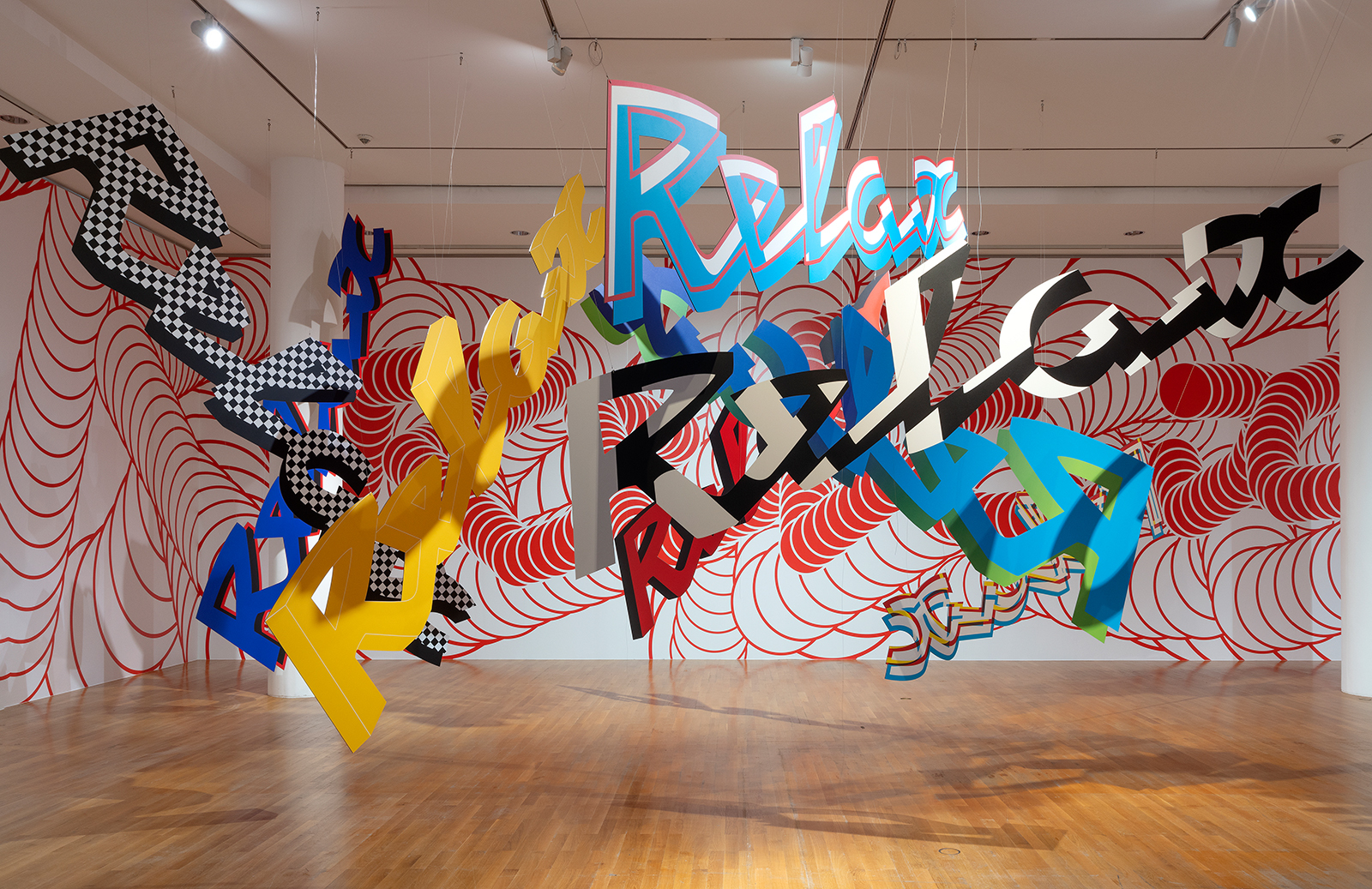
‘à propos’, Frankfurt, 2020-21. In Lenz’s exhibition at the Angewandte Kunst, one room was completely dedicated to her dynamic, ‘floating’ identity for Le Nouveau Relax theatre in Chaumont.
After graduating in graphic design in Munich, Lenz stayed in the Bavarian capital to first work at Günter Becker’s studio AWG (Atelier für Werbung und Gestaltung) – modern, systematic and meticulous. Designing identities she received a post-academic education in clean functionalism and then decided to look elsewhere. ‘I had learned a lot, but realised this kind of work would not fulfil my wishes,’ she says.
In 1989 she left for Paris. ‘At the time, it was relatively easy to find a job when you arrived there with a good and clean portfolio – especially for those who had completed a thorough design course in The Netherlands or Germany.’ Being an admirer of Grapus, the socially and politically committed design group that had grown out of the city’s May 1968 rebellions, Lenz presented herself there. There was no immediate need for a designer like her, so she started freelancing for smaller studios, and pitched for German-French cultural TV channel Arte’s identity. Then came a call from Grapus partner Alex Jordan, a German-born designer-artist. What Lenz did not know was that the collective was about to implode and had been divided into independent groups.
The former collective’s motivation had always been to attain utilité publique – visual communication that was a socially useful medium. As the group’s senior members had roots in art, having studied with Polish poster designer Henryk Tomaszewski or, in Jordan’s case, under Joseph Beuys at Düsseldorf Art Academy, their designs were conceptual and often handmade, cherishing a vernacular look.
Jordan’s team had landed an identity assignment he wanted to hand to Lenz. The job’s character made her hesitate. ‘I had to return to the kind of work I had left behind: I dreamed of producing huge posters, but I was given a lot of responsibility handling a budget that seemed enormous. I was in!’ The first time a poster project came her way, she worked through the night so she could be the first with a great proposal. The reaction when she presented her spotless design (on paper) next morning was disappointing. ‘Jordan told me: “Anette, that’s all much too tidy! You must free yourself from the grids and the cleanness.” Then he took a cutter to my design, and – ratch-ratch-ratch! – went at it. I was furious and ran out. When I came back, he looked at me with an inquiring look, and I realised he might have a point. I had been so strongly influenced by my Munich studies. Two very different worlds were colliding. And something new had to develop.’
Within a year Grapus was disbanded. The conflicts between its senior members had become too acute to solve. Jordan and Lenz decided to co-found a new studio with three others, including Ronit Meirovitz – Nous Travaillons Ensemble [‘We work together’]. The new group’s intention was to continue the original socio-political approach, making work that helped bring cultural events and social projects to the larger population. Yet to Lenz, the promising studio became a transitional phase in her Parisian career. ‘I found it interesting to continue that commitment, but I wanted to develop my own graphic language. In 1993 I left the group.’
The same year she established her own one-woman design studio, focusing on socio-cultural projects. Her motives and objectives remained close to the Grapus mentality. When the group’s former leader, Pierre Bernard (1942-2015), presented his work at the first AGI Open (Porto, 2010) I quoted him in ‘Due process’, my review on the Eye blog: ‘Bernard reminded the audience … that good design can only take place when the designer appropriates the assignment and gets deeply involved in the subject matter, and the client gradually loses exclusive ownership of the brief.’ This was more or less how Lenz would approach her projects in the coming decades.
She landed smaller and larger assignments from clients in social and cultural sectors – from the Association Française d’Action Artistique (AFAA) to a project focusing on French-Moroccan cultural exchange. The latter’s communication manager, François Croze, was impressed and invited her to design the visual material for Radio France. ‘That was one of the earliest projects that earned me a certain visibility as a woman running her own design shop,’ she says with a grin.
In 1999 Lenz was approached by Les Graphistes Associés, former Grapus members, who had worked for a city theatre south of Paris for four years. The place was Rungis – which is home to the world’s largest wholesale food market. Its conservative mayor had been annoyed and offended by Graphistes Associés’ subversive style and threatened to throw out theatre director Joël Gunzburger if he did not hire somebody else. The group’s coordinator Vincent Perrottet insisted that the theatre management should not hire an advertising agency, and work instead with Lenz.
Théâtre de Rungis, 2000. Poster for the city theatre of Rungis, a prosperous suburb of Paris.
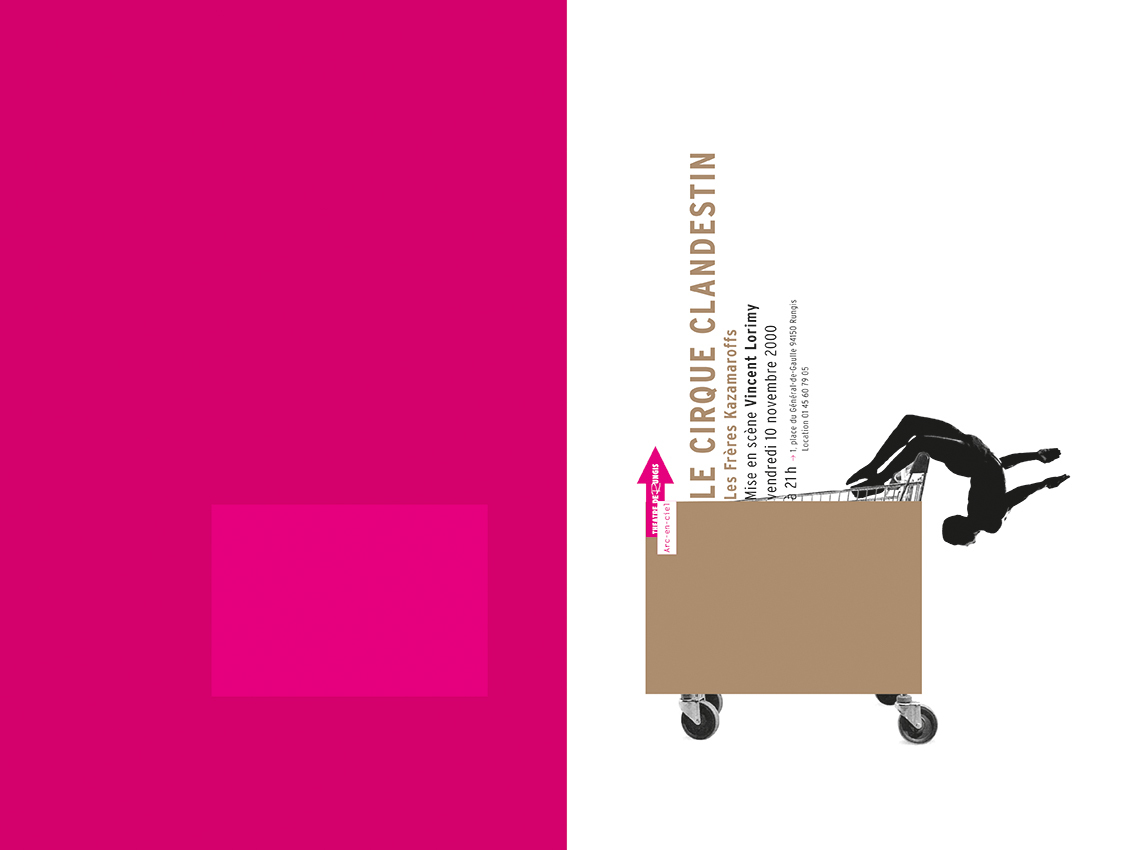
Lenz was hired and managed to turn every project into a personal exploration, still under the authoritarian mayor’s scrutiny. For four years she designed the theatre’s publications – a series of unorthodox booklets. The mayor kept an eye on the theatre’s visualisation, checking every page for readability. He complained about the poetic, yet blurred photos Lenz had commissioned for the first issue. Gunzburger suggested visualising the theatre’s practice more literally in the next brochure by including actor portraits, all against the same background. Lenz created a white space and a big white couch was acquired.
She then suggested inviting the public on board to bring the organisation closer to the people. Lenz had a Polaroid camera installed in the foyer; the audience members were invited to pose on the white sofa. These photos were displayed throughout the season and the project received international attention.
That same season, 1999-2000, she designed the theatre’s poster campaign for Paris Métro stations, a near-abstract project inspired by Métro management covering unsold advertising billboards with blue paper. Lenz created a near-monotone poster in International Klein Blue, subtly mentioning the theatre’s name. This was the time when many people believed the millennium bug would cause the end of the digital world as we knew it. Would that also cause problems in advertising? Lenz was the first to translate these dark speculations into a minimalist campaign. The next year, when Y2K had proved less serious than many had feared, she came up with a charming Métro campaign. Combining images with striking colour planes, all printed in pink and bronze, the series won design awards from Finland to China.
In the following decades, poster and publication design for theatres across France would be one of Lenz’s principal activities. When theatre director Gunzburger left Rungis for the renowned national theatre in Angoulême, not far from Bordeaux, he wanted to take his former designers with him. He let Lenz and her predecessor, the aforementioned Perrottet, know that his new theatre would be too large for a single designer and invited the two of them to become a team.
They both hesitated. Having worked for the same studio but in different groups, they did not know each other very well. Lenz lived in the centre of Paris; Perrottet had moved to the countryside with his family. Their compatibility was not obvious. But the theatre director was a great working partner, and Angoulême, hosting a renowned annual comics festival, was a hub of French visual culture. Lenz and Perrottet began working for the Angoulême theatre in 2001. It was the start of an intensive long-distance collaboration that would continue for more than a decade and comprise the identity of three theatres / cultural centres. (See ‘Sticks in the mind’, Eye 69.)
For twelve years, Lenz and Perrottet became a renowned double act of French graphic design. They would sign their projects together, yet often develop them individually in their own studios. The result was an impressive body of work: hundreds of posters and plenty of programme brochures, as well as temporary identities for seasons and themed series. Their social commitment did not impede upon visual sophistication and playfulness. The poster series, with their adventurous, witty approach and innovative graphics, impressed both the locals and the international design scene.
The first brochure they worked on together, for Angoulême’s 2001-02 season, was an early demonstration of how a friendly clash of two design views could produce a publication that was unorthodox yet accessible, and resulted in unusual graphic liveliness. Lenz had noted the grid-like structure of the monumental building’s façade, and had derived a simple scheme from it as a grid for the brochure. For Lenz, this also referred to the city’s world-famous comics festival and museum. On each double page she played with photos, texts, colours and changing patterns – the rectangular result was offset by Perrottet’s irregular background of diagonal black lines and geometric shapes.
Théâtre d’Angoulême, 2001-2002. Lenz’ long-time, long-distance collaboration with Vincent Perrottet began with the 2001-02 brochure and posters for the Angoulême city theatre. Their design – partly inspired by the theatre’s famous classical façade.
The Angoulême posters for the 2005-06 season feature monochrome portraits of actors’ faces, partially covered by white, apparently irregular shapes that contain information. Seen as a series, the shapes spell out the word ‘T-H-E-A-T-E-R’.
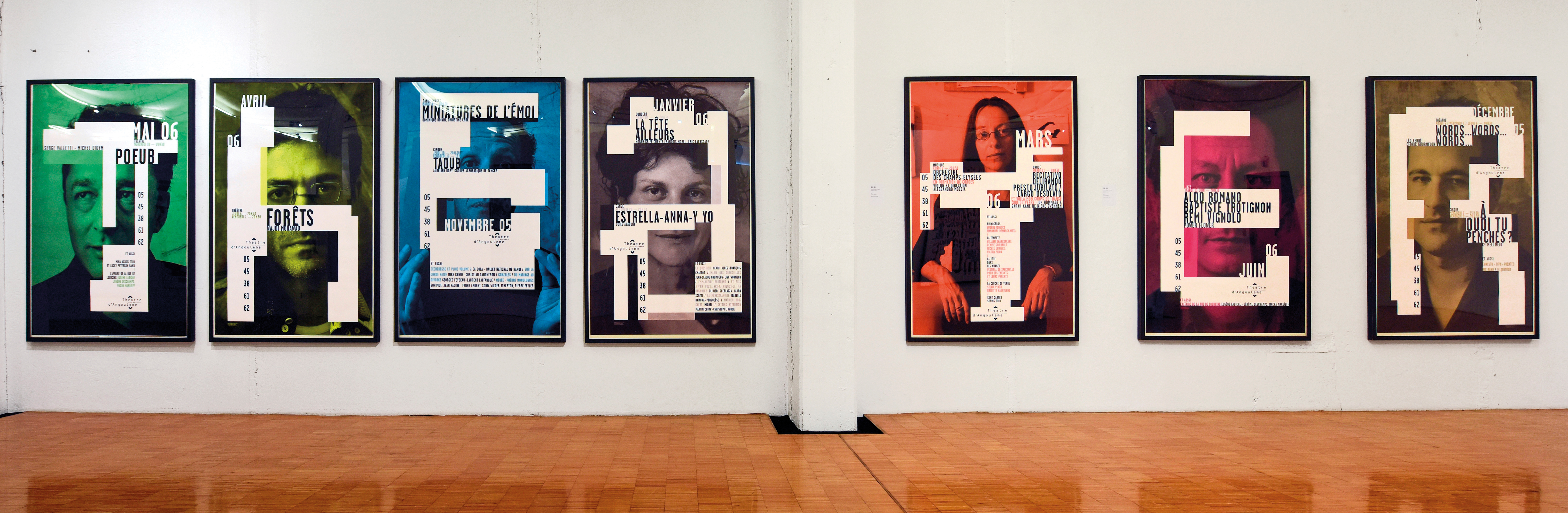
Over the years, Lenz says, the collaboration became more harmonious, shifting from a continuous discussion to a more integrated way of working together. Each year the pair chose a photographer whom they gave carte blanche to express their view on Angoulême through a series of photos that would grace the posters and booklets. The sensitive montage, layering images with coloured shapes and sophisticated typography, was seen by some as a digital continuation of the ‘Typo-Photo’ approach defined by László Moholy-Nagy and his peers in the 1920s and 30s. As Surrealist painting was also on their minds, they referred to the inspiration of one series by saying: ‘Magritte was kissing El Lissitzky on our posters.’
A new theatre in Chaumont approached Lenz and Perrottet for another long-term collaboration. The small town east of Paris was known for its annual international poster exhibition. The new theatre was built on the former site of a cinema (Relax) and a bowling alley. The venue’s new designation received much criticism in the local press. Its director outlined his concerns to the designers: he admired their work, but was worried that its graphic sophistication might be felt as ‘elitist’ and intellectual. They should communicate as directly as possible with the town and its people.
That informal briefing was a perfect starting point for the designers, who had both remained faithful to their social motives. They began with the logo. Having discovered a faint imprint of the remains of the cinema’s original script-style ‘Relax’ emblem on the building, they made it the focus of the new identity. With variations on the logo, doubling or adding a fake 3D effect without changing its shapes, each design got its own version – sometimes elegant, often cheeky, playing with the limits of good taste. Lenz says: ‘We were the makers, we could torture the logo as much as we liked.’
Le Nouveau Relax, 2006. Lenz and Perrottet conceived programme magazines and posters that established contact with the small city’s population.
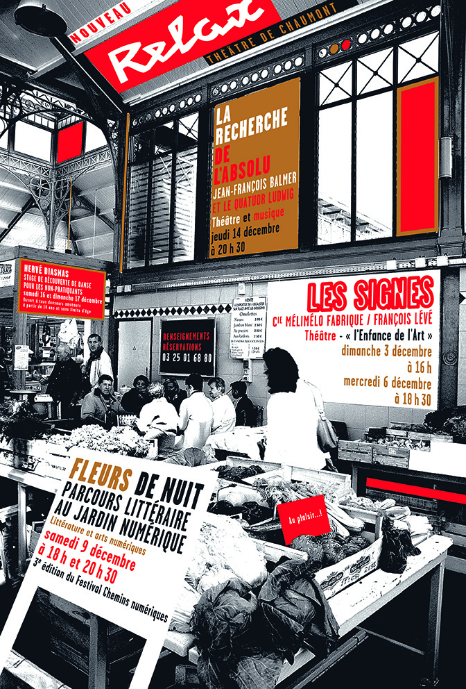
The fact that Chaumont had a population fewer than 25,000 people offered a unique opportunity to involve the public. For the monthly posters, the city photographer, who knew just about everyone, was invited to take photos of Chaumont’s people at work, at the market or in the sports hall, and the month’s programme was lettered in text blocks with intriguing perspectives, silkscreened in two spot colours. The posters immediately grabbed the attention of passersby. ‘To me, the main aspect of the campaign was that it was inclusive,’ Lenz says. ‘It involved the people in a visual dialogue. Daily life was a stage for the theatre, and the theatre was a stage for life.’
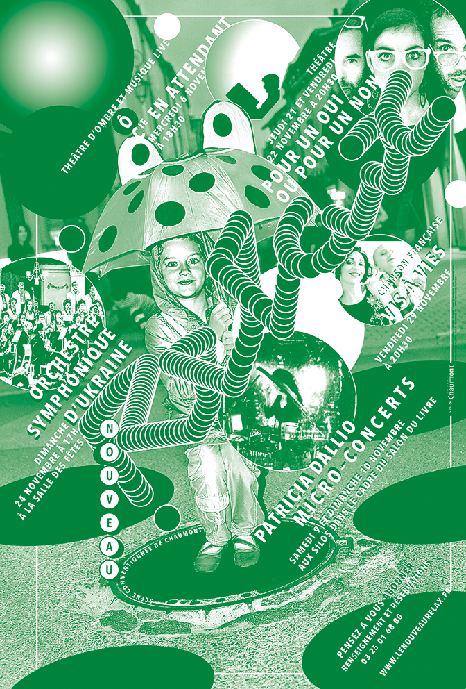
Le Nouveau Relax, 2014.
While sharing the design tasks with Perrottet for these two theatres and, later, for the large cultural centre La Filature, Lenz also worked independently from her studio near Place de la Bastille for clients in social and cultural sectors. Her projects at the time included identities for film festivals at La Géode and Centre Pompidou, the identity and trophy of a literary award at the latter, signage at Unesco Paris, photobooks and exhibitions. In 2012, Lenz decided to focus on her one-woman studio. The two amicably terminated the collaboration.
Lenz still runs her studio in central Paris, occasionally working with assistants and collaborators, such as specialists in various digital techniques. As Étapes editor Vanina Pinter wrote, young graphic artists referred to Lenz as ‘the embodiment of graphic design in France’ (Étapes no. 89, October 2002), admired for her ability to merge playfulness, originality and precision. Convinced that client and designer should be on a par, Lenz’s idea is to work together to develop a visual language striving for that utilité publique mentioned earlier – defining and strengthening the organisation’s relationship with its community.
Lenz was invited by Emmanuelle Vo-Dinh, the new director of contemporary dance centre Le Phare in Le Havre, to develop a new identity and coordinate its visual communication. Under its previous directions, the dance centre had been called Centre Chorégraphique National, but in 2011 Vo-Dinh proposed its current name, which means ‘the Lighthouse’. Having produced an identity and a concept for the printed matter, Lenz was asked to design a typographic sign for the façade. She proposed a more radical solution: make the place radiate its function more expressively, focusing on light and movement. The building, a former storehouse in the rather bland environment behind Le Havre’s central station, tended to remain unnoticed.
Le Phare, 2013. The façade was painted red to stand out from its grey neighbourhood, while glass tiles were turned into a permanent light installation, each tile functioning like a pixel.
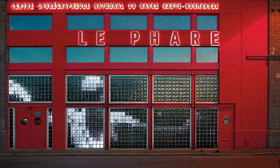
Lenz proposed to paint the front in saturated red – a standard lighthouse colour – and add the name in huge red capitals, which were to be lit from behind at night. What was most sophisticated, both visually and technically, was the moving light emanating from within. Two dynamic fragments of dance were rendered in low-resolution pixels: each of the glass bricks that form the ground floor façade was equipped with a lighting device. The video installation is permanent.
Le Phare’s printed matter changes each season. The basis for pages and posters are processed photographs of moving people, sometimes monochrome, recently as multicoloured outlines that simulate ‘aura photography’. Always intriguing, Lenz’s dramatic restyling of dance photos represents exactly the kind of communication a contemporary dance centre requires.
Le Phare, 2013. In-house photographs of dancers are graphically processed with patterns based on the random lines often seen in body scans or ‘aura’ photography.
For the typographic identity Lenz decided on an individualistic 1990s sans serif – Peter Biľak’s Eureka. In a 2015 interview by Marion Chibrard (on typofonderie.com) Lenz commented on that choice: ‘I had used Eureka for a Hermès poster … but I was really uncomfortable with the capital “M”. I called Peter Biľak to talk to him about it, and then his response was: “But why do you use Eureka? It’s one of my old typefaces, it’s full of flaws, I have other, better typefaces now.” To this, I replied that it was precisely what I like so much about Eureka. The same day, Peter surprised me with a new “M”. After all, I see a lot of myself in this typeface. It’s not perfect, but it has a lot of personality.’
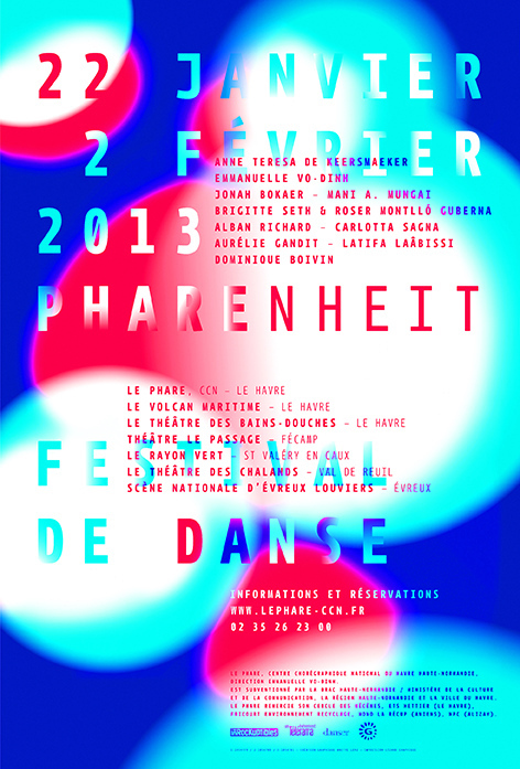
Poster for the Pharenheit Festival de Danse.
Lenz’s interest in contemporary type led to an unusual approach for a series of brochures for the Paris Museum of Applied Arts. Each issue’s cover and headlines sport a different display typeface. Closing the booklets is a double-page spread featuring the font family. To her, it was an obvious way of using this platform to give some attention to typefaces and their designers – a ubiquitous design realm that is often overlooked by design institutions.
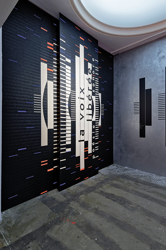
One project gave her the opportunity to add sound-inspired textile design to her portfolio. In 2019 Lenz was invited to develop the visual elements for ‘La Voix Liberée’ [‘The Liberated Voice’], an exhibition dedicated to experimental sound poetry at Palais de Tokyo in Paris. As usual, her proposals were based on meticulous research. Having looked into the graphic visualisation of sound waves, she stylised them digitally into abstract black and white wall patterns, which were counterpointed by monochromes of neon orange on the opposite wall and ceiling. Lenz then proposed involving one of the event’s initiators in the design of the space. This was Fondazione Bonotto, the foundationof the prestigious textile company of that name in northern Italy. Lenz transferred the sound patterns into digital data for an automatic loom, using the woven fabric as the grille of a giant loudspeaker, with low bass sounds coming from behind the textiles. Bonotto’s weaving mill agreed, adding their speciality to the spectacular staging of an adventurous art event.
La Voix Libérée’, 2019. Lenz designed the abstract patterns on the textile panels and walls as a stylised visualisation of sound waves.
Recently Lenz got to work again for Gunzburger, the theatre manager she had worked with at Rungis, Angoulème and the Filature stage. When put in charge of cultural centre L’Onde [‘the Wave’], Gunzburger was not supposed to choose his own designers. A competition was to be set up and a jury was installed to judge the proposals. Lenz, who felt challenged, decided to take part. Her identity was purely typographic, translating the irregular movement of waves into typography by using variable spacing – notably for the logo, which became a changing, expressive sign – with similar ideas for the posters. Lenz won, and has designed all L’Onde’s posters and publications since 2016. Building layouts with Berton Hasebe’s sturdy Druk typeface (from the Commercial Type foundry) in various bold widths and weights, a variety of sizes, and expressive use of white space, Lenz came up with one of the most personal and remarkable cultural identities of the past few years.
Determined to avoid the language of commercial advertising, Lenz merges design’s communicative function with elements of contemporary art. An unstoppable researcher equipped with boundless imagination, a strong will and a modest attitude, Lenz often manages to take her assignments way beyond the conventional realm of graphic design.
The radical outcome of a brief is often thanks to Lenz’s resolution to ‘give every client more than they expect’. Various recent projects comprise much more than graphic design for screen or print.
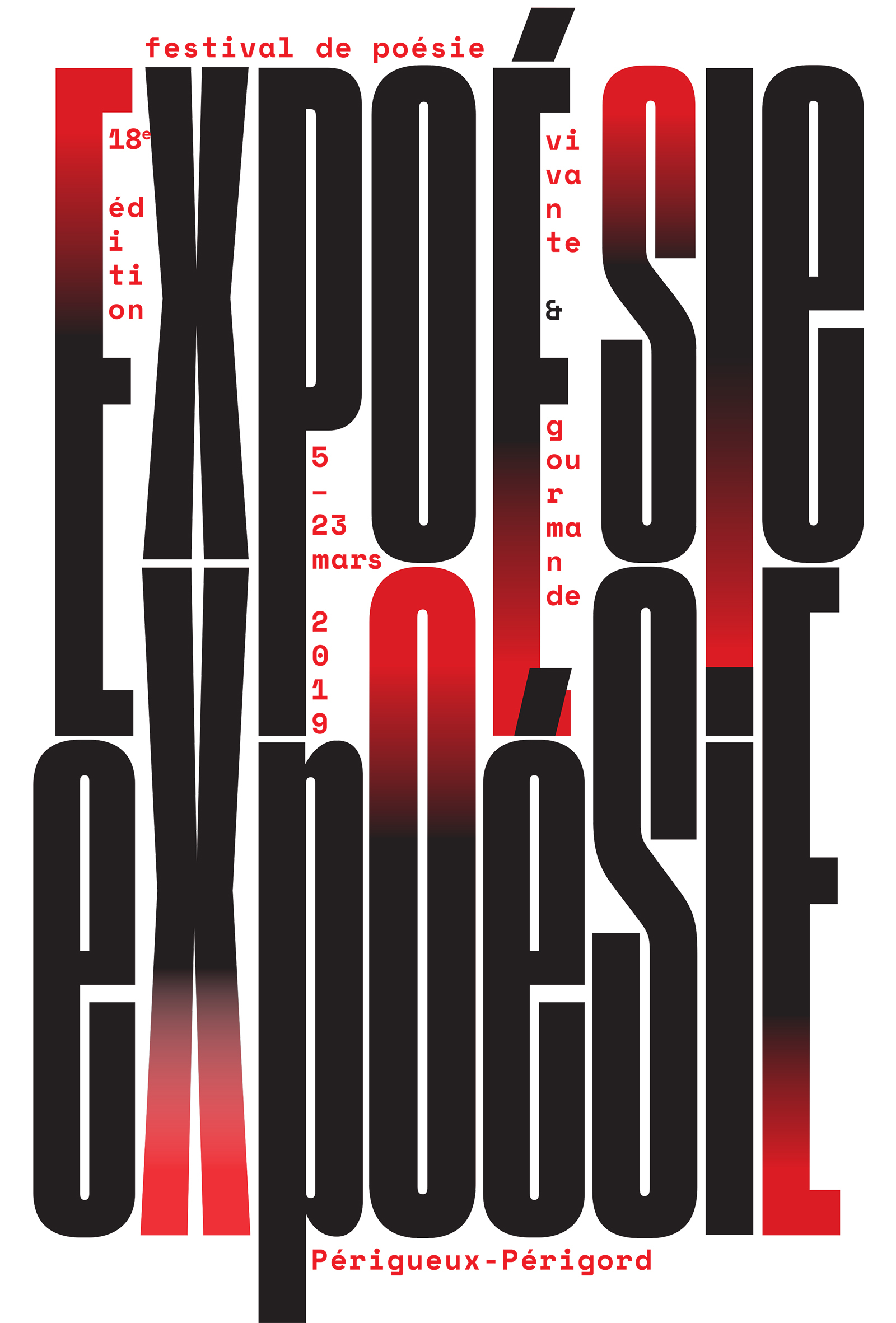
‘Expoésie’, Périgueux, 2020. Poster for a unique festival in Périgueux – its title a portmanteau combining ‘exposition’ and ‘poetry’.
Almost all of the projects described here turned up in ‘à propos’ (2020-21), the Frankfurt exhibition of her work. There were dozens of large theatre posters on display. Yet the show also became a striking demonstration of the designer’s urge and ability to carry work produced to convey a specific message beyond that obvious task. Many works were far more than ‘career selfies’, and became something more abstract and poetic … may I call it ‘art’?
Lenz seems to be one of those artists who has chosen to embrace design rather than art because it provides her activities with a social function, and also with self-justification. In ‘à propos’, wall paintings and installations take the audience beyond the limited area of designed public information, showing visual elements outside their original context while still referring to it. The layering of ideas and visual statements turn the broadcasting of information into a challenge to interpret and dissect visual expression, and to speculate about meaning. The exhibition is a dramatic amplification of Lenz’s view on visual communication: appropriating the brief and making the message deeper, more charming, more fascinating … and possibly also larger and louder.
Jan Middendorp, designer, writer and author of Dutch Type, Berlin
First published in Eye no. 101 vol. 26, 2021
Eye is the world’s most beautiful and collectable graphic design journal, published for professional designers, students and anyone interested in critical, informed writing about graphic design and visual culture. It is available from all good design bookshops and online at the Eye shop, where you can buy subscriptions and single issues.