Summer 2006
By printers, for printers
Until its 1980s demise, ‘Penrose’ documented a fascinating trail of printing and design developments
The Penrose Annual was a one-off, in every sense. Its design and production needed to be planned with military precision; it was a complex and demanding publication that drew on, and demonstrated in its pages and inserts, every innovative technique, material and idea that had emerged in the course of the previous year. Sections to be bound in would arrive throughout the year from printers all over the world. There were tip-ins, fold-outs, different paper stocks, inks, artwork and processes to dissect and present, and advertising copy that more often than not needed binding in separately. And as a showcase not only for the printers themselves but the whole international industry, it had to be immaculately presented, printed and bound. A small staff spent the entire twelve months planning, compiling and producing it; and the printers, who were also its publishers, Percy Lund, Humphries & Co, would dovetail its production into their normal schedule.
At the same time, as the concept progressed and developed throughout the twentieth century, Penrose spent less time dissecting the past in order to balance mature reflection with speculation about the future of an industry in a constant technological ferment. It is only now, nearly a quarter of a century since its demise, that it has acquired the veneer of nostalgia. Experimental processes, once painstakingly described and beautifully presented, have now been abandoned and largely forgotten, or have passed into the mainstream.
‘The shaping and fabrication of every volume is an adventure,’ said its editor R. B. Fishenden, in the jubilee 50th edition of 1956. ‘Each is the outcome of a wonderful co-operative spirit – surely unique in a publishing endeavour – which seems to gain impetus in time.’
Penrose went through a number of phases and sizes from its modest beginnings in 1895 as Process Work Yearbook – Penrose’s Annual, its original title. Lund Humphries printed it from 1897, and acquired the title and took over publication in 1906. It appeared each spring, with gaps only during the war years, and remained profitable well into the 1960s. In its heyday – which lasted several decades – the industry would eagerly await its appearance and make investment decisions largely on what Penrose advised. Each issue would sell around 10,000 copies: Japan took 800, there were agents selling it worldwide, and it was published separately in the US by Hastings House. It attracted significant advertising revenue. Looking at the substantial shelf space the complete run occupies, the boom years are obvious from the sheer size of the books. The final issues are almost half the weight of those in the 1950s and 1960s, and even the name was trimmed to Penrose: they could no longer guarantee its annual appearance.
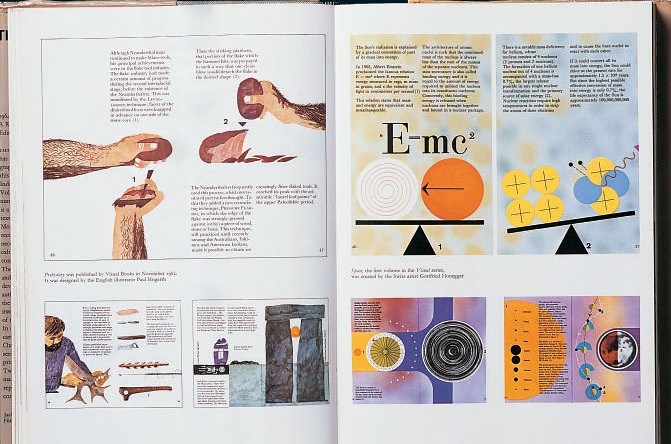
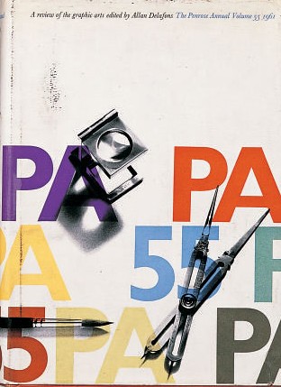
Volume 56, 1962. Editor: Allan Delafons. Jacket design: Duncan M. Firth. Top: ‘The Integrated Book’ - a carefully reasoned argument, with particular reference to the Isotype Institute and Frédéric Ditis's Visual series of pocketbooks - on the need to restore a relationship between art and science, by Germano Facetti (see Eye no. 29 vol. 8), who died on 8 April 2006. ‘The available technological advances in printing should be used not only to obtain an economic advantage but also an artistic breakthrough.’
The rapid growth during the 1960s of weekly and monthly magazines dealing with print, design and graphics ate into Penrose’s near monopoly of information and advice; the economic and industrial disasters of the 1970s – the three-day week, inflation, devaluation of the pound – all conspired to shake the publisher’s confidence in its future.
‘So gradually the circulation fell off and costs increased,’ recalls John Taylor, Penrose’s publications manager in the 1960s, originally hired as assistant to the then 80-year-old Bruno Schindler, a scholarly German émigré. ‘It got to the point where it was not losing a great deal of money, but it was not making it either. But because of this tremendous sentimental affection for it, having been associated with it for 60 odd years, it would have been very difficult for the company to close it or find another home for it.’ But out of the blue Northwood, part of the Thomson organisation, offered to buy the title, and give Lund Humphries a five-year contract to continue printing it.
Thomson produced a few issues, and it was sold again, to Benn. It continued to appear, more and more sporadically, until 1982, when it was finally put to bed by its last editor, Clive Goodacre. ‘I knew it would have a struggle to survive at a time when production costs were killing this type of multi-process publication,’ he explains. ‘We had gravure, screen, letterpress, metal printing, xerography and litho all in one issue. So I made it as good as I could and hoped for the best. The problem is that Penrose in its heyday was published when good colour printing was scarce and expensive. Today we receive mailers that are printed better than limited editions produced in the 1960s and 1970s. So the value of print is lost. Today a £100 inkjet printer and £800 PC can do more than a whole typesetting and repro department could do back then. When someone gave you their business card or brochure you felt it was something special. What I am saying is that the democratisation of printing killed Penrose – plus a bit of help from the accountants.’
For most of its existence – the Lund Humphries years – there were just four editors: the first two, William Gamble and Fishenden taking it between them from 1895 to 1957, and both, incidentally, dying in office. Allan Delafons edited it from 1958-62 and Herbert Spencer guided it through the latter days of its major phase of existence, as editor from 1964-73.
Spencer, founder and editor of Lund Humphries’ Typographica (from 1949-67, see Eye no. 31 vol. 8) was well aware of a difficult future. Despite his belief that ‘printing is a vital ingredient of Western civilization and culture’, he would write in the 1964 issue: ‘The printing industry is today faced with a flood of technical developments. The tide is pouring hard against the traditional structure of the industry and is forcing new channels of finance and control. The proliferation of specialist periodicals enables innovations to be quickly documented but the relatively leisurely production of an annual such as Penrose provides the opportunity – and the responsibility – to attempt to measure and evaluate the principal changes taking place, to set developments in perspective, to forecast the future course, and outline some of the hazards and opportunities that lie ahead.’
Penrose had started life as a glorified catalogue. A. W. Penrose was a chemist who met William Gamble, a journalist interested in the impact of photography on printing in what were still pioneering times. Concerned at the difficulties in obtaining processing chemicals they started a supply company together, and were soon producing and supplying the trade with a wide variety of materials and machines. The annual was a natural progression: ‘An Illustrated Review of all Photo-mechanical Processes’.
Lund Humphries were also pioneers: the first Monotype machines were installed in their Bradford works in 1904: ‘The mechanism,’ wrote William Gamble, ‘is a marvellous example of mechanical skill and accuracy, which never fails to excite the onlooker … it must immensely influence the future of letterpress printing.’ It soon became a policy to try out each of Monotype’s new types in Penrose.
John Taylor sees this pioneering spirit as central to Penrose: ‘It had to be adventurous and innovative if it was going to survive. So it depended on the flair of the editors: and they all had it in different ways.’ Each editor brought a different set of skills and interests to the annual and each developed its range and span, and none more so than the supreme technician Fishenden. He had contributed to most issues during the first part of the century before taking over as editor in 1934. The annual had already started to take account of design matters in relation to printing, looking at advertising, private presses and typography. Fishenden took over at a significant time, with a revolution in typographical design gaining momentum on the continent and especially in Germany. He introduced the concept of inviting a different designer to oversee each issue, and was entirely unapologetic about the uproar his 1938 choice caused: ‘It was intended that the typography of the last issue by Jan Tschichold should arouse controversy: it achieved its object.’ In that 1938 issue alone there were articles by John Gloag, Noel Carrington, Beatrice L. Warde, Allen Lane, Harold Curwen, the future editor Delafons, and A. J. A. Symons. In other, randomly picked editions you find Herbert Read, Stanley Morison, Moholy-Nagy, Nikolaus Pevsner, Paul Nash – a potent mix of pioneers, innovators and leading lights. Spencer perfected the delicate balancing act of the mix of articles dealing with either the art or science of printing. However John Taylor felt that the technical articles and design articles were unhappy bedfellows: ‘It began to fall between two stools.’ Nigel Roche, librarian at the St Bride Institute, and apprenticed to the trade in the 1960s, disagrees: ‘It was the only journal which bridged the two sides and gave technicians any idea of artistry, and the artists any idea of technicality.’
But these were still times when the printing trade was a closed shop with the most rigid demarcation of skills. Any more than a passing interest in the detail of other trades was anathema to printing and graphical unions. These barriers started to break down quite possibly with the universal availability of Letraset which helped democratise the ability to produce professional letterforms. The process was completed by (in no particular order) photocopying, desktop publishing, the personal computer, Photoshop, digital photography, and somewhere in that mix Margaret Thatcher’s crusade against organised labour. There is no small irony in the fact that the greatest changes – a true revolution in printing, design and publishing – happened without the guiding hand and ‘mature reflection’ of the Penrose Annual, which foresaw most things, but could never have anticipated such speed and profundity of change over little more than a decade.
Today Penrose remains an important publication, as it was during almost 90 years of its existence. ‘Its importance then,’ says Nigel Roche, ‘was largely as a link between disparate areas of the trade. Its importance today is in the seminal articles that it published that still have reference value: monographs on individuals; articles on various matters of typesetting. In a world that was suddenly discovering air travel and international communications, Penrose was already showing an interest in printing in foreign languages: there’s a 1956 article on printing in Chinese and Japanese. In 1956 there were very few people in this country who would know anything about printing in Chinese. Printing on corrugated cardboard was absolutely astounding in 1964. It was all part of a new world and people were genuinely interested. So the significance has altered over time. There are a lot of copies being read here: it’s still in considerable demand.’ Today there is nothing like it. Similar ventures in continental Europe have also closed. There was the German version, the catchily titled Klimschs Jahrbuch des graphischen Gewerbes, technische Abhandlungen und Berichte über Neuheiten aus dem Gesamtgebiet der graphischen Künst, which re-emerged after World War ii as Polygraph. In France there was the Bulletin Officiel (Union Syndicale et Fédération des Maîtres Imprimeurs de France) which eventually became the Christmas edition of Caractères. And in the Netherlands there was the Drukkersweekblad Kerstnummer, again a Christmas compilation.
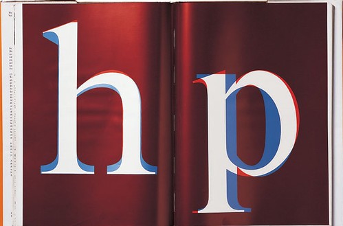
Red and blue cel overlays from the article ‘The Evolution of Times New Roman’, by John Dreyfus. He writes: ‘These drawings demonstrate how severely the bowl of “p” has been reduced in the bold version, because mainstrokes have been thickened without drawing the bold version any wider.’
The only books of similar stature and vision to have emerged since are perhaps the arts quarterly Zoo, which closed in 2003 after thirteen issues, and Matrix, which continues today. Matrix came into being a few years after Penrose closed. It’s tempting to view it as a successor, but Matrix differs in profound and specific ways: its slant is essentially historical, and while it is frequently and beautifully illustrated, colour is seldom used – and, as Nigel Roche points out, rarely involves any process other than letterpress. Henry Morris, proprietor of Bird and Bull Press in the us and a commercial printer since the 1940s, put it succinctly: ‘The Penrose Annual covered advances in the commercial printing industry; Matrix is about the craft of printing. They are two different animals.’ ‘Penrose was printed by printers, for printers,’ John Randle, Matrix’s publisher responded. ‘It smacks of The Trade, and all its philistinisms. Matrix looks upward to Verve, Motif, Typographica, Typography, Signature, Parenthesis, Arts et Métiers Graphiques, and the rest.’’
Nevertheless, for almost a century Penrose trod a delicate and difficult path balancing supposed contradictory elements: art and commerce; art and science; machine technology and handcrafting. It foreshadowed and predicted the way the industry operates today, and in fact the way we all work now – with the easy access of the home enthusiast to techniques and equipment previously the strict and jealously guarded confines of the professional tradesman. The Penrose Annual quietly lives on, and presents to us now in its pages a wonderful evocation of the look and feel of almost the entire twentieth century.
The author and editor gratefully acknowledge the invaluable and unstinting help of Clive Goodacre, Nigel Roche, John Taylor and the St Bride Institute Library.
First published in Eye no. 68 vol. 17 2008
Eye is the world’s most beautiful and collectable graphic design journal, published quarterly for professional designers, students and anyone interested in critical, informed writing about graphic design and visual culture. It is available from all good design bookshops and online at the Eye shop, where you can buy subscriptions and single issues.