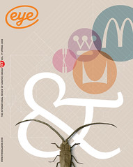
Spring 2008
Chameleons
Single-character logos provide rich, raw material for identity design
Considering the familiarity of the Latin alphabet, the diversity of alphabetic logos, using the initial of a company name, service or product, is remarkable. Just like handwriting, the same letter can appear in myriad ways. The ubiquitous ‘M’ of McDonald’s is unlikely to be confused with the ‘M’s of Motorola, Minnesota Zoo or Herman Miller. Likewise, the Suzuki ‘S’ could not be confused with the monogram of its Spanish rival Seat. Same letters – just different graphic treatments. Unlike pms colours, or even everyday phrases (Nike’s Just do it!©, Sony’s like.no.other™), no single company can claim a letter. As logos / trademarks are classified by form, the single-letter category contains many more than 26 examples.
The letters of the alphabet are the building blocks of the written language and a rich foundation for logo creation. Their use can be seen as a modern adaptation of early monogram tradition and an obvious starting point for a trademark. However, when the obvious is transformed with the spark of imagination and wit, it can be very powerful.
It is the instant recognition of a letter that lies behind the success of the logos featured here. They are more than simple letterforms. When existing typefaces are modified or entirely new ones are created through computer manipulation, calligraphy or hand lettering, letters transcend linguistic function. They morph into symbols. Pictorially, they can hint at or describe the nature of a company or a product. An ‘M’ combined with a moose can represent a zoo and an ‘O’ can liquify into an oil drop to signify an oil concern. Letters are champion chameleons.
Such renowned figures as Paul Rand, Saul Bass and Lance Wyman realised this. Many of their logo designs embrace the inherent communicative power, symbolic potential and raw immediacy of the alphabet. Bass, for instance, adapted a ‘C’ for Celanese, a ‘U’ for United Airlines, a ‘W’ for Warner and several ‘A’s (Alcoa, Avery). Rand claimed a ‘C’, an ‘E’ and a ‘W’ for Cummins, Enron and Westinghouse respectively. Wyman modified an ‘M’ for Minnesota Zoo, another for the Mexico City Metro, an ‘S’ for the Setauket Center, and a ‘H’ for Hoboken. The familiar transformed and made new.
Free of the shackles of strategic and marketing departments that push and pull contemporary design so much, they could focus fully on creating marks of simplicity, clarity, originality, relevance and beauty. Pure design, undiluted by pseudo-scientific and strategic positioning talk. No wonder many of their marks are timeless, cornerstones of some of the most successful corporate identity programmes ever conceived.
Any examination of single-letter logos will reveal that certain letters are more popular than others – ‘A’, ‘M’ and ‘T’, for example – and lend themselves better to modification. ‘J’ and ‘Z’ seem difficult to resolve. ‘A’ is a particularly common signifier, due as much to its potency as the first letter of the alphabet as to its inherent graphic dynamism.
Beyond rhetoric and theory, great design speaks to people in a familiar yet new language. Relevant and reassuring, the alphabet thus makes a good basis for a corporate symbol. Forget the current trend for abstract symbols (soft marks, generic curves, swoosh-balls) or nondescript wordmarks, and recognise the power of the monogram. After all, one letter is good enough for Superman.
Garech Stone, creative director, writer, The Stone Twins, Amsterdam
First published in Eye no. 67 vol. 17 2008
Eye is the world’s most beautiful and collectable graphic design journal, published quarterly for professional designers, students and anyone interested in critical, informed writing about graphic design and visual culture. It is available from all good design bookshops and online at the Eye shop, where you can buy subscriptions and single issues.

