Winter 2004
Excoffon’s autograph
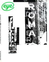
Why is Mistral the typeface of choice for so many of Montréal’s small businesses?
There is a complex – perhaps unfathomable – relationship between cities and the typographic traditions that help to define and describe them. After moving to Montréal in the spring of 2003, I was immediately struck by the large number of publicly visible instances of the typeface Mistral in the city. Designed by the maverick Frenchman Roger Excoffon (1910-83) for the Fonderie Olive in Marseille and Paris, and completed in 1953, Mistral was a considerable technical and artistic achievement – ‘a marvel of engineering’, according to Jonathan Hoefler. It was a hot metal, script typeface without a consistent baseline, designed to appear completely cursive – especially when set in the letter combinations most likely to occur in written French.
Excoffon reported that his aim had been to achieve ‘a handwriting of the man of the twentieth century … a modern handwriting perfectly free, uncodified, and spirited.’ After studying hundreds of writing samples and autographs and consulting graphologists, Excoffon ended up using his own handwriting as the basis for the typeface, which points to the most intriguing aspect of the story. The many instances of Mistral on store canopies, signs, posters and in windows amount to a highly personalised rendering of the type designer’s own hand: Excoffon’s autograph. Is there any more compelling, if unexpected, way for a designer’s personality (and in this case ‘one of the most adventurous type designers of the twentieth century’, according to Gerard Unger) to have such a direct yet ghostly presence?
Any street, anywhere?
Generally speaking, our experience of urban space is defined by formal architecture: high- and low-rise offices, apartment buildings, stores and malls, and the spaces found between them: streets, sidewalks, alleys and parks. Graphic designers are, more than most, sensitised to the various forms of lettering and type that litter these surfaces: from vast advertising billboards to graffiti; from manhole covers to stone carvings; from limpet-like logos on the top edges of skyscrapers to neon branding devices high above street level; from road signs to restaurant fascias.
These devices have been recorded and memorialised in the image-making of such diverse talents as Walker Evans, Robert Frank, Jenny Holzer, and Ed Fella. Vital, if sparse, research on public lettering and architecture has been conducted by, among others, Alan Bartram, Jock Kinneir, Nicolete Gray, Phil Baines and Catherine Dixon (see pages 26-35). Traces of these themes can also be found in a smattering of recent scholarly projects, including writing about the development of New York City’s electric signs in cultural historian David Nye’s American Technological Sublime; a brief argument by Hubert Damisch in Skyline: The Narcissistic City, for the development of a ‘political graphology’ (addressing ‘the social body in its entirety, grasped in all the diversity of its graphic manifestations’); and, of course, a flotilla of ruminations on the vernaculars of North American cities in the wake of Venturi, Brown and Izenour’s Learning from Las Vegas. Most recently, Mitchell Schwarzer has forged a productive connection with his notion of the ‘zoomscape’, recognising that we generally experience urban architecture (hence lettering and type, too) while on the move: as fragmentary glimpses framed through the window of a car, taxi, or bus, or rendered fleetingly in the aerial, tracking and swish-panning shots of a thousand film and TV title sequences.
Surely, then, it is not merely architecture per se that distinguishes, say, an empty, early morning street in the middle of London from a similar scene in Vancouver? Indeed, the gamut of alphabetic and numeric ephemera we are fond of listing as evidence of graphic design’s ubiquity must also play a vital role in defining our sense of place. And yet, paradoxically, we could also plead that a certain sameness has long been creeping over these peculiarly human landscapes, making one neighbourhood an easy substitute for the next. For example, take a closer look at Jackie Chan doing his thing in Rumble in the Bronx and you’ll notice, in the background, the North Shore Mountains of British Columbia’s Lower Mainland, where the movie was actually filmed. Parachute yourself into any commercial strip in North America (and, increasingly, Europe) and the queasy familiarity you feel will have much to do with the always, everywhere sight of McDonald’s, Pizza Hut, Esso, ihop, White Castle, WalMart, Shell, Burger King, Wendy’s and Old Navy.
The distinguished type designer Matthew Carter related to me a story about working with Colin Forbes, a founding partner of Pentagram, on a signage project for London Airport (now Heathrow) in the early 1960s. Helvetica had been released four years earlier, but it was still not available in England. So, as much as Carter and Forbes might have wanted to use it, they had to make other plans. A more extreme example being explored by Phil Baines and Catherine Dixon relates to the political and cultural insularity imposed by the recent histories of dictatorships in Spain and Portugal. These regimes served to ensure that developments in public lettering remained isolated at a time when other countries were open to influences from abroad.
Carter and his Dutch contemporary, Gerard Unger, recounted, quite independently, their memories of finding Excoffon’s oeuvre – especially Mistral – in use absolutely everywhere during their youthful travels around France in the 1950s and 1960s. In an article in Baseline, Julia Thrift claimed that this was still the case in the early 1990s. Carter referred to Excoffon’s faces as ‘quintessentially French’; Unger has, within his slide collection, an old photograph of a sign sporting no less than three of Excoffon’s idiosyncratic type designs: Choc, Banco and Mistral.
The arrival and rapid spread of digital technologies has not only greatly facilitated the almost instantaneous licensing and distribution of type, it has also served to dilute these local and regional particularities. As Michael Worthington recently pointed out: ‘National traits in type design were once formed by the typographic history and legacy of the country and culture where type designers were educated or [where they] practised … this has diminished somewhat with the rapid global exchange of local design ideas and forms.’ (Metro Letters, p.118)
The ultimate implication seems to be that any designer or signmaker in any reasonably wired city in the world has potential access to every-thing from Dom Casual to Template Gothic. And yet – at least for now – it seems highly unlikely that any two cities currently possess precisely the same publicly visible palette of type. Patrick Giasson, on the other hand, a talented type designer from Montréal currently finishing his graduate work at Reading University, noted that practically all of the North American cities he has ever visited are (aside from their ‘trendy areas’) ‘still … pretty much an open-air Monotype plus Linotype catalogue.’
Markers of the past
A countercurrent to the oft-perceived tendency towards the global homogenisation of culture is the periodic appearance of new typefaces aimed at preserving or perpetuating local traditions. For example, Gotham is a typeface developed by Hoefler & Frere-Jones, based on various municipal letterforms found in New York City (see pp.18-25). The project Typocity (see Eye no. 52 vol. 13) is a modest attempt by Kurnal Rawat and Vishal Rawlley to document the vanishing public lettering traditions of the artisans of Mumbai (aka Bombay), partly through the design of new typefaces that reflect these fading customs. Typefaces such as these may fail in their lofty aim to capture a particular essence, but they still stand as expertly rendered markers of some distinct element of these cities’ pasts. One could also argue, however, that they commodify these historic forms, by turning them into marketable goods that can be instantaneously exported: Gotham in Mumbai, for example.
Dramatic ambivalence
Another countercurrent relates to typefaces designed for specific cultural events, such as the European City of Culture (for example Erik Spiekermann and Ole Shäfer’s typeface Glasgow) and certain millennial celebrations (Gerard Unger’s typeface and signage for Rome 2000; see Eye no. 40 vol. 10). If these examples do not amount to revivalism per se, they certainly betray a strong hint of historical revisionism. In the us, the University of Minnesota Design Institute held a competition to design a typeface for their Twin Cities Design Celebration in 2003. This project – consciously conceived to avoid revivalism entirely – is documented in the new book Metro Letters: A Typeface for the Twin Cities (Deborah Littlejohn, University of Minnesota, 2003).
In 2002, when Janet Abrams, the Design Institute’s director, suggested the idea of a type competition for Minneapolis and St Paul, she was accused of dallying in graphic fascism. Taking this as the ultimate challenge, she and Deborah Littlejohn (design fellow at the Institute and eventual editor of Metro Letters), set about the task. It is particularly instructive that a dramatic ambivalence about the project’s feasibility can be felt throughout the book’s pages. Organisers, entrants and jurors alike found reason to suggest that this was a dubious, if not plain impossible, design brief. And this is perhaps part of the project’s value: rather than blind boosterism, or dictatorial art direction, or cloying preciousness fuelled by graphic design’s neurotic uncertainties about its own importance, Metro Letters firmly underscores the difficulty of capturing the essence of a city – let alone two conjoined cities – in one typeface. LettError’s winning entry, called Twin, comes in a range of wildly divergent guises, but is only ‘Minnesotan’ in the sense that the online version changes according to local climate conditions; every city, after all, has its weather.
Giasson noted that a typeface developed along these general lines ‘embodies a kind of ‘touristic image’ of the city (which can sometimes verge on cultural stereotyping).’ Janet Abrams referred to this kind of reductionism as ‘the proverbial ‘Three Perfect Days’ beloved of in-flight magazines’ (Metro Letters, p.11). ‘It resonates with visitors but, at a deeper level, not with its inhabitants,’ continued Giasson, ‘it represents the aesthetic presence of the city (usually from a past era), but not its social experience. Ultimately, a city is much too complex and diverse to be captured by a typeface, and I’m very grateful for that.’
Travelling fonts
It would surely be fascinating to be able to trace the circulation and duplication of fonts between countries and continents. Matthew Carter was gracious enough to entertain this improbable idea, acknowledging, for example, that Fonderie Olive once had a contract with a distributor called Amsterdam Continental in New York – which could go some way to explaining the initial take-up of Excoffon’s hot metal typefaces in North America. Of course it’s also tantalising to ponder the significance of Quebec’s deep cultural and historical ties to France, and to wonder if on some level there was, or is, a direct channel of mutual influence, however tenuous, between Paris and Montréal, for example. After all, Mistral is designed to work best in French, and government rules dictate that all public signs in the Province of Quebec must be in this language, first and foremost. As any epidemiologist would argue, however, the spread of diseases – or typefaces for that matter – is far less neat and predictable than it is beginning to sound here.
Why is it, then, that the signature script of a singularly charming, if enigmatic, Frenchman has become the preferred idiom of Montréal’s hairdressers, boutiques, video stores and even boats? Jennifer De Freitas, founding partner of the Montréal-based design studio Associés libres, and assistant professor in the department of design art at Concordia University, has a family background in sailing. She suggested that the profusion of Mistral-inscribed boat hulls may have everything to do with the ultimate type specification faux pas: selection based primarily or solely on the typeface’s rather evocative name (the mistral is the seasonal, northwesterly wind that blows across the coastal and inland regions of southern France; the word itself is derived from the French for ‘masterful’). There are, after all, boat- and windsurfer-builders called Mistral, an Olympic windsurfing class called Mistral, at least one watersports company called Mistral and fleets of boats that have been named ‘Mistral’ at one time or another. And this is quite aside from the ingrained tradition of using jaunty scripts to paint their names on their hulls.
Denis Dulude, a Quebec native and co-founder of the Montréal type design bureau 2Rebels, was quite emphatic about the arbitrary or accidental nature of Mistral’s presence in Montréal. He pointed to the likelihood of readily available, cheap or bundled font packages for those in the business of signmaking. Signmax (www.signmax.us), for example, offers a piece of ‘cutting software’ called Winpcsign. The four versions, from Letter to Pro, offer 250-5000 logos ‘ready to cut and print’ and 30-200 ‘Top quality max fonts’ including at least one Excoffon font. The most ordinary signs – meaning those that are simply too new, bland or inept to be romanticised or fetishised as worthy examples of ‘the vernacular’ – are often backlit boxes and vinyl cut-outs. They are unlikely to have passed through the hands of anyone calling themselves a graphic designer, and yet they are as ubiquitous as fire hydrants.
A matter of taste
Although Mistral is not quite in the same league as Comic Sans, it is still a typeface that designers love to hate, and this must in part be blamed on the uses to which it is commonly put. Type designer Jonathan Hoefler recently lamented ‘the font’s sundry associations, from lip gloss to jet-skiing to adult videos – it really is a terrific design which deserved better.’ This is a far cry from the positive reception that greeted Mistral when it was first released: Matthew Carter, for instance, described the response as ‘dumbfounded’. Yet according to Baseline magazine, Excoffon’s ‘fonts were dismissed by purists of the time as being nothing but fashionable ephemera. That they are still used, and in some cases are increasing in popularity is proof of the immense skill with which they were designed.’ (‘An A-Z of type designers’, Baseline no. 27, 1999, p.51)
Carter met Excoffon on several occasions over a number of years, and was able to share many anecdotes about a man who was apparently charming and gentlemanly to a fault. His evident ‘classiness’ (for want of a better word) actually suggests that there was something slightly disingenuous – if unconsciously so – in Excoffon’s claim that, in falling back on his own handwriting to design Mistral, he was employing ‘the forms I possessed by nature itself, by instinct.’ Surely handwriting is never ‘natural’ but, in its most accomplished forms, a marker of ‘good’ education and even of privilege. After all, Excoffon didn’t start by examining just any old signatures, but rather ‘hundreds of autographs of important men of our century.’ Design is unavoidably a matter of taste, then, and whether that taste is populist, elitist or somewhere in between, it is also an extension of class.
Excoffon’s Nord, an ultra-bold weight in his Antique Olive family, has a certain seriousness to it (although Gerard Unger described it as a ‘delightful parody’ of Helvetica and Univers). Nord or its prototype can still be seen in the logos for Air France (one of Excoffon’s clients) and Michelin. It also appears fleetingly in this year’s AIGA annual and on a poster for a new movie called Final Cut. In contrast, Excoffon’s other faces, such as Banco, Choc, Calypso, and Mistral, have been repeatedly described as ‘elegant’ or ‘flamboyant’, meaning, perhaps, that they are also ‘nice’, but rather too decorative or kitsch for contemporary designers’ tastes. The type specimens Excoffon produced for Fonderie Olive (for which both Phil Baines and Jonathan Hoefler express admiration), show his typefaces in a variety of speculative uses that are decidedly ordinary: an invitation to a wedding anniversary party, a menu, a birth announcement, a flyer for a shoe store, an ad for a pharmaceutical product aimed at families. Maybe Excoffon wouldn’t be all that dismayed to see the contemporary uses to which Mistral has been put.
Ultimately, it would appear that the worst fate for a type designer’s beloved creations is not so much to have been misused, but to be entirely unused or forgotten. As Matthew Carter suggested: ‘It’s a backhanded tribute to Mistral’s popularity that signwriters have felt it necessary to modify Mistral rather than reject it altogether.’ Mistral is far too characterful to have survived by being merely an anonymous, ‘crystal goblet’ workhorse. Its pervasive use – in France, in Montréal, and perhaps elsewhere, too – suggests that Mistral continues to prove its worth because of its sound engineering, as well as its sure hand. And it may still be around – in and out of fashion, but still around – long after those purpose-built city types have been forgotten.
First published in Eye no. 54 vol. 14 2004
Eye is the world’s most beautiful and collectable graphic design journal, published quarterly for professional designers, students and anyone interested in critical, informed writing about graphic design and visual culture. It is available from all good design bookshops and online at the Eye shop, where you can buy subscriptions and single issues.