Winter 2010
Head Trip
Simon Esterson applauds the vivid drama of a pharmaceutical brochure
When I found a copy of this large-format, 52-page case-bound book, complete with slip-case, on a second-hand bookstall in 2001 I knew it only by reputation: reproductions of its pages in design annuals and in the pre-digital information graphics bible Graphis Diagrams (1980) where it is given a whole spread.
Produced in 1971 by Crosby/Fletcher/Forbes (soon to become Pentagram) for the Swiss drug company Roche, it is a marketing brochure for Nobrium, a then new drug designed to control anxiety, and aimed at doctors who might prescribe it. The text is densely scientific.
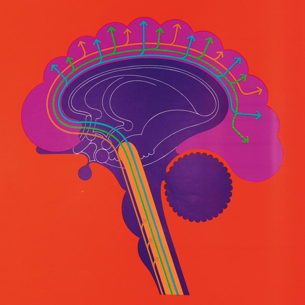
All spreads and images from a brochure for the anti-anxiety drug Nobrium. Design: Crosby/Fletcher/Forbes, 1971. Art direction: Mervyn Kurlansky. Artwork: Wolf Spoerl. Design: Madeleine Bennett. Size: 265 x 270mm.
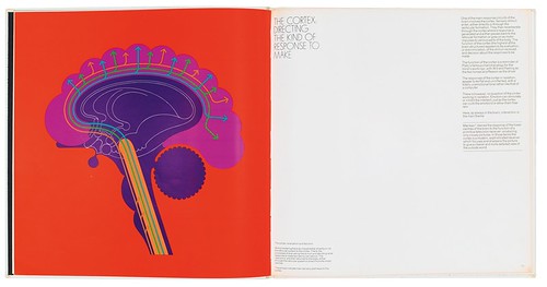 In the hand, the Nobrium book has dramatic qualities as a physical object: the black slip-case with its white logo slides off to reveal a stark square-backed white cover with the logo in reverse. Its pages are printed with vivid special colours and an overall varnish so that even the unprinted paper is super-glossy. It is bold and colourful and the diagrams do all the work.
That’s what I enjoy about it: the design decision that by using colour and scale the illustrations, from schematic brain cross-sections to statistical tables, could fill whole pages, even spreads, and become the graphic structure of the document. The weight of colour in the diagrams is played off against the white space of the text pages with their tight margins, ultra-thin display type and minimal sans-serif typography printed in black only.
When we think about information design today there’s an understandable concentration on the excitement around computers and current digital techniques of data visualisation. The Nobrium book’s approach recalls in part that earlier pioneering age of ‘Swiss’ information design for chemical companies such as Geigy, where illustration was rationalised by pen-drawn straight lines, round corners and the modernist language of chart design was invented.
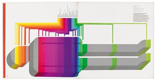
To this tradition, Crosby/Fletcher/Forbes’s art director Mervyn Kurlansky added an archetypal 1970s projected-type logo and a psychedelic colour palette, making the job more Beatles’ Yellow Submarine than Basel.
From today’s perspective it can be criticised for elements of both design and intent. Like much drug marketing at the time, there is a strong element of seduction in the way the information is presented. The diagrams’ simplified, graphic nature is unlikely impress the rigorous followers of Edward Tufte. And expensive drug marketing to Britain’s National Health Service doctors was heavily criticised later in the 1970s. Despite these reservations, the Nobrium book remains a bold product of its time.
Simon Esterson is Art Director of Eye.
First published in Eye no. 78 vol. 20.