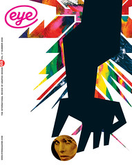
Summer 2008
Home Counties surrealism
Keef’s album covers are visual essays of their time, full of bleakness and possibility.
While American LP covers of the early 1970s are as robust as a Mormon outhouse, their UK counterparts are more vulnerable to the vicissitudes of the local climate. It is harder to find mint copies of British prog albums than American ones – the former were not hardy enough to survive.
The same can be said of the cover art itself. Even the most mannered examples of late-1960s Americana have a quality of light and colour in photographs that revel in crisp and hard surfaces. The British equivalent is invariably wet and often morose.
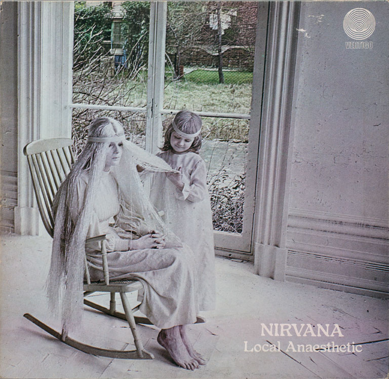
Yet some of the most evocative and influential British cover art of the early 1970s was produced by Keef – aka designer / photographer Keith MacMillan. His best-known work was for Vertigo, Neon and Nepentha, labels with a varied roster of folk and prog acts, singer-songwriters and heavy-metal bands.
Olav Wyper, who launched the Vertigo label in 1969, had met MacMillan while the latter was a student. ‘I was hugely impressed by his creativity in putting together pictures that told a story,’ recalls Wyper. Vertigo simply gave Keef the music and told him to come back with visual ideas. The label was delighted with the results, and nearly always used his designs without alteration. MacMillan later left graphic design for the film industry, directing videos for Kate Bush, Paul McCartney and others.
Keef’s covers commonly relegate the performer to the inside of the gatefold. The front is characteristically an exercise in incongruity. Mysterious, deathly figures stand in otherwise empty landscapes, often dressed in capes, circus outfits and other post-hippy folk-art threads. Colours are muted, bleached or excessively doctored. Rocking horses, scarecrows and dolls’ heads suggest a world of scraps and discards, a place haunted by a past of labour and leisure that is weirdly familiar but also otherworldly. The sun rarely shines, or is setting, and the air is heavy with damp. This is England circa 1970, no longer swinging, no longer modern, if it ever was.
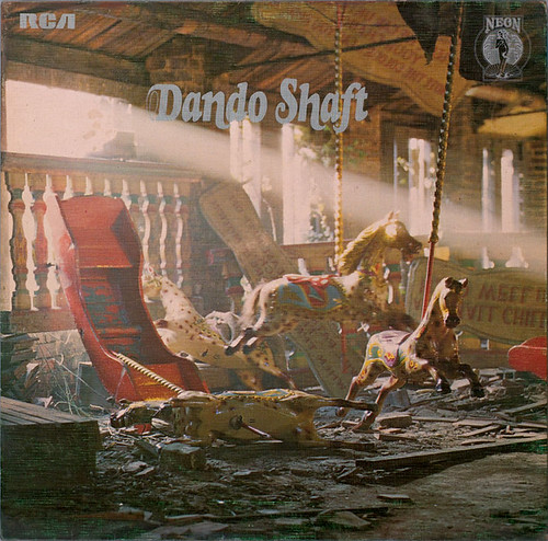
Above: cover of Dando Shaft, by Dando Shaft (RCA Neon NE5), 1971.
Top: Local Anaesthetic, by Nirvana (Vertigo 6360 031), 1971. Design and photography by Keef (aka Keith MacMillan).
Keef’s imagined rural past is located in some magical time before the First World War but after Sgt. Pepper. He combines references from the Pre-Raphaelites, pagan ritual, P. H. Emerson’s photographs, Edwardian fashion and the legend of King Arthur, to create a future-past that is both carnivalesque and downbeat, shaped by small pleasures and overshadowed by a sense of doom. No surprise that his most iconic cover is for the first Black Sabbath album.
Considered in the context of British underground and popular culture of the period, Keef’s images make a lot of sense. With films such as The Wicker Man, Witchfinder General and Blood On Satan’s Claw (and TV adaptations of M. R. James’ ghost stories) they share a fascination with pre-modern Britain that has not quite gone away. It is not, though, the ‘heritage’ past of kings and queens, monuments and cathedrals, but more lumpen, poverty-stricken and muddy. Peter Hall’s 1974 film Akenfield is a good index, especially in its splicing together of Edwardian and contemporary timeframes.
What distinguishes Keef’s work from that of Hipgnosis, the most celebrated music designers of that time, is the rejection of Modernism, science, celebrity and professionalism – there are no glossy portraits or spaceships; no white space or fine typography.
Where Hipgnosis used photography to create distinct elements for elaborate collages, Keef used it to capture his grainy Home Counties surrealism, images that have the look of low-budget fantasy or horror-film stills. At their most disturbing, as in the cover for Rod Stewart’s 1970 album, An Old Raincoat Won’t Ever Let You Down (which shows a tramp chasing a child dressed in a Victorian nightgown), they call forth a grimness that is radically at odds with music business gloss and ‘rockist’ self-aggrandisement. Taken together, Keef’s record sleeves comprise a tarot pack of recession-era bleakness and possibility.
First published in Eye no. 68 vol. 17 2008
Eye is the world’s most beautiful and collectable graphic design journal, published quarterly for professional designers, students and anyone interested in critical, informed writing about graphic design and visual culture. It is available from all good design bookshops and online at the Eye shop, where you can buy subscriptions and single issues.