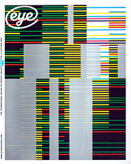
Autumn 2003
Laptop aesthetics
A crackly, digital approach informs one of three current design trends.

What are the major stylistic trends in current graphic design? Are there any aesthetic developments to rival the great leaps of past decades? Perhaps we will need the sharpened perspective of history to help us decide, but my guess is that when we come to look back at design in the first few years of the new millennium (there will be no shortage of published evidence – books, magazines and websites devoted to chronicling graphic design pour on to the scene daily), we will see that this was the point that graphic design finally lost the momentum that it had acquired during the 1980s and 1990s.
For those who envisaged a role for graphic design beyond that of merely commercial problem-solving, this makes gloomy news. Graphic design appears to have settled into a complacent middle age, content to be in the thrall of corporatism, branding, marketing, focus groups and quick-fix makeover culture. Even in its more radical guises, design has become self-admiring and masturbatory – a condition utterly alien to innovation and the forging of new directions.
There are isolated bright spots, nevertheless. It is tempting to view the return of illustration as a welcome trend, but illustration’s widespread adoption by the big brand owners in their search for ‘controlled novelty’ has meant that there is a great deal of anodyne illustration about. Increasingly, illustration appears not to be graphic design’s saviour; instead it is rapidly becoming a visual cul-de-sac. Elsewhere, three strong trends catch the eye as worthy of closer inspection.
The first of these is the emergence of a new, second-generation digital aesthetic – a sort of laptop aesthetic – that threatens to supplant the old multi-layered, highly rendered look of most digital design; the second is is anti-design; and the third is faux-Baroque complexity, of the kind practised by M/M (Paris) and Åbäke.
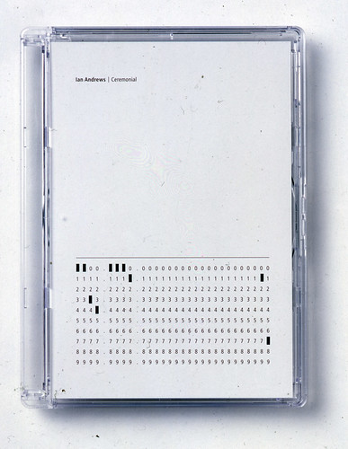
Front and on-body graphics for Ian Andrew’s Ceremonial, 2002. Packaging designed by Fehler (Chris Murphy) and alorenz (Angela Lorenz) for Murphy’s Fällt Music label.

Laptop aesthetics
Within the digital domain, for so long the place for graphic innovation, there are signs that a burgeoning aesthetic maturity has arrived offering an alternative to Toy Story 3D-ness and the rigidity of graphics software. As John Maeda points out: ‘Macintosh-fuelled design tools are explicitly programmed to express a finite set of visual expressive styles, hence implicitly guiding design work performed with these tools along precisely defined stylistic axes.’ In other words, everything looks the same in digital design.
But there is a small school of designers who are actively engaged in challenging the tyranny of software through the considered misuse of technology. Designers who are happy to allow errors to appear in (and inform) their work, things `that are normally anathema to the formal graphic designer who hunts down and eradicates mistakes like a Burroughsian bug-hunter (that’s bug as in insect, not computer virus).
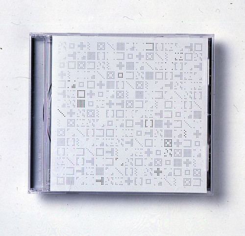
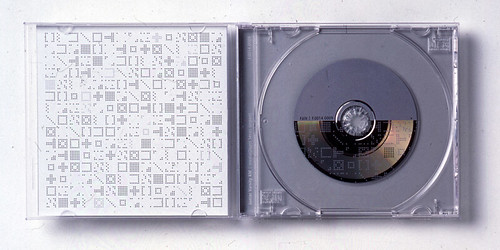
Cover and interior for Junior Varsity KM invalidObject Series (export), various artists, 2000. Packaging designed by Fehler (Chris Murphy) and alorenz (Angela Lorenz) for Murphy’s Fällt Music label.
Anti-design
The rise of anti-design is a response to the slow strangulation of design by ‘branding’, and to the partial rediscovery of a political instinct among graphic designers. (It is also a response to the ‘everything-in-Helvetica’ school of design.) For traditionalists, anti-design is easily dismissed as stylistic promiscuity and the abandonment of standards; for the more radically inclined, it is a refreshing and vibrant alternative to the spread of corporate design. The best collection of ‘anti-design’ can be found in the book Specials (Booth-Clibborn Editions). Published in 2001, and oddly neglected by the design press, it was the first serious cataloguing of a trend which marked the movement away from the formalism that had been at the root of even the most radical graphic design since punk in the 1970s.
The element that most distinguishes this collection of brash and iconoclastic work is the absence of a digital aesthetic. It was as if the anti-design faction was also rejecting both design formalism and highly rendered CGI slickness. If there was any sort of technological aesthetic, it was of the antediluvian technology of dot matrix printers, architect’s CAD plans and Biro scribblings. As Clare Catterall noted in her introductory essay to Specials: ‘Slick computer-generated design is now being tempered with a more human(e) aesthetic by way of a re-acquaintance with the awkwardness of manual operation.’
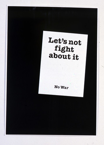
Poster, self-initiated project by Jon Hares, 2002. Hares designed this photograph for an anti-war march that took place in London in September 2002. Hares mounted one on a placard and distributed copies of the poster during the demonstration.
Temporary logo for the University of Portsmouth’s summer show, 2003. Design by Jon Hares and Nicholas Barba.

Faux-baroque
The faux-Baroque style is similarly an attempt to humanise design. The work of M/M in Paris and Åbäke in London makes extensive use of heraldic scrolls, rococo cartouches and semi-camp drawings of stags and unicorns – all readily identifiable images from the pre-Modern era that evoke notions of craft, luxury and higher kitsch. There’s a lightness of touch about this work that makes it refreshing and beguiling, and it offers a new eclecticism that graphic design urgently needs. But its widespread adoption by the fashion world (M/M have recently redesigned French Vogue) means that it probably won’t last.
Spread from Polish magazine Fluid no. 28, March 2003, with graphics and layout by Kasia Korczak, photography by Igor Omulecki.

A new digital sparseness
Two designers who make a virtue of the ‘digital glitch’ are Angela Lorenz in Berlin and Fehler in Northern Ireland (they frequently collaborate on projects). Their work is more refined and understated than the jacked-up, hyper-infantilism of eBoy and other superstar graphistas who use the pixel as their hard currency. Most of their work is for the crackly, glitchy electronic music sector, but in certain manifestations of their work they define a new aesthetic for digital design.
As a closer examination of the work of Angela Lorenz will reveal, this new aesthetic shares a sparseness and auto-generative cyber-like directness with the sounds and creative ethos of various pioneers of laptop-generated music. This aesthetic overlap – the point where design and music meet – is an significant new area for contemporary graphics: you might even call it laptop design.
Adrian Shaughnessy, director, Intro, London
First published in Eye no. 49 vol. 13 2003
Eye is the world’s most beautiful and collectable graphic design journal, published quarterly for professional designers, students and anyone interested in critical, informed writing about graphic design and visual culture. It is available from all good design bookshops and online at the Eye shop, where you can buy subscriptions and single issues.