
Summer 2020
Letterform Archive: Objects of Inspiration
Letterform Archive is feeding the post-digital generation’s passion for physical artefacts

Typefaces and fonts have evolved suddenly from an esoteric field – seen but not heard about by the public – into a cultural phenomenon. For the post-digital generation, type is both entrepreneurial opportunity and commodity. Functional and artful, type is integrated into painting and sculpture, architecture and interior design, and is seriously studied by scholars in multiple disciplines as well as by legions of type designers, typographers and graphic designers. To this end, study centres, libraries and archives in art schools, universities and institutes are stocking up on historical materials, with public and private, virtual and physical collections seemingly popping up like mushrooms. Founded by Rob Saunders in February 2015, Letterform Archive, based in designer-populated San Francisco, is carrying on an aggressive acquisition, education and outreach programme with a uniquely large staff for curation, scholarship, development and programming. This year, the rapidly growing institution moves into a new home in San Francisco’s Third Street, including a permanent gallery where the first exhibition will be a retrospective on Bauhaus typography (in the wake of last year’s centenary).
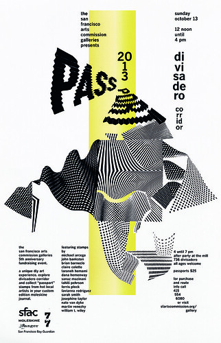
Martin Venezky, SFAC Passport 2013 event poster, San Francisco.
Top. Giovanni Pintori, the Dutch edition of the Olivetti 82 Diaspron typewriter brochure. The original version was published in Italy.
Saunders, a former children’s book publisher, marketing consultant and video producer, has been collecting for 40 years, mostly for his own reference. ‘Around six years ago I started inviting designers and students over to explore the collection,’ he explains, ‘and it became apparent that I wasn’t alone in my passion. It made sense to open it up to other designers who want to move beyond the internet and have direct contact with inspiring objects.’
It was presumed that Letterform Archive would find its audience within
a few years. In five years its reputation, and the number of visitors (more than 6000 from over 30 countries), increased beyond expectation, with a rise in interest among young designers for the fetishisation of artefacts. ‘We had no idea how quickly word would spread, how large the collection would grow, and how widely our community would expand beyond the Bay Area,’ Saunders says. The collection is now four times the size of its initial holdings. Much of this is due to generous donations from leading designers and foundries, such as Emigre Fonts, and also purchases of rare materials. Saunders bought a large quantity from the Paul Rand estate auction in 2019.
El Lissitzky, cover for Wendingen series 4, no. 11, Netherlands, 1922.

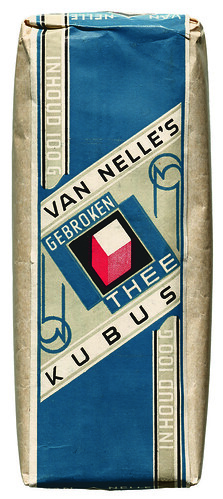
Jacob Jongert, Van Nelle’s Kubus Gebroken Thee. Unopened package, Rotterdam, 1930.
‘The collection responds to our community,’ he explains. ‘We try to collect objects that tell design stories – whether it’s major movements that changed history, like early printing or the Bauhaus, or the story of a single project from process work (sketches, comps, mechanicals) to final print.’ A premium on serendipity and surprise extends from the curatorial vision. ‘Our tour tables are set with design icons right next to anonymous ephemera.’
Vigorous programming includes public workshops and Letterform Lecture
series that are part of the Type West Postgraduate Certificate Program in Type Design, where the public is invited to take part in the curriculum. Recent events have included talks by Silas Munro (see ‘“As not for”: The critique goes on’ in Eye 100), Nadine Chahine (see her interview with Anna Lisa Reynolds in Eye 94) and Letterform Archive’s associate curator and editorial director Stephen Coles.
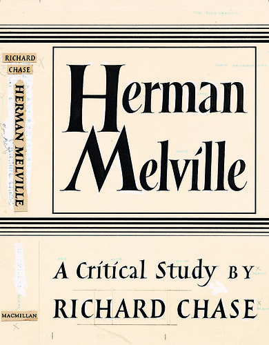
Philip Grushkin, original hand-lettered artwork for the cover of Herman Melville: A Critical Study (Macmillan) New York, 1949.
Letterform Archive has also published crowdfunded books on W. A. Dwiggins and Jennifer Morla. A third book, Only on Saturday: The Wood Type Prints of Jack Stauffacher is due later in 2020. Now with newly recruited associate publisher Lucie Parker, the Letterform Archive is planning an ambitious publishing programme, something that was always Saunders’ goal. The Online Archive is another huge effort that has been in the works for several years, and is now open to all, with 9000 hi-res images and 15,000 artefacts.
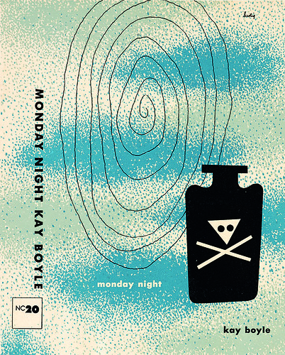
Alvin Lustig, cover for Monday Night (New Directions) New York, 1947.
Steven Heller, design writer and educator, New York
First published in Eye no. 100 vol. 25, 2020

Eye is the world’s most beautiful and collectable graphic design journal, published for professional designers, students and anyone interested in critical, informed writing about graphic design and visual culture. It is available from all good design bookshops and online at the Eye shop, where you can buy subscriptions and single issues.