Spring 2011
Men behaving stylishly
Who would dare to launch a glossy men’s magazine during an economic crisis? The team behind Port discuss their new quarterly
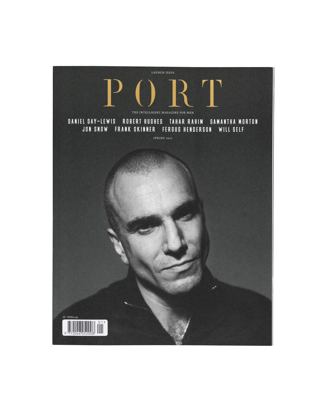
You could be forgiven for thinking that the cold Spring of 2011, with its cutbacks, closures, price hikes and app-frenzy, is not the best of all possible times to launch a new magazine. Especially a beautifully printed quarterly aimed at affluent urban males. Yet here comes Port, an independently financed start-up spearheaded by two art directors and an editor, brimming with confidence, big pictures and long articles.
Sure, there’s an iPad app (about which more later), and a website, but it is the 192-page print manifestation that lies at the core of what the founders hope will be an enduring artefact and brand – perhaps closer to Tom Wolsey’s Town or the early days of American Esquire than any recent titles serving the dwindling popular market for men’s mags.
The men behind the magazine may be familiar to Eye readers. Matt Willey (see ‘Wanted: self-images’ in Eye 66) is the principal of Studio8 Design and art director of Elephant magazine; Kuchar Swara (see Eye 73) was formerly a designer at Winkreative, where he art-directed and redesigned Case da Abitare with Tyler Brûlé; and Dan Crowe was the editor of literary journal Zembla (see Critique, Eye 51) – which is where he first met Willey, then employed by Frost Design.
For Crowe, Port is the solution to a ‘massive gap in the market’. He and his partners love the medium of the magazine, and they are appalled by the ‘disintegration of mainstream men’s style magazines’ that began in the 1990s. ‘With the demise of content, you see the demise of design,’ says Crowe. ‘You need to have great content to have great design.’
Port’s solution to this crisis is to assemble an expensive-looking product for a next-to-nothing budget. They persuade the writers, photographers and stylists in their high-profile address books to write in return for, say, a ‘very nice bottle of wine’ (Martin Amis), a first edition (Frank Skinner) or a colourful tie (Jon Snow). The cover star is Daniel Day-Lewis, with whom Crowe worked on a book for art publishers Rizzoli, and who, he adds, ‘hasn’t done a cover for six years’. Day-Lewis contributes a piece of reportage about the time he visited Gaza with Médecins sans frontières.
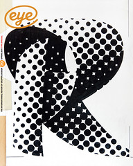
The art direction and typography is spacious, considered, serious without being too solemn, with two custom display typefaces designed by Willey: Port 1, the stencil font used for the masthead and big folios, and MFred, a caps-only font used for the big features at the back of the magazine. Port has many of the elements that readers and advertisers expect from a style mag, but it aims for a more relaxed approach. ‘We decided to strip out everything we don’t like,’ says Swara. ‘This is supposed to be a little oasis that you go to, nicely curated.’
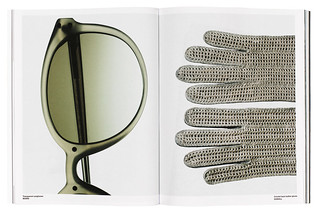
Regulars include a ‘Design briefing’, on uncoated paper, including huge photos of lamps, clocks, chairs and Willey’s appreciation of the Bialetti Moka Express coffee maker. ‘Commentary’ embraces writing by Robert Hughes on privacy (‘Everything That’s Popular Is Boring’), Ekow Eshun on culture, Janine di Giovanni on identity and Marcus du Sautoy on maths. There’s plenty more prose, including a six-page short story by Will Self. Poetry is also slotted into the calm three-column grid: work by Ann Kim, Michael O’Brien and Clive Wilmer.
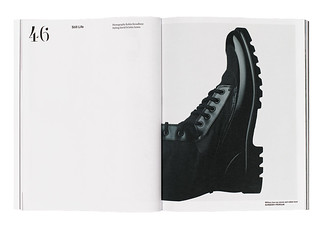
The more substantial features – including Day-Lewis’s report from Gaza, articles about Nike, ‘Reinventing the banana’ and styled photo-profiles of the Palestinian journalist / novelist Rula Jebreal and French actor Tahar Rahim – are placed at the back of the magazine, ending with a powerful fifteen-page feature by photographer Markus Bühler-Rasom on the effects of climate change in Greenland.
So what do the founders think about industry pundits who believe the magazine is dying, or migrating elsewhere, via websites and apps?
‘I don’t think visual magazines will suffer because of the iPad,’ says Swara, who describes his frustration trying to read magazines on tablets. ‘Yesterday Jeremy [Leslie, Port’s iPad consultant] brought in Self Service on his iPad and we were flicking through it. Halfway through, I said: “Stop. This is never going to make it!” ’ He makes a repeated swiping motion. ‘It’s strenuous physically to go through it like this, all the time,’ he says, and everyone laughs. ‘No, really, it’s taxing. I’ve had a long hard day, I just want to read an article.’
‘I don’t subscribe to this over-excited, knee-jerk notion that print is dead, that the future is an online, tablet-shaped place,’ says Willey. ‘Fewer magazines with more valuable content would be a great thing.’
‘We’re trying to produce a beautiful object,’ says Crowe.
But isn’t this the worst of all times to make a business out of a printed publication? Willey (jetlagged, and just back from working on the redesign of The New York Times Magazine) thinks not. ‘It’s a fucking brilliant time to launch a magazine!’
First published in Eye no. 79 vol. 20.