Spring 2011
Modern method
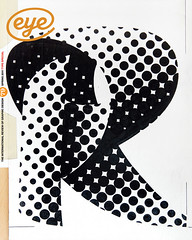
As the Design Museum launches a retrospective of Wim Crouwel’s work, Kerry William Purcell interviews the Total Design (TD) co-founder.
Throughout the twentieth century, when the turmoil of social and political change became intolerable, the seeds of desire for order and logic were sown. The First World War presaged an outpouring of artistic movements, the rise of schools and work that propagated the ideals of Modernism. After the Second World War, the International Typographic Style established its powerful influence. The logical approach of Swiss designers such as Josef Müller-Brockmann, Max Bill and Richard Paul Lohse codified many of the design innovations of the inter-war years.
How do we explain the current fascination with Modernism? Is it because such work offers a design language that comes with clear moral authority as to the purpose of graphic design? Or is it because the purveyors of the International Style ignored the radical political ideas once associated with Constructivist and Bauhaus design philosophies? Do the clean and orderly surfaces of postwar European design dovetail with the seemingly apolitical wishes of commercial clients?
One of the designers who has become intrinsically associated with Modernist graphics is Wim Crouwel, both through the originality of his work and through his tireless succession of talks, judging and interviews. Crouwel (now 82) has become a father figure. With an exhibition of his work opening at the Design Museum, London and a new book on the famous Total Design studio (see pp.18-19) he co-founded, the place of Crouwel in the pantheon of Modernist designers appears secure.
Born in 1928, the Dutch designer Wim Crouwel was twelve when Germany invaded Holland in May 1940. His remaining school years were a time of mass deportations (of Jews and other ‘undesirables’), the imprisonment or execution of political figures and Arbeitseinsatz, the drafting of Dutch men to carry out civilian labour in Germany. ‘My father was taken away to Germany,’ Crouwel said when I interviewed him in his Amsterdam home. ‘Train-loads of men between 18 and 45 years of age were forced to work there, to do things the German men would have done had they not been in the army.’ His father was a lithographer by trade and for the young Crouwel a big influence on his early life. ‘He was a block-maker and during the holiday periods I worked in his drawing room, so early on he stimulated me to do drawings.’
During his father’s two-year absence, Crouwel took it upon himself to continue his own education in art and architecture. He began to explore his local library in Groningen, a small town in northern Holland. ‘I would often go on Wednesday afternoons, when we were free of school, to the town library to read magazines from the 1930s. I was interested in architecture and there was an old lady librarian, who learned what interested me and put together a pile of things she thought I would like.’ Among these was Paul Schuitema’s De 8 en Opbouw [8 in Construction], from 1932-43.
All hands on deck
The Modern architectural movement in Holland (known alternatively as Nieuwe Bouwen or Nieuwe Zakelijheid) was principally concerned with architecture rather than design. Yet, in magazines such as De 8 en Opbouw, they approached the page as a piece of architecture in itself, developing a radical language through which to communicate their functionalist ideas on the design of urban spaces. While initially drawn to the content, Crouwel also learned from the form of the publication.
After the war, Crouwel entered the Art Academy Minerva in Groningen (1946-49) to study painting. He struck up friendships with the painters Job Hansen (who lived next door to his grandparents and was a friend of H. N. Werkman) and Jan van der Zee, who lived opposite the art school. Both men encouraged Crouwel’s interest in abstract painting. He didn’t consider graphic design (or ‘commercial art’ as it was then termed) as a possible career until he saw the A. M. Cassandre poster Étoile du Nord (1927), on the academy’s studio wall.
After leaving art school, Crouwel saw no future in Groningen, so he travelled to Amsterdam. In the aftermath of the war, Holland’s capital, like most of Europe, was struggling to re-establish itself. There were few commercial agencies and work opportunities were slim. Crouwel decided to phone Dick Elffers and Otto Treumann, Holland’s most celebrated poster designers. They both invited him to visit, and soon afterwards, Elffers offered to find him work with Enderberg, a local exhibitions company. The company was staging several touring exhibitions, funded by the US-backed European Recovery Program, or ‘Marshall Plan’.
Crouwel worked on two large displays staged on barges, on the lines of the Soviet Agit trains. He says: ‘They were known as Rhine Barges, and we had two of them. One had a cinema in it and an exhibition on top. They were intended to travel around Holland and teach the farmers about the American system. It was the Marshall Plan to get Europe going again and learn the American way of agriculture and industry.’ In an exhibition entitled ‘Alle hens aan dek’ [All hands on deck] the top level of the barges was designed to collapse so it could fit underneath the bridges – Crouwel worked closely with the company’s three-dimensional designer to create a workable system.
For Crouwel, being at the heart of this collaboration of architects, interior designers and graphic designers was a key moment. At Enderberg he met the photographer Ernst Scheidegger, the Italian exhibition designer Lanfranco Bombelli, and the Swiss designer Gérard Ifert, all of whom had been sent to Amsterdam by the US Information Office. Later, he travelled to Switzerland with Ifert to meet designers Armin Hofmann, Karl Gerstner and Hans Neuburg. What struck him on these trips was the use of type in Swiss design.
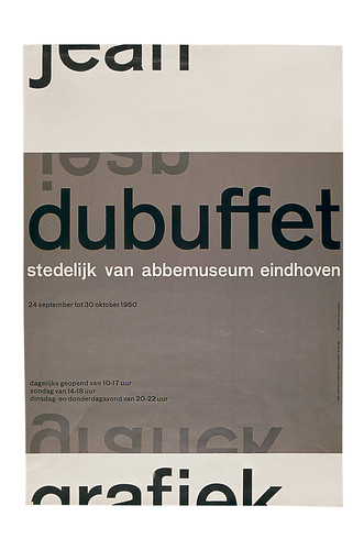
‘First of all I was impressed by the Akzidenz Grotesk typeface,’ he says. I did my first posters in that period [mid 1950s] for the Van Abbemuseum [Eindhoven],’ he says. ‘You couldn’t get [the type] in Holland: the printers were all fed by the Amsterdam Type Foundry who didn’t have it [the other foundry at this time was Joh. Enschedé and Sons Foundry]. So I bought Swiss magazines and newspapers and cut these typefaces out and glued them on to make up the lettering for those first posters.’
Swiss mix
The Swiss influence on Crouwel came more from Basel than Zurich. Although the graphic practitioners from both these cities developed a Constructivist and functionally minded approach to design, the philosophy of such Basel designers as Hoffman or Gerstner was less rigid than that of their Zurich counterparts. For Crouwel, with a painter’s interest in fine art, the greater flexibility of the Basel School appealed. ‘I was partly influenced by the abstract painting exhibition from Paris that I saw at the Stedelijk that [Willem] Sandberg designed,’ says Crouwel.
‘I joined a group of abstract painters in Amsterdam in 1953. I became a member of this group to design their exhibitions! So I was very influenced by this – and that mixed with the Swiss approach to design to make my flavour.’
From the mid-1950s, when he received a commission from the Van Abbemuseum, Crouwel began to concentrate exclusively on graphic design. At the time Crouwel was teaching graphic design at the Royal Academy of Art in s’-Hertogenbosch, whose director was a friend of Edy de Wilde, the museum’s director. Just as Samuel Hirschi had commissioned Josef Müller-Brockmann to produce the iconic posters for the Zurich Tonhalle for more than 25 years, De Wilde was to become one of those rare life-long advocates of a graphic designer’s work; the relationship lasted 30 years.
‘De Wilde was my most beloved client,’ says Crouwel, ‘because later on he became director of the Stedelijk Museum in 1963 and he took me with him to the museum. He had a very interesting way of looking at my work. He never criticised my proposals, but when he printed it, then he would say what he thought about it. He was always critical, but only on the finished work. Fantastic!’
In the second half of the 1950s, the Dutch economy began to prosper, like most of Western Europe. The rise in demand for consumer durables and investments in infrastructure meant that designers’ services were in great demand. However, major companies often commissioned design work beyond the Dutch borders –for instance the practice of F. H. K. Henrion had been commissioned to design the corporate identity of Dutch airline KLM.
In 1962 Crouwel and his fellow designers Friso Kramer and Benno Wissing went on a fact-finding trip to the UK. Henrion, asked why the KLM job had gone to English designers rather than Dutch ones, replied by saying that ‘institutions like to talk to institutions’. On the same London visit, the trio visited the new office just founded by Fletcher, Forbes and Gill, and decided to adopt their model. The following year, Crouwel, Kramer and Wissing (with financial support from brothers Dick and Paul Schwarz) founded Total Design (TD).
Total design ‘was an immediate hit’ says Crouwel. ‘We started at a good moment. There were many large companies who wanted to do a corporate identity. So we did such companies as SHV [Steenkolen Handels-Vereeniging] and all their subsidiaries, all their supermarkets. And until the end of the 1960s “trees grew into heaven” . We had started with twelve, but then it just grew and grew and grew. In no time we had 30 people.’
What drove everyone in Total Design was the desire to both professionalise the graphic design profession and bring a much needed sense of order to the visual landscape. The company worked across many sectors (although the creation and maintenance of house styles took up around a third of their time).
As with many studios, the spread of work within Total Design was often uneven. The partners in the company would often seek out the more high-profile and creatively satisfying work – for companies such as PTT and, given their close relationships with museums such as Van Abbe, Boijmans-van Beuningen and the Stedelijk, numerous identities, poster campaigns and catalogues.
It was often left to designers such as Ben Bos (Total Design’s first employee, and later a director of the practice) to manage teams that worked for trusted clients such as the employment agency Randstad, which brought in the regular income.
The critical years
Managing the competing interests of designers in a studio is difficult at the best of times. But, if there were any cracks in TD when they started, these were exposed in 1968, when a wave of student protests rippled across Europe. Of all the designers in TD, Benno Wissing was the one most strongly affected.
‘He wanted to give power to the people,’ says Crouwel. ‘That is, he wanted all the staff at Total Design to get shares in the company. But I said if you do this, it’s the quickest way to finish the company.’ Quarrelsome discussions eventually forced Dick Schwarz to get out.
‘He [Schwarz] couldn’t stand it,’ says Crouwel. ‘The brothers really helped us out. We had years when we made a profit and years when we made a loss. And they always put the money in. It was a luxury and Benno wanted to change it into a Communist state!’ Although, strangely enough, according to Crouwel, Wissing never actually wanted to work on more political briefs through TD: ‘Benno felt like a communist, but in many ways he was the hardest of the lot of us. Like a real capitalist. It was a very strange mixture.’
By 1972 Wissing and Kramer had left along with Paul Schwarz. With only Crouwel and Ben Bos left as partners, Total Design became a purely graphic design company.
The political tremors that shook Total Design towards the end of the 1960s rumbled on into the 1970s. Crouwel, whose work had become part of the Dutch landscape, became an easy target for those who wanted to criticise what was perceived in Holland as the cold brutality of Modernism. For Crouwel, ‘the 1970s were the real critical years. There was a lot of opposition to our ideas.’
Journalist Renate Rubinstein, writing a weekly column in Vrij Nederland, called Modern architecture and design ‘the new ugliness’. ‘In the graphic design field, I was the enemy,’ says Crouwel.
‘She always used my name and it was just in the period when I did my new telephone directory [Crouwel and Jolijn van de Wouw created the famous PTT telephone book of 1977 in which the numbers were placed before the name], which, she said was the most awful book you could think of.’
‘I always said: “let it go, let it go”. Then Vrij Nederland organised a night on this discussion of the “New Ugliness”. So me and some architects and this journalist were sat on stage with the crowd full and people were shouting. It was crazy! So, I discussed it with her and I still remember there was somebody in the audience who shouted “fascist”! It was an awful evening.’
In the appraisal of Crouwel’s career, this debate (alongside his 1972 dispute with fellow designer Jan van Toorn in which Crouwel’s objective, logical and systematic approach to design was set against Van Toorn’s more politically engaged and personally expressive approach) has seemingly fixed his identity as a keeper of the Modernist flame. Admittedly, his appearance in the 2007 film Helvetica (in which he introduces himself by saying: ‘I’m a Modernist’) seems to reinforce that opinion; it is not an image he has fought against.
Yet, while Crouwel’s journey from painting to design is a common one among many Modernist designers of the postwar period, he is one of the few who, in his work, if not in his statements, has carried from his formative years an artist’s desire to experiment; a variety that is often at odds with the strict order and logic of Modernist design. Looking at such posters as ‘Hiroshima’ (1957), Léger’ (1957) or ‘Edgar Fernhout (1963), we find what could best be termed an ‘expressive Modernism’ is at work.
While Crouwel’s designs are pared down to their essentials, within them there is a surprising willingness to adopt a variety of approaches to the graphic space. His work registers the truth that the solution to a design problem is not an abstract concept, but something rooted in the concrete.
First published in Eye no. 79 vol. 20.