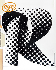
Spring 2011
Mr Mistral
New discoveries about Roger Excoffon’s virtuoso typefaces for Fonderie Olive prompt a fresh look at the legacy of this dynamic designer and the foundry itself.
The universe of the French type and graphic designer Roger Excoffon is inevitably linked to his native country, which has a typographic history rich in traditions and unique practitioners – from Claude Garamond to Pierre di Sciullo. Yet beyond this national flavour, it also throws up unexpected facets and excellent resources, which are ripe for future exploration and study. A recent investigation into Excoffon’s typographic oeuvre has led to the discovery of some remarkable archives that had been forgotten for more than 25 years.
Born on 7 September 1910 in Marseille to a family of flour-mill owners and magistrates, Excoffon moved to Paris around 1929, to study law and philosophy. However, he spent most of his time there studying drawing and painting at a number of free academies, and absorbing the visual vitality of the French capital, where the posters of Jean Carlu, Charles Loupot and Cassandre were to be found on practically every wall. His early professional steps during the late 1930s are still unknown, but it is thought that he designed a few posters.
After the Second World War and a brief stint as an artilleryman and technical draughtsman in the army, Excoffon was invited by Marcel Olive (1912-1990), his brother-in-law, to take on the artistic direction of his family’s type foundry in Marseille. After Olive had taken over the foundry in 1938, he had initiated a policy of original type creation for the first time in its history, launching Banville (1936-43) and Vogue (1939). This endeavour had been brutally interrupted by the war, although the foundry had continued to operate as best it could, and even managed to publish a general catalogue in 1943. Fearful that the imminent liberation might bring a further threat to the factory, Olive had built a false wall to conceal a large quantity of type stock as a precaution against plundering by the Nazis.
With practically no experience in type design – although he worked for two weeks during the war on an inline version of Banville for Olive – Excoffon ‘cut his teeth’ at the foundry’s Paris office on a project that had been started by Marcel Olive in 1942, a contrast sans serif inspired by Cassandre’s Peignot. Chambord, the first type family to be published after the war, was to enjoy great success with French printers and marked the revival of the typographic industry as well as the start of Olive’s unstoppable ascent. Charles Peignot, artistic director of Deberny & Peignot Foundry, until then the incontestable market leader in sales of metal type, watched the arrival of this provincial outsider with displeasure: it was to be the start of a long and fierce commercial rivalry.
Around the same time Excoffon oversaw the development of Vendôme (1950), an audacious interpretation of Garamond by the theatre designer François Ganeau (1912-83).
Excoffon’s ascendancy
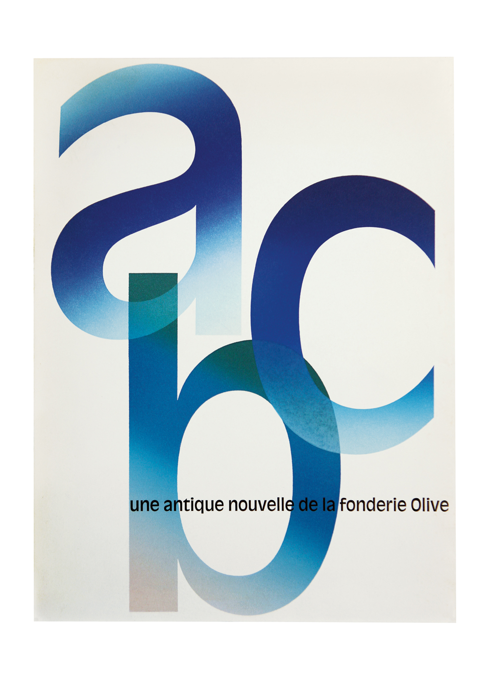
With Cassandre now immersed in design for the theatre, Marcel Jacno (1904-89) could claim to be the face of French typography at the time. That situation was to change in 1951 when Excoffon saw in a magazine a sample of the new face that Jacno was preparing to publish with Deberny & Peignot. Spurred by the spirit of competition, Excoffon proposed his own interpretation of the face: a playful and dynamic alphabet of capitals. And so Banco was born. Designed in two months and quickly put on the market by Fonderie Olive, this ‘copy’ of Jacno’s face was to prove more popular with printers than the original. It revitalised Olive’s range of display typefaces and was taken up by sign painters and manufacturers, which guaranteed the popularity of Excoffon’s typefaces; their presence remains strong in the cities of the entire world even today.
But real recognition came in 1953 with the publication of Mistral, a script typeface with an unprecedented vitality and virtuosity. Mistral was a masterful solution to a problem as old as typography itself: how to simulate the flow of handwriting while respecting the limitations of the type block. Years later, Adrian Frutiger, Excoffon’s friend and adversary (he had been hired in 1952 by Deberny & Peignot), would admit to him that he had examined the typeface closely under a magnifying loupe and wondered how on earth he had managed to pull off such a tour de force. Marcel Olive’s intuition had paid off; Excoffon had an undreamed of ability to unite a pragmatic technique with an ‘artistic’ vision of typography.
Mistral became a huge success, giving its designer international standing. It would be followed in 1955 by Choc, an energetic script that imitated brush strokes. His confidence bolstered, Excoffon became increasingly involved in visual communication and co-founded the advertising agency Urbi & Orbi in 1956, which for a while he ran from Olive’s Paris offices. He became the artistic director of Air France while at the same time developing new typefaces: Diane (1956), a variation on the theme of an English round hand script and a unique reference to the history of typography; Calypso (1958), an experimental typeface constructed on the play of twisting forms in halftone; and the powerful Nord (1958). In 1959 Excoffon finally left the Paris office of Olive in the rue Crébillon with his team and moved into his new agency offices. There he created his last great type family: Antique Olive (1960-1971).
Excoffon’s renown extended beyond the world of typography. An eminent member of AGI (Alliance Graphique Internationale), he worked for several major French companies and institutions such as Air France, SNCF (the French national railway company) and the Ministry of Economy. In 1968 he conceived the visual identity for the Winter Olympic Games in Grenoble. He left Urbi & Orbi in 1971 to create his own agency, Excoffon Conseil, which he ran until his death in Paris on 30 May 1983. However in the following decades, apart from a retrospective organised by his family in 1986 at the Monnaie de Paris, Excoffon’s oeuvre fell into unwarranted obscurity.
Twenty years later, a new generation of graphic and typeface designers started to become interested in this body of work. In 2006, Grand Ensemble, the Paris studio run by Sandra Chamaret and Julien Gineste, put together an exhibition, ‘Roger Excoffon en toutes lettres’, at Lurs-en-Provence to coincide with the Rencontres Internationales de Lure, (an annual meeting launched in the 1950s for graphic arts professionals) of which Excoffon had been president between 1963 and 1968.
When, at the end of 2007, I launched the Bibliothèque Typographique series with Ypsilon Éditeur to bring typographic work to a wider public, I dreamed of a project dedicated to Excoffon and Fonderie Olive. The centenary of Excoffon’s birth in 2010 provided a perfect opportunity and so I approached Chamaret and Gineste to work with me on a book about him [Sandra Chamaret & Julien Gineste & Sébastien Morlighem, Roger Excoffon et la fonderie Olive, Ypsilon Éditeur, Paris, 2010].
We embarked on a painstaking search of public and private libraries, building up an inventory of specimens and catalogues published by Fonderie Olive mostly under the artistic direction of Excoffon. Over a period of almost 30 years, dozens of promotional documents had been designed, as well as some 200 back cover advertisements for graphic design magazines such as Caractère, La France graphique, Le Courrier graphique and Techniques graphiques. It was an invincible promotional arsenal that Deberny & Peignot could never fully rival. We examined hundreds of these magazines and found many articles about his typefaces and the foundry, drawings, photographs and, most thrillingly, some pieces of hitherto forgotten writing by Excoffon.
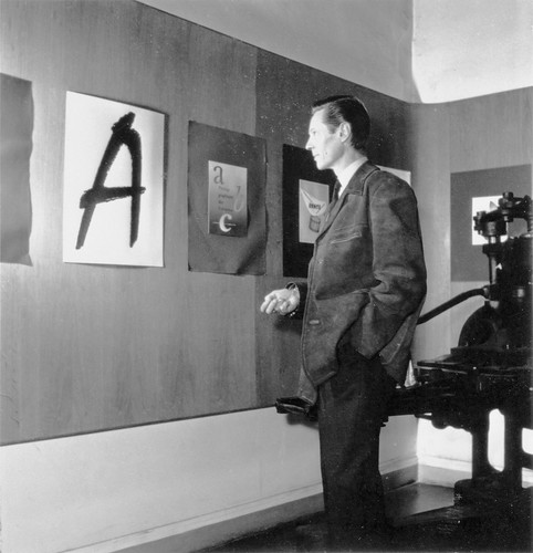
In July 2009, just when we thought we had come to the end of our research, the graphic design historian Catherine de Smet told me about the existence of archives collected by her relative, Jacques Devillers (1921-2008). A graphic designer whose work is testimony to his great interest in lettering, Devillers was Excoffon’s chief assistant at Olive between 1950 and 1952. Through an in-depth exploration of his vast archive – he threw away almost nothing in a career of nearly 60 years – we were able to bring to light a number of unpublished layouts and sketches: fruits of this forgotten collaboration.
This documentary manna was the first in a series of revelations. A few months later, we made contact with François Ganeau’s family and were able to unearth several hundred original drawings for Vendôme. Ganeau had apparently recovered them from Fonderie Olive after the typeface had been produced. Among this sadly incomplete set were also some trials for other alphabets.
Researching Excoffon & Olive
To recover these pieces of the puzzle was beyond our wildest dreams, but the best was yet to come. Martine Excoffon-Rosaz, Roger Excoffon’s daughter, with whom we had been in contact since the start of our research, by now convinced of our commitment to the project, gave us access to her own personal archive. It was with considerable emotion that we opened for the first time in decades the boxes that contained the original drawings for most of Excoffon’s typefaces.
When Marcel Olive’s elder daughter put the administrative archives of the foundry at our disposal, we found a series of copyright applications filed by her father to protect the foundry’s creations. This last discovery called into question certain assumptions we had made, and forced us to go back and rewrite some of the text that we had almost completed.
Between them, these private archives probably add up to the most important set of documents on the history of a French typographic foundry in existence. Among the most remarkable things we found were the preparatory files for Catsilou, the most experimental of Excoffon’s projects for Olive. In 1955, working in a way that was more intuitive than rational, Excoffon and José Mendoza y Almeida (his chief assistant until 1959) started to develop a sans serif typeface with improved legibility.
The hiring in 1956 of the graphic designer and intellectual Gérard Blanchard, who did extensive research at the Bibliothèque Nationale into the history of type, graphology and the work carried out on the legibility of small typefaces by the doctor and opthamologist Émile Javal, had a determining influence on the physiognomy of the typeface.
Well before the completion of Catsilou (its working name was the result of a chance encounter of some test letters that Excoffon and Mendoza had put up on the wall), Blanchard drafted the text and designed the artwork of a specimen manifesto project.
L’Étude raisonnée du Catsilou: Étude pour une théorie nouvelle de la construction d’un caractère en fonction de la lecture [A Systematic Study of Catsilou. Study for a New Theory of the Construction of Letters in Relation to Reading] is a substantial collection of notes and sketches in which Excoffon expresses his vision for a ‘new typography’: ‘Until now, we were dealing with architectural genealogies of letters. We saw letters in terms of sources and not formal fact. The letter that we are looking for is considered from the point of view, not of the historian – who has been left behind – but of the physicist. Forget everything that has been done so far and think about what the alphabet can be for us in 1956. I am searching in a way for the archetype, the exact representation of the unconscious alphabet in each of us. A synthesis of all the influencing factors, we said, the ideal alphabet …’ [Translation: Jean-Marie Clarke.] For reasons that are not known, this study – a rare attempt to ally theory and typography in France in the twentieth century – was never published. The rise to power of sans serif ‘neo-grotesques’ such as Folio (Bauer, 1956), Neue Haas Grotesk (Haas, 1957) or Frutiger’s Univers (Deberny & Peignot, 1957) led Marcel Olive and Excoffon to implement a swift strategy capable of combating these new typefaces. In November 1958 Fonderie Olive released Nord, a typographic ‘sumo warrior’, cleverly paving the way for its publication by using it first in the Air France logo, in a subtle adaptation rapidly designed by Mendoza.
Functional and organic – Antique Olive
It was not until 1960 that Excoffon unveiled the project that had preoccupied him, on and off, for five years. Catsilou became Antique Olive, a sans serif which was surprisingly readable in spite of some unusual forms: very short ascenders and descenders, a large x-height and above all an unexpected weighting given to the horizontal parts of the letters. At once functional and organic, Antique Olive was the last typeface in France created for casting as metal foundry type for use in hand setting. However it failed to revolutionise the world of typography and enjoyed only a limited success because Olive’s customers were using the foundry’s types for advertising, not for books and magazine texts. Excoffon’s final project – for the German company H. Berthold AG during the 1970s – was Excoffon Book, an experiment around the Elzevir style for phototypesetting which unfortunately he was asked to abandon.
Now that Roger Excoffon et la fonderie Olive has been published, there is still much work left to be done to rediscover the work of other French type designers of the twentieth century: Eugène Grasset, George Auriol, Marcel Jacno, Albert Boton, Ladislas Mandel. So many ‘lost’ archives yet to unearth and explore …
Article translated by Deborah Burnstone.
First published in Eye no. 79 vol. 20.