
Spring 2014
Natural fantasy
Crispin Porter + Bogusky
Duffy Design Group
David Iglesias
Landor Associates
JKR
Brewer-Riddiford
Lynne Schulte
Charles S. Anderson
Anna Kealey on the myth-making powers of food packaging design
Packages for food are quintessential ephemeral design objects; we throw them away daily, often without thinking of their persuasive power. Yet food-packaging design is integral to the way companies communicate stories about food. And some of those stories are myths.
Recent health scares combined with an increased awareness of the benefits of natural foods has resulted in a growing number of consumers willing to pay a premium for healthier products, often opting for fresh and organic items. This expanding market has intensified food companies’ focus on visual and verbal communication on packages, so that processed products can be more easily equated to natural, unprocessed foods. This, in turn, has created new demands for the designers and strategists to create (or maintain) myths about the food contained within the packaging.
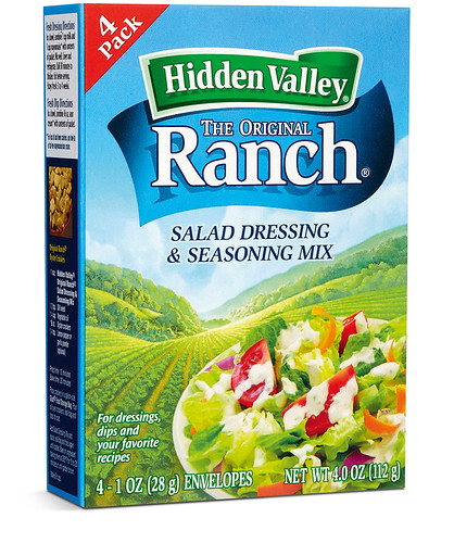
Sunrise by sunrise, wheatsheaf by wheatsheaf, grocery store products have been redesigned to look closer to nature than they really are. The delicate smoke emanating from the Pepperidge Farm chimney and the inviting country scene along Hidden Valley both evoke a bucolic existence. And in the cardboard covers of other products there can be seen a re-emergence of exaggerated motifs related to the landscape, such as pastoral scenes, radiant sunshine, green grass, red barns, picket fences, soaring mountains, blue skies and fruit trees.
Packaging design adds a level of emotional resonance to the food we eat, linking us to a natural environment or tradition that is often far removed from the reality of the boxed, processed item on the shelf. Tess Wicksteed, a ‘brand strategist’ at design agency Pearlfisher says: ‘The role of food packaging is to make the food look real and fresh.’ But the essential dilemma is that a food product that requires packaging is at odds with the very idea of freshness. Wicksteed continues: ‘Organic food was able to command this incredible price point, and all the mass-market brands got very jealous. They realised people wanted to feel connected to their food. So [they said to themselves] “how can we pretend to be organic, or take some of the organic cues?” And that’s when companies started using words like “real” and “honest”.’ [1]
Birds Eye logo, from 2008 to 2011 by JKR.
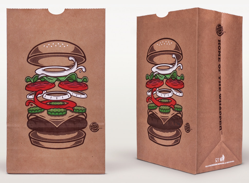
Top: Burger King paper bag. Design and art direction: Crispin Porter + Bogusky, 2010. Illustration: David Iglesias.
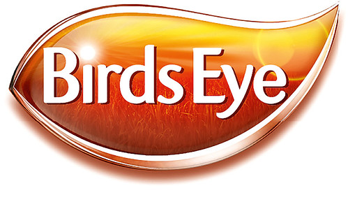
Image and colour
Illustration plays a significant role in packaging design because the places that are pictured may not exist to be photographed. Certain types of architecture feature prominently, such as a red barn on a dairy product, or a château on a wine label, and these sell a sense of place, whether real or imagined. Designers will also opt for faux woodcarving, etching or letterpress styles to add a double layer of tradition and nostalgia.
Typographic elements, too, are softened. Friendly serifs such as Archer and Sabon, and curved, expressive script faces like Burgues and BistroScript decorate the cardboard coverings, trying to evoke anything but a machine. These subtle and seemingly innocent aesthetic decisions create landscapes of fictitious imagery that are distanced from the realities of food production. And as the food industry moves further away from traditional modes of production, these nostalgic tropes become increasingly insistent.
Colour in these packages is important too, and the colour of the ‘green movement’ isn’t simply green. There has been a general trend towards using creams, browns, blues and other colours commonly found in nature. White has become associated with sterile unnaturalness, so companies prefer colours that symbolise concepts of sustainability, wholesomeness and ‘getting back to nature’.
Many fast-food chains, such as Cinnabon, Dunkin’ Donuts and Burger King, have converted to brown napkins. And companies are often surprisingly candid about why they have changed from white to brown. The brown ‘symbolises’ eco-friendliness and has been shown to ‘make people feel like they were doing something good for the environment’ says Scott Murphy, vice president of strategic manufacturing and supply for Dunkin’ Brands.[2]
In 2011, advertising and design agency Crispin Porter + Bogusky redesigned the global packaging for Burger King – moving to brown bags. Instead of their previous emphasis on the BK logo, the new packaging features quirky illustrations that highlight the tomatoes, lettuce and pickles, while the less healthy ingredients, such as the bread bun and the beef burger, blend into the brown background.
As well as implying an environmental ethos, brown also aligns the product to the natural or organic food market.
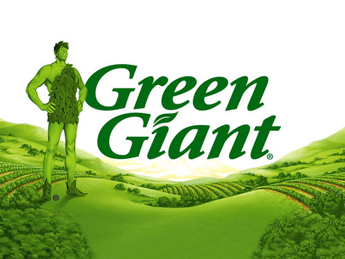
Green Giant logo, from 2009 to the present day.
Pleasant pastoral
In the past few decades there has been a shift of direction in packaging, away from images of the body – whether it’s a housewife in the 1950s to athletes’ endorsements in the 1990s – to images of landscape and nature. During the 1950s, even the Green Giant of the eponymous vegetable company could be seen sitting at the dinner table with a napkin around his neck. The Green Giant adverts from the 1950s, especially those illustrated by Norman Rockwell, featured people prominently, and emphasised the social qualities of food and family.
More contemporary advertisements – and the company’s own website – emphasise food production through prominent agrarian imagery – a big red barn, blue skies and green grass. The social value of sharing food gets lost; where food was once about the home, family and socialising, it is now about the individual. Yet this imagery of the natural environment is predominantly an illusion.
The Green Giant logo has gone through a number of redesigns incorporating many forms, from a purely typographic version, to the icon of the Jolly Green Giant, to a combination of the two. In 2009, the logo was updated radically to include the green giant standing in green rolling hills – what some in the industry called ‘putting in context’.[3] The giant stands like an owner of all he surveys, a fantasy figure who towers above the smooth fields and abstract bushes in a landscape devoid of signs of any agricultural activity. The exaggerated ‘greenness’ of the scene adds to its abstract quality, and distances the viewer from a sense of reality.
The Green Giant logo reflects anthropologist Barbara Bender’s hypothesis from her essay ‘Landscape and Politics’, where she argues that Westerners think of landscapes in terms of views: ‘something seen, usually at a distance. Often beautiful, usually rural, or if not – then with a value judgment attached.’ Bender calls for Westerners to have a more holistic understanding of landscape and see it as more than just ‘views’, rather as something that we engage with and rely on. The landscape in the Green Giant logo is there for its aesthetic value, rather than because it represents the food the company provides.
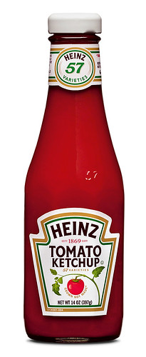
In addition to Green Giant, a number of other major established food companies undertook corporate rebrands in the late 2000s, just as organic food reached its peak in popularity and prominence. Birds Eye changed its logo from the well recognised bird icon to an abstract shape sheathing a wheat field bathed in radiant sunlight, while Heinz Tomato Ketchup had its first significant packaging redesign in 65 years.
Ray Armes, who undertook the Heinz Tomato Ketchup redesign while working at London-based branding firm Vibrant, says, ‘The whole reason we had to do a redesign in the United Kingdom was that ketchup was one of the foods that was highlighted that had too much sugar and salt for kids, so mothers started to move away from the product.’ To detract from the negative publicity, Armes spearheaded a new brand strategy for Heinz in the UK that tried ‘to eliminate the negatives and highlight the positives,’ as well as ‘eliminate the perception of too much sugar and salt’.
In 2008, Vibrant began an in-depth research project and discovered that Heinz grew its own tomatoes. This became the story that gave rise to the new slogan ‘Grown not made’. The new label design introduced the image of a tomato on the vine and the word ‘tomato’ was enlarged for emphasis. The thin green outline was also changed to a more natural-looking green. ‘We’re great believers in semiotics,’ says Armes. ‘If you’ve got an artificial green, the consumer’s mind will tell them it’s an artificial product.’[4]
Heinz Tomato Ketchup logo and bottle. Branding: Vibrant, 2009. ‘Grown not made,’ reads the slogan around the tomato image.
It’s all about perceptions
The redesign attracted attention from the client’s US branch, which adopted it the following year. When asked if he or the company had been concerned about any backlash, Armes replied, ‘That was the clever twist. We didn’t say “natural”, we said “Grown not made”. And we could prove that through some marketing copy on the back … It’s about perceptions without being deceitful.’
The words used on the packaging are also significant. Naming conventions such as ‘Farm’, ‘Market’ and ‘Valley’ are becoming increasingly common, as new products launch, or existing products reintroduce the terms. The supermarket chain Marks & Spencer [M&S] took this idea one step further with the creation of their ‘Lochmuir’ salmon in 2006. There is no such place – Lochmuir is simply the name that has the ‘most Scottish resonance’, according to M&S fish expert Andrew Mallinson.
Nicola Twilley, a food and cultural critic, believes that this example takes the ‘abstract, yet powerful, geography of food labelling to its logical, imaginary conclusion.’[5] Originally, the role of geography in food description was intended to reconnect consumers to the producers of their food. But the use of an imaginary location may help to disguise the nature of the industrial chain.
Dates matter, too, as food companies’ years of establishment take new prominence. Often seen hovering over a logo are phrases such as ‘since 1972’ or ‘three generations’, emphasising the company’s provenance. As Stuart Elliot, advertising columnist for the New York Times, notes, it is a relatively new phenomenon for companies to celebrate their anniversaries.[6] Companies used to fear that age would suggest they were outdated. Now an older company is more likely to be associated with success, tradition and the presumption that they use ‘old-fashioned’, wholesome ingredients.
Related to this is the renewed interest in old packaging and typographic styles that has emerged in the past five years – the ‘retro’ packaging phenomenon. Armes describes himself as a ‘brand archeologist’, saying that when redesigning the brand of a company ‘it’s often a good idea to go back right to the start to see what they first stood for.’[7] This approach of returning to the ‘original brand promise’ is effective, but may be misleading. Effective because aligning a food company to their past is comforting to consumers, but misleading because it frequently obscures the complex nature of the practices of contemporary food conglomerates.
Many designers’ reservations about clichéd pastoral conventions are aesthetic, rather than ethical. They express concern about current food design’s nostalgic obsession with old styles, stating that such tropes are unoriginal and do nothing to move the profession forward. Designer Brian Collins calls the look ‘phoney naïveté’ and believes it is ‘aisle after aisle of design desperation’,[8] while Pentagram’s Paula Scher, agrees that ‘it’s the bottom of the barrel’. As Steven Heller writes, ‘such direct replication is like cultural or commercial grave-robbing.’
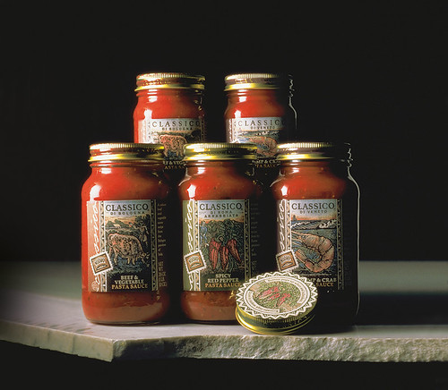
Classico Pasta Sauce labels and lids, Duffy Design Group, 1986. Design and illustration: Charles S. Anderson. Illustration: Lynn Schulte.
Power of nostalgia
In 1990, Tibor Kalman challenged fellow designer Joe Duffy over the latter’s design of the Classico pasta sauce jar. The label’s design used illustrations in the style of traditional wood engravings. Kalman argued ‘the fake nostalgia thing is kind of a lie ... I think it’s misleading’. Duffy gave a spirited response in the pages of Print magazine.[9] Nostalgia for times and places that one has not experienced has a powerful allure, so marketers continue to mine the warm associations of the past to sell us their products.
This new nostalgia, however, has a thoroughly modern cast. We still want our food to be convenient, even if it is wrapped in something that harks back to simpler times. For many people, the shopping experience is increasingly perplexing and emotional, with a conflict between health concerns and a desire for the speed and ease that processed food provides. Food packaging helps alleviate some of this tension by equating the processed product with its fresh counterpart through images of nature, thereby making the two feel less distant from each other. Siobhan Lonergan, senior vice-president of Design Intelligence at Sterling Brands, puts it simply, saying that packaging design is ‘all about making people feel better about their choices’.[10]
Many graphic designers primarily want to make something visually beautiful. Nature, having served as inspiration to artists throughout history, is often seen as the essence of beauty, and using images of it thereby serves to satisfy both the designer’s personal aims and his or her commercial duties. The allure of this natural imagery aligns the priorities of both the company and the designer, both of whom have a vested interested in the product’s success.
But although images of nature – particularly fruits and vegetables – are important in packaging design, they’re often disappearing from the products themselves. For instance Kellogg’s Frosted Mini Wheats come in a blueberry variety, with an image of fresh blueberries featured on the box. Yet there are no blueberries mentioned in the product’s list of contents, which includes, ‘natural and artificial flavor, modified corn starch, gelatin, soybean oil, glycerin, sorbitol, blue 2 lake, red 40 lake, red 40, BHT for freshness’.[11]
Truth or ‘truthiness’
A number of designers haven spoken about ‘organicness’ – a concept not unlike comedian Stephen Colbert’s ‘truthiness’. Here the ideas of the organic movement are symbolised visually through illusions that spin a pastoral fantasy. Andrew Strauss, former executive vice-president at Sterling Brands, believes that ‘years ago, food companies could just say natural and it was enough. But now consumers are looking for organic, even though they don’t know exactly what it means, but they know it must be healthier.’[12]
Such haziness plays straight into the hands of less scrupulous food companies, who rely on the ignorance of consumers, coupled with confusing copywriting on the packaging, to make their products seem organic or healthy – even when they are neither. The unrelenting visual bombardment perpetuates a lack of understanding about food by overwhelming and confusing the consumer with an enormous range of packaging designs.
Recently there has been a significant business trend whereby large agribusinesses acquire organic brands. Gene Kahn is the owner of Cascadian Farm, which began in 1972 as a single small farm but has since expanded into an industrial organic operation after being acquired by General Mills. Cascadian Farm has become a General Mills showcase – ‘a PR farm’ as its founder freely acknowledges.[13]
The company no longer produces from the original farm because it is too small, so it buys berries for freezing from as far away as Chile. However the imagery of the original farm is still used prominently throughout the branding, websites and packaging.
Yet food packaging, which may celebrate the natural landscape, has an inevitable impact upon the environment. Design director for Kellogg’s and Pringles, Matt Wickhert joked that, because packaging is wasteful, his role as a packaging designer means that ultimately he ‘decorates the landfills’.[14]
Packaging is an expensive endeavour for the food companies. Yet clearly they are willing to invest heavily in it because the myths it creates are integral to their success and profits. Graphic design plays a central role in developing and sustaining these myths.
1. Tess Wicksteed, interviewed by author Anna Kealey, New York, 9 November 2011.
2. Naussauer, S. (25 January 2012). Trying On Shades of Brown to Scream Green, Wall Street Journal.
3. Siobhan Lonergan, interviewed by Kealey, New York, 27 November 2011.
4. Ray Armes, interviewed by Kealey, New York, 22 January 2012.
5. Twilley, Nicola, ‘The Atlas of Aspirational Origins’, Edible Geography blog, November 2011. ediblegeography.com/
6. Stuart Elliot, interviewed by Kealey, New York, 11 November 2011
7. Ray Armes, interviewed by Kealey, New York, January 2012.
8. Severson, Kim, ‘Be It Ever So Homespun, There’s Nothing Like Spin’, New York Times, 3 January 2007.
9. ‘Tibor Kalman vs. Joe Duffy Revisited’, Print (March/April, 1991) printmag.com/interviews/tibor-kalman-vs-joe-duffy-a-retrospective.
10. Siobhan Lonergan, interviewed by Kealey, 28 November 2011.
11. Frostedminiwheats.com/Products/Blueberry-muffin.
12. Andrew Strauss, interviewed by Kealey, 28 November 2011.
13. Pollan, Michael, ‘Behind the Organic-Industrial Complex’, New York Times, 13 May 2001.
14. Matt Wickhert, interviewed by Kealey, 22 November 2011.
Hidden Valley ranch salad dressing packaging, 2012.
Anna Kealey, design writer, educator, creative recruiter, New York
First published in Eye no. 87 vol. 22 2014
Eye is the world’s most beautiful and collectable graphic design journal, published quarterly for professional designers, students and anyone interested in critical, informed writing about graphic design and visual culture. It is available from all good design bookshops and online at the Eye shop, where you can buy subscriptions, back issues and single copies of the latest issue. You can see what Eye 87 looks like at Eye before You Buy on Vimeo.