
Spring 2019
New bottle old wine
Drawing on the punches, matrices, specimens and smoke proofs at St Bride Library, Commercial Classics give nineteenth-century typefaces a new lease of life. By John L. Walters
Type designer Paul Barnes is acutely conscious of the way in which the letterforms of the past recur and evolve in the context of the present day. He explains this with reference to the last days of letterpress. ‘Not so long ago, you could use anything that had existed in the era of letterpress. Even if it was from the sixteenth century, if you wanted it, it could have been recast.’
As the co-owner, with Christian Schwartz, of Commercial Type (see Eye 82), Barnes’s perspective is informed by his background as a designer who specified in type: ‘In the 1900s, foundries would cast things from all kinds of periods. And that gave the printer – and later the designer – a choice.’
By the time Barnes was a student at Reading, letterpress had already been eclipsed by phototype, and early digitisation was well under way. Yet the typefaces that have been extensively digitised are often the ones that were best-sellers at the time: the big foundries based their choices on popular tastes. But tastes change, and many beautiful typefaces have been neglected.
Commercial Type’s Paul Barnes revived this style, originally made in capitals only, based on examples of matrices (right) and specimens in the archive at St Bride Printing Library in London. Barnes based his design for the lower case on the Figgins slab serif style.
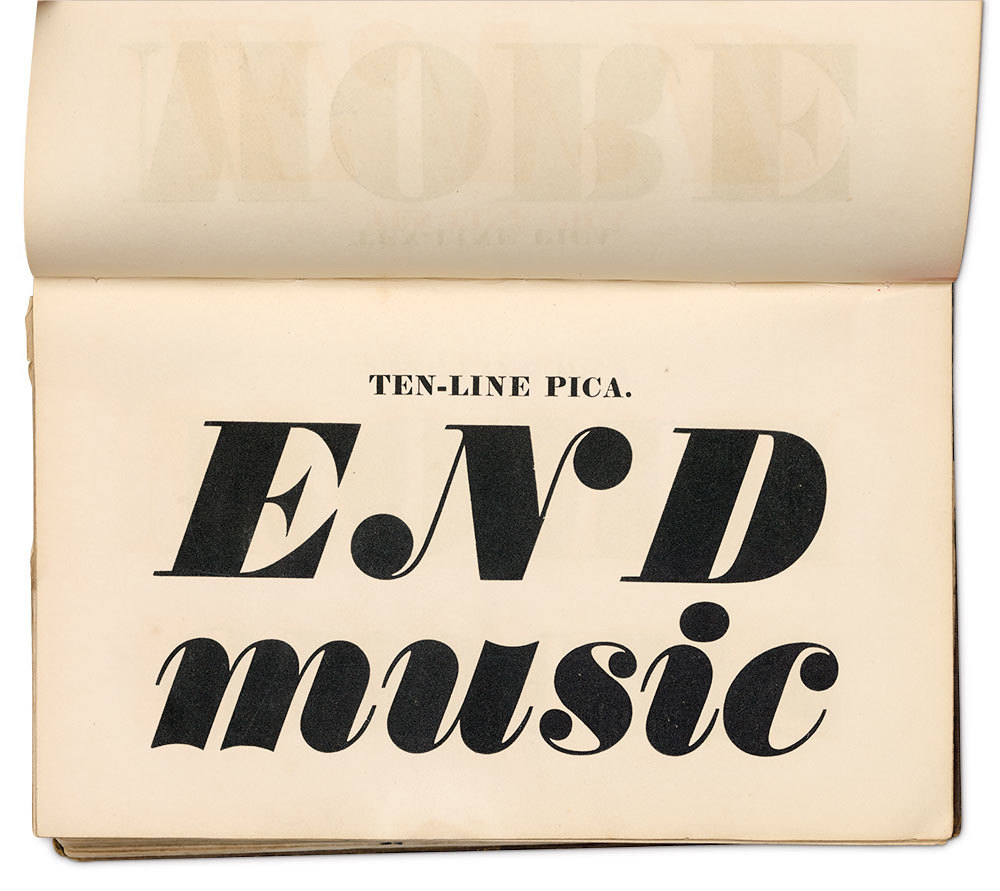
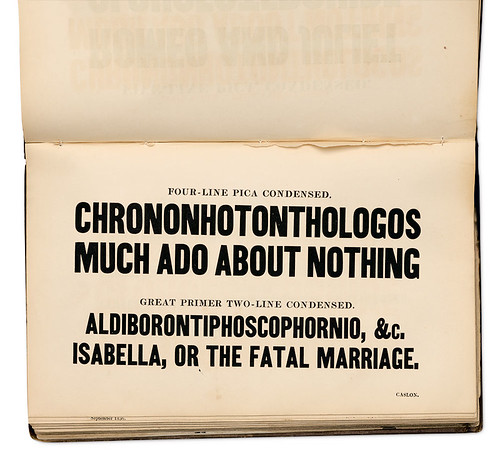
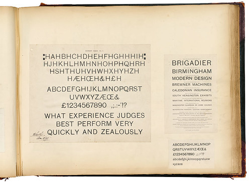
Top: Pages from Specimen of Printing Types, Henry Caslon, 1842, which informed Isambard.
All photographs taken at St Bride Library by John Bodkin and Philip Sayer.


Commercial Classics is a response to Barnes’s hunch that contemporary designers would like to have a wider choice. With eleven families and an eclectic assembly of shaded display faces, it effectively decants some vintage wines into smart new bottles.
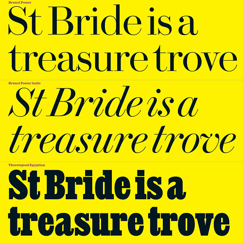
Barnes’s research began at the St Bride Printing Library in London, which he has visited since he was a student. ‘There’s this enormous mountain of stuff,’ says Barnes. ‘You start mining somewhere and realise it’s really interesting, it has something to say. St Bride is basically a treasure trove.’
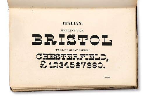
Caslon Italian in the Specimen of Printing Types, Henry Caslon, 1842. One of the strangest styles pioneered in the nineteenth century, Caslon Italian reverses the typographic norms of thicks and thins. Schwartz added a lower case, and Ripper and Barnes added italic and contra italic forms, both of which appeared in lettering of the time, such as gravestones, but never in type. ‘What’s interesting about the Italian is that it is really strange and weird, but in certain words it looks great,’ says Barnes.
Three fonts from Commercial Type’s Commercial Classics collection, from research at the St Bride Printing Library. Barnes says: ‘Compared to Didot, Brunel is British ... elegant without being cold, Savile Row tailoring rather than French couture.’
With Commercial Classics, Barnes and Schwartz want to ‘give something back’, and to give St Bride a new revenue stream from the sale of the fonts.
Some Classics are familiar; Barnes began designing Brunel in the mid-1990s, soon after he returned to the UK from New York. Walking through London’s Georgian streets he started to think about the influence of history. ‘Brunel comes from a particular point, the turn of the eighteenth and nineteenth centuries. It’s a bit like the birth of rock‘n’roll. You get bolder and bolder weights, fatter and fatter, all driven by advertising.’
More fonts from Commercial Classics. Paul Barnes says: ‘It was the British foundries from the first two or three decades [of the nineteenth century] who seemed to be doing the most innovative things.’

He mentions A London Street Scene, the 1835 painting by John Orlando Parry that depicts the side of a building plastered in announcements, playbills and advertisements: for hats, a masked ball and the Thames Tunnel. This shows the commercial world these typefaces inhabited. The display fonts had to pick out the important words, or, in the case of lottery posters, the big prize money.
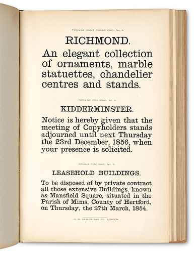
A page from Specimen of Printing Types of the Caslon Letter Foundry, published by H. W. Caslon & Co., London, ca. 1861. By the mid-1800s, increasing press speeds meant that roman type lost its thins and serifs when printed. Caslon pioneered a robust face for body text, which influenced many twentieth-century newsprint fonts. Caslon Ionic has a matching egyptian bold, which is based on Figgins’ Antique No. 6 (1870).
Barnes relishes analogies and metaphors from theatre, music and food, comparing what he’s doing to the vogue for reviving analogue synthesizer sounds. His ambition is to make the typographic world richer, seeing similarities to the quest for authentic ingredients in contemporary cooking. But he is also aiming to expand the range of possibilities for each typeface, imagining what nineteenth-century punchcutters and founders might have done to make things usable today.
Brunel typeface. Foundry: Caslon, 1794. Punchcutter: John Isaac Drury. Design: Paul Barnes, with Christian Schwartz and Dave Foster, 1995–2017.
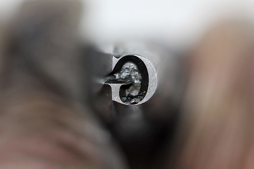
‘G’ punch by John Isaac Drury, who cut the first moderns for Caslon. Brunel and Isambard (a fat face version of Brunel) are new families based on these older types.


‘I’m not interested in making an old playbill, I’m interested to see what you can do in a modern way,’ says Barnes. ‘Some people see old type and think it’s old and dusty. Type designers remove the dust and show it still has relevance.’ Some of the typefaces were originally all capitals. ‘They didn’t instantly add a lower case – they didn’t think like that then.’ This is where what Barnes calls the ‘method acting’ of type design comes in, trying to think like a nineteenth-century punchcutter who is called upon to make a new glyph. ‘I know how it would go,’ he says. ‘You could give me ten characters and I would say: “The bold will look like this, the italic like this.”’
Pages from Specimen of Printing Types, Henry Caslon, 1842, which informed Isambard.
Isambard. Foundry: William Caslon IV, Caslon & Livermore, Caslon & Catherwood, 1821 and later. Design: Paul Barnes & Miguel Reyes, 2012-18.


There are parallels with the Early Music revival of the 1960s, in which ‘authenticity’ became essential, making a huge impact upon classical music performance. ‘Matthew Carter thinks of these original typefaces as musical scores,’ says Barnes. ‘Sometimes you want them just as they are. You don’t want someone scatting over the top!’
Punches cut for Caslon and Livermore in the 1830s, and one of the inspirations for Commercial Classics’ Isambard Condensed.

Caslon Doric. Foundry: Henry Caslon, 1840. Design: Paul Barnes, 2009–17. The Caslon foundry pioneered the sans style of typeface around 1816, but did not issue another sans typeface until the 1830s, which was only designed in condensed form in capitals. Later in the 1840s it began to issue a regular width (also all capitals) bold-style sans, which it named Doric after the simplest of the Classical styles.Caslon issued many styles of Doric, numbered 1 to 12.
Pages from the Specimen of Printing Types, Henry Caslon, 1842, though the faces were cut in the 1830s.
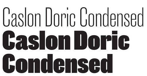

Paul Barnes’s contemporary interpretation takes its inspiration from Doric No. 4 (1879) and adds a lowercase (where it was missing), plus a wide range of weightsand widths.
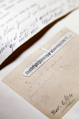
The Caslon foundry scrapbook at St Bride Library. The book dates from the 1930s, but contains proofs from the foundry going back to the 1870s.
Smoke proof of Doric Condensed No. 8, from 1894. A smoke proof was made by the punchcutter holding his punch above a sooty flame, then pressing it on to paper. This enabled the punchcutter to examine the work in progress.
Spread showing proofs of Doric.
Caslon Sans Rounded. Foundry: Henry Caslon, 1836. Design: Paul Barnes, Tim Ripper & Christian Schwartz, 2010-17. Barnes says: ‘This is the first rounded typeface. You look at it and think – that can’t be 1836!’ Its lower case and italic forms are contemporary inventions: these letter styles are derived from condensed egyptian typefaces issued by Caslon in the 1830s.
Caslon Rounded punches at St Bride.


Thorowgood Grotesque. Foundry: Thorowgood, 1833. Design: Paul Barnes & Greg Gazdowicz, 2005-18. The first sans with a lower case was made by the Thorowgood foundry.
A Specimen of Printing Types, Thorowgood & Co., 1840.
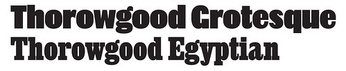

Thorowgood Egyptian. Foundry: Thorowgood, 1834. Design: Paul Barnes, 2018. In the 1830s, Thorowgood introduced other condensed styles, including serif faces, ornamented and egyptians, as did foundries such as Caslon and Blake & Stephenson. Similarities in form suggest they were cut by the same punchcutter.
Page from the specimen of the Fann Street Foundry, Thorowgood & Co., 1850.
Thorowgood Egyptian founder’s type in the collection of St Bride Printing Library.
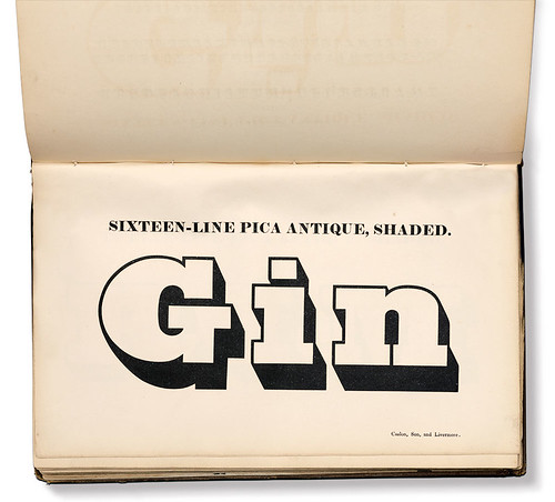
Caslon Antique Shaded. Foundry: Caslon & Livermore, 1830s. Design: Paul Barnes & Tim Ripper, 2005-17.
Caslon Sans Shaded No. 1 and No. 2. Foundry: Caslon & Livermore, before 1839. Design: Paul Barnes & Jesse Vega, 2010-14.

Thorowgood Two-Line Grotesque Outline. Foundry: Thorowgood, 1834. Design: Paul Barnes & Tim Ripper, 2008-17. Blake & Stephenson Two-Line Sans Shaded. Foundry: Blake & Stephenson, 1839. Design: Paul Barnes & Tim Ripper, 2008-17. Caslon Doric Outline. Foundry: Henry Caslon, 1842. Punchcutter: Eugene Boileau. Design: Paul Barnes & Tim Ripper, 2008-17.
Caslon specimen books, 1830s. Shading – the effect of adding a shadow to a letterform – became popular in the 1830s.


John L. Walters, editor of Eye, London
First published in Eye no. 98 vol. 25, 2019
Eye is the world’s most beautiful and collectable graphic design journal, published quarterly for professional designers, students and anyone interested in critical, informed writing about graphic design and visual culture. It is available from all good design bookshops and online at the Eye shop, where you can buy subscriptions and single issues. You can see what Eye 98 looks like at Eye Before You Buy on Vimeo.