Autumn 2006
‘No muscles, no tattoos’
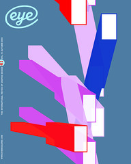
Each of Jop van Bennekom’s eccentric magazines perches precariously at its niche’s edge
Jop van Bennekom chose American Typewriter for the text face of Butt because he thought it was a really gay typeface. It enables the Q&A (Question and Answer) sections to evoke the immediacy of typewritten transcripts, while being rounder (and according to Van Bennekom ‘faggier’) than Courier. But, as if to modify its perceived effeminacy, he uses a ‘scruffy’ version of the typeface that has bad spacing and kerning. He is less equivocal about using Compacta for the headlines: ‘It’s very leather. Rough, buff and masculine.’ But this is qualified by the fact that the interviews and soft-core gay porn are printed on paper the colour of a strawberry milkshake.
I meet Van Bennekom in Amsterdam. The studio from where he and journalist Gert Jonkers, his partner in Top Publishers, produce Butt and style journal Fantastic Man is spartan. The wall above Van Bennekom’s desk is almost bare save for a note and two black-and-white images tacked into the plaster with pins. In his hand is a to-do list at least 40 items long, typed and with some annotations in blue biro.
Butt was established in 2001, around the time Van Bennekom was beginning to attract critical attention for Re-Magazine, a series of self-referential explorations of the marginalia of existence. The first eight issues of Re- each used a different thematic lens (the home, boredom, sex, or re-connecting with one’s past) to look at daily experience. In 2002, with issue nine, it changed direction. Since then, each issue has been devoted to one person. Marcel delivers three monologues on his relationship to food and dieting in an issue called ‘Food Coma’; Hester, a failed screenwriter from London, was interviewed and photographed extensively as a way to examine some of the issues surrounding depression.
Andrew Blauvelt, design director at the Walker Art Center, mentioned Re- in an article in Eye (no. 35 vol. 9) and included the first eight issues in a show he curated at the Walker called ‘Strangely Familiar: Design and Everyday Life.’ He says: ‘Aesthetically and conceptually it was very much in tune with ideas about everyday life and culture at the time.’ Others concurred. It was written about in v Magazine, Frieze and The Independent on Sunday and included in the Design Museum’s ‘European Design Show’ and in Phaidon’s 2004 compendium of Dutch design, False Flat.
An addiction to otherness
Where Re- was sprawling, seeking a new form and identity with every issue, Butt had a defined, almost rigid, format and a distinctive language right from the start. The primary editorial device is the Q&A, direct and honest, like a verbal equivalent of the full-frontal nude. Van Bennekom believes in showing things in context. In Re- this is taken to an extreme. As part of his interest in slowing things down and the notion of boredom, in the early issues he focused on the seemingly trivial aspects of life. ‘I wanted to talk about napkins,’ he says of this period of his career. In Butt this impulse is toned down. The interviews still include ‘wrong questions and mistakes,’ and, if a meeting between interviewer and interviewee contained awkwardness and misunderstanding, no attempt is made to smooth this over in the editing. This is because Butt is a sex magazine that provides a space for imperfection. ‘I wish Butt had been around when I was 22 and insecure,’ says Van Bennekom. ‘Other gay magazines have cut-and-paste, retouched bodies unlike any you’ve ever seen in real life and certainly not like mine.’
Growing up in rural Holland, magazines like The Face, i-D and NME played a defining role in Van Bennekom’s teenage quest for identity. ‘I was addicted to otherness,’ he says. As a graphic design student at the Arnhem Academy of Art and Design, he found inspiration in the experimental work of fashion design students. Among them was his boyfriend of the time, Viktor Horsting, who would become one half of fashion house Viktor & Rolf. In his own department, he valued the teaching of designer Karel Martens, whose rigorous experimentation with the material qualities of print were an inspiration, but generally he was frustrated with the introspective, non-conceptual approach to design that his school favoured. Students worked with abstract forms, colour and typography but rarely with images. Van Bennekom wanted to use his newly honed typographic skills to ends other than themselves.
Focusing on magazines, especially alternative ones, was an unusual choice for a Dutch graphic design graduate in the mid-1990s; the presence of alternative media in the Netherlands was negligible. If Van Bennekom wanted to pursue a career in this field and stay in the Netherlands, he would have to start his own magazine.
To figure things out, he went to the Jan van Eyck Academie, a loosely structured postgraduate research programme in Maastricht. The one thing he didn’t want to do was to make a design magazine, a photography magazine or a fashion magazine. But in the late 1990s he was drawn to a new Parisian fashion magazine called Purple. The way it juxtaposed fashion and art intrigued Van Bennekom and confirmed some of his own ideas about interdisciplinarity. The idea of Re- as a magazine began to take shape.
When Van Bennekom proposed Re- as his thesis project, he wanted to interview his friends in detail – excruciating detail – about their homes and the things they surrounded themselves with. Armand Mevis, partner in the design firm Mevis & Van Deursen, an advising researcher at the Jan van Eyck Academie at the time, was sceptical:
‘It was not clear what such an endeavour could reveal or whether it would be an interesting topic,’ he recalls. Once he saw the results, however, Mevis recognised that ‘it was an exceptional project, a project which took a risk, and distinguished itself.’
Mevis encouraged Van Bennekom to convert what was a successful academic project into a real magazine. Van Bennekom obtained permission to use a small A2 offset printing machine in the basement that was usually reserved for Jan van Eyck-related print jobs. Olivier Zahm, Purple’s founder and editor, was one of the first to pick up Re-. He was drawn to the strength of its concept and its controlled aesthetic: ‘What I found especially intriguing was that it was almost boring, but somehow also interesting at the same time.’ This is just one of the paradoxes that characterises Re-. There’s no doubt that it’s a difficult magazine, one that resists understanding. Part of the difficulty comes from the fact that it treads such a subtle line between seriousness and irony, reality and fiction, celebration and cynicism, informality and artifice. And all within the space of one photo-shoot, one interview, or at the meta-level of editorial devices such as headlines, captions, the ‘Reality Check’ list at the end of no. 12 and the space on the back cover.
Van Bennekom was able to regulate all these variables to such a minute degree because of the extent to which he immersed himself in every component of the magazine’s construction. He wrote the texts, took the pictures, and edited and art directed the results. The subjects of the early issues were his friends. In this way he attempted to discover which role he wanted to play in his own media empire.
Reality and representation
Van Bennekom has not always designed for himself. But his work for a range of cultural clients tends to leave him dissatisfied. Even the role of art director of Blvd. – which he considered the only cutting-edge magazine in the Netherlands – held his attention for just a year. One of the drawbacks of working in a country with such a rich design culture is that the path to success is so well trodden, it becomes predictable. ‘You already know where you will be at the age of 45. Which clients you will work for and so on.’ For the graduating Van Bennekom this was not enough. ’
Blvd. brought the designer in contact with Jonkers, who was the magazine’s editor at that time and who recruited Van Bennekom based on the two issues of Re- that he’d seen. It was there that they began to discuss the nascent Butt. ‘We thought it was a good and commercially sound idea to launch a reality gay porn magazine,’ says Van Bennekom. Nevertheless, it took them almost a year to prepare the materials. They had to establish a tone and an aesthetic from scratch. Only a few photographers, such as Wolfgang Tillmans and Marcelo Krasilcic, understood what Van Bennekom was trying to create. None of Butt’s portraits is a studio shot; the pictures show real people in their own environments. That was one of Van Bennekom’s rules as he developed guidelines: ‘No muscles. No tattoos.’
A tight, almost tense, relationship between playfulness and seriousness, good taste and bad taste, the spontaneous and the mediated, brands it as Re-’s progeny and distinguishes Butt from the majority of magazines (let alone gay magazines) on the shelves today. ‘Everything in the magazine is considered a thousand times,’ says Van Bennekom. As you flick through Butt’s pages, printed in black on uncoated pink paper, one of the things that strikes you is how coherent it feels. This is because of the robust – even dogmatic – editorial-visual formula. It is also to do with the fact there is nothing to interrupt your experience of the magazine, such as ads for example. The inside few spreads front and back and the back cover contain colour ads. ‘It’s easy to forget how extremely radical it is to have Dior on the back of a sex magazine,’ Van Bennekom observes. But the one-page typographic ads throughout the interior, paid for by galleries and clothing stores, are all designed by Van Bennekom himself and therefore fit seamlessly with the rest of the content. The idea of designing artwork for the advertisers derives from the early days of the magazine when Jonkers and he thought their clients would be gay bathhouses, bars and clubs with ‘terrible artwork.’ But such places never took ads. In the first issue, Van Bennekom hand-drew the logos of their six advertisers. Half of them ‘were really mad,’ and didn’t pay. But now brands are eager to give themselves over to Butt.
Butt’s readers belong to a defined subset of hipster gay males – ‘Those with truckers’ caps from Brooklyn but also 55-year-old intellectuals from Paris, France.’ Van Bennekom had learnt about distribution through Re-Magazine and so he knew exactly which shops Butt should be in. At first they published it every five months in an edition of 750. Now they print 12,000 copies quarterly. ‘It was picked up by the fashion people,’ Van Bennekom recalls. ‘We knew that important people were reading it, like Tom Ford, Hedi Slimane, Karl Lagerfeld.’ Ordinary people read it, too, and they responded by sending in their own photographs, artwork and reports about their sexual encounters and exploits. There is now a ‘Readers’ Section’ at the back of the magazine for such material. ‘For me Butt is important,’ says Andrew Sloat, a graphic designer who lives in Brooklyn. ‘It has given voice and visual presence to those of us who are trying to figure out our own worlds.’ In a way, the magazines Van Bennekom makes are to do with representation – and the lack of it. ‘Not being represented means you have to start something yourself that does represent you,’ he says.
In 2004, as soon as Butt was starting to generate a little money, Jonkers and Van Bennekom decided to invest it in a new fashion magazine for stylish and style-conscious men in their mid-thirties. In other words, Fantastic Man is another magazine by and for Jop van Bennekom. ‘If you are about 35 what do you wear?’ he asks. ‘This season, I’m interested in what bag to wear. I really have no idea. So I’ll use the next issue to find out.’ The magazine is also a celebration of personalities. Again, Van Bennekom is clear about why: ‘I use Fantastic Man to meet my heroes,’ he says.
Nearly every decision made is in service of the text. Some pages are completely typographical and really dry. ‘But,’ Van Bennekom says, ‘we make sure the people we include are so fucking interesting that you have to read it.’ The headlines ‘Grey Suits …’ and ‘Mr. Wim Crouwel …’ and ‘Leather …’ are no-nonsense and precise but also lighthearted. Stacked in bald black Gill Sans caps on the contents page, the ellipses feel like an invitation to complete a statement. The contents page does not look that different from the to-do list with which he begins the whole process of compiling the magazine.
Van Bennekom is as much an editor as a designer. If he feels the need for a pull quote, a new headline, an extra-long subhead or a caption in order to visually complete a spread, then he will write one. Captions tell you something other than what you can see in the picture. Fantastic Man doesn’t use devices such as sidebars: ‘We’re not going to list ten facts about Wim Crouwel or whatever.’ He does use pull quotes, albeit reluctantly. ‘We use them to help the reader a little bit, but they are always absurd,’ he says. One of his favourites is in an article on musician Antony Hegarty. It says: ‘A fan knitted this sweater for me. I love it; it’s just my style.’
When compiling reference images for Fantastic Man, Van Bennekom leaned towards what he calls ‘positive images’ – photos where men are actually smiling. ‘I wanted to evoke a world where people are still amazed about things like travelling to Moscow, and say things like, “I just love that fishmouth collar on your suit.” ’ Fantastic Man is a calculated reaction against the mediated and ‘gloomy’ image of menswear fashion. Looking through images in GQ from the end of the 1980s, Van Bennekom noticed a very different kind of model from the ones in vogue today: older men rather than young boys. ‘Seeing young boys dressed in expensive designer clothes isn’t sexy. It’s just disconnected.’ In Fantastic Man, by contrast, the interview subjects – the editor of Italian Rolling Stone, a chauffeur from Rio de Janeiro and 78-year-old Wim Crouwel – model Yves Saint Laurent, Christian Lacroix and Jil Sander, as well as their own clothes.
Letting the featured personalities wear their own clothes is significant: it goes against the economic paradigm of conventional fashion magazines but it is also about the rejection of fashion as fantasy. The clothes are well integrated in each story, and they are always visible. Even when they don’t belong to the person wearing them, they seem to. And even where models are used, they have wrinkles, beards and moustaches, and are sometimes shot with their eyes shut or scratching their nose. In keeping with the formal, almost anachronistic tone, they always have a surname, as well as a first name. Here, Van Bennekom’s unblinking study of reality is applied to clothes but the same thing happens in Butt, where fantasy backdrops are rejected in favour of domestic environments that show everything but – and in one case including – the kitchen sink.
Articles in Fantastic Man are introduced in a leisurely fashion. In each case a full page is devoted to a title and subhead set in centred capitals, detailed with rules and underlines. The inspiration for these pages again comes from newspapers, but also from traditional English pub signs with their capitalised serif typefaces. Graphically, Fantastic Man looks formal; a return to good manners. Van Bennekom uses Times, a typeface he feels has endless flexibility, and is calculated to convey a casualness that feels very contemporary. The choice of Times Ten, a version with wider characters and slightly stronger hairlines, hints at just how much care goes into creating the effect of nonchalance.
On the subject of staples and paper stock
‘I was nervous about designing Fantastic Man,’ Van Bennekom says. ‘Because I felt as if I hadn’t actually designed Butt – it’s like a dollar bill: it doesn’t change.’ In fact, several times in our conversation he makes the claim that his design is ‘almost nothing.’ But as soon as he begins to describe his design process it becomes clear that ‘nothing’ can be very complex, dense and tightly controlled. ‘It’s a few basic typefaces and some rule lines and, of course, language,’ he says. ‘Oh, and editing. Designing is definitely a form of editing. And I always try to have a clear idea and concept and let every detail correspond to that concept; that’s why I sit on things forever. They become really good when I can control everything.’
While ‘magazines are usually about diversion,’ for Van Bennekom, ‘it’s the opposite of that. I really want it to be about concentration: very focused instead of scattered.’ Whether or not there is any room for other visions, other creative voices, in his work – especially in such a personal project as Re- – is a question he wrestles with. ‘I wanted to explore depression in a very particular way,’ he says of no. 12. So how can you get other people to contribute to that idea?’
He has moved beyond the early days of Re-, when he wrote and designed everything himself. But working with other people is still an unresolved experiment. ‘There’s no such thing as a standard procedure,’ he says. ‘Do you give a photographer a whole folder of reference pictures or do you give him just two words?’
He often asks people in the US (where Butt sells a third of its issues) where they think Butt comes from. ‘A lot of them think it comes from Brooklyn!’ Given the global fluidity of his products and the international range of his collaborators and subjects, it might seem odd that he is still based in Amsterdam rather than, say, Paris, New York or London. But being slightly outside the fashion and media fray is a surely a good thing. As he observes, ‘Here we’re never a threat to people.’
Van Bennekom’s relationship to media is complicated. It combines nerdish enthusiasm and cool detachment, the desire for success and the audacity to make 180-degree turns when you least expect them. What is compelling and mysterious is how he has managed to document such a deeply personal view and disseminate it so widely. Fantastic Man is only three issues old, and it is already reaching 20,000 readers. Mentions of Butt and Fantastic Man in the New York Times and its magazine earlier this year indicate that the titles are becoming works of cultural importance. ‘These magazines discuss magazines, the glossy, but also themselves,’ says Mevis. ‘They are ironical, serious, useless, but never pointless.’
Van Bennekom’s relationship to his publications is equally complicated. His magazines are what he calls ‘real players’ in that he works with – calls in favours from – the best names in the business. He participates willingly in the dramatic staging of reality through his highly directed photo shoots and ultra-controlled graphic design. And yet the success of his stable of publications derives, counter-intuitively, from the precariousness of his perspective – his wilful and relentless awkwardness. As readers, we are drawn to follow Van Bennekom on his solipsistic journey of examination – from the dust bunnies on his friends’ floors to the range of realistic possibilities from which to reaffirm his gay (and his aesthetic) identity. Despite the singularity of both his subject matter and his viewpoint, we can all relate to the imperfection that he renders so perfectly.
First published in Eye no. 61 vol. 16 2006
Eye is the world’s most beautiful and collectable graphic design journal, published quarterly for professional designers, students and anyone interested in critical, informed writing about graphic design and visual culture. It is available from all good design bookshops and online at the Eye shop, where you can buy subscriptions and single issues.