
Summer 2017
Obsessive meditations
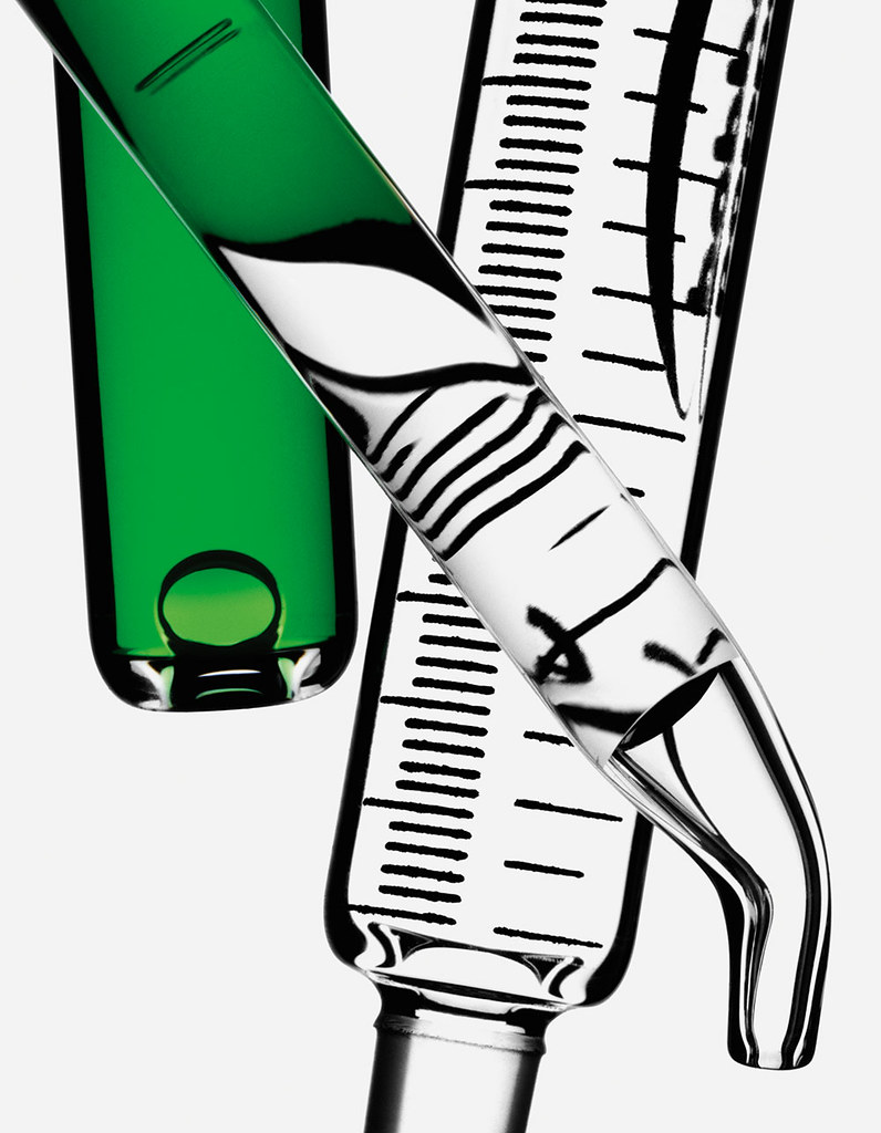
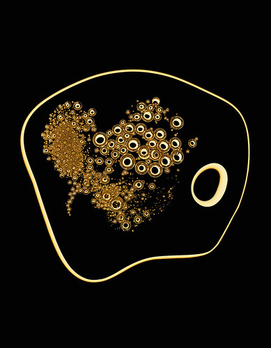
The photography of Robin Broadbent takes still life photography to minimalist extremes
UK photographer Robin Broadbent left the UK for New York in 1999. Though he had published some personal work in the photobooks Marmalade and Minus Sixteen (both published by Browns), he had become frustrated with the still life photography he was asked to do by London art directors. In New York he found a milieu more appreciative of his talent for ‘lighting and shooting objects beautifully’, and his career began in earnest. He has worked on advertising campaigns for luxury brands such as Rolex, Burberry and Prada and has shot editorial stories for magazines including Harper’s Bazaar (when edited by Fabien Baron), GQ, Intermission and W in the US and Port in the UK.
Mixing commercial practice with personal work, he has exhibited in solo and group shows in London, New York and Los Angeles. His latest work, The Photographic Work of Robin Broadbent, is a sumptuously printed photobook for Italian art publisher Damiani, which develops further the patient and obsessive investigation of shadow and texture seen in his work for big brands. It features a bold sequence of images, predominantly black and white, with what Broadbent calls ‘pockets of colour’. Some of the prints are identifiable as familiar items shown large: pills, crayons, pipettes, a syringe … a monstrously large gold tooth. There are silhouettes of combs, brushes, fishnets and knives, plus patterns and structures and shadows that are impossible to identify; Broadbent’s work has a graphic, reductive simplicity.
The book was sequenced by Broadbent with designer Doug Lloyd, ending with three pages of notes – a list of studio equipment, the materials against which objects were shot and some of the photographer’s gnomic musings: ‘The smell of a freshly pulled 8×19 Polaroid,’ or ‘30 years of reduction reduction reduction’.
‘You have to try and make a strong picture,’ he said (in conversation with Richard Krzyzak). ‘There are a lot of black lines in the book … It is about line but I like to keep a little bit of each item in the picture, it’s not abstraction for the sake of pure abstraction.’
‘I spend a lot of time trying to get rid of stuff from a picture, trying to minimise any distraction from it. Sometimes I feel that even the lines have a sense of moving; they’re contained within the crop or the frame but they have the potential to move. In the past few years I have resolutely pursued the endless search for lighting and photographing things beautifully. With editorial, there’s no one in the studio. It’s down to me and my thoughts and what I want to do.’
Some of the book’s images have their origins in commercial work, for example the close-up images of dried seeds and their shadows, first shot for French style magazine Numéro. ‘It took days moving little seeds around, comparing prints, looking at how they sat compared to previous arrangements, extending the shadows,’ said Broadbent. ‘The process is meditative and exciting in its tranquillity.’
Richard Krzyzak, art editor, designer, London and Hampshire
Andrew Robertson, writer, London
First published in Eye no. 94 vol. 24, 2017
Eye is the world’s most beautiful and collectable graphic design journal, published quarterly for professional designers, students and anyone interested in critical, informed writing about graphic design and visual culture. It is available from all good design bookshops and online at the Eye shop, where you can buy subscriptions, back issues and single copies of the latest issue. You can see what Eye 94 looks like at Eye before You Buy on Vimeo.