Winter 2007
Reputations: Ken Garland
‘The Nazis had the most effective corporate identity ever – this should warn us. That evil, horrible regime had this superlative corporate identity in which they didn’t tolerate any diversity.’

Ken Garland is a designer known for his outspoken views, foremost among which is an insistence that the role of graphic designers is to convey other people’s messages – rather than introduce messages of their own.
This paradox he reconciles in practice by designing with unfaltering respect for the client’s material, and leaving it to his writing, lecturing, teaching, photography and political campaigning to provide the channels he needs to express his own ideas. His warmth and generosity as a person is complemented by an absolute integrity about his work.
But although he is a key figure in the development of graphic design since the mid-twentieth century, Garland’s design work is less known than that of his peers. He rarely exhibits it. He never publicly discusses it. He is interested in communicating ideas but believes his own interpretations of those ideas should speak for themselves. Those who are familiar with his name know about certain strands of his work but few have the full picture. Following a series of interviews with him, however, I have been able to put many of the pieces together. Garland is a designer who deserves greater recognition, and whose experiences offer some crucial insights for younger generations within the graphic design community.
Garland graduated from the Central School of Arts and Crafts in London in 1954, where his fellow students included Derek Birdsall, Alan Fletcher, Colin Forbes, Peter Wildbur and Philip Thompson, some of the most highly regarded designers of their generation. He worked as art editor of Design magazine from 1956 to 1962, during a postwar era that was on the cusp of huge social change and an explosion in the creative arts.
In 1962 he left the magazine to establish his own graphic design studio, Ken Garland & Associates (KG&A). His early clients included Galt Toys, Which? magazine, Barbour Index, Race Furniture, the Butterley Group, the Labour Party, the Campaign for Nuclear Disarmament, Paramount Pictures and the then Ministry of Technology. Since the late 1950s, he has also taught at establishments such as the Central School, the University of Reading, the Royal College of Art and the University of Brighton, as well as lecturing internationally. He also written five books about design, and contributed to more than 30 design publications, including Typographica, the Penrose Annual, Blueprint, Baseline and Eye. Garland famously wrote and published the First Things First manifesto in 1964 (see Eye no. 13 vol. 4).
Photography, always an interest, has in the past few years become a preoccupation, resulting in a book and two large exhibitions to date. Garland is currently working on three photography projects: an exhibition of detritus on Pollan Strand, County Donegal; an exhibition entitled ‘In Praise of Rust’; and a small book entitled A Close Look at Pebbles.
CND (Campaign for Nuclear Disarmament) banners outside Windsor Castle, 1963.

Anne Odling-Smee: Your generation at the Central School became very influential – why?
Ken Garland: I don’t suppose we were any cleverer than any other year, but there was a combination of the right kind of teachers and the right kind of atmosphere. I think there was a general feeling that we should be modernising and extricating ourselves from the strangely isolated attitude about design that had existed in Britain up to then, dominated by things like private presses and opposed to the Continental school.
Something explosive did happen in the 1960s, and my generation happened to be around just at the time when certain people felt the need for us. I guess it looks significant because there were so few of us – there were a dozen at the most who had their fingers on the certain pulse.
AOS: When you left Central, Jesse Collins, the college’s head of graphic design, helped set you up with a job. Did he do this for all of you?
KG: I do know he got quite a few of us jobs. Well, there weren’t that many of us. The only place where decent training in graphic design was going on was the Central School, so it wasn’t perhaps too difficult to get us landed.
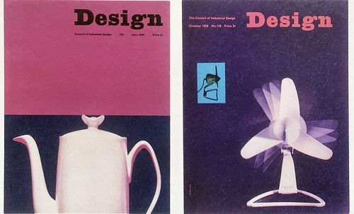
Covers for Design, June 1960 and October 1958.
My first job was on a trade magazine called Furnishing at £5 a week. After eighteen months I got another job as art editor on Design. I stayed there for six years and I loved it. In 1962 I left. I was enjoying it and beginning to make the kind of changes I had always wanted to make, but I also had freelance work and couldn’t hold down all these jobs. From then on I was full of work and was for the whole of my 40 years as a consultant graphic designer.
AOS: So you were constantly busy?
KG: Because of one client, there never was a time when we would have nothing to do. That client was Galt Toys. We started designing wooden toys for them, then games, on the basis of “we present you with the idea and if you like it we do it and if you don’t, don’t worry.” They would produce the game under licence from us and pay us royalties. If we ever had a Friday afternoon where there didn’t seem much to be doing, one or other of us would start thinking up another idea for a game or something.
AOS: Is this one of the reasons you’ve enjoyed your career so much, because you did things that enabled you to be very creative?
KG: I don’t think it was planned, I think it was luck that I had this client or that client whose work stimulated some other sort of responses. And it was also luck that I got into congenial teaching in 1958. Jesse Collins ‘dragooned’ me into teaching [at the Central School] while I was still working on Design magazine, and I found I enjoyed it enormously. I always have. It’s difficult to imagine a career in graphic design that doesn’t involve some teaching.
AOS: After teaching at prestigious London design schools such as the Central School and later the Royal College of Art, you surprised many in 1972 by joining the Typography course at the University of Reading. Why?
KG: I was invited to Reading by Ernest Hoch and Michael Twyman when the course was only a year or so old. They desperately needed another practising graphic designer to offer practical experience to the fourth years so that they wouldn’t be entirely embedded in an academic environment. I wasn’t invited because I was scholarly, but Ernest knew I would have some sympathy with the course, which I did. I very much liked the idea that the students were given such a wide span of background information – I thought this would make them good designers who would be able to tackle many different things and to feel on equal terms with clients, and not just to feel like people scurrying around putting the icing on their cake.
AOS: You did a lot of writing at that time, didn’t you?
KG: My first written piece was in 1959 for the Penrose Annual, called ‘Structure and Substance’, comparing Swiss and American graphic design. I chose Saul Bass to represent the United States and Karl Gerstner to represent Switzerland, and said that British design should take its cue from both Swiss graphic design, which was highly disciplined and very conscious of production values, and American graphic design, which was much freer. We could blend them, and make the best of both of them. I do think that’s what we’ve done, in fact. That was the first piece of serious writing I’d done, and I’ve been doing it since.
AOS: The following year you spent a month visiting Swiss graphic designers.
KG: Yes, this was an important experience in my life. I was, at my own suggestion, commissioned by Design magazine to go to Switzerland and find out how graphic design worked over there, and in particular how periodicals came to be so well produced and printed. Because of the Penrose Annual article I had made Karl Gerstner’s acquaintance, and he introduced me to maybe a dozen Swiss designers. I learned about their care for production values. They all knew a lot about printing and they had a personal relationship with printers and publishers. I brought that back with me to the UK, though in the end I had to say, well, their ways are not our ways!
AOS: You’ve gained fame as the originator of the First Things First manifesto (1964). How did that come about?
KG: The manifesto was written in the heat of the moment. I was at the back of a conference room when there was a sort of debate going on about why younger designers should join the Society of Industrial Artists (SIA). I went along because some of my chums were going, but all I wanted to join was a trade union. I joined the National Union of Journalists, and then the National Union of Teachers. I had been a founding member of D&AD in 1962 but I left after the first year because I thought the advertising people were taking over. It wasn’t that I didn’t like advertising, I just didn’t feel part of that scene.
The manifesto was meant to be an alert to the fact that monies, which were pouring into visual communications of all sorts, seemed to be going down the wrong channels. There were all sorts of things that we could have been about and we weren’t. I hardly expected it to raise any interest but I got this terrific reception.
AOS: How do you feel about its reissue by Adbusters magazine in 1999?
KG: It was a little strange that it was in virtually the same form. I would have liked another form, maybe a CD-ROM, but I thought at least it has alerted more people than the original manifesto did, so it can’t be doing any harm. But there was the same misunderstanding about it now as there had been then. I get asked to talk about ethics, and they mention ‘your anti-advertising manifesto’ and I say: ‘Read it again please!’ It’s not anti-advertising. And it isn’t primarily about our ethical attitude. It’s not that I discount ethics, but I was talking about what seemed to me to be a political and economic point, about the way we spend money. That was my concern.
AOS: How does your work for the Labour Party and the Campaign for Nuclear Disarmament (CND) relate to your views as a designer?
KG: I did a lot for the Labour Party in the 1960s and early 70s. I’ve got quite strong views as a socialist, but that is as a voter, a citizen, and I may make all kinds of claims and statements on that basis. As a designer I have different attitudes, but it’s not that I abandon my political views, otherwise why would I have written that manifesto?
AOS: What about your involvement in the student sit-in at Hornsey College of Art in May 1968?
KG: I was a governor of the college and had resigned in 1967 – before the sit-in – because, like the students, I disliked the way the course was being run. The students asked me to join them, so I agreed. I was there on the first night of the sit-in, on the platform. I felt very embarrassed because I didn’t think I belonged there: I wasn’t a teacher, I was a retired governor, that’s all. But I became a sort of friend of the sit-in. I went to quite a number of their seminars, and to one very notable seminar with Nikolaus Pevsner as the invited guest.
AOS: You seemed to participate at a lot of design conferences during this time, both in the UK and internationally.
KG: I wasn’t a great conference-hunter at all, but I was sometimes asked to do a paper. The first one of any significance was in 1967, in New York – my first visit to the United States – a conference on the theme of ‘Design for Survival’. My contribution was called ‘Here are some things we must do’, an echo of a very serious lecture by Lenin called ’What is to be done’, and there were quite a few Marxist quotations in my piece as well! Well, that was quite fun.
AOS: Is it true that that you fired a starting pistol in one of your lectures in the 1960s?
KG: I was giving a lecture at the ICA and talking about attention-grabbers and ‘the trouble with advertising’ and other sorts of things, and I said, ‘Some attention-grabbers are irresistible, like this one, for example’, and I took out a fake pistol and fired it. It’s something I would never do now! This was back in 1964 or ’65, and I think it was a stupid idea and I would never do it again.
AOS: But your messages were serious, particularly with regard to corporate identity?
KG: I am seriously concerned about whether as graphic designers we should continue to immerse ourselves in corporate identity. I believe in doing identities for small and medium-sized companies, but I think a corporate identity for a large company is deadening, because it means we’re going to be confronted by identical imagery wherever we look. It’s an affront, and I don’t think we should do it. Now you could say, if something’s going to be everywhere, let me try and find a way in which it’s restrained. Sounds like a nonsense though, doesn’t it?
AOS: So this is why you advocated identities with inbuilt difference?
Catalogue for Galt Toys, 1969-70. Design: Ken Garland & Associates (KG&A).

KG: I have been advocating diversity from the late 1970s onwards but I don’t see much evidence of this. It has always been an absolute criterion for me: when we were working for Galt Toys, although we used the same logo, we twisted it round and did umpteen versions of it and never let it stay the same. It does require effort, of course, and commitment on the part of the people who are then going to take it on a stage further or do their own version of it. And it does require a creative response. A style shouldn’t impose, it should always, as it were, arrive, be taken in, absorbed.
If we look at any movement, religious, cultural, national or supra-national, and that movement is dedicated towards some kind of homogeneity – like, say the Nazis, who had the most effective corporate identity there has ever been – this should warn us. That evil, horrible regime had this superlative corporate identity in which they didn’t tolerate any diversity. Everything was to be subjugated to this form. And this is the forerunner of what we have now: we are faced with this inhuman imposition of imagery when what we really want is to celebrate how different we all are.
We have to grapple with ourselves over this, because this notion of implanting a brand is very enticing. And I am wary of tying up students with dos and mustn’t dos. But they should be made aware, by whatever means. Making jokes is a good way.
Maybe we’ll come out the other side. Maybe the whole buttoned-up thing will just dissipate. There are, after all, thousands of people who don’t like stereotyping. Stereotyping is bad for everyone in every way. It’s bad for the outfit because people think it’s boring, it’s bad for the designers because they don’t have any new thing to do, and it’s bad for anyone with any motivation because they can see what could be done and they can see it’s not happening.
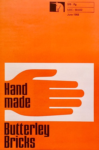
Information leaflet for Butterley Bricks, 1968. Design: KG&A.
AOS: You turned down Paul Rand’s invitation to handle the UK end of IBM. Was this because it was a corporate identity?
KG: Paul asked me if he could put my name forward and I said yes, but I had a reservation. When I was invited to an interview with the chief executive of IBM, I insisted that before we met he read my introduction to a little book I’d produced called Ken Garland & Associates: Twenty Years of Work and Play, in which I said that we had never had any taste for working for multinationals, and that the few examples we had were not very satisfying, so we had avoided them. He sent back a letter saying: “Thank you so much for answering me and for your courtesy of informing me about your piece. I think, in the light of that, it probably would be best if we didn’t meet.”
It wouldn’t have worked any way. For two reasons. First of all, I did have an aversion to working with giant bodies where you could never work out who was having the last say about who was approving what you had proposed to do. And the other one was that [the identity] had already been designed by Paul Rand, and all one would be doing would be adaptations. And I would never want to do that; with the greatest respect for Paul, who I thought was a superb designer, I wouldn’t want to be following his footsteps.
AOS: But if you don’t take on these jobs another designer always will. Had you designed some of these multinational companies perhaps they might not look as bad now as they do?
KG: Well, that’s flattering, but I don’t think that’s true. I wrote an article for Blueprint in 1991, ‘The rise and fall of corporate identity’, and in it I said that big organisations couldn’t produce a graphic image for themselves that was anything other than dominant and overwhelming and yet unimpressive. They manage to be ubiquitous, powerful-looking and unappetising all at the same time. It’s in the nature of the beast.
AOS: But Paul Rand’s identity for IBM was good.
KG: Well, he had a unique relationship with the top man at IBM. Paul Rand was not like the people who did the Olympics 2012 logo, a big organisation of 180 people. Paul was only one man plus assistants who came and went as he needed them. However, the IBM logo shouldn’t have gone on and on any more than the Coca-Cola one should. They were very good, but you know, it’s stultifying. Where do you go? The best thing that Paul Rand ever did for them was that wonderful poster that had an eye – a real eye – and a bee, and then just an ‘M’. It was a brilliant piss-take on his own logo. But it could only be changed by him, basically, because if you brought in another person he would be under instruction. So that is the problem.
AOS: Coming back to your own design work, would you say that over your career your style moved away from Modernism?
KG: At one time I would design exclusively with asymmetric typography and tended to favour sans serif – I still like it very much and use it in quite a lot of my books – but later I saw that that was too prescriptive a way of designing, and that one could design in different ways according to the subject matter. I certainly didn’t reject Modernism but I didn’t agree with those who said there’s only one way to design, and that is asymmetrically, using, preferably, Helvetica. That seemed to me terribly narrow-minded and over-simplified. I still think so, of course. And I think they think so now too, probably.
Programme cover for the St Pancras / Camden Arts Festival, 1966. KG&A worked for this annual festival from 1964-67,

AOS: Have you been influenced by any other designers?
KG: I would name one: that’s Hans Schleger. Hans Schleger was a Modernist to his fingertips, but he also loved using features that you might well have thought belonged to the past. One of the most influential books for me was a book written and designed by Schleger and published in 1946 called The Practice of Design. I came to know him and be his friend later, but long before that he became important as a guy who seemed to have the cue for modern design.
Saul Bass and Karl Gerstner were also important to me. I wouldn’t say Karl’s design work was so much a model; I liked the way he flourished his ideas. Swiss graphic design to a large extent avoided intellectualising – it was concerned with formalising. Karl liked to formalise but he also liked to intellectualise. I regarded Hans Schleger like an uncle, and Karl Gerstner more like a brother, and Saul Bass I suppose a bit between the two.
AOS: Did most of your inspiration come from non-designers then?
KG: I’ve always been interested in photography and I would have to say that John Heartfield is another of my influences. Very much, and he still is.
If you want to name the most dominant influence for me visually its William Blake. I have a whole shelf of his books – I completely absorbed his work. The other one is Piero della Francesca. He’s a great designer – he has as much to say about design as he has about art. Rather in the same way as Michelangelo, but for me Piero della Francesca is ‘the man’. When I was working on Design magazine, which was quite close to the National Gallery, I would go every week and sit and look at the Piero della Francesca Nativity for a quarter of an hour or so. It was like a necessary injection. You learn so much about design there, about the counterpoint, contrast, the balance of forms.
Film makers are designers, too – directors like Eisenstein and John Ford design their frames in the most immaculate fashion. And Jean Cocteau: Orphée is one of the most beautifully designed films I’ve ever seen. Ingmar Bergman’s Wild Strawberries is another of my favourite films.
One friend who was very much an influence on me was Alfred Wainwright, with his guides to the Lakeland Fells. He was an amateur photographer, amateur illustrator, amateur writer and amateur designer, and he brings the word amateur into its true meaning, which is a person who loves things. He just found the right way for him to record the things he loved.
Harry Beck’s London Underground diagram was another influence. Harry wasn’t a great influencer outside the diagram. He was a very limited designer, but within that limitation he was absolutely superb.
One of the things that’s been most invigorating to me as a graphic designer has been my discovery of Mesoamerican culture. Because I found myself teaching in Mexico I was confronted by the art of the Maya, the Toltec, the Zapotec and the Aztec, and other Mesoamerican people, which is so beautifully imaginative. It has so much stimulating imagery, which is at first sight exotic and ‘other’, and difficult perhaps to relate to, and yet eventually one peers through it and discovers all kinds of models one can use.
In Bangladesh I learned that you can do without the orthodoxies of graphic information. They’re not used to things like street signs and house numbers so you do need to throw yourself on the mercy of the population! It’s quite good to rely on people helping people to find your way around.
I’ve always thought it was terribly important to be able to say to someone: ‘You don’t need this – you can do without this symbol or you can do without this sign.’ I think graphic design will only come of age when it can take on these sorts of questions, and sometimes answer them by saying, what you need here isn’t graphic design it’s whatever else. Or maybe nothing.
Anne Odling-Smee, designer, art director, London
First published in Eye no. 66 vol. 17 2007
Eye is the world’s most beautiful and collectable graphic design journal, published quarterly for professional designers, students and anyone interested in critical, informed writing about graphic design and visual culture. It is available from all good design bookshops and online at the Eye shop, where you can buy subscriptions and single issues.