Spring 2011
Reputations: Kris Sowersby
‘New Zealand is a young country and hasn’t had the time, or resources to develop a typeface culture. I am free to draw upon multiple influences. I haven’t been taught or exposed to any one particular typographic heritage, so my hand isn’t biased.’
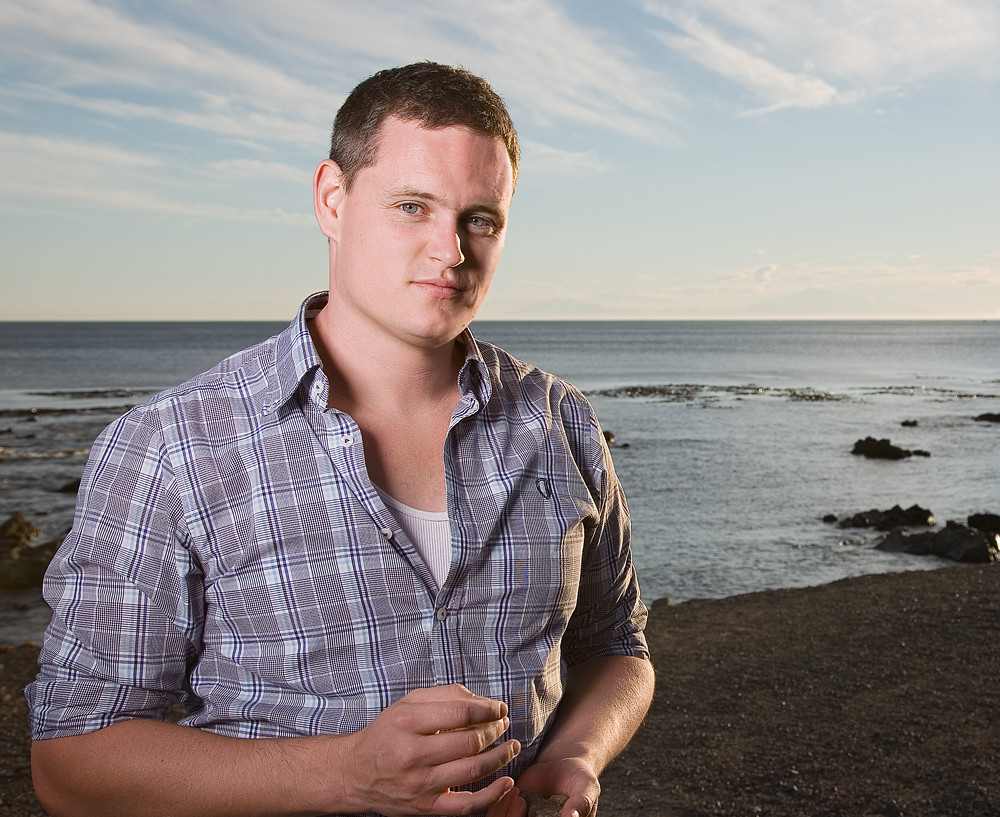
In the past few years the Klim Type Foundry has released a succession of finely crafted typefaces that have been as notable for their range and engagement with typographic history as for their immaculate execution. Klim is the work of one man, Kris Sowersby, a young New Zealander with a prodigious talent for drawing letters.
Sowersby, born in 1981, is largely self-taught as a type designer. He studied graphic design at Wanganui School of Design in New Zealand, graduating in 2003, and typeface design was just one module. But he was already in love with letterforms, and in 2005 the Klim Type Foundry was born. Its first commercial release was the curvaceous Feijoa (2007), followed by National (also 2007), a vivid grotesque that delves deep into pre-Akzidenz history for inspiration yet comes out with a remarkably assured lightness of touch. National captured the spirit of the moment, winning a certificate of excellence from the Type Designers Club in New York in 2008. A slightly revised version is currently in preparation, along with Condensed and X-Condensed variants.
By this time Sowersby had also developed custom typefaces that would themselves win TDC certificates of excellence and a new degree of exposure – in particular Serrano and Hardys (for the wine-producer) – as well as wordmarks. In 2008 he released Newzald (an accomplished interpretation of the work of Fleischman and Rosart), which was featured, with National, as a guest typeface in Eye 72, and later the mellifluous Karbon (2009), a reading of modernist essays into pared-back type, through which influences run deep without ever surfacing in direct quotation.
Sowersby collaborated with Christian Schwartz and Erik Spiekermann on FF Meta Serif (2007), and with Chester Jenkins on Galaxie Copernicus (2009, used in Eye 76), a re-examination of Plantin.
This led to the sprightly Tiempos (2010), designed with newspapers and magazines in mind, and now highly visible in the iPad app The Daily. Here it is joined by FF Unit Slab, also by the Spiekermann / Schwartz / Sowersby collaboration, and principally by Sowersby’s own Founders Grotesk, another literate typeface informed by historical type specimens and yet unburdened by them.
In 2010 Sowersby was named an ADC Young Gun; in the same year he spoke engagingly about his practice at TypeCon. The Klim Type Foundry’s fonts are marketed globally through Village, the compendium of typographic voices marshalled by Chester Jenkins in New York.
Like all Sowersby’s work, Karbon, Tiempos and Founders Grotesk are meticulously drawn. This dexterity might be seen as providing a kind of gloss, a sheen of professionalism that militates against individuality or originality, but in Sowersby’s case the reverse is true. His various raids on typographic history have produced a collection of typefaces that is wide-ranging, diverse, yet marked by a consistency of hand, and an inventiveness and freshness of thought that is distinctively his. The seemingly effortless execution heightens the detail qualities, rather than flattening them. While avoiding obvious attempts to create an ‘original’ type he has built a body of work that stands collectively as a particularly individual achievement. And there is more, much more, to come …
Mark Thomson: What made you want to design type?
Kris Sowersby: At design school I became enamoured with typography. I loved the simplicity of its raw state – arrangements of black and white space on the page. One day I decided to copy a typeface by pencil in order to understand it better, much like apprentice painters copied the masters. The typeface was Bembo and I remember drawing the lowercase ‘n’ and realising that the right-hand leg was slightly curved. Cheeky Bembo! It made me understand that typefaces are full of beautiful subtle details, all conscious drawing decisions by the designer. After this I began to obsessively draw crude letters and rough proto-typefaces. I thoroughly enjoyed drawing letters and decided to pursue it as a career.
MT: How did you learn?
KS: We had one elective of typeface design at Wanganui, but apart from that I’m self-taught.
MT: Who has inspired you – did you have ‘heroes’ at this stage?
KS: Those are two different questions, really.
I have been, and continue to be, inspired by many designers, from the anonymous punchcutters of the old foundries through to the contemporary digital ‘superstars’. There are interesting bits in all the nooks and crannies of typographic history, and I’ve only scratched the surface. Inspiration for me doesn’t necessarily come from the shapes of letters, but also from the practices of other foundries – that many of them even exist and continue to (presumably) remain profitable is heartening. I can’t name any names, I’ll invariably forget someone and the list would be too long. As for heroes, I don’t have any, sorry. That implies a sort of blind devotion and admiration. I prefer to retain a bit of critical distance, helps me to keep perspective.
MT: How did Feijoa, your first release, come about?
KS: Well, you have to start somewhere! I was very interested in book typography at the time, and had attempted a few small freelance typesetting jobs. I didn’t want to tackle anything too adventurous, so a small serif family seemed perfect – Regular, Small caps, Italic, Bold and Display. Just enough to complete smaller typographic tasks, and similar in stylistic range to Underware’s Dolly. But stylistically I was interested in letterpressed book type, the warmth and weight of it. I wanted to strike a textural balance between softness and firmness. It was also the typeface that got me accepted into Village, and took me four years to finish. I consider it my learning typeface.
MT: Interesting that you should mention looking at letterpress book type; Newzald looks to me like it has taken on the challenge of conveying that warmth and weight in a type made for offset printing, even on smooth paper.
KS: I don’t recall it being a conscious effort. But it was started during the process of Feijoa, and I suppose the resulting darkness and heft on the page bubbled through subconsciously. I don’t particularly care for spindly, brittle digital text typefaces. I prefer a bit of meat on my bones. There have been a couple of recent faces that offer two slightly different text weights. I’m thinking of Kai Bernau’s Lyon here. It’s different to the concept of grading like Poynter Oldstyle Text, Miller News or Mercury Text. Just thinking about these options for fine-tuning text makes me realise what a bountiful age of type we live in.
MT: The first clear example of closely graduated weights for me was Fred Smeijers’ Arnhem, which has a ‘Blond’ weight just inside of the regular, that gives a slightly more relaxed, less insistent tone…
KS: Arnhem is so lovely, I learned to love it via Hyphen Press books. The other interesting thing about Arnhem is the multi-weight duplexing. I’m not sure how practical it actually is, but it’s interesting nevertheless.
MT: Picking up your point about brittle text faces, there are so many examples: Monotype Bembo foundry vs photo and digital; Gill Sans; Joanna. Some of them are practically unusable in digital form – their relationship with the paper seems tenuous, cold; as if they might blow away.
KS: Many digital renditions of the classics are disappointing, really. But what can the big foundries do? Invest in re-drawing the classics properly, or put money into new typefaces? Having said that, a proper digital version of Gill Sans with a fair range of optical sizes would probably sell extremely well. Just look at the amazing job Christian Schwartz did with Neue Haas Grotesk. It shows what can be achieved when the classics are paid proper digital attention.
MT: Let’s talk about [the eighteenth-century punchcutter Johann Michael] Fleischman – your typeface Newzald is a sparkling revisiting of some of his work for Enschedé. How did you focus on Fleischman – through primary source material or through other designers’ interpretations?
KS: The focus was via primary source material. I did look at the work of others to see where they went with Fleischman, in order to avoid too much overlap. Admittedly, the three I’m thinking of predate Newzald by quite a few years, I suppose it was almost a bandwagon thing – there was a lot of talk about these Rosart and Fleischman chaps, my interest was piqued. Having never had formal typeface design training, discovering the old stuff was (and is) quite a kick. Typographic resources are scarce over here, our libraries don’t have the vast reserves of type specimens other countries or universities do.
The other more interesting point, though, is how much diversity can be created from a small range of source material. Fenway, Mercury and Farnham all come from similar places but end up in very different areas. DTL Fleischman is different again. It’s a straight revival, which is all well and good, but it’s less interesting.
MT: As resources are relatively scarce, how do you find your source material?
KS: I’ve purchased quite a few specimen books online and from the odd antiquarian dealer. Christian Schwartz has recommended several essential specimens over the years, invaluable information when you’re handing over a lot of money for something you’ve never seen.
MT: Karbon is a kind of child of Gill Sans and Futura. You mention in the development notes that it also nods to Jan Tschichold’s Uhertype, which was itself influenced by Gill Sans.
KS: All I know about Tschichold’s Uhertype work comes from Christopher Burke’s wonderful Active Literature (see review in Eye 65). But from what I can tell, he was more than influenced by Gill Sans – it seemed like a wholesale reproduction. What’s more interesting are his sketches for it. He seemed to be toying with the idea of a ‘spurless’ sans. (I say spurless, as that seems to be the only decent description of typefaces like Karbon, FF Dax, DTL Prokyon, Barmeno, etc.) There are certain letterforms in Gill Sans that have these same spurless forms, like the ‘b’, ‘d’, ‘p’, ‘q’ (I think) and they’ve always intrigued me (most humanist sans serifs have the ‘b’, sometimes the ‘q’; I presume it comes from serif typefaces?). I thought an entire typeface along the principles of minimalism and spurlessness would be interesting. Both Dax and Prokyon seem very humanist in their proportions and skeletons, whereas Gill strikes me as quite geometric with sa humanist polish. So Karbon is basically a geometric, spurless sans.
MT: Karbon has a slab serif version as well, and a stencil version of the slab – leaving the origins well behind …
KS: That’s the beauty of type design, it can spin off in new and unexpected directions. Karbon Slab Stencil came from a private commission for a vineyard; I don’t think I would have come up with that myself. I’m not sure about Karbon Slab. The romans look good, a natural companion to the sans. But the italics are proving virtually impossible to get right.
MT: There are no small caps in Karbon. Is this a response to the way that typefaces come in so many forms and weights now?
KS: I simply didn’t think small caps were necessary. Gill doesn’t have or need them and they look a bit ridiculous in Futura. I’m still on the fence about National’s. I sometimes find small caps pretentious. Their over-use is usually a sign of someone trying too hard to be ‘typographic’ and it’s very off-putting.
MT: You are currently making a rationalised ‘superfamily’ version 2.0 of National, with changes in the weights and condensed and compressed versions.
KS: National 2 will probably have slightly fewer weights, but a better distribution between the current extremes from Thin to Black. There will also be Condensed and X-Condensed styles, as people have been asking for them ever since National was released. I’ve decided to add a slab version as well, making it the biggest family I’ve attempted so far – 80-odd fonts all up, quite a daunting task for a solo operator.
MT: National is interesting among the various revisitings of the grotesque (e.g. FF Bau, Akkurat, etc.) that have looked to re-orientate the line that resulted in Helvetica.
KS: I can assure you my goals were never as lofty. However, the impetus for National was spurred by Helvetica. I received a copy of The National Grid, which had used Helvetica and Times, and it got me wondering why a fringe New Zealand design publication would choose Helvetica. (At that stage I was naively against Helvetica, thankfully I’m now past it.) I wondered if Kiwi designers could have a decent typeface with a local flavour, something with a bit of verve and character. I suppose I wanted to make a ‘local grotesque’. I can’t really remember which particular grotesques I looked at during the development. I didn’t have access to any historical specimens at that point and I wasn’t even aware of Akkurat or FF Bau. It was more about standing in direct opposition to Helvetica. So National is looser, spaced for text. It has angled terminals, round dots and punctuation, an ‘a’ tail through all the weights, small caps, old-style figures, etc., etc. For such a naive starting point it seems to have worked out OK.
MT: It may be that designers dislike Helvetica as much for its ubiquity and the fact that it has occupied space to the exclusion of other ideas.
KS: It’s not really Helvetica’s fault that it’s so damn popular! It has occupied a lot of space, but I don’t think to the exclusion of other ideas.
MT: But if you are seriously interested in continuous text, Helvetica is a disaster.
KS: If you’re talking about the digital versions, sure. But Neue Haas Grotesk is a different beast, and the metal text-sizes of Helvetica are fine for reading. Boy, do all conversations about typefaces always end up discussing Helvetica?
MT: National has a slight smile behind it, a light touch in its ostensibly sober form. In fact, to me it has the same sparkling, dancing quality as Newzald and Karbon – three very different constructions that share the same sensibility. Are you conscious of this as your own hand?
KS: I’ve talked with other type designers about their hand. I’m entirely unaware of mine but Christian [Schwartz] reckons he can spot it a mile off. Conversely, I can see his, as well as Chester’s [Jenkins]. But now that Paul Barnes and Christian collaborate [as Commercial Type] it’s harder to tell, they seem to cancel certain parts out. Hoefler & Frere-Jones are similar in that way.
MT: Once you start to lock into someone’s work you can definitely sense something consistent that comes through. I guess it is not really surprising, it is drawing after all. Jan van Krimpen is a good example, the variations on his basic idea of a serif type, and also the Romulus Sans where you see a translation of his serif ideas on to a sans.
KS: There are a few other Dutch designers who, like Van Krimpen, seem to be pursuing their ideal form. It was almost like he had a singular idea that was expressed in several different ways, but never quite satisfactorily. His hand is easy to spot – the proportions are elegant and bookish, the arches are rather shallow and the detailing sharp. It feels as if his typefaces were drafted with a severe, elegant hand, tightly clenched. If only he’d allowed his hand to relax a little, to feel the shapes out rather than over-think them, they might breathe easier on the page. A bit more of the Dutch humanism instead of Calvinism. Perhaps he got exactly what he wanted, I don’t know – these are just my observations. As far as I can see, the Romulus Sans are a logical counterpart to the serif. They have similar proportions, shallow arches, a certain spartan-ness. The light and extra-bold aren’t great, they feel like early drafts, but they match well enough.
MT: They were early drafts – cut by hand at Enschedé, presumably by Rädisch, before the project was cancelled. Bram de Does’s work seems like an extension of Van Krimpen’s, both as a book designer and as a type designer, even though he only designed two typefaces. One feature of both is the variable extender lengths – which is coming back into the picture a lot now as typefaces are being designed with optical sizing in mind.
KS: De Does achieved a vast amount in two typefaces. Trinité and Lexicon are cracking types, he really nailed them. Both of his typefaces are sharp with very fine details, but they’re not overly fussy. He didn’t over-think them, he allowed himself to feel the shapes out – in contrast to Van Krimpen. They have a lot of life and warmth on the page.
And optical sizing is back. It’s only been away for a short time, relatively speaking. It’s totally necessary as well. There are a lot of challenges to sizing a typeface correctly, I rather enjoy it.
MT: Tiempos is a clear recent example: you were commissioned to design a newspaper type. In the process you have addressed Times, perhaps with something of the same spirit with which you approached Helvetica?
KS: Nah, it’s a totally different approach. If I’d attempted Tiempos at the same time as National I would’ve ended up with something totally different – I hated Times as much as Helvetica. Again, it was a totally naive reaction, I rather love it now. It’s such a great typeface, still performs as strongly as ever.
But I digress. Tiempos came directly from Galaxie Copernicus, which was inspired by the mighty Plantin. The client asked for a newspaper-optimised version of Galaxie Copernicus, so Times was the obvious place to look, remembering that Plantin is also an ancestor of Times.
MT: It’s very sleek, beautifully made. The tight figures and tall small caps give it a very solid feel. How did the client approach you, and what did the development process involve?
KS: Sleek? I suppose it is, though I didn’t set out to make it so. Times has a certain British sleekness to it, a nice mix of smooth curves and sharp points. I’m glad that you see it as being solid – I was definitely aiming for that. The small caps are relatively tall – they’re still capitals after all and need to function as such. I find x-height small caps diminutive and ineffectual.
The client approached me in a very straightforward manner, it was really a case of making a newspaper version of Galaxie Copernicus. So the usual tricks were applied: make the x-height larger, tighten the spacing, make it narrower overall, sturdy-up the details and calm the expressive Italic. Unfortunately, it was never finished for the intended newspaper.
MT: So is it in use somewhere?
KS: There are a few newspapers that use it. The Weekend Herald in NZ uses a nice combo of Founders Grotesk, Tiempos Headline and Publico Text. Mark Porter recently redesigned 24 heures with Tiempos Headline, Gotham and Publico Text. There are others but I can’t remember them off the top of my head. SouthSouthWest uses Tiempos really nicely in their redesign of Landscape Architecture Australia, which was previously all National – and, boy, did they make it sing.
Justin Thomas Kay used Founders Grotesk and Tiempos for his redesign of The Fader, and that also looks great. I see the licences go out, but it’s usually quite a while until things get designed and printed and distributed.
MT: Is Founders Grotesk a revisiting in the same way that Neue Haas Grotesk is?
KS: It’s not a specific revisiting. I don’t think Neue Haas Grotesk was either. Founders Grotesk used the Miller & Richard grotesques as starting points – I took the bits I liked and cast about for the rest. It would be too tricky to revive that series, there is a lot of variation between the styles, weights and sizes. And that brings up the usual revival problems that I don’t want to deal with.
MT: Throughout your work there are echoes of influences – are you conscious of this when you begin to develop a new typeface?
KS: Yes, I am conscious of the influences. I try to hold (what I consider) the good parts of typefaces in my head and ignore the bad parts. Karbon takes a lot of formal cues from Gill Sans – like the sheared vertical terminals and proportions. It takes conceptual cues from Futura – did you know Renner considered it a ‘serifless roman’, not a grotesque? I find this idea fascinating and I’m not even sure what he means. But from what I can see, he reduced letterforms to their naked fundamentals, stripping away as much as possible. So I had this idea of extreme reductionism in mind, coupled it with the formal geometry and humanist finish of Gill, and Karbon is what happened. I suppose I use the bits that I like and mix it up with what I think will work and see what happens. Sometimes it gels into a decent typeface, other times are a bit disastrous. My ‘typeface working’ folder is littered with the beginnings of terrible typefaces.
MT: Do you design books as well as typefaces and wordmarks?
KS: I used to do a bit of graphic design under the name of The Letterheads Ltd. My good mate Gus Murray and I set up the business not long after design school. We didn’t have any real experience, capital or clients, but there weren’t many jobs about, so the logical thing was to plunge headfirst into running a business. We designed an A1 poster ‘Tahi Rua Toru Whā’ [‘One two three four’ in Māori], which we sent out to prospective clients.
I really enjoyed designing books, although we never did anything totally amazing. Jewellery Out of Context is probably the best. And the series we did for AWA Press had promise, until the cover style started to become compromised.
What really smoked my tyres was finding new (to me) and interesting typefaces to use in my work. I was also writing regular typeface reviews for ProDesign, NZ’s national graphic design mag. The last few things I ‘designed’ for print were my wedding invitation and the Klim Type Specimen. I do miss it a little bit, but I don’t think I’d ever be good enough at graphic design to be great.
MT: It’s interesting that of the type designers we have talked about, most have been book designers primarily – Tschichold, Van Krimpen, De Does. But we have been talking about text types.
KS: I suppose that people who design books will know what they want in a text typeface. If these same people are also good enough to design typefaces, then it’s a perfect combination.
Most historical examples are book types, possibly because at one point print shops and type foundries were joined at the hip. They could design their own typefaces and print things with them – immediate testing. The experience in one complemented and fuelled the other. These days, everything is specialised and fragmented. You don’t see many type foundries doing design for other clients, or printers making typefaces.
MT: Growing up, were you aware of type specific to New Zealand?
KS: I was only vaguely aware of type when I was growing up. I remember The Lettering Book at primary and intermediate school – it was a book that kids copied type styles from, for their title pages in subjects like social studies.
In high school I became more aware of fonts – there were a couple of Macs and Freehand to muck about with. I remember drawing letterforms and being frustratingly fascinated by them. I especially liked blackletter.
Having said this, I was not aware of type specific to New Zealand. We are a very young country and a lot of our twentieth-century typography seems to be rather British. There might be certain styles of lettering that has a unique Kiwi-ness to it – I’m thinking of the lettering Neil Pardington did for Parihaka – but no definable typeface characteristics.
MT: Whose work has interested you among your predecessors?
KS: In terms of typeface design in New Zealand there is one man who stands head and shoulders above us all – Joe Churchward. His draftsmanship and sheer inventiveness resulted in some crazy forms and surprising typeface families. It’s a shame that a large swath of it remains as drawings and phototype negatives. Many designers would find interesting uses for them – if digitised well.
MT: Your influences seem to be focused around western Europe, so you are not really designing ‘NZ type’, although you are a designer from and working in New Zealand.
KS: We haven’t had the time, population or resources to develop a typeface culture. There’s not a lot draw on locally, so I have to cast abroad. On the plus side, I am free to draw upon multiple influences. I haven’t been taught or exposed to any one particular typographic heritage during my design education, so my hand isn’t biased.
MT: In your TypeCon talk in 2010, you characterised this as a ‘magpie’ approach, and put it squarely into the context of cultural history in New Zealand. So perhaps your roots are coming through, not in the types but in the process?
KS: I would agree with you there. It has taken me a long time to come to this conclusion or realisation, but it’s pretty accurate. It’s hard to analyse one’s own methods and thinking, because most of the time it just happens, you know? We have a pretty strong cultural legacy regarding ‘making do’ with what we’ve got, the ‘number 8 wire’ mentality [that anything can be fixed with a piece of wire].
Willem De Kooning described art history as ‘a great big nourishing stew, into which [artists] could put their hand and pull out the bits they wanted’. Many New Zealand artists have seemingly taken this same approach. Except it’s not only our own stew we’re dipping in to, it’s everyone else’s as well. I take a similar approach.
First published in Eye no. 79 vol. 20.