Autumn 2010
Reputations: Paula Scher
‘I am fascinated by organisations and the way people behave in power structures.’
Paula Scher has been a graphic designer for four decades, spending nearly half that time as a partner at Pentagram’s New York office. She has worked with an impressive roster of big-name clients in every sector from commerce to culture, attracting particular acclaim for her large-scale environmental graphics on urban buildings (see Eye 67) and her landmark series of typographic posters for the Public Theater in New York, which changed the look and feel of theatre promotion in the city in the late 1990s.
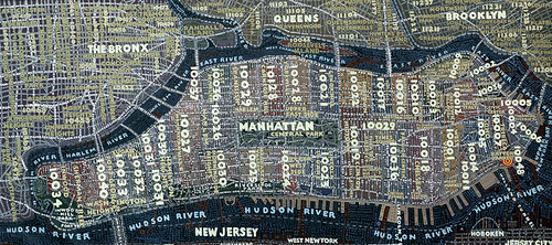
Born in 1948 in Virginia, Scher grew up in Philadelphia and Washington DC and studied design at Tyler School of Art before moving to New York City in 1970. Her father, who worked for the United States Geological Survey as a photogrammetric engineer, invented a device that corrects the distortion caused by aerial photography, which prompted her passion for creating hand-painted maps.
The first part of her career was spent in the record business as an in-house art director for CBS Records (designing covers for Eric Gale, the typographic ‘Best of Jazz’ series and Boston’s 6m-selling debut) and Atlantic Records – experiences that engendered a longstanding fascination for the way design is managed within large organisations, and the power structures that determine how design gets commissioned and completed.
In 1984 she co-founded Koppel & Scher with designer Terry Koppel. Their work included book covers, Swatch watches, the Mondrian-influenced identity for Bruce Lundvall’s Manhattan Records and promotional items such as Great Beginnings and Beautiful Faces.
Below: One of Scher’s hand-painted maps: Manhattan, 2002.
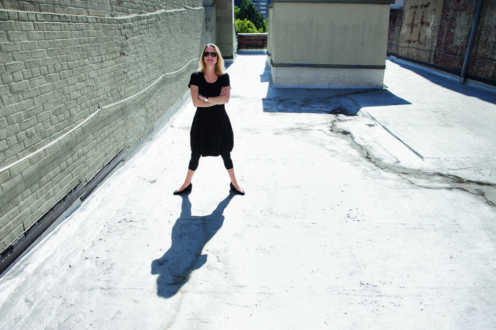
Top: Portrait by Jake Chessum.
Since becoming a Pentagram partner in 1991, her work has included identity (Citibank, The Metropolitan Opera), exhibitions (The US Holocaust Memorial Museum), editorial design (Metropolis) and environmental design for a wide variety of clients including Bloomberg, Grey Group, the New 42nd Street Studios and New Jersey Performing Arts Center.
Her work is featured in two books available this autumn: examples of her painted maps – which she exhibits and sells through art galleries – in Mapping America: Exploring the Continent (Black Dog); and environmental work in Supergraphics. Transforming Space: Graphic Design for Walls, Buildings and Spaces (Unit Editions). Scher is currently putting the finishing touches to two giant murals for the NYC Department of Cultural Affairs at the Metropolitan High School campus in Queens, which brings together her solo art work (a giant map) and environmental design.
Her many awards include the Beacon Award, a Chrysler Design Award, an AIGA Medal and the Type Directors Club Medal. Scher’s work is held in the collections of the Museum of Modern Art, the Cooper-Hewitt National Design Museum, the Library of Congress, the Denver Art Museum, the Museum für Gestaltung Zurich, the Bibliothèque nationale de France and the Centre Georges Pompidou in Paris. Her monograph Make It Bigger was published by Princeton Architectural Press in 2002.
She teaches identity design at the School of Visual Arts [SVA] in New York, and holds honorary doctorates from the Corcoran College of Art and Design and the Maryland Institute College of Art. Scher is a member of the AGI (Alliance Graphique Internationale) – and is its current president – and joined the Art Directors Club Hall of Fame in 1998.
Paula Scher also serves on the Art Commission of the City of New York, which reviews works of art and architecture proposed for City-owned property.
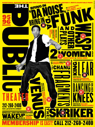
Campaign for The Public Theater’s 1995-96 season, 1995. Design: Paula Scher / Pentagram. Photography: Richard Avedon. The poster was intended to be flyposted (or ‘sniped’) in multiples on the streets of New York.
John L. Walters: Do you remember being aware of design when you were small?
Paula Scher: I remember seeing a cover for South Pacific … I had to be five or six years old. The faces were cropped off into this strange shape … either a clover or part of a flower (it was an anchor but I didn’t know what an anchor was). I was incredibly curious about it, but I liked it, trying to figure out why there wasn’t a whole picture of Mary Martin’s head.
JLW: Did you paint and draw?
PS: Always. I was the school artist. First I made paper dolls, then comic strips, then I took art classes at Corcoran [College of Art and Design] when I was a teenager, which meant I had to take three buses from Washington DC. I was the publicity chairman of the high school – I made posters for proms and events I never went to. I still do that.
JLW: Was that unusual in your family?
PS: There were no artists in my family. My father was really opposed to me going to art school – when he took me to Tyler he saw a naked man standing posing; he thought it was horrible. My father was what’s known as a photo-grammetric engineer, the co-ordinator of the United States Geological Survey who made all the government maps. He’s the reason I paint maps. He invented a device called stereo templates, which make it possible to correct the distortion of lenses when you blow up aerial photography. Google Maps is based on that. I remember him working on it in the basement of the house.
JLW: He devised this system in his own time?
PS: He figured it out while he was working for the Government. He was Depression burned, and a big believer in Government programs and a big FDR supporter. I was one of the rare people in my family who was entrepreneurial.
JLW: So art school was a really weird thing to do?
PS: Totally. My mother made me get my teaching certificate so there would be something to fall back on. I’m a certified teacher in the state of Pennsylvania. When I said I’d go to New York and be a designer she said to me: ‘Don’t do anything like that, it sounds like it takes talent.’
JLW: Did you understand what a designer did?
PS: No, I was there for drawing and painting. I liked printmaking, but I didn’t find myself until I did a course called Graphic Design.
JLW: What did that mean then?
PS: A lot of things – real problem-solving using ideas. You had to make a portrait of something using symbols – metaphysical portraits using symbols or some such thing. I did Ronald Reagan as a mule that turned into an evil elephant. My teacher was Stephen Tarantal – he was a painter and designer. Then I majored in design and had a teacher called Stanislaw Zagorski, who influenced my whole life.
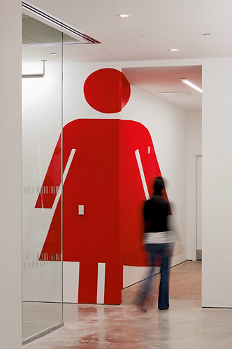
Anamorphic projection of sign for women’s bathroom at Grey Building. Environmental graphics for Grey Group building, New York, 2010. Design: Paula Scher, Andrew Freeman / Pentagram. Photograph: Peter Mauss / Esto.
Illustrating with type
JLW: Were you aware of other designers and the way studios worked?
PS: Peter Max was very popular. But he was too drippy, a bit children’s book-y to me … Then there was the counterculture: Zap Comics, Zig-Zag rolling papers. And Push Pin. And album covers – Zagorski did the silver Cream cover [Wheels of Fire].
JLW: You once said you can learn everything you need to know from just three Beatles covers: Revolver, Sgt Pepper’s and ‘The White Album’.
PS: Sure. In the Revolver cover there’s the grace and lusciousness of drawing against photography that’s simple black and white but incredibly involving. Sgt Pepper’s is a great editorial cover. It tells you about your times, you can keep finding things in it … you try to discern meaning, some of it seems cultural, some of it seems irrelevant – it’s an incredible narrative. ‘The White Album’ is the ultimate conceptual cover, the opposite of Revolver.
JLW: Interesting that the three covers you cite were not by conventional graphic designers …
PS: Well, I see Peter Blake as an artist who thinks like a designer. The 1960s were an inspiring time. There was the whole Fillmore scene in San Francisco, Victor Moscoso … It was counter-culture art – not what I was being taught at Tyler, which was Swiss Modernism.
JLW: Which you’ve pronounced against many times.
PS: Well I rather like it now, you know!
JLW: Were you taught those rules?
PS: First I had a design teacher who gave us Basel basics: move a black square around a white page, make a white on white piece – things that involved seeing and craft, but I was very sloppy, so for me that form of exercise was terrible. Y’know, the notion of lining things up and making things function, and then later designing a business card or putting typography on a grid was virtually impossible to achieve and depressing for me. I felt I was cleaning up my room in some kind of ordered system where the goal of life is to be neat.
I remember seeing Kathy McCoy talk about it from her perspective and she had said that the biggest compliment you could give to something was that it was ‘clean’. C’mon, there’s gotta be more than that… That can’t be it! What about expression, what about emotion, what about feeling? You had to be engaged with it in some way. If you could be neat, it seemed that you could achieve it. And that didn’t seem right to me about a form of expression and communication. If anybody can achieve it, why bother to do it, why don’t we all do it ourselves?
JLW: So putting type together – the way things were then – didn’t appeal to you …
PS: Yeah, the course split between design and illustration and I went into illustration. (I later moved to New York to try to be an illustrator.) What Zagorski did for me is this: I could never do the type on my projects, I could come up with an idea and I would illustrate the idea but he said to me: ‘Why don’t you illustrate with type?’ So I began drawing the type and discovering that typography could have form and then later when I began setting type at CBS Records, I found that you could be expressive simply by making choices.
JLW: Were you a type aficionado?
PS: That’s how I started, When I was at CBS most of the inspiration for the typographic album covers came from things like a Buckingham Pipe Tobacco tin. Or I’d buy a lot of old sheet music and copy the typography. I used Morgan wood types, which Jonathan Hoefler later digitised. When I started to give lectures, people started asking where I found my typography, because they couldn’t order the things from the traditional type houses, so I published Beautiful Faces through Champion Papers – all of my typefaces laid out on a grid so people could Xerox them. Now they’re all digitised. In fact I can tell when a type house picked up something from Beautiful Faces because they’ll use the name I gave it.
JLW: At CBS you commissioned a lot of illustrators … how did that begin?
PS: Well, first of all, I married Seymour Chwast! It was like I was living in an illustration landscape – and it was a golden age. Illustration was immensely popular. From around 1974 to 1980 I favoured this very lush illustration. I would commission it and then put typography on it. But I never felt that I owned the cover. It always became the work of the illustrator.
JLW: There’s a big return to illustration at the moment … would you like to revisit it?
PS: Well, you put your old clothes in the closet, and you think you’re going to wear ’em ten years later but they never fit you! Y’know I’ve been working now nearly 40 years – what I have to do is take what’s going on stylistically and let it inform me but I can’t go back to doing what I already did. I have to find my own little narrow thing that I can do and find something new to do it on. Which is how I change.
JLW: So when you started to do a lot of drawing again, was that to please yourself?
PS: I was always making things. In the 1970s I would put together rough-hewn comps and paint the type on acetate overlays. (I was horrified when people started making borders around things … you didn’t have to integrate the type into the illustration or photograph.)
In the 1980s the way I would work is that I’d find the typography. I would Xerox it and glue it down with wax and cut up the letterforms and move ’em around until I got that right and then I’d give it to somebody on my team to do the finished mechanical. Then I’d make the comp myself … like little collages – that was my art. By the 1990s the computer had come in and then it was pointless for me to make the comps… I never had computer skills so I always had to sit behind somebody and point. I felt I had my craft taken away from me, so I started painting because I needed to do something with my hands.
JLW: Yet over the years the hand-made work has become part of your practice hasn’t it – the maps and so on?
PS: That’s my fine art, I sell those in galleries …
JLW: But there’s the Public Theater posters, the environmental art and the op-ed illustrations … Your work is full of words. The projects are similar, even though the context is different.
PS: Yeah, that’s true. Like Zagorski said: it’s all illustrating with type.
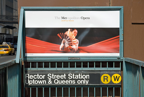
Identity and environmental graphics for The Metropolitan Opera, 2006. Design: Paula Scher, Julia Hoffman / Pentagram. Photograph: James Shanks.
Against style
JLW: And it’s often your words, too.
PS: The thing I do – which is why I became less interested in style and more interested in finding a way to do it – is to create expressionist typography.
Words have meaning and typography has feeling. When you put them together it’s a spectacular combination. I think the reason I responded so negatively to Helvetica way back when was that it neutralises feeling. A Modernist would argue that that’s terrific because then the words speak and you’re not influencing the content by creating disorder with them. It’s almost like an understood, generic form … that you can say OK take the words as they are because they’re laid out very clearly in Helvetica. All other styles imbue the words with a shade or meaning, which changes them, which is where I think all the fun is!
JLW: But don’t you now work with clients who just want a few lines of type and a logo?
PS: I don’t think clients know what they want. What’s interesting about working for larger organisations is that you become concerned and involved with how people understand and perceive something. By doing very simple things you can change or increase the feeling or spirit of something. The notion of typography and spirit is a subtle thing but it’s real. Cultural institutions often have terrible in-house departments because the art directors have no ability to control anything – they’re run ragged by marketing directors or curators …
JLW: … so it’s not an appealing job …
PS: … but they should be the best jobs in the city. And it’s all social. Most of the reasons why in-house departments are bad is the pecking order – where somehow art directors are perceived as the lowest form of life. A lot of what I do is to a degree management consultancy: how to get people to behave nicely to their art departments.
JLW: Do the clients realise this is what they’re hiring you for?
PS: Once you do something two or three times you’re an expert. You become the go-to person until you wear out your welcome. Your clients are always the same age as you, so as your clients get older they become more powerful. I enjoy the work because I am fascinated by organisations and the way people behave in power structures. It’s anthropology.
JLW: So is there a way you can recognise the perfect client, who will enable you to do good work?
PS: I’ve only had a couple. They’re really rare. First of all somebody with immense power. So if it’s a big organisation they have to be an autocrat or a crazy entrepreneur who doesn’t have to answer to anybody. There also has to be chemistry. And then anything can happen. And I think money is irrelevant.
My favourite client of all time was George C. Wolfe at the Public Theater. When he became director he had immense power.
Technology
PS: I like the iPhone and the iPad. I’m much more comfortable with them than the computer because I can move them. I travel with my
iPad – it’s fantastic. I always thought the mouse would become obsolete. Our computers are going to look ridiculous in five years.
The iPad’s amazing because magazines look like themselves again. Photographs and illustrations can look really good and for advertising that’s a must. When you pick up Vanity Fair on the iPad, it’s like looking at the magazine except that you can flip through it, sliding it like the way you go through your record collection on an iPhone, and the ads are like full-page ads. When you’re reading anything on the NYT blog or what have you, and you’re looking at these little stupid strips and you just bat ’em out of your way like flies. That’s bad for advertising, so how can anyone make money? We’re finally getting the technology where editorial can be editorial again and ads can be ads again.
JLW: Are you an early adopter, or did the iPad appeal to you because of its visual nature?
PS: I felt comfortable with it. There was a time when people thought I was a Luddite, which is not true. I don’t think technology is bad; it’s the norm. The way the computer seemed to be from 1989 to the iPhone is like a telephone you have to wind up on its side. When they got one that worked I was ready to use it. Don’t you think a mouse is just dumb! It gives you a stiff neck, you get carpal tunnel syndrome.
If you’re too locked up in the moment of a technological discovery it becomes hard to move forward, because you become locked in that technological period. My view is that to grow as a designer you have to allow yourself to be who you are irrespective of the technology, but let the technology inform you in ways that it can. When you look at periods you find designers whose body of work is completely connected to one technological form and then it stops there. I see it in some of my ex-students – it’s quite a sad thing. Students who learned to work on the computer in the late 1980s and 90s who are now approaching 40 are having a hard time working because the younger kids who are right out of school are not only cheaper but they can adapt to the technology much faster and much more easily, so they’re actually better at the gig. It leaves a whole generation cold in relation to advancement.
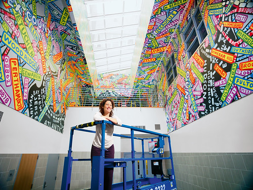
Mural from atrium of Queens Metropolitan High School, New York, with principal Marci Levy-Maguire, September 2010. Design: Paula Scher, Drew Freeman. Photograph: Ian Roberts.
Environmental design
PS: I’m on the design commission for New York City. I made NYC realise you have to hire graphic designers to do environmental graphics. Signage is usually something that’s not thought of (though the architect will tell you that the building is the sign!).
When I did the Public Theater identity, James Polshek was doing a quick fix on the lobby and there were these archways that directed you into various sections of the theatre. George showed him my posters and Jim said ‘this is great, let her do some big banners’. I was given some holes to fill. The first major signage job I worked on was the new 42nd Street studio. The brief was to transform the exterior – we ended up painting the entire building. Then everybody started doing it!
JLW: How did you respond to that?
PS: I told you I’m not a craftsperson. Anything I do where I think I make a breakthrough, in five minutes someone’s going to come along and do it better than I did it.
JLW: So you keep moving …
PS: Well I have to because I’m never going to develop the craft well enough. That’s been true for me my whole life.
I find that with 3D work it’s the opposite of graphic design for print. The computer has revolutionised this kind of work – the way you can see work before it is built. The jobs come out almost identical to my Photoshop rendering, and usually something is selected in the first or second round. These things, they’re a whole different speed. They take a very long time to realise. There’s a lot of expense involved, trying out materials – they go on forever. I’ve been working on the High Line [a New York park built on the 1930s elevated railway] for a million years [since 2000].
JLW: Did these electronic or highly technical things come naturally to you? Or is it a case of working with the right collaborator?
PS: It’s always a case of working with the right collaborator. I don’t like equipment. I don’t even take pictures.
JLW: How have things changed over the 40-odd years you’ve been designing?
PS: Technology has changed but people haven’t. For example there are genres of design that haven’t moved at all since I entered it in 1970. Look at movie advertising. It’s as banal and stupid as it ever was. You see Jennifer Aniston in a poster for some cutesy crappy movie – looks exactly like it did in 1970 with goofy typography. Nobody cares about it. Go to a drug store – doesn’t look much different … only a small section has become highly sophisticated. If you go to editorial websites they’re just terrible. Seriously, do you think The Huffington Post is an advancement? Really, that’s just some piece of garbage desktop publishing without any interesting type.
I don’t think things have improved. In-house departments – just as bad as ever. I wrote about the CBS records promotion department in 1972 and I get letters from people all over the world telling me their jobs are just like that. What is scary to me about technology and where I’ve seen the biggest change as it affects perception is a disaster and that’s the 24-hour news cycle.
JLW: Do you think designers are part of the solution or part of the problem?
PS: It’s not about the crafting or the making of the message. It’s the lack of editing. There’s such garbage spewed out everywhere. We live in a world of confusion and blather. The major trend in the States right now is doing work for good social issues, so social issues become the new David Carson. All this environmentalism has made me want to run out and pollute! Here in the States it’s very anti-visual.
JLW: Is the Queens mural the first example of both art and environmental design in one project?
PS: This is the best example, the biggest, and realised in the best way.
JLW: Did you have to make sure that Queens was in a particular part of the space?
PS: The first mural is the Tri-State Area, including Queens in a strategic position. The second mural is the immediate area of Queens where the school is, showing all the names of local neighbourhoods in every language they speak in Queens. I painted in Korean, Chinese, Japanese, Farsi, Arabic, Hebrew, Greek and Russian alphabets. God knows what they say!
First published in Eye no. 77 vol. 20.
Eye is the world’s most beautiful and collectable graphic design journal, published quarterly for professional designers, students and anyone interested in critical, informed writing about graphic design and visual culture. It is available from all good design bookshops and online at the Eye shop, where you can buy subscriptions, back issues and single copies of the latest issue. You can also browse visual samples of recent issues at Eye before You Buy.