Winter 2000
Self-control. self-raising
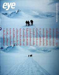
Pentagram are ‘time-rich’. Browns are the young establishment.
Self-control
One consequence of our current hyperactive dotcom culture is a flood of management theory. How to make the transition from the old economy to the new. How to give your company an identity or brand. Advice comes quicker than a consultant’s invoice. But one thing new companies cannot buy is time. That’s what distinguishes Pentagram from every other company: they are time-rich.
Pentagram are the design equivalent of old money. They are like an old east coast WASP family. The materials they produce for their clients reflects this. It is not that Pentagram don’t have to market themselves– it’s just that you get the impression that marketing themselves would be simply bad taste. The aesthetics of modesty and politesse frames their books and The Pentagram Papers.
But this aesthetic can only work because it can draw on the company’s longevity. And they have played this aesthetic out with a remarkable degree of self-control. Since the length of Pentagram’s books matches the width of the Pentagram papers they all stack neatly. The layouts in their papers and books give an intensity to the idea of ‘tidy’. Along with the consistency of their aesthetic, it’s this intensity that makes the whole approach work. The Pressman’s Hat, Six Tunes for Eight Wine Bottles and Crossword may have the air of a slightly effete parlour game about them but their eccentricity has a kind of charm.
And their Feedback book, now in its seventh edition since 1974, is a reference guide of places to visit, restaurants and shops in major cities around the world recommended by the “international fraternity of ‘designers, artists, writers, architects and photographers’. Is this a sign of a company refreshing itself with ideas from the outside, or a sign of claustrophobia, of inbreeding?
What saves the Pentagram aesthetic from being mannered is the fact that they are so obviously interested in the content. They want to show interesting things, curiosities such as the Australian mailboxes. Clients must feel that they are not so much hiring a design company as buying into a cultural and social authority. When you can offer this package you don’t have to shout about it. Self-marketing is just a little bit too vulgar.
(J. O’R.)
Self-raising
If you are a design company who have come from nowhere to being almost ‘establishment’ in a couple of years, you have the challenge of letting people know who you are without appearing to be publicity tarts. So the creative directors at Brown’s design group Mike Turner, Jonathan Ellery and Graham Taylor are the Men In Black, their backs to the camera. This sensitivity to not appearing too self-important is played out in their book What’s in a name? This series of images shows the signs of London companies called Browns. The book spotlights the company while simultaneously hiding it in the synonymous name belonging to fishmongers, restaurants and retailers. While Browns paper nos. 1 and 2 are conventional resumés of their work for clients, their other route to becoming better known is via the design community itself. Their books, and the attendant launch parties, are aimed as much at other designers as they are at clients. (J. O’R.)
John O’Reilly, writer, London
First published in Eye no. 38 vol. 10 2000
Eye is the world’s most beautiful and collectable graphic design journal, published quarterly for professional designers, students and anyone interested in critical, informed writing about graphic design and visual culture. It is available from all good design bookshops and online at the Eye shop, where you can buy subscriptions and single issues.