Spring 1994
Small, mobile, intelligent units
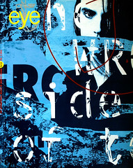
Eye talks to young French designers who reject the atelier system and prefer to go it alone
The atelier system is the basis of traditional French graphics, with the master designer supported by a team of apprentices. In the last few years younger designers, assisted but not dominated by new technology, have begun to question a culture that regards you as still young and inexperienced at the age of forty. Eye talks to three of the go-it-aloners.
Graphic design in France is facing a crisis. As the recession hits relatively late on the world scale, compounded by the swing to conservative politics, public money for large-scale cultural projects is drying up and the traditional role of designers specialising in graphisme d’utilite publique (graphic design for public use) is threatened. Since the heady days of the protests of ’68, many of France’s graphic designers who were involved in the student movement have shied away from the commercial world, preferring to collaborate with cultural institutions or to work on posters, signage, forms and pamphlets for national and local government. Designers tend to specialise in one area – whether publishing, television, advertising or packaging – working either in-house or in design practices and never crossing over to another medium.
Two distinct but complementary graphic traditions – Polish poster design and Swiss typography – have been extremely influential in France, thanks to an influx renowned practitioners to work and teach in Paris and the rejection of more traditional, local designs. The image-plus-information approach has been moulded into national style by a handful of big names who between them seem to receive the major commissions. These are awarded through invited competitions that require months of speculative work, so only design offices of a certain size and status can afford to enter. As in the architectural world, you are still “young” at 40 and therefore regarded as too inexperienced to handle a prestigious commission. The Dutch influence is beginning to be felt as expatriate designers join the larger practices, but as yet the computer-inspired aesthetic is not widely present.
The education system reinforces the split between the cultural and commercial by teaching problem-solving and drawing as representational and expressive tools. Graduating designers aspire to join advertising agencies as visualisers, to become illustrators or to set up their own as hybrid designer-artists. Typography is not on the curriculum and often the only available equipment is a PMT camera. Graphic designers end up wishing to work as artists, but without the status and privileges of others – for instance, the income-related supplementary benefit that film industry personnel enjoy between jobs and glittering annual awards ceremonies sponsored by professional organisations to honour their collective achievements. As a result of their ambiguous status in highly stratified society, designers can find the process of realising a project difficult. Printers often circumvent designers by offering design-and-print services, while typesetters too offer stuff competition.
But younger French designers are producing work that redefines national conceptions of graphic design. Helped by the speed and economy of Macintosh technology and the drawing skills taught in French art and design skills, a new generation of designers are working independently of the atelier system based on the fine art tradition of a studio run by a master employing an army of assistants to realise monumental projects.
The old guard may retain its loyal if dwindling client base, but younger designers with lower overheads are applying their anarchic techno-art approaches to new commercial and cultural clients – record companies, fashion houses, avant-garde publications and galleries. What the work has in common is an acknowledged Frenchness: language, film, food, popular culture – which is not lauded by French graphic designers as it is by their English-speaking contemporaries – and humour are all used to resist the globalising influence of the Macintosh approach.
M/M
M/M is a partnership between Mathias Augustyniak and Micheal Amzalag, both in their 20s. They met at the Ecole Nationale Superieure des Arts Decoratifs and after college art directed the French rock music magazine Les Inrockuptibles. Augustyniak left to study graphic design at the Royal College of Art in London, during which time he worked on the 1990 degree show catalogue, arguably the most extreme to date, its reversible folded loose-leaves held together by hinged metal rings.
Back in Paris the record company contacts made while working on the magazine were converted into new clients. Many international record companies have bought up smaller French labels or developed French divisions. French-language music is extremely popular with all age groups and sells in such quantities that the charts are effectively bilingual. Both designers enjoy French music and the work is divided according to individual musical preferences. Augustyniak likes more lyrical, poetic music while Amzalag is a rap fan and edits and designs a fanzine called eDEN.
M/M combine an irreverent attitude to computer technology with a playful personal style. “Micheal is a computer nerd, he reads the manuals.” Augustyniak tempers the universalism of the Macintosh with drawing skills and absurd and accidental touches.
Augustyniak grew up in the south of France and has collected type manuals from Marseilles-based foundries that illustrate fonts which are still to be seen on café and shop signs, but which are considered ugly, or in bad taste, by the design establishment. The use of fonts such as Vendome, Banco, Choc and Mistral on CD covers gives an exuberant, vaguely retro feel, reminiscent of the post-1945, pre-1968 optimism. But the contemporary photographic and computer-manipulated imagery means the designs never looked dated. Rejecting the worldwide domination of the font foundries, Augustyniak draws or scans found objects – string, paper clips, flakes of sea salt, masking tape, Polaroids – on to the computer. When digitised they can be manipulated into typefaces or used as graphic elements. On one CD cover the photograph of Jean-Baptiste Mondino of singer J shows his torso covered in vicious-looking scars. Augustyniak echoed the destructive feel by drawing an equally scarred typeface through a stencil straight on to the computer.
Augustyniak attributes his fascination with computers to playing as a child with a Telecram, a screen-based sketching toy. He reiterates that work should be fun and that everyone benefits from a good personal relationship between designer and client.
Augustyniak produced an identity for Weekend, a small subsidiary of Virgin Records that issues music by middle to highbrow contemporary French musicians. The logo works at different resolutions, in black and white, and printed on various media, regardless of the standard of the computer that generates it. The client was happy to have M/M suggest they produce a fold-out poster/manual demonstrating possible usages.
Styling themselves as artisans ready to adopt a different approach for every situation – “I’ll make a new typeface for every project,” says Augustyniak – M/M work well within the off-beat, semi-indie world of French music. Whether the international fashion conglomerates that market the likes of Jil Sander and Yohji Yamamoto, both of whom are clients, can cope with their unpredictability remains to be seen.
Jeanne Verdoux
Jeanne Verdoux studied graphic design at the Ecole Nationale Superieure des Arts Decoratifs in Paris before enrolling at the Royal College of Art in London, from which she graduated in 1989. In a conscious effort to broaden her skills, she learned typography and audio-visual techniques, but stresses that the most important advantage of studying in a graphic design faculty in a country where the profession is well defined is the confidence this inspired.
Verdoux make a virtue of flexibility, working across diverse media – book jackets, interactive interface design and limited edition posters – and is as familiar with computer technology as with a colour copier or silkscreen press. At college she wrote and produced a magazine on cinema, Emotion, whose spot-coloured die-cut pages were designed to create surprise and movement. That paper version of interactivity was transferred to the computer. Attracted by the vibrancy of on-screen colours, Verdoux designed a purposefully quirky multimedia programme for a horoscope. From that came offers to work with interactive designer David Collier on a project for Philips and with the Multimedia Corporation on a programme about performance artist Laurie Anderson.
But by demonstrating a degree of technical expertise, Verdoux was in danger of being cast as a technician. “I wanted to learn how to draw on a computer and to prove that I could use one. Now I can choose whether I want to or not.” The solution was to move back to Paris. She joined the atelier system to find out about the “club” from the inside and to gain experience in the areas of graphisme d’utilite publique.
A major project while at Atelier Fabrizi was to design a fanzine written by teenagers in a Parisian suburb. The publication was financed by the communist-run local council. The mood of the supplied images is echoed in a skewed misfolding whereby the first long fold of the single sheet is angled to throw all the pages off true, giving the magazine a look of having already been read. Verdoux watched the politicians trying to manipulate the content, more interested in public relations than in expressing the teenagers’ concerns: “They wanted to put a picture of a little girl white girl playing the violin on the cover, when the magazine is written by black kids.” She is wary of creating propaganda, and declares, “I’m bored with images that mean something.” For her, graphisme d’utilite publique means T-shirt designs – useful because you can wear them.
This stance has not stopped Verdoux from taking on freelance work with Pierre Bernard, one of France’s most established politically correct practitioners, as part of Atlier de creation graphique – Grapus’ five-strong design team. She was involved in applying the Parc Nationale identity and describes the job as being “as much about teaching the clients what graphic design is as about designing.”. Outside Grapus, Verdoux’s project for “pure pleasure” is the design of book jackets for UK publisher Serpent’s Tail. She receives a manuscript by post and two months later returns a cover design based on her readings of the text.
With her mix of design skills and interest in cinema, Verdoux believes she should be well suited to designing film title sequences. Whether that will entail leaving France again or working within the overly precious state-funded industry is a decision she will have to make. She knows that like colleagues in the UK or US she could survive with one major client. But in France, a country which is visually aware but not design aware, it is harder to find such a client.
Toffe
Toffe is Christopher Jacquet, a designer who studied fine arts at the Ecole des Beaux-Arts and was credited as being the first Macintosh artist in Paris back in 1985, although he denies ever having read a manual. “I have a love/hate relationship with the Mac,” he admits with a shrug. “It’s like a troublesome love affair you can’t give up.” He began by using the computer to compile an image bank, recording through drawing an archaeology of current signs and symbols. His first Macintosh was linked to an ImageWriter, creating a printing effect similar to that of an “electronic” litho press. Gallery works and installations explored the formal and mysterious qualities of computer output, including one work which consisted of blocks of printed “continuous stationary” arranged on the floor in the proportions of a floppy disc. The whole stack of sheets was printed, but only the top page was visible.
Toffe began to work as a graphic designer in order to earn money, with clients ranging from local businesses – plumbers and dentists – to private galleries and public art-funding bodies. His interest in technology has led to projects which challenge the established channels for displaying and disseminating art works. Marketing limited edition phonecards, screen-printed with miniature originals, through the L’Avant Musee gallery is just one new way of viewing and collecting art. Taking this subversion a stage further, Toffe launched a charity card – “People will buy anything if it’s for a good cause” - to feed “starving” artists.
Toffe produces two magazines, Virtual Europe and Unvisible, both concerned with the potential for making art using technological and electronic media – video, virtual reality and interactive multimedia. He writes the copy for Virtual Europe, integrating it with the visuals to create a journal which is not compromised by the usual publishing hierarchy of words and images.
Toffe’s graphic language is a combination of elements: graffiti, symbolic colours – “red and black for propaganda” – low-resolution reproductions and cartoon humour, using the computer-as-scanner as a “third eye”. These trademark elements represent a concerted effort to humanise the image of the computer by introducing error and accident. Working with Dutch designer Rik Bas Backer for a suburban youth organisation Droit de Cite, Toffe drew a logo of a stick man surrounded by a graffiti-inspired form resembling an aura or alter ego. The inner figure faces the viewer; the surrounding aura strides along in profile. Colour combinations of “Martian” green – “because as far as older people are concerned these kids come from another planet” – buzzing orange and stark white create a graphic images that is both sophisticated and accessible in its references to computer game figures and spray-painted icons.
A sense of humour erring towards satire and cynicism is reflected in work that revels in puns and unholy alliances. In French, blazon means both town shield and cow’s hind-quarters. This inspired Toffe’s use of huge back-lit images of cows for a municipal commission to brighten up a car park. His efforts were rejected. For an as yet unbuilt arts centre for “virtual” artists, Toffe sent out a calling card with greetings from the portacabin on the construction site. The flip side sported a collection of scanned and digitised pine cones, fruit, lumps of red meat and various organs which emphasise the clash of clean technology and commerce with the organic and vernacular gastronomic culture.
First published in Eye no. 12 vol. 3 1994
Eye is the world’s most beautiful and collectable graphic design journal, published quarterly for professional designers, students and anyone interested in critical, informed writing about graphic design and visual culture. It is available from all good design bookshops and online at the Eye shop, where you can buy subscriptions and single issues.