
Spring 2019
Strategy of excess
Like a human algorithm, Hansje van Halem explores a huge number of variables until she finds the right ‘recipe’ for each project

There are many ways to look at the work of Hansje van Halem. You can succumb to its mesmeric surfaces, your gaze wandering among the interwoven lines that are its hallmark, or you can pick up the echoes of other periods in the history of graphic art, such as Op Art and West Coast Psychedelia.
Yet another approach is to try and uncover its origins, which reveal that Van Halem’s visual tapestries are nothing less than full page extensions of the Dutch designer’s major obsession: letters. Even when scrolling down the home page of her website, as her earlier works appear, you can see the gradual movement of her attention away from character design towards pattern and surface. ‘When I started drawing letters, I was more interested in their texture and not so much bothered with their outline,’ she recalls. ‘I tried to let the drawing system of the texture determine the outline of the shape as far as legibility allowed it. At a certain point I was not bothered with legibility and let the drawing system take over the whole page.’
Right from the start of her studies, the late Gerard Unger, her lecturer at the Rietveld Academie, encouraged her to explore the inherent creative potential of letter design. It is precisely this exploration that brings about projects whose density recalls the ‘carpet pages’ of illuminated manuscripts, and whose production, even when executed using digital methods, requires dedication and concentration.
Much later, Van Halem worked closely with Unger, who died last November, on the design of his final book Theory of Type Design (See Peter Biľak’s review, ‘Rules of engagement’ in Eye 98).
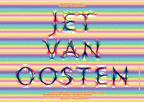
Poster for an exhibition by Jet van Oosten at Galerie Block C in Groningen, 2016.
Top: The Lowlands project is Van Halem’s biggest endeavour so far. Thanks to her collaboration with other designers, developers and animators she was able to take her approach to an unprecedented scale. Photo: Cassander Eeftinck Schattenkerk.
Hansje van Halem is the kind of designer who invests a huge amount of her time exploring the potential of ideas – far more than that required by specific projects or commissions – through simple curiosity about what can come of them. This is a way of working that inevitably generates excess material, producing ‘by-products’ of the design process. In Van Halem’s case, these archived, partially developed ideas often re-emerge later to become the basis of new projects. Some of them can be seen in her 2013 Sketchbook, a collection of letter designs and patterns created over the previous ten years, dating back to her diploma at Rietveld.
Her systematic way of working, based on a series of ordered steps, lends itself to being transferred to video, in which every iteration of the project’s idea becomes a frame in a sequence, though not necessarily a linear sequence, leading to the final result. Van Halem has used this method more than once to demonstrate her workflow or even at the request of a client.
Faced with such visual complexity and such a systematic methodology, it seems a natural next step to ask how she views technology and programming. To what extent can an algorithm, created with the precise purpose of producing endless variations and iterations, be a substitute for the role of the designer? Van Halem’s response is very clear: she keeps control of the process until she finds the ‘recipe’ that defines the identity of a project. Once that has been established, she collaborates perfectly happily with a systems designer, allowing them to apply technology in the most effective way possible. Such is the case with the Lowlands Festival in the Netherlands, for which she has designed the identity since 2017. Just van Rossum designed a programme that enabled her idea to be transformed into a tool that she and her team (Marjolein Rinckes, graphics, Jurriaan Hos, animation) could use for a wide variety of static and moving applications. This example also shows how a very personal approach such as hers can evolve into a collaborative project, on a larger scale. As she herself says: ‘As a solo designer I am constantly wondering if I should expand as a studio. For me, Lowlands became a great example of how growing my practice does not necessarily lead to a “top-down” company.’
Wind typeface, published by Typotheque in 2018. ‘Typotheque unravelled the system behind the letter shapes I had made, and rebuilt it from there,’ says Van Halem. ‘They surprised me by also engineering it into a variable font.’

When working on her first typeface family Wind (2017), published by Typotheque, Peter Biľak (see ‘Originality and inspiration’ in Eye 98) and his team needed to overcome her initial reluctance to transform personal ideas into fonts available to everyone. However she was convinced, and thanks to team collaboration, many innovations emerged from her designs, such as the ‘variable font’ that allows the user to choose the direction of slant of its letters.
The ‘In Patterns’ exhibition at the Bijzondere Collecties of the University of Amsterdam was an important stage in her creative journey, when the curator Mathieu Lommen asked her to respond to the Collection’s ‘Modernism in Print’ exhibition. Van Halem remembers her approach: ‘I read a statement by Paul Schuitema from 1928: “Yesterday, art: artistic, decorative, symbolic, fantastic, non-social, lyrical, passive, romantic, aesthetic, theoretical, craftsmanlike. Today, reality: real, direct, photographic, business-like, competitive, rational, active, current, purposeful, practical, technical.”
‘My work checked everything mentioned at “yesterday” and I did not connect to the “today” of 1928. To me, it means we have been here before in history.’
Detail from an endpaper pattern, 2010. Since 2009 Hansje van Halem has collaborated with publisher and printer Uitgeverij De Buitenkant, for whom she designs endpapers.

Over the years Van Halem has had ever more opportunities to work on a grand scale, including architectural projects in which the intersection between text and pattern – the hallmark of her work in print – returns in a wide variety of visual richness. Letters emerge from the background in the form of interruptions, variations, or distortions of the pattern. Their legibility varies according to distance – when the work moves into three dimensions, it varies according to the interaction between colours and that between texture and different materials.
The fact that Van Halem is known for a personal, recognisable style never bothers her: ‘I like to dig deep into the technical aspects of a certain kind of output and let those parameters decide which direction the design goes. If you compare the text memorial I designed in Amsterdam with the book design for Gerard Unger’s Theory of Type Design, I am happy that they are as much connected as they are different.’
Lowlands Festival programme cover, 2018.

Silvia Sfligiotti, graphic designer, writer, Milan
First published in Eye no. 98 vol. 25, 2019
Eye is the world’s most beautiful and collectable graphic design journal, published quarterly for professional designers, students and anyone interested in critical, informed writing about graphic design and visual culture. It is available from all good design bookshops and online at the Eye shop, where you can buy subscriptions and single issues. You can see what Eye 98 looks like at Eye Before You Buy on Vimeo.