Autumn 2007
Through thick and thin: fashion and type
Fashion’s obsessions are mirrored in its typography, from Vogue’s femme serifs to butch Chanel and the hybrid YSL logo

Typefaces are abstract. Barring letters that have an overt figurative origin (characters made of branches or rope), the domain of typography and lettering is refreshingly content-free, a matter of style, history and functionality. Yet, as typefaces and lettering are employed in related contexts, the associations of these contexts bleed into our understanding of the typeface itself. Type designer Tobias Frere-Jones once recounted his experience developing a logo for a company that produced hair products, false nails and perfume. After working to produce an appropriately ‘feminine’ logotype he arrives at a high-contrast sans serif that intuitively feels right. He checks his work against the competition by making a trip to the drugstore and discovers that Almay, L’Oréal, Revlon, Cover Girl and Maybelline follow an almost uniform typographic code, most sharing the stylistic root of the typeface Optima: he knew the ‘right’ typeface before he realised he knew it. ‘What is so feminine about Optima?’ he asks, as he wonders whether these gendered associations inhere in the forms of the typeface, or evolve from patterns of use. Such patterns of use can become so pronounced that they shape our understanding of typography. [1]
This phenomenon is observable in the arena of fashion, where serif and sans serif tyefaces have articulated a certain landscape among fashion magazines and fashion brands. Over the twentieth century, carrying into the present, one can observe competing aesthetics of modernity, traceable through different uses of the ‘modern’ typefaces of Didot and Bodoni and the ‘avant-garde’ aesthetic of sans serif grotesques.
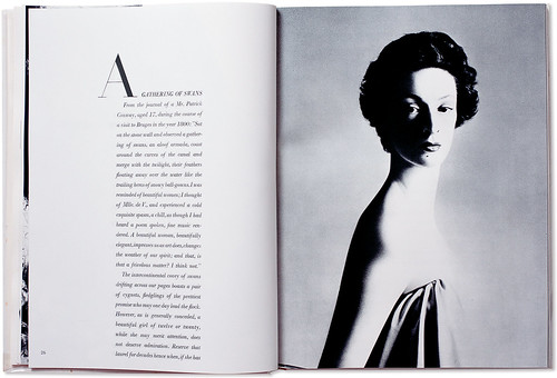
Spread from Avedon’s Observations (1959). Designed by Alexey Brodovitch. The large format of the publication provides expanses of white space, punctuated by elegant initial capitals in black Didot.
Top: Charles Peignot, head of the French type foundry, Deberney + Peignot, with a beautiful specimen of Didot in the background.
Fashion x-rays
The late eighteenth- and early nineteenth-century typefaces of the Frenchman Firmin Didot and the Italian Giambattista Bodoni are classified as modern because they introduced an extreme contrast between thick and thin elements, achieving a radical consistency among letter shapes by subjecting the variety of the alphabet to a thick / thin autocracy. [2] The result is abstraction and precision, echoing their Enlightenment origins. Bodoni and Didot exaggerated the height and verticality of the ascenders and descenders of the letterforms, lending the characters an architectural grandeur. Bodoni described the ‘beauties of type’ as ‘conformity without ambiguity, variety without dissonance, and equality and symmetry without confusion. A second and not minor value is to be gained from sharpness and definition, neatness and finish.’ [3] Bodoni’s prescription would be equally at home in a classical treatise on type, or in a 1950s book on proper grooming for debutantes.
Didot and Bodoni dominated printing until the late nineteenth century, when the Arts and Crafts movement returned to the solidity of humanist letterforms and the texture of Renaissance printing (William Morris called Bodoni’s letterforms ‘shatteringly hideous’). [4] After fading from view, Bodoni and Didot made a comeback in the early twentieth century, partly because their geometric clarity seemed modern again. An Italian foundry, Nebiolo, issued a new cut of Bodoni in 1901, and ten years later the largest American foundry, ATF, issued its own very popular cut of Bodoni.
In 1912, Deberny + Peignot, bought the original punches of Didot, making the font newly accessible to designers. In a classic portrait, Charles Peignot, the head of the French foundry, was photographed with a beautiful poster-scaled Didot ‘A’ hovering in the background. It is from this fashionable context of European Modernism in the 1920s and 30s that America borrowed two of its most influential art directors, Dr Mehemed Fehmy Agha, who would art direct Vogue from 1929 to 1942, and Alexey Brodovitch, who served as art director at Harper’s Bazaar from 1934 to 1958. Both are credited with having imported a Modern approach to layout and photography, as well as a ‘Modernist’ sensibility about type.
Brodovitch had used Didot while working in Paris on Cahiers d’Art in the 1920s. In his reign as art director of Harper’s Bazaar, Didot was the black blade that cut the white space of his layouts. The font became the signature of Harper’s Bazaar as well as Brodovitch’s own signature: he used the font for the identity of his influential Design Laboratory at the New School. In the 1950s Bodoni (and its clownishly bloated progeny Bodoni Poster) was used in many other ‘design’ contexts. The cover of a 1950 Museum of Modern Art book, designed by Jack Dunbar, prominently displays its title, What Is Modern Design? in Bodoni, as if the question it asks is answered by the typeface, rendered in stark white letters on a black background.
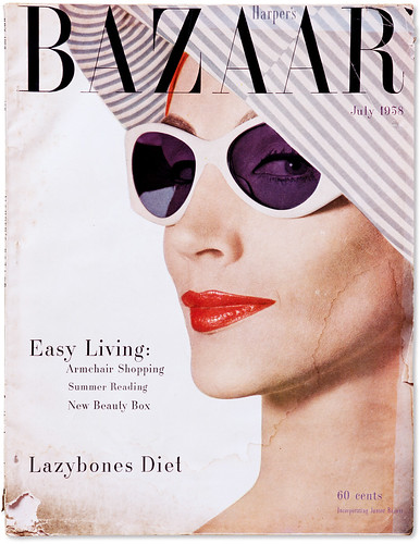
Harper’s Bazaar from the 1950s. Art Director: Alexey Brodovitch, Jack Dunbar and Adrian Condon.
Fashionising fonts
The canonisation or the ‘fashionisation’ of the Didone style can be observed in the evolution of Vogue magazine. In Vogue’s early pre-photographic covers, illustrators created lettering that worked with the style and spirit of their illustrations. This ethic was carried over as Vogue made the transition into the photographic era: photographers and designers created ambitiously varied and inventive approaches that integrated letterforms as part of a total approach to design. But even in those covers that did not integrate the lettering as part of the overall concept, type choices were extremely varied.
As late as 1955, Vogue covers vacillated between serif and sans serif typefaces, as well as script faces and illustrative, photographic letters. It was after 1955 that the magazine appears to have legislated a consistent use of the all-capitals banner headline set in Didone lettering. Apart from minor details, it has remained absolutely fixed since then, the trade-dress of a powerful international franchise.
Bazaar aesthetic
Flash ahead to 1992 and the Didone aesthetic is powerfully resuscitated in Fabien Baron’s re-design of Harper’s Bazaar. Baron commissioned Jonathan Hoefler to create a new digital Didot, a kind of super-Didot, drawn in extremely large sizes that allowed the type to be set in enormous display sizes while still retaining its razor-thin lines. When I interviewed Baron in 1995 for Eye, he seemed irritated when I asked if his choice of Didot was self-consciously referring to the Brodovitch era: ‘No … We used Didot because it’s very feminine, not because of the magazine’s history. When we started at Bazaar things were very elegant and the direction of the magazine was about elegance.’ [5] He applied the same spirit to his advertising and brand work with Valentino and Calvin Klein, and, more recently, his art direction for a book on Balenciaga.
A casual glance through the lexicon of fashion brands confirms that this Didone aesthetic is shorthand for luxury, refinement and a certain prissy / posh attitude. To paraphrase Jack Parr’s line ‘Whenever I hear the word culture, I take out my chequebook’, consumers are now trained to take out their chequebooks whenever they see Didot. So why are Bodoni and Didot used so much in relation to fashion, apart from their stylishness and pedigree? Can it be that within the very forms of these typefaces they evoke the precision of tailoring, the flatness of fabric, the dynamics of gathering, draping and folding? In Dreaming by the Book, Elaine Scarry discusses how writers create and manipulate imagery, showing how mental images are subject to bending, folding and stretching. Typefaces perform similar manipulations, conjuring visual associations, rather than purely mental ones. In my mind, the attenuated forms of Didone letters are not unlike the flattened geometries of dress patterns: accelerated curves and tapered rectangles meeting at precise junctures. One can imagine the fine lines of the Didone serifs as the seams and stitches that connect into an ensemble of parts.
While we can speak of this ‘imaginary’ and associative dimension to Didone fonts, we can also point to one of its most salient, pragmatic aspects: it has an almost see-through quality. Because of its radical thick-thin structure, the mass of the letterforms are greatly diminished: words typeset in Didone fonts act as a typographic veil over photography, making them particularly useful for magazine covers. Like Tom Wolfe’s ‘social x-ray’, Didone fonts create an x-ray of the word. Their anorexic, skeletal forms create an ideal overlay for photography. The connection between Didot, Bodoni and the topic of fashion is so embedded that not only do Vogue and Harper’s Bazaar continue to dress themselves in its sparkling linearity, but so do countless other magazines and brands.
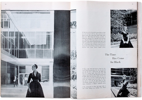
Spread from July 1952 Harper’s Bazaar photographed by Karen Radkai at New York’s Lever House.
Sans serif and Chanel
If Didot and Bodoni acquired the unmistakable scent of fashion at this mid century juncture, the use of sans serif typography in fashion can be connected to a single, powerful instance of design: the brand identity for Chanel. Set in black sans serif capitals against a white field and applied to the cubic apothecary-like bottle of Chanel No. 5 perfume, it aligned itself with the avant-gardism of Le Corbusier and the industrial vernacular. The visual approach (and the mystique of a perfume that was numbered rather than named) was a refutation of the romanticism that dominated women’s fashion and perfumes. [6]
The sans serif, black and white simplicity of Chanel’s label, adorning the apothecary decanter. Photographed for Eye by Lee Funnell, 2007.
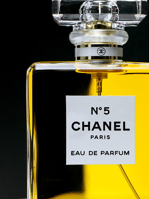
The label’s little black capitals – like Chanel’s ‘little black dress’ – captured the power inherent in understatement. Because it has been part of the commercial landscape for so long, it is hard to see the packaging for Chanel as radical, yet one can retrospectively appreciate its alluring combination of modesty and authority, an effective analogue for Chanel’s urbane style. Chanel’s sans serif set itself against the cultivated and super-refined aesthetic of Bodoni and Didot, as well as against the loopy and voluptuous scripts used for other perfumes, clothing and ‘fancy’ goods. We see the same attitude expressed in the sans serif logos for Rei Kawakubo’s label, Comme des Garçons, and bold sans serif wordmarks for Jil Sander, Helmut Lang and Fendi. But the Chanel lettering also carries a vaguely moderne quality, that has a related but distinct progeny, in Givenchy and the contemporary-retro spirit of Marc Jacobs.
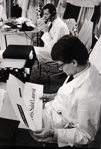
The ‘third position’ and Yves Saint Laurent
In 1962, as Yves Saint Laurent was preparing his first collection under his own label, Pierre Boulat photographed the anxious young designer holding two cards: both feature his name set in Didot, one with white type against a black field, the other with black type against white. [7] He cannot have been satisfied, because the following year he unveiled a new logo commissioned from the poster designer A. M. Cassandre. [8]
The Yves Saint Laurent signature became one of the most distinctive graphic signatures in the world of fashion, and was one of the last pieces Cassandre would produce before his death. If we can think of the sans serif grotesques of Chanel as staking out one aesthetic pole, and the Didone world as another, Cassandre and Yves Saint Laurent claimed a third position, letters that are neither serif nor sans serif, not strictly roman or italic or even a proper script, but a complex hybrid of all of these forms. The YSL logo expresses the ambivalent modernity of Cassandre’s last typographic style, reflecting his disappointments with what he saw as the coarseness of advertising and the declamatory style of poster art that he had pioneered.
With the YSL mark he wanted to create modern letters that also reflected the gestural and rhythmical forms of handwriting. Yet one could argue that with this ‘third position’ between serif and sans serif idioms, Cassandre was also playing with the subtle codes of gender and sexuality in the YSL logo, just as Saint Laurent himself played with the intermingling of masculine and feminine languages in his designs for clothing. Saint Laurent’s mystique as a gay man surrounded by beautiful people of both sexes was part of the YSL brand promise, as was made clear in a perfume ad featuring a Jeanloup Sieff portrait of the designer, naked with his legs crossed to obscure his crotch; he is not carnal as much as pan-sexual, a figure of both male and female sensibilities.
If Chanel’s identity exploited the traditionally male (industrial, abstract, mechanical) characteristics of sans serif for a decidedly ‘butch’ logo, and if the forms of Didot and Bodoni were so intricately wed to notions of fashion and femininity (the ultimate ‘femme’ typefaces), then Cassandre’s YSL logo could reasonably be considered a ‘queer’ typeface.
Notes and references
1. Tobias Frere-Jones, ‘Drugstore Travelogue’, Sex Appeal: The Art of Allure in Graphic and Advertising Design, ed. Steven Heller. Allworth Press, 2000.
2. My interest is in the broad stylistic characteristics of Bodoni and Didot; there are now more than 500 versions of Bodoni. (See Cees W. de Jong, Alston W. Purvis, Friedrich Friedl, Creative Type , Netherlands: Laren, 2005.)
3. Alexander Lawson, Anatomy of a Typeface, Boston: Godine, 1990.
4. Lawson, p.200.
5. Abbott Miller ,‘Fabien Baron’. Eye no. 18 vol. 5, 1995.
6. Art historian Ken Silver discusses the packaging for Chanel No. 5 in Chanel. New York: Metropolitan Museum of Art, 2005.
7. The Pierre Boulat photograph is included in Laurence Benaim’s Debut: Yves Saint Laurent 1962. New York: Abrams, 2002.
8. The real name of A. M. Cassandre’s was Adolphe Mouron. See A. M. Cassandre. Rizzoli, 1986, by his son: Henri Mouron.
At his 1962 debut, Yves Saint Laurent seems to wearily confront the hegemony of Bodoni and Didot. Within a year he would have a new logo designed by Cassandre.
Abbott Miller, designer, Pentagram, New York
First published in Eye no. 65 vol. 17 2007
Eye is the world’s most beautiful and collectable graphic design journal, published quarterly for professional designers, students and anyone interested in critical, informed writing about graphic design and visual culture. It is available from all good design bookshops and online at the Eye shop, where you can buy subscriptions and single issues.