
Summer 2014
To have and to hold
The challenges of digital publishing have galvanised a new spirit in book design and production. Is it just the decadent flourish of a disappearing format?
A few years ago the death of the printed book was being foretold: the rise of the e-book would send publishing the way of the music industry. Everybody would be buying digitally, profit margins would be slashed, and Amazon would have destroyed all the bookshops.
So far that hasn’t happened, though the disintegration of the bookshop seems to be in hand. Sales of printed books have fallen and will probably continue to fall, but it is a complicated picture, with intriguing variations. While novels have lost a lot of physical sales to e-books – as much as 70 per cent for some titles – the figure is much lower for non-fiction, and lower still for art and design books and graphic novels. And some countries, for example France and Germany, seem little interested in e-books. But if you do still have a local bookshop, pop down there and you can quickly confirm that, in creative terms at least, the printed book is not just surviving but thriving.
Far from the paperless wasteland, the digital Fahrenheit 451 that was prophesied, we seem to have stumbled into a golden age of book design, in which more beautiful and surprising books are being printed than ever before. This is not just a matter of nicely designed covers, but of books cleverly conceived and elegantly manufactured; of books that are a pleasure to hold, books that could never be anything but books, that extend the possibilities of paper and would lose all point flattened on to the screen of a Kindle or an iPad.
Why this flourishing? The pessimistic view is that what we’re seeing is a temporary phenomenon, a rear-guard action against the digital hordes. Or perhaps, as Julius Wiedemann, director of digital publishing at Taschen, speculates, designers and art directors know that if they want to produce a really fabulous book this is their last chance: what we are seeing is the crowd at the bar after time has been called.
No doubt there is some truth in both those theories. But by this stage a more optimistic view is looking plausible: that we have entered a new stage in the history of the book. Apps, e-books and websites are facts of life; their effect on publishers’ and retailers’ finances is not negligible, and they will continue to develop. But people are still reluctant to fork out for digital content – they won’t pay as much for the e-book as they will for the printed equivalent (though from the point of view of the publisher, the production costs aren’t very different, especially when you have to produce multiple versions for iOS, Android and Kindle). Lucas Dietrich of Thames and Hudson is bullish: T&H’s sales are strong, without any real contribution from the digital programme. Among the reasons he adduces: ‘The sense of ownership, of wanting to display books, of wanting to have and hold and smell them, doesn’t go away. No-one ever feels they own an e-book.’
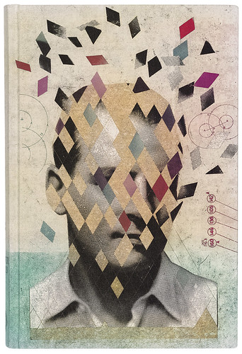
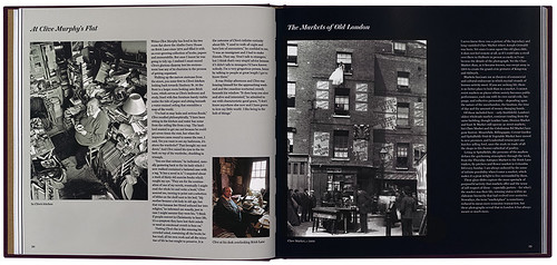
Illustration by Martin O’Neill for the Folio Society’s edition of Oliver Sacks’ The Man Who Mistook His Wife for a Hat (2011).
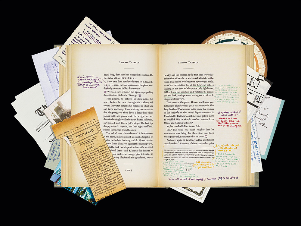
Top: Spread and paraphernalia from the multi-layered S by J. J. Abrams and Doug Dorst (Mulholland Books US / Canongate UK, 2013). Design: Melcher Media.
Cover by Martin O’Neill for Oliver Sacks’ The Man Who Mistook His Wife for a Hat.
Art director Sheri Gee pinpoints two changes brought about by new technology: speed of turnaround and complexity. ‘There aren’t many illustrations that are purely flat artwork. Even if illustrators have drawn it, they’ll scan it in and add digital elements.’
Editor and writer Andrew Losowsky makes the same point: ‘Digital is harder to share, to show to people.’ In his introduction to Fully Booked: Ink on Paper, Losowsky played wittily with the fantasy of print as an exciting, user-friendly new technology, pushing out dreary old digital: ‘At last, with print books, we have come to understand what it is like not to be forever leasing information. We can destroy, scribble, or mail our books from one country to another in ways that digital platforms stubbornly refuse to permit … print books remain accessible no matter how or where we choose to read them. It is truly an “open” platform.’
Sending a link is not the same as pressing a book into someone’s hand – Emma Hayley, founder of the graphic novel imprint SelfMadeHero, talks about the unmatched thrill of giving an author the finished copy of a printed book.
Where digital technology is making a big difference is not in providing competition for print, but providing new opportunities, creative and commercial. Big publishers are finding it tough, which is why they are consolidating. Penguin gangs up with Random House. But for the time being, says Losowsky, ‘Smaller players, with none of the legacy costs and expectations, are finding it easier.’ That’s not always the case, especially when the smaller players rub up against the big boys. Until lawyers raised an eyebrow, Amazon.com allegedly nicknamed its programme for negotiating terms with small publishers the ‘Gazelle Project’, the idea being that small publishers were defenceless prey to Amazon’s big cat.
Still, it is true that the business of editing, designing, publishing and selling a book is far quicker and cheaper than ever before. And as Sam Arthur of Nobrow says, ‘Social media changed everything.’ Amazon is still big and important, but going round it and straight to the reader is easier than ever.
But digital changes more than the way books are produced and distributed; it changes the nature of the printed book. Andrew Losowsky says: ‘Books have been freed up because they no longer have to do everything.’ And designer David Pearson (see Eye 77) says: ‘A nice by-product of this panic we’ve had over the last few years is that we’re thinking about what a book is or could be.’
The consequence is that publishers, authors and designers have been forced to ask themselves, ‘If we’re going to choose to make a physical book, why are we making that choice?’
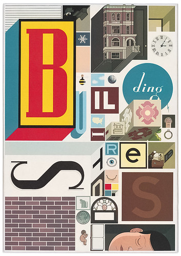
There are a lot of answers to that question. Dietrich says: ‘People still want – and this is a horribly overused phrase – “curated content”. Nothing symbolises that more than a book between two covers. Nothing symbolises it less than an open-ended website.’ Other answers range from the elaborate games with paper, image and text played by Chris Ware’s Building Stories – closer to a giant toy than a book – and J. J. Abrams and Doug Dorst’s S, a playful ‘love letter to the written word’, with its elaborate scribbled marginalia and folded, inserted notes. Elsewhere there’s the beauty of The Gorgeous Nothings, a collection of facsimiles of poems Emily Dickinson scribbled on the backs of envelopes, and the blues of sky and water in Peter Sis’s illustrations for The Conference of the Birds. A screen can give you the content, approximately; but it can’t give you weight, texture, precision of tint and saturation in the way that a well made book can. You cannot scan a screen in the same way either. And of course, a screen isn’t going to impress anybody on your shelf or your coffee-table, or casually poking out of a jacket pocket.
There is a new awareness among publishers and readers of the importance of the aesthetics of books. It is not unusual now, when publishers announce titles, for them to note what paper it is printed on, in what typeface, and to mention the book designer and printer – things that, until recently, nobody thought readers cared about. On the Pushkin Press website the series design (by David Pearson and Clare Skeats) has become part of the selling proposition, with a statement called ‘The Design Story’ that reads: ‘Book design … should be an appeal to (or, if you like, a seduction of) the prospective reader, a manifestation of the qualities of the writing, a primer of expectations. A book should feel right in the hand, and present itself, and its text, well to the eye. That means that the details matter: not only the cover design and illustration, but the paper, the binding, the typeface inside, the positioning of the textblock and a dozen more details.’
As Francis Atterbury (of Hurtwood Press, a specialist publisher of small-run, digitally printed books) points out, a lot of the work on those details has been done in advance: the well made book is the outcome of centuries of experience. That is why the book is a device that does its job extremely well. It has been suggested that, if matches had been invented after the cigarette lighter, they would have been hailed as a huge advance – convenient, cheap, reliable, satisfying to use. Printed books stand in much the same relation to e-books, but books can be individual and beautiful: good design is part of the argument for the value of printed books. Maybe Andrew Losowsky’s fantasy is not as fantastic as all that. And perhaps Julius Wiedemann was premature: we may have plenty of drinking time left. We should celebrate.
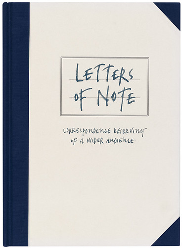
Shaun Usher’s Letters of Note (Unbound, 2013). Design: Here Design.
Shaun Usher, Letters of Note (Unbound, 2013). Design: Here Design.
Reupholstering the classics
The business model that the Folio Society has been running since 1947 – make your books beautiful and distinctive, charge a premium, and market direct to the customer – seemed for many years to be a relic of another age. But, rather like Scott of the Antarctic facial hair, it has become new and fashionable all over again. Some things have changed: where the Folio Society used to advertise for members in colour supplements, next to the Staffordshire pottery, modern publishers woo potential readers through Facebook and Twitter. The aim is not so much to get them to join an actual club as to make them feel they are already in one. But more and more, publishers are adopting the central tenet of Folio’s philosophy, which art director Sheri Gee sums up as ‘Trying to make it so that this will be the copy you want.’
The Folio Society sits at the top end of the market. Each book, with its specially commissioned illustrations and introduction, is printed on carefully chosen paper, bound in particular cloth and presented in its own slipcase. Even at the prices they charge – £35 for a new edition of The Day of the Jackal illustrated by Tatsuro Kiuchi, which is surely the most attractive and stylish copy of an airport thriller you will ever encounter – the margins are not large. Marketing absorbs most of the savings from cutting out the retail middleman.
But beneath Folio sits a whole mass of gorgeous, if somewhat less lavish, reading material. ‘Classics’ – or at any rate, books that have gone out of copyright – come in for a good deal of reupholstering. While the editorial costs are minimal, it is also likely that a reader can find the text free online – so it’s worth spending some money on making the book look like something worth paying for. The designer David Pearson (see Eye 77), who for Penguin has overseen five series of ‘Great Ideas’ and a recent set of Orwell reprints, says: ‘It’s important to make people aware of where the money is going.’ Penguin alone has two new series of scrubbed-up classics, the ‘clothbound classics’ and the Penguin English Library, both designed by Coralie Bickford-Smith.
The clothbound classics are Folio-lite – hardbacks embossed with repetitive motifs hovering between illustration and abstraction. They are gift books, but not extravagant. The English Library editions are handsome paperbacks with their own cover motifs (or sometimes tweaked versions of the clothbound ones) and candy-stripe spines that look neat massed on the shelf.
But at this level there is plenty of competition. Persephone Books concentrates on ‘neglected fiction and non-fiction by mid-twentieth century (mostly women) writers’. They can supply all your Dorothy Whipple needs, in dove-grey paperbacks with endpapers copied from mid-century fabrics. Pushkin Press started out specialising in translated classics – Stefan Zweig was its great rediscovery. Lately, under new management, Pushkin has branched out into contemporary writing; its books are now designed by Pearson and Clare Skeats.
The Folio Society isn’t the only vintage model getting a revival. In the early eighteenth century, Alexander Pope got enough eager readers to subscribe to his forthcoming translations of Homer to become the first English author outside the theatre to live off his writing alone. Three hundred years on, the site Unbound (unbound.co.uk) has successfully solicited funding for books by celebrity authors such as Jonathan Meades and Stephen Fry – but also Shaun Usher, whose Letters of Note was a spin-off from a popular blog.
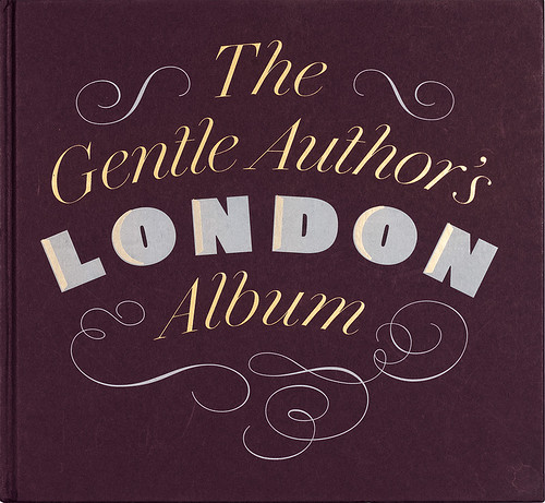
Spread from The Gentle Author’s London Album (Spitalfields Life, 2013). Design: David Pearson.
Cover of The Gentle Author’s London Album. In his long-running blog, the carefully anonymous Gentle Author offers a more celebratory, less ironic view of east London than that of Adam Dant. His devoted Web following has become – again through subscription models – a paying readership.
The ‘red pill’ of publishing
A fundamental error of the early digital era was the assumption that, as writers and readers moved online, the money would somehow follow; consequences included financially distressed newspapers and a lot of hopeful blogging. More recently, newspapers have gone some way towards solving the problem of ‘monetising’ an online readership.
But for the individual blogger a more effective route is to swallow the red pill and go back to the physical world: turn your blog into a book. The anonymous Gentle Author was a pioneer, with spin-offs from his popular Spitalfields Life blog. David Pearson, who designed the Gentle Author’s books, has tried to get as far as possible from the infinitely copyable digital world – the gold leaf shadows on the title of The Gentle Author’s London Album are applied by hand, so that each copy is imperfect and unique.
Former graphic designer Nick Hand, having blogged a summer-long circumnavigation of Britain, published Conversations on the Coast through his own Department of Small Works.
Not every self-published book is a blog in search of itself. Martin Usborne says it is common for photographers like him to see a book as the end-point of a project. But, he says, ‘it is very difficult to find a publisher. It takes a lot of time, and some publishers are asking for a lot of money.’ His solution was Hoxton Mini Press, which specialises in books about fashionable East London.
The first was I’ve Lived in East London for 86½ Years, a photographic record of Usborne’s friendship with the late Joseph Markovitch, a Hoxton resident who professed to have left London once in his life, for a day by the sea. From an initial print run of 250, it has gone on to sell more than 3000 copies.
A Hoxton book costs £12.95, and is nicely produced; a really desirable de luxe copy, including a limited-edition print, goes for £45.
Cover and elements from Chris Ware’s giant box of Building Stories (Pantheon US/Cape UK, 2012). This offers some of the pleasures of Cape’s educational Jackdaw folders (see Eye 29), but with the bleak message that we are all alone and that love is an illusion.
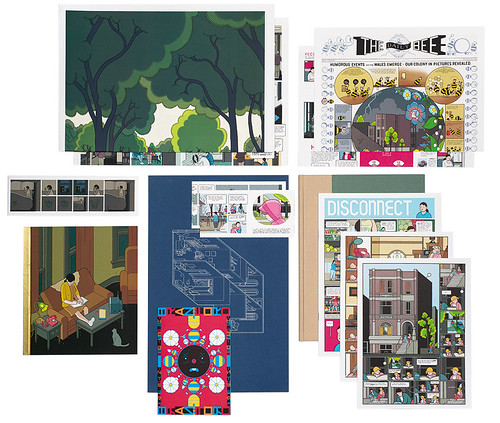
Cover of Chris Ware’s Building Stories.
Bound to connect: the printed hypertext
One explanation for the pessimism about physical books is the assumption that a book is essentially a container for text. In fact, the book is a highly adaptable technology. With a little tweaking, it can encompass Takahiro Kurashima’s interactive visual games in Poemotion 2, or the multilayered narratives of S and Building Stories. S by Doug Dorst and Lost creator J. J. Abrams is ostensibly a copy of a 1949 novel by a mysterious vanished author, V. M. Straka, littered with marginal notes and physical bits of paper – postcards, tickets and maps – which tell another story altogether.
Chris Ware’s Building Stories depicts a single building’s various occupants (old lady, middle-aged florist, unhappy young couple, trapped bee) through comic books in a variety of formats – a pamphlet, album, strip book, poster, newspaper for bees – all in a giant cardboard box. Perhaps it took a modern, hyperlinked sensibility to come up with the format, but paper and card are what give it a whiff of life.
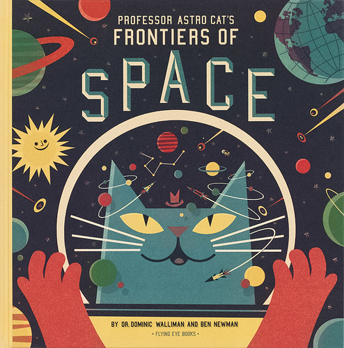
Professor Astro Cat’s Frontiers of Space by Dr Dominic Walliman, illustrated by Ben Newman (Flying Eye, 2013). Serious cosmology in the guise of a retro picturebook for Nobrow’s children’s imprint.
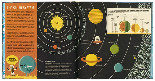
Cover of Professor Astro Cat’s Frontiers of Space by Dr Dominic Walliman, illustrated by Ben Newman.
Luminous graphics to beat digital burn-out
In 2008, Sam Arthur started the imprint Nobrow as a response to the idea, ‘that print was dead, that everything would exist in the ether, in the cloud, in a drive in the San Fernando Valley … it was so depressing.’ The week the new company acquired a lease on its premises in Shoreditch, Lehman Brothers collapsed, which was also depressing.
But Nobrow survives, pushing out into the world strange, luminous graphic art books. English doesn’t have a proper word for the genre – the French bande dessinée fits best – and perhaps that helps explain their comparative success. The market in Britain barely existed, so it could hardly shrink. Nobrow and SelfMadeHero (est. 2007), which publishes books that are more plausibly classified as ‘graphic novels’, have found that while digital marketing adds customers, digital publishing doesn’t subtract sales. Graphic content – so dependent on layout, proportion, the way the eye travels on the page – does not easily translate to a screen. Arthur speculates that artists and readers have suffered digital burn-out: ‘It got to the point where everyone was so reliant on digital, it’s almost a novelty to do it by hand. So screenprinting, monoprinting, risograph … These are things people have taken to.’
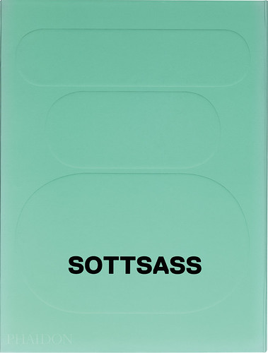
Spread from Sottsass by Philippe Thomé (Phaidon, 2014). Design: Julia Hasting.
Cover of Sottsass by Philippe Thomé. Even though its weight and £100 price tag scream seriousness, the book is an appropriately playful, colourful survey of the celebrated designer, with an abundance of sketches and holiday snaps. Sottsass is not so much a book as (to borrow a phrase from the text) a ‘virtual reliquary’.
The bold beauty of a great big book
If there is one segment of the book market that has not been affected by digital competition, it is that of art and design books. That may be because, as Lucas Dietrich of Thames and Hudson argues, digital books have two big problems: first, aesthetic diminution – ‘the devices impoverish the images quite considerably’ – and second, by the time the publisher has produced editions for Kindle, iOS and Android, costs for digital versions are not significantly lower than for print, but the digital customer wants to pay a fraction of the print price. Dietrich says, ‘If they’re going to buy a book, they want a big book.’ Hence, for example, Phaidon’s Brobdingnagian Sottsass retrospective – 3kg of text, photographs and repro artwork printed on paper in a giddy range of weights, textures and colours, all bound in a textured, wraparound cover.
One thing that has changed is the way a book is marketed and distributed through the Web and social media. Unit Editions is run mostly over the Web by founders Tony Brook (see Eye 86) and Adrian Shaughnessy. Recently, they tweeted the printing progress of their elegant Manuals 1: Design & Identity Guidelines, showing photos of piles of finished copies to foster a sense of anticipation among existing customers and, at the very least, mild covetousness among potential customers.
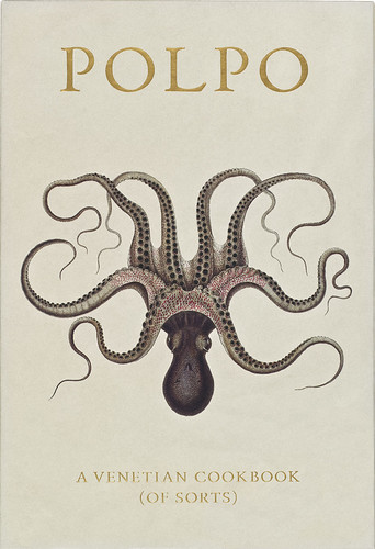
Russell Norman’s tactile Polpo (Bloomsbury, 2012) has a look and feel that excites book lovers as well as gourmands. Design: Praline.

Cover of Russell Norman’s Polpo.
Fetishised manuals for an idealised kitchen
No books are more fetishised – more over-produced, more showed off, more drooled over – than cookery books. A good example is Polpo by Russell Norman, with a spine stripped to expose the binding, and a typeface based on an antique Venetian model. But cook books are also instruction manuals, intended for use in humid, messy environments. Polpo does acknowledge this: it sits flat when open in a concession to functionality.
Emilia Terragni embraces the contradiction: her family had an elderly copy of The Silver Spoon, the huge and popular Italian cookbook, ‘Looking at all the stains is quite funny, and you perfectly remember which recipes are done over and over and which pages are pristine,’ she says:
As editorial director of Phaidon, Terragni oversees elaborate projects such as A Work in Progress by René Redzepi of Noma in Copenhagen. It is actually three books, a diary, a recipe book and a book of snapshots, packed together with a fetish-friendly thick rubber band. You could cook with it. Or you could just stroke it, while dreaming of glazed sweetbreads.
Spread from Martin Morales’ Ceviche (Weidenfeld and Nicolson, 2013). Design: Here Design.
Robert Hanks, journalist, critic, broadcaster, London
First published in Eye no. 88 vol. 22 2014
Eye is the world’s most beautiful and collectable graphic design journal, published quarterly for professional designers, students and anyone interested in critical, informed writing about graphic design and visual culture. It is available from all good design bookshops and online at the Eye shop, where you can buy subscriptions and single issues. You can see what Eye 88 looks like at Eye before you buy on Vimeo.