Spring 2002
When 1+1=3
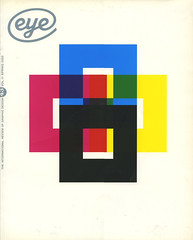
Colour overprinting: constructed images by printers and designers
Set inconspicuously on the Attributes palette of Adobe Illustrator 9.0 is a setting labelled Overprint Fill. What, exactly, an ‘x’ in the box will produce may at first mystify the uninitiated, though Illustrator’s Help manual soon clears the matter up. By default, if two onscreen objects of, say, different flat colours are superimposed, the top object will ‘knock out’ its shape from the one beneath. If the objects are then output to separate films or plates and printed sequentially in their assigned colours, the common edges abut, but their colours do not mix. If, on the other hand, the top object is set to overprint, both objects retain their shape when output. If again printed as separate colours, they overlap. And where they do overlap, their colours mix to create a third if the ink is transparent.
It may seem odd to take much notice of something that even the least experienced designer quickly grasps, and that users of Illustrator encounter and deal with routinely. But of the many traces left by the work of printing ink on paper, overprinting surely demonstrates the process most obviously. And if colours – especially flat ones – feature prominently, their interaction and articulation of colour-space can be dramatic and intriguing. For commercial printers and reprographic technicians, colour overprinting is hardly a novelty, since most colour printing has long relied upon pigments mixing on paper (as well as light waves mixing through vision). Yet it is only since the 1940s that designers have really taken to the technique as a conspicuous device of image construction.
Though Illustrator is an advance on older procedures of design and production, its overprint option remains circumscribed by an inability to display on screen what actually happens on paper. The deficiency is not calamitous, as most designers are able to imagine the result of two colours overprinting. Nevertheless, it fails to address what has always been the most challenging aspect of colour overprinting: its accurate prediction. Knowing how printed colours mix is essential to controlling outcomes. And accurate prediction makes possible the efficient use of colour, where a select few can be multiplied into a broad chromatic spectrum.
Prediction and economy are indispensable to printing in which colour separations are created manually (i.e. not by process photography). Commercial colour lithography based on hand drawing, perfected during the middle decades of the nineteenth century, is an important example. In preparing a painting, a cartoon, a poster or some other design for reproduction, it was incumbent upon the lithographic technician to devise a colour ‘map’ for it, one able to give an acceptable translation of the original. The colour map also needed to create the required colours, singly and if necessary by overprinting, using the least number of ‘workings’. This meant fewer stones or metal plates to prepare, and less time spent printing: both naturally affected the cost and profitability of the lithographer’s activities.
In most instances, knowledge of colour mapping resided in the collective expertise of lithographic technicians. Like many trade skills, colour mapping was commonly learnt on the job and passed down to apprentices from those already practised in the work. In addition to selecting the colours –sometimes more than ten or twenty – and predicting those newly generated through overprinting, the technician had to consider the opacity or transparency of the inks, their most appropriate order of printing and the optical interactions of neighbouring colours. These and other variables made colour work a complex matter but, if skilfully done, exceptionally effective.
There was an alternative to the colour complexities of drawn lithography: the three-colour (or tri-chromatic) process. It was developed in the latter part of the nineteenth century and, as a means of colour reproduction, was at first thought complementary to lithography. As its name suggests, colour mixing was achieved with just three transparent inks: cyan, magenta and yellow (black was later introduced to produce the four-colour process). This simple scheme meant that the three-colour process was relatively easy to demonstrate, as it often was in contemporary technical and trade literature. Although its colours it could generate were less rich than those of lithography, its ease of use had much to recommend it.
Colour overprinting was exploited by printers and technicians on a daily basis: it was just one component of colour creation and rarely considered meaningful on its own. But in 1940 an attempt was made to locate colour overprinting closer to the expressive centre of image construction: Thomas E. Griffits’ The technique of colour printing by lithography (see sidebar, below). Though written by someone who was trained as a technician, the book - more a manual, in fact - formed a bridge between Griffits’ own extensive technical expertise in colour overprinting and the possibilities the technique opened up to designers and artists.
Helpful though Griffits’ manual was, it dealt with a species of printing that designers had increasingly little contact with. Just a few years later though another publication took up colour overprinting for letterpress and offset-lithography, and it, too, sought to link the technical side of printing with design. Inspirations for printers was issued by the West Virginia Pulp and Paper company (Westvaco) and art directed by Bradbury Thompson. At the end of World War ii, Thompson guided Inspirations away from its wartime subject matter toward an emphasis on the mechanics of four-colour process printing. This provided Thompson with a vocabulary of form and colour drawn from the artefacts of print production: halftone screens, process separations and colour mixing with overprinting inks.
In his (almost unavoidable) integration of mechanical form into the pages of Inspirations, Thompson fell in with those Modernist designers who had, since the 1920s, used the formal vocabulary of mechanical reproduction to express their own preoccupations with technology and the machine. One element was direct and obvious overprinting that made explicit the workings of the press – type on type and over images – and photomontage conceived through superimposed process blocks. Here, transparency and colour often played an important role. But there was little apparent interest in making new colours with overprinting: while colours might be chosen individually for their narrative associations or optical behaviour, those made on press – where this occurred – appear fortuitous. This is surprising given the suggestive analogy of image and structure colour overprinting formed with practises elsewhere in Modernist art and architecture (see Purism sidebar, below).
By 1945, however, colour overprinting had in the work of Thompson found a ready exponent, and his experiments encouraged designers to examine what the operations of printing might offer in the way of inventive, contemporary expression. Still, it is difficult to ascertain the influence Inspirations had in general, and unwise to suggest that it inaugurated the popular application of colour overprinting among designers. One might, for instance, note the publication of Language of vision (Gyorgy Kepes, 1944) and Vision in motion (László Moholy-Nagy, 1947): both books illustrated methods of image construction that employed superimposition, interpenetration and transparency. Indeed Kepes made explicit the latter’s connection to printing wherein ‘one printing over another will condense a variety of spatial dimensions into one meaningful whole’, a unity that seems likeliest when colour is involved. These pedagogical compendia were a diffusion of Modernist modes of image-making for which overprinting was a natural ally. This was apparently true in Switzerland where colour overprinting proved germane to postwar ‘constructive’ design based in part on a (Modernist) expression of structure through pure form and colour.
From the mid-1940s, the obvious and designerly use of colour overprinting could be found in many places, and continued well into the 1960s. But despite publications such as Inspirations, and books and polemics that expounded languages of vision, many designers probably learnt colour overprinting informally: through trial and error; a desire to experiment; budget pressures; or a helpful and patient printer able to make imaginings concrete. Others may have come to colour overprinting through printmaking – lithography, wood-engraving, and so on – where, as in the printing industry, it was already well understood. And manuals were published, such as Donald E. Cooke’s Colour by overprinting (1955). It was indebted to drawn colour lithography and, in its impressive planning and execution, indicated just how seriously some took colour overprinting as an engine for ‘new’ kinds of image construction. (See sidebars: Dramatic colour; Overprinting with process colours).
Colour overprinting has since been absorbed into the work of design for print; in places reduced to an evocative 1950s-style design, a shorthand for all that is (repro)graphic, or a vestige of Modernism’s fascination with mechanical form. But these associations do not apply uncontested. They may be resisted by the mere utility of colour overprinting that signals the economics of design and print production where budgets are a matter of urgent restriction and colours are few. In such cases – and as a general principle – colour overprinting derives from available resources that, if used well, can be configured and multiplied in intelligent and surprising ways. That colour overprinting is avoided by many designers may be due to the perennial difficulty of prediction, the scarcity of imaginative exemplars, the lack of clients and printers willing to countenance uncertainty and experimentation, or the configurations of present-day software applications that obscure the expressive potential of the printing process. But those designers who are inclined to work in this way remind us that the printed artefact need not be singular and unyielding and impenetrable but may instead, through the discrete and observable operations of printing, accommodate our enquires into how it was made. Colour overprinting also reminds us that here at least is one technique of image construction that designers for print can surely call their own.
With thanks to:
Ken Garland, Karl Gerstner, Jost Hochuli, Richard Hollis, Robin Kinross, Theodora Mantzaris-Kindel, Pauline Sugino (Honolulu Academy of Arts), Graham Twemlow, Michael Twyman, Gerard Unger, and the Department of Typography & Graphic Communication (The University of Reading).
Sidebars:
Colour lithography
Thomas E. Griffits, The technique of colour printing by lithography, 1940
The publication of Thomas E. Griffits’ 1940 manual on drawn colour lithography coincided with its decline as a viable commercial process. But by publishing an account of colour lithography as he had known it in Britain for almost 50 years, Griffits wanted to place in the hands of artists and designers skills that were commonly the domain of the technician. In describing the whole work of lithography, Griffits dealt with colour at length; indeed his manual is one of the few – if not the only – that attempts to codify the complexities of printed colour in this sphere.
For Griffits, the use of colour was predicated on translation, that is to say for reproducing a colour original. To this end, the artist or designer aspiring to lithography needed to envision the original as a series of black impositions to which colours were assigned. The colours of each imposition would, when superimposed, mix to produce a rendition of the original. Colour choices were made by eye: a palette was made up first by isolating a set of basic colours in the original; these were then tested (using equivalent water-colour washes) to establish what additional colours they might create through overprinting.
What made colour overprinting complex was anticipating colour behaviour, as colour maps could be distorted by a variety of secondary factors: the relative opacity or transparency of overprinting inks (often highly variable); their order of printing (two overprinting colours might give different results depending on their position in the order); the reflective values of contiguous colours (where haloes of complementary hues from one colour mix with the adjoining colour and alter it); and a surprisingly large number of minor colour effects that could only be foreseen with the benefits of experience.
Griffits was a skilled lithographer with a special feel for printed colour. In his subsequent 1948 book Colour printing, a comparison of letterpress, photo-lithography and drawn colour lithography, Griffits reminisced on his collaborations with many well-known artists and designers. Tellingly, he regretted among those with whom he worked a tendency to treat colour lithography merely as monochromatic design with colours added, or as drawing in colour, and not something more: ‘Why, I wonder, has colour lithography never been exploited by any modern artist as a painting medium by using the colours over and under one another for obtaining deep rich colour effects?’
Purism
More than any other area of early twentieth-century Modernist art or design, Purism may pre-figure colour overprinting as exploited by designers for print. The style was championed by two painters, Amédée Ozenfant and Charles-Edouard Jeanneret. A great deal of what defined their work revolved around ‘mechanical selection’, a machine age equivalent of Darwinian natural selection. Objects that manifested mechanical selection were those whose form had evolved toward some maximum of efficiency and functionality: they became purified ‘object-types’. Purist paintings were usually constructed from a limited choice of objects (usually French) which Ozenfant and Jeanneret observed had undergone this process: jars, glasses, bottles and pitchers, for example, as well as guitars and architectural elements.
Their co-ordination within the Purist painting was effected in several ways: by the formation of chromatic harmonies; by a ‘marriage of contours’ which illustrated economies of form by emphasising profiles shared by several objects; and by superimposition. The latter was achieved by introducing a degree of transparency to opaque objects or by simply choosing transparent glass objects as subject matter. The resulting compositional order of the painting was both mathematical – a kind of neo-Platonic geometry – and mechanical, where form and colour meshed together two-dimensionally and in an illusionistic succession of interpenetrating planes.
The Purists did not render machines, as one might expect, but their imagined equivalences and their paintings were mostly devoid of surface texture or relief. Their theoretical inclinations also allowed for the multiple production of single works, though this was never carried out in practise. Ozenfant argued that this process would not devalue them, but rather continue the process of mechanical selection that led towards perfection.
Though Ozenfant and Jeanneret ceased collaborating by the mid-1920s, the latter – as Le Corbusier – pursued aspects of Purism in his architecture, where object-types are found in his vocabulary of discrete geometric forms ordered in plan and elevation. Their interpenetrating and overlapping planes and volumes, and many transparent features, developed in three dimensions what Purist painting had done in two.
Dramatic colour
Donald E. Cooke, Color by overprinting, 1955
As drawn lithography was disappearing from the commercial printing scene, Donald E. Cooke published this book to revive its principal technique of colour creation. In Color by overprinting, Cooke lamented the imitative impulse of most colour printing generally and four-colour process reproduction in particular. He argued that they were always imprecise and distorted the colour original. Instead, he believed that work should concentrate on outcomes, on end products whose originality resided partly in the printing process itself. This, he felt, might be achieved with ‘line art’ whose colours were mixed directly, by overprinting, rather than by the process emulation of colour using half-tone screens.
Cooke claimed his was a ‘new approach with startling potentialities’ while admitting that its basis was in fact a re-alignment of already well-known principles. But where drawn lithography’s innumerable colour interactions could not be easily codified, Cooke devised a palette of eleven carefully selected, transparent colour inks for letterpress and offset lithographic printing. Singly and through overprinting, the eleven colours would afford designers a wide range of chromatic expression, while the demonstration of their myriad interactions was admirably compact.
Though Cooke’s approach was expressed in technical terms, his aims (like those of Thomas E. Griffits) were artistic, and he encouraged the designer to conflate the technical and artistic processes. But despite the close relationship Cooke promoted between image-making and the printing press, and the evident accord this struck with Modernist ruminations on the role of the machine in art and design, the applications he envisioned for colour overprinting were distinctly conventional. Most examples included in the 1955 edition were at once technically elaborate and graphically banal: he took special note of a programme of colour overprinting begun by The Reader’s Digest in the late 1940s. Cooke published a second edition in 1974 under the revised title Dramatic color by overprinting, but the few additional examples he included did little to represent the diversity of design since conducted with colour overprinting.
Overprinting with process colours
Hans Gaensslen, Graphik-druck mit Einkopierraster in vier Farben [Graphic printing with overprint screens in four colours], 1958
Unlike the debt Donald E. Cooke’s near contemporary manual of colour overprinting owed to the colour palettes of drawn lithography, Gaensslen’s Graphik-Druck was based on the chromatic spectrum generated by overprinting the four process colours. Gaensslen’s demonstrations of colour interactions were intended to help designers ‘avoid much disappointment, expense and experimentation’, and assist in discussions between printers or reprographic technicians and designers and their clients.
The bulk of Graphik-Druck illustrates two-, three- and four-colour groups overprinting as solids and in a variety of textures, patterns, and process screens. The latter – printed on film, paper or cellophane and bought commercially – were to be laid down by the designer in the preparation of camera-ready artwork. Colour creation was guided by the colour groups, which were printed one per page throughout the middle section of the manual. Dots at the edge of each page indicated the colours used in any particular group and their order of printing. In addition, every page was halved horizontally, allowing different colour groups to be combined by turning the top or bottom set of pages as needed.
At the back of the manual, a series of more elaborate three- and four-colour combinations indicated just how sophisticated overprinting could become and where else the technique might lead. Indications included gloss effects generated by printing colours over black, and the creation of moiré by overprinting half-tone screens at various angles. For the enthusiastic author, moiré represented ‘a quite new field’ of visual effects ‘hitherto unknown or not sufficiently appreciated’.
First published in Eye no. 43 vol. 11 2002
Eye is the world’s most beautiful and collectable graphic design journal, published quarterly for professional designers, students and anyone interested in critical, informed writing about graphic design and visual culture. It is available from all good design bookshops and online at the Eye shop, where you can buy subscriptions and single issues.