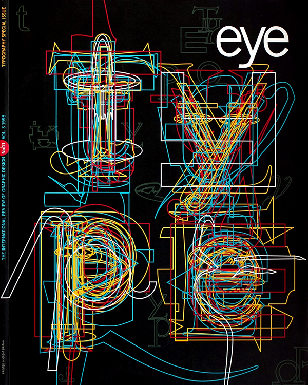
Winter 1993
Editorial Eye 11
Editorial
A certain tension has been present in Eye’s pages from the beginning and in the process of assembling a special issue on typography that expresses the range of contemporary opinion it has surfaced again. For Robin Kinross, writing about the work of Dutch typographer Karel Martens, “multiplication of text is a social act” and orderly typography can be a model for social arrangements too. Jeffery Keedy, on the other hand, concludes an essay illustrated with some of the more subjective and extreme new typefaces by advising designers to stop worrying and jump into the “post-structural, post-modern, electronic flow.” One position is ethical, sees design as a tool of social improvement (as did the Modernists) and subordinates all other goals to this aim. The other is hyperindividualistic, accepts the conditions of advanced consumer capitalism and surrenders hedonistically to the seductions of media. One prioritises the needs of the user; the other celebrates the freedom of the designer. One struggles to resist the “delusions” of the image; the other bathes in the image. Nor can this division be written off as simply a case of Europe versus the US. Dissenting voices can be found within American design, while many European designers are much closer to Keedy’s position than to Kinross’. In fact, Dutch design of the 1980s could teach America lessons in self-absorption, which is why some Dutch design thinkers now see an urgent need to re-examine the designer’s relationship with client and society. And yet listening to the two sides, I sometimes suspect that the differences are as much to do with temperament and taste as with underlying philosophy. Does it really have to be one worldview or the other? Why can we not have both a critically rigorous typography that answers as scientifically as possible to the full range of users’ needs (as Paul Stiff writes in Agenda, hunches are no longer enough) and design as an evolving, expressive, media-based art? The important issues would then be (a) avoiding the present confusion of the two functions in cases where there is no justifiable overlap and (b) ensuring that design effort does not fall disproportionately in one place. RP
First published in Eye no. 11 vol. 3, 1993
Eye is the world’s most beautiful and collectable graphic design journal, published for professional designers, students and anyone interested in critical, informed writing about graphic design and visual culture. It is available from all good design bookshops and online at the Eye shop, where you can buy subscriptions and single issues.

