Summer 2008
Fraser Muggeridge
Who cares about graphic design history?
Fraser Muggeridge, London, Fraser Muggeridge studio.
Fraser Muggeridge grew up near Luton in Bedfordshire, and graduated from the University of Reading, where he studied Typography and Graphic Communication, in 1995.
Q1. What do you think is meant by ‘the canon of graphic design history’? Do you ever think about it, or buy design history publications?
A1. Yes, I think about it a lot – for me graphic design history is very much linked to the history of technology – what was possible at the time, how things were made and produced. I’m not so much into the big, well known things – more the normal day-to-day things that were printed throughout history. It’s funny, people imagine the 1930s to have all this Bauhaus stuff everywhere but really it was a tiny percentage. I am very into looking at old ads in old magazines. This tells me what was really going on at the time. And buying old art catalogues – the content is the same as what I do now but the technology is very different. I’m drawn to strange, quirky (so bad it’s good) stuff, not necessarily good from a critical design point of view.
Q2. How does this relate to your practice?
A2. All these things go into my brain and get reinvented or part-used in some way – sometimes obviously (like a colour combination), sometimes more subtly (like a particular fold or format). For example, I recently designed an invitation card to an exhibition, the format being based on a 1973 card that Richard Hollis did for the Whitechapel Gallery – Kenneth and Mary Martin. It was a very small format as it used mirrored card – Richard told me that it was so small as the card was so expensive – so I took this idea and did the same thing for a card 30 years later.
Q3. Where did you learn about design history?
A3. At Reading in the 1990s.
Q4. Does history have any relevance to the new technology and techniques you’ve had to master in your work?
A4. Yes. I am forever trying to make things look old or from a certain time period. I often scan in old type specimens and hand-set them in Photoshop or set things on a Mac – print it out, blow it up and down on a photocopier, then rescan. The thing that I’m drawn to about history is pre-computers, when things were more soulful (nowadays the computers have made things too perfect), so I use the computer in reverse to make things look historical and more quirky – and less perfect. Instead of just using a line drawn perfectly in Quark, I will scan in a rule from a type specimen sheet and use that (very subtly different but very important). Instead of using computer typewriter fonts, I will set the text on a typewriter and scan in. I know of when typefaces were released – and from what period and country. When I look through Linotype Font Explorer, I recall some of the Saturday morning lectures I had from James Mosley.
Q5. If you were in charge of a design education programme, what aspects of design history (if any) would you teach to your students?
A5. I would look at how and why technology changed things – Michael Twyman’s book ‘Printing 1770-1970’ is excellent – and also the really bad pieces of design throughout history that somehow seem good.
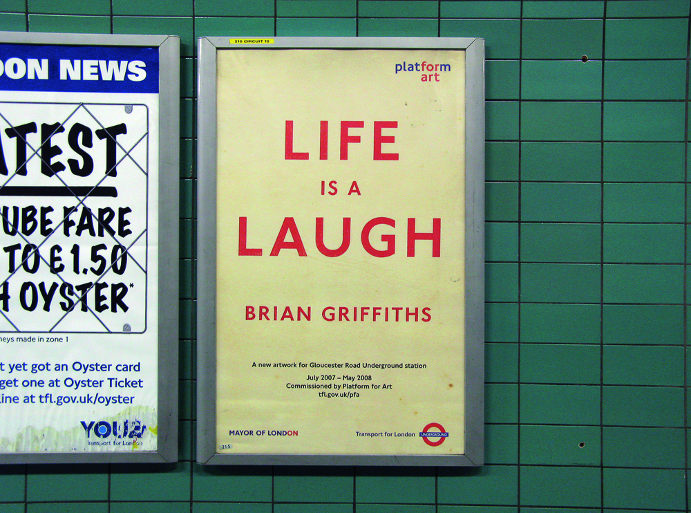
Top: ‘Life is a Laugh’ by Brian Griffiths, poster commissioned by Art on the Underground, London. Design: Fraser Muggeridge Studio, 2007. Muggeridge explains: ‘I made the poster look like a poster from the 1930 or 40s by doing the type, then printing it out, then photocopying it, then blowing it up, then rescanning, then superimposing on a dirty background that was taken from the end papers of an old book I had lying around.’
First published in Eye no. 68 vol. 17 2008
Eye is the world’s most beautiful and collectable graphic design journal, published quarterly for professional designers, students and anyone interested in critical, informed writing about graphic design and visual culture. It is available from all good design bookshops and online at the Eye shop, where you can buy subscriptions and single issues.