
Winter 1993
Monitor
Who says classical has to mean boring?
"Tradition is an historical accomplishment that the designer must grow upon and yet apart from,” argued Lester Beall in “Typography-USA,” a critical paper issued in 1959 by the Type Directors Club/New York. Thirty-four years later, Beall’s admonishment has some force when applied to those who hide behind historical scrap as a way of avoiding original thinking. But times have changed. For some of today’s designers, adherence to humanist typography and classically inspired page design is a welcome and necessary escape from the retro and techno excesses that have characterised the past decade.
The reprise of a venerable aesthetic rooted in simplicity and symmetry is gradually finding its way into design competitions and the marketplace. Whether this resurgence of historically influenced design is nostalgia of the type Beall decried or simply a re-appreciation of the inherent virtues of time-honoured forms is unimportant; both are valid justifications for its practice. Yet to call the new classicism a new wave may be premature, if not dangerous: though there are significant signs of change, at present the evidence does not yet add up to a fully fledged movement. And in any case, to refer to this work as though it were on a par with the ups and downs of hemlines is to trivialise what may be influential shift in methodology.
Classic approaches are being practised in different media by designers throughout the US. Some of them have been students of classicism for a long time – for example, Roger Black, who draws inspiration from an extensive library of type catalogues. Black’s 1990 format for Esquire magazine uses custom-made, digitised versions of typefaces by American type masters Goudy, Dwiggins and Updike, often in layouts borrowed directly from their oeuvres. Other designers have acquired an interest in history and a healthy respect for precedent, as with Fred Woodward, whose opening spreads for recent issues of Rolling Stone draw inspiration from nineteenth-century English title pages. Other practitioners who to date have worked in contemporary styles are now turning to the classical heritage for nourishment and renewal, as is New York firm Drentell Doyle, whose advertising kiosk for New York’s Cooper-Hewitt Museum pays homage to the holy grail of humanist type, the Trajan column.
Not only are the exuberant design styles of the 1980s giving way to a new sobriety, but the supremacy of Modernism as a design standard is also on the wane as designers create new paradigms from older precedents. This re-evaluation of the past is not analogous to the architectural neo-classicism that has flourished during the last two decades, based on a torturous marriage of Modern and traditional forms. In design terms, the new classicism is not simply about decorating Modern grids with an array of quaint ornament, but rather seeks out the most economically elegant solutions to a range of complex problems – from book design to annual reports. But simplicity is not the only touchstone – the classical solution is also notable for its abiding respect for the word.
The new classicism regards the word as the cornerstone of communication. In contrast to design where texts are treated as stylistic accoutrements, this aesthetic regards type as the servant of language, and design – no matter how stylised – as enhancing meaning. While this may also be true of much other contemporary graphic design, what further distinguishes the classicism is its use of elements derived from the classical wellsprings of Renaissance Italy and France. But this approach is not an appropriate solution for all design problems and should not be regarded as a panacea for all design’s current ills. Classical applications are most suitable for media with historical legacies – in particular the magazine and the book.
The popularity of a classical approach to book design was evident at the 1993 AIGA “Fifty Books Show,” whose jurors favoured publications whose architecture followed the classical model. This was not always easy, given the number of raucously designed submissions that eschewed even the most fundamental rules, such as lining up the half-title and title pages or maintaining margins generous enough to allow for unhampered reading. But the competition results indicate that a significant number of books designed today conform to classical principles, while at the same time showing obvious signs of having been produced in the 1990s. Though not as orthodox as the “Fifty Books Shows” of the 1920s and 1930s, which included barely a single Modern asymmetrical format, or as pluralistic as more recent competitions, which seemed set to celebrate alternative design, the 1993 event – with books such as Crack Wars, designed by Richard Eckersly, and Agnes Martin, designed by Katy Homans and Sayre Coombs – proves that a classical archetype is alive and well respected.
All well as book interiors, covers and jackets also exhibit a switch to classical simplicity from what might be called the mini-poster aesthetic. While most recent American jacket and cover design has been governed by the ten-foot rule – the idea that the title (and sometimes the author’s name) must be legible from a distance of at least ten feet – today the radical notion that the type or image need not be explosive to attract attention has infiltrated some marketing departments. Though this does not mean that book stores are about to be filled with a plethora of single or two-colour jackets with small Bodoni or Jensen type, there are some arresting experiments in simplicity nestled among the conventional clutter. One noteworthy example is the jacket for the paperback Intimate Visions: The Photographs of Dorothy Norman, designed by Sheila Levrant de Bretteville (with Susan Sellers). The generous use of negative (off-white) space against which are printed fine digital cuts of Eric Gill’s Gill Sans and Joanna, rendered in two subtle colours with a tip of the hat to classical precedent, is an eye-catching alternative to standard fare.
The jacket for Intimate Visions also dispels the notion that classical equals boring. The new classicism is distinguished from parochial typography of what might be called the traditional school through its ability to achieve contemporaneity with grace and style while respecting the rules of design. Many of the old-school traditionalists (designers whose names are known to the venerable Typophile and Book Builder societies) work for academic presses and journals where conventions – such as the unswerving adherence to central-axis symmetry rooted in Renaissance ideals of beauty – have been followed for decades with little modification. The new classicists, by contrast, are flexible enough to allow changes introduced by time and technology to affect, though not to overpower, their work.
Some of these practitioners have been exponents of contemporary approaches and so brig to their craft a wisdom born of experience. Stephen Doyle of Drenttel Doyle was a maverick proponent of typographic complexity as exemplified by his format for Spy magazine, which unabashedly broke numerous taboos governing typographic legibility and harmony. The fact that his inventiveness became monstrous when appropriated by other designers has caused him to impose old standards on his work. The result has been a conspicuous switch from measured chaos to restraint. In embracing classicism, Doyle has not forsaken contemporaneity, but rather has released his work from the fashionable clichés he created.
The new classicism serves as an antidote to the prophesy that print is dead. Those designers who have backed up their predictions about the inevitability of the demise of print in the wake of an interactive media explosion with concoctions that exude the worst excesses of hypermedia in static approximations of the video/CD-ROM experience may have to recant. The following anecdote illustrates the need to refocus current practice away from matters of style to issues of standards.
Following the presentation of book and magazine designs by a veteran designer to a prestigious American design organisation, a member of the audience announced: “Your work is irrelevant today because it was not done by computer.” “I do all my work on the computer,” the designer replied. “Well, it doesn’t look like it,” countered the young man. This inane exchange illustrates a belief among many young American designers that graphic design must be discernibly computer-generated to qualify as “relevant.” As the computer has become an integral part of designers’ lives, the layered aesthetic has become almost a litmus test of contemporaneity.
A reaction to computer-driven approaches was predicable, but to judge by the evidence, exponents of the current return to classicism are not just reactionary or nostalgic, but are attempting to re-apply the tenets of traditional design in order to rout visual chaos. Drenttel Doyle’s Dislocations catalogue for a recent New York Museum of Modern Art exhibition is not a facsimile of a seventeenth-century Italian book page, but rather uses classical composition to complement the avant-garde nature of the exhibition – that is, as an appropriate solution to a contemporary problem. Similarly the recent paperback fiction covers designed by Louise Fili take their cue from the early twentieth-century classical revivals of Goudy and Updike, yet show that strong typographic treatment can be achieved by well-designed letters framed by generous amounts of white space.
The new classicism is not a prison built of tradition, but a release from isms and technological bromides. To adhere to classical approaches is not a rejection of timely practice, but rather an alternative way to address design problems – not by how much “today” can be imposed, but by what will serve as a firm foundation that might endure the battering of time and fashion.
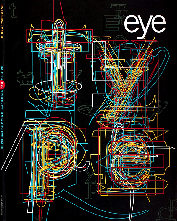
First published in Eye no. 11 vol. 3, 1993
Eye is the world’s most beautiful and collectable graphic design journal, published for professional designers, students and anyone interested in critical, informed writing about graphic design and visual culture. It is available from all good design bookshops and online at the Eye shop, where you can buy subscriptions and single issues.