Sunday, 11:59pm
9 February 2003
The ‘Ernst Bettler’ problem
A ‘testament to design’s power to change things’? Or exactly the reverse? Critique by Rick Poynor
Web-only Critique written exclusively for eyemagazine.com
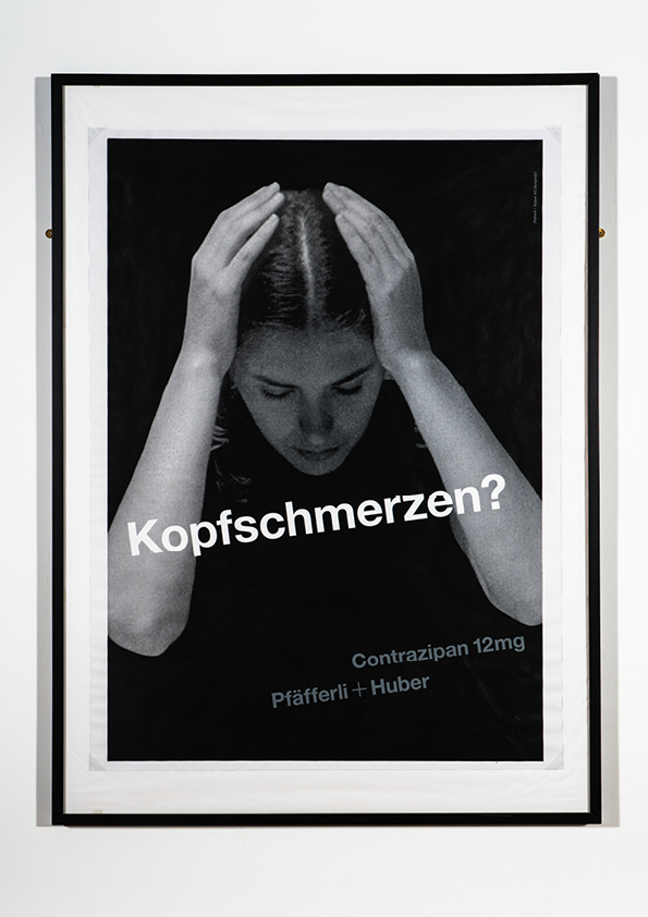
Readers of Problem Solved, a new book by the British designer Michael Johnson, incoming president of D&AD, will learn about a remarkable episode in graphic design history. On page 202, Johnson shows a poster created in 1959 for Pfäfferli+Huber Pharmaceuticals by a Swiss designer named Ernst Bettler. A young woman clutches her head with her hands and the word ‘Kopfschmerzen?’ (headache), printed at an angle across the image, combines with her arms to form the letter ‘A’. Clearly she would benefit from the company’s pain reliever, Contrazipan.
The poster, Johnson records, is one of four which, displayed side by side, spelt out the word ‘Nazi’ – a helpful little typographic illustration shows how. Posted in public places, they revealed P+H’s ‘Nazi roots’ (Johnson gives no further details) and the Swiss public was outraged. Within six weeks, the pharmaceutical company had gone out of business, making this a highly effective early example of ‘culture jamming’ by one of the movement’s ‘founding fathers’.
It’s a fantastic story. The only problem is that none of it actually happened. Every element – Bettler, P+H, Contrazipan, the posters – is a fabrication. Johnson gives his source, but it is one that will already be familiar to readers of Dot Dot Dot, the eccentrically inventive, twice-yearly design journal. Issue two, published in 2001, carries an article by Christopher Wilson titled ‘“I’m only a designer”: The double life of Ernst Bettler’, in which he tells the full story. It’s a highly convincing historical profile, written with a nice sense of irony and many plausible details. Pfäfferli+Huber had been involved in testing carried out on prisoners in concentration camps, and the posters were put up on hundreds of sites around Burgwald and neighbouring Sumisdorf (unfortunately, these places don’t exist in Switzerland either). The article shows the ‘A’ poster and photographs of someone purporting to be Bettler as he was in 1954 and as he is today, living in London.
Johnson isn’t the first to fall for the hoax. Adbusters showed the poster and ran a short item about ‘one of the greatest design interventions on record’ in its September / October 2001 issue. The hoax was exposed months ago by the excellent Lines & Splines weblog (now defunct) and this was gleefully reported by the website Leftwatch (also defunct). Dot Dot Dot, asked on its own website whether the story was a hoax, replied: ‘as far as we are concerned it is true. DDD is based on true stories.’ An editorial in issue two acknowledges that the journal resorts ‘to fiction to make certain points’.
What, then, is the point of the hoax? If the aim was to fool credulous browsers into perpetuating the story, then this latest development is a triumph. It’s now a permanent feature in thousands of copies of an internationally distributed book produced by a major publisher, Phaidon, and it’s likely to be taken at face value for years to come. It reveals how skimpy standards of research, validation and basic knowledge can be in design book publishing. Johnson will presumably delete it from future editions, or at least add some explanatory note. Yet talking to a source close to Dot Dot Dot about this latest development, I sensed concern in their camp, as though Bettler’s double life was starting to have consequences no one had fully thought through and predicted.
It’s certainly odd that Wilson, a London designer who has also written for Eye, put his own name on the piece. One might have expected a determined hoaxer to cover his tracks. Did writer and editors assume that every reader would see this as a fiction – a story that was ‘true’ in senses other than the strictly literal? And if it was intended to be read in these terms, what was it trying to say? On one level, it’s a subtle goad to ‘the 8vos, the Norths’ (Wilson’s words) who pursue, in stylistic terms, ‘some semblance’ of what the Swiss Modernist designers of the 1950s began, without perhaps dealing, as 'Bettler' puts it, with ‘the problems’ of their own time. The profile seems to endorse the possibility of such an intervention, which ‘stands as a testament to design’s power to change things since then’. However, since it didn’t actually happen, perhaps what it is really doing is underscoring the limitations of design’s power to intervene. More than anything, the myth of 'Ernst Bettler' delivers a reminder that scepticism is still the most vital operational mode.
Rick Poynor, writer, founder of Eye, London
Eye is the world’s most beautiful and collectable graphic design journal, published quarterly for professional designers, students and anyone interested in critical, informed writing about graphic design and visual culture. It is available from all good design bookshops and online at the Eye shop, where you can buy subscriptions and single issues.