Winter 2005
A talent that linked Modernism with life
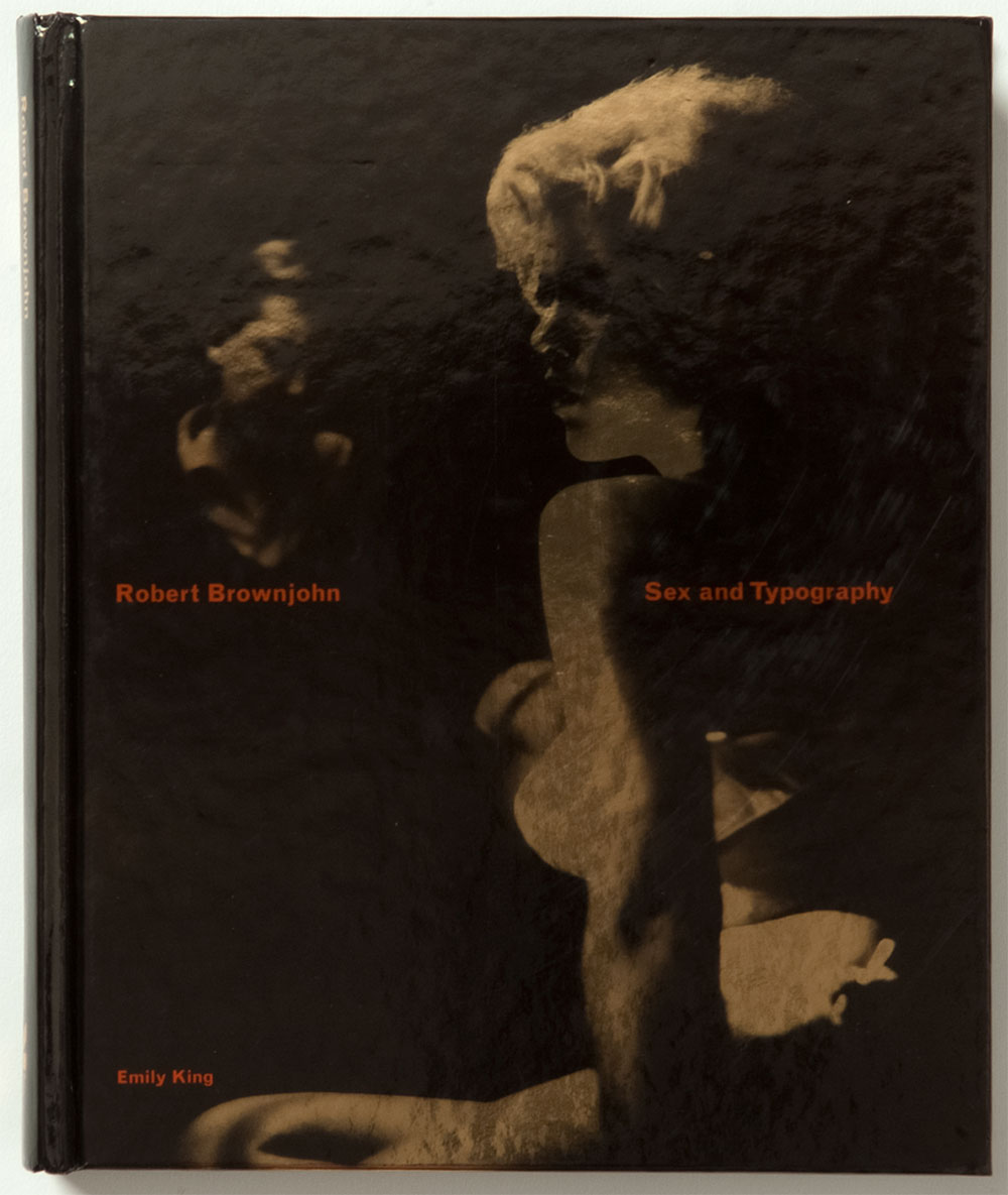
Robert Brownjohn: Sex and Typography
By Emily King, Laurence King, £25<br> Exhibition: Design Museum, London 15 Oct 2005–26 Feb 2006<br>
Graphic design is a formless discipline. Functioning at the nexus point of so many traditions and subject histories (photography, typography, painting, film, etc.), when the historian attempts to get a handle on this field, he or she is often left with a lingering insecurity that their study is deficient in some way. Thus, in any monograph or anthology that aspires to completeness, it often becomes clear that to speak of ‘graphic design history’ in the singular is nonsensical. Thus, in an attempt to set some meaningful boundaries to this area, the work of a celebrated pioneer or individual frequently enables the writer to give identity to this shapeless mass by situating it within the narrative arc of a single life.
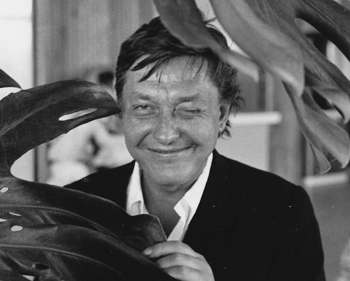
Portrait of Bj by Bob Freeman.
Nevertheless, as with the proverbial return of the repressed, the multifarious nature of any life creates problems for the biographer. How do you reduce a single life to 250 pages? It only compounds the problem when graphic design is thrown into the mix. Squaring an account of a designer with a contained analysis of their profession can often leave the head spinning. One way around this is to mirror the fragmented nature of events, anecdotes, influences, and work that make up the life of a designer, in the formal layout of the book itself. This is what makes the first half of a new monograph on designer Robert Brownjohn, Robert Brownjohn: Sex and Typography, so satisfying. Originated by Brownjohn’s only child Eliza Brownjohn, and written by Emily King, the book (supported by an accompanying exhibition at The Design Museum) is divided into two sections: ‘Life’ and ‘Work’. After a brief introduction, King has utilised a montage of quotations culled from original interviews, together with extracts from contemporaneous articles on Brownjohn’s work, to construct an eyewitness account of the designer’s life. This approach enables the reader to make links between the designer, his life, and his output, and especially bears fruit when documenting the eventful accomplishments and failings of Brownjohn’s turbulent existence. It serves as a perfect medium for a man who, as King notes, ‘was one of a clutch of extremely distinctive characters who embodied the link between modernism and modern life.’
Born in 1925 in New Jersey, Brownjohn was fortunate enough to be taught by Moholy-Nagy at the Institute of Design in Chicago from 1944-46. This auspicious meeting saw Brownjohn develop an interest in product design, with Moholy-Nagy offering the young designer his Parker Pen account. Less propitious was the fact that while Brownjohn was in Chicago he developed a serious heroin addiction that would haunt him for the remainder of his life and eventually bring about his premature death at the age of 44 in 1970.
After Chicago, Brownjohn made the journey to New York, working as a freelancer for such clients as George Nelson. New York of the 1950s appeared to have been the ideal setting for Brownjohn’s larger-than-life persona. Mixing with musicians such as Stan Getz and Charlie Parker, his creative appetite gave rise to a graphic idiom that combined the Modernist teachings he had received in Chicago with a broader appreciation for the vernacular graphics of the street. It was this synthesis of forms, together with a rising demand for graphic design in affluent postwar America, that gave rise to Brownjohn forming a design agency with Ivan Chermayeff. For such a talented duo it was relatively easy pickings, as Chermayeff noted: ‘We went into business together because there was something to be done in graphic design and not so many people to do it. It was not that there was no competition, but there was an opportunity. If you took your portfolio to a publishing company, you could get some work, more or less.’ This partnership was soon expanded to three with the arrival of Tom Geismar to become BCG Associates.
While Brownjohn’s design work prospered, unfortunately so had his addiction to heroin. In 1960, he made the decision to move to London with his wife and daughter. The grounds for this relocation was that the British government had decriminalised the use of heroin, and, with an eye to withdrawal, addicts were supplied by their general physician. This aside, Brownjohn had a flair for being in the right place at the right time, and his arrival in London came at a moment when the city seemed alive with possibility. As the illustrator Angela Landels recalled, ‘There was a fabulous kind of rustle, a murmur that ran through the town, the people, the air, the climate, everything!’
Detail of titles for From Russia With Love.
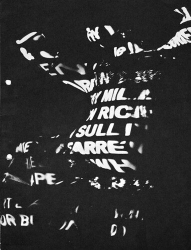
Shortly after arriving, Brownjohn was quickly hired to head up the London branch of the American firm J. Walter Thompson. He held this post for two years before he quit for the position of creative director at McCann Erickson. It was from McCann Erickson that he freelanced and produced his justly celebrated sequences for From Russia With Love and later Goldfinger.
It is always a danger with biography that the allure of an individual’s life will cast a shadow over their work. As King acknowledges in her introduction, this was always going to be possibility with the tumultuous existence of Brownjohn. In the second segment of Sex and Typography (which, film credits aside, is a rather perplexing choice of title), Brownjohn’s work is displayed in ten sections. Focusing on his important Pepsi-Cola World magazine covers, credit sequences for the Bond films, and the influential Midland Bank series, each body of work is given a detailed introduction.
Unfortunately, as the biographical opening section is so rich in dramatic detail and first-hand accounts, this second chapter does feel slight by comparison. That said, Sex and Typography is a worthwhile attempt to document the life of one of the most influential designers in the post-war period. The book and exhibition complement each other well to reveal a seemingly boundless talent that served to inspire and frustrate in equal measure. It pays homage to a capacity for visual invention that, like graphic design itself, was difficult to restrain within easy boundaries.
Kerry William Purcell, design historian, London
First published in Eye no. 58 vol. 15, 2005
Eye is the world’s most beautiful and collectable graphic design journal, published quarterly for professional designers, students and anyone interested in critical, informed writing about graphic design and visual culture. It is available from all good design bookshops and online at the Eye shop, where you can buy subscriptions and single issues.