
Summer 2021
Data storytelling in late Victorian London
Visual Fields
Daniel Streat
anonymous designers
Charles Booth
Book design
Design history
Information design
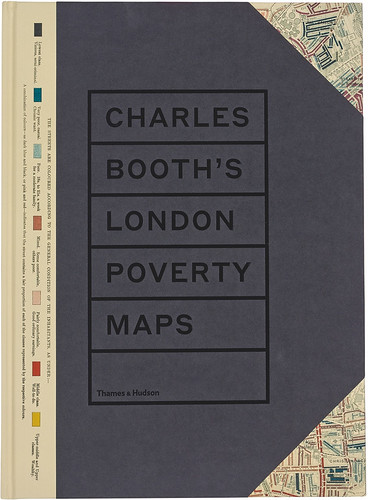
Charles Booth’s London Poverty Maps
Thames & Hudson, 2019 Text by Mary S. Morgan, Iain Sinclair and others. Hardback, £49.99. Design by Daniel Streat / Visual Fields.

The design community is currently fascinated by data storytelling. Everyone wants to design visual tales with story arcs that lead to data-driven conclusions. Anyone trying to accomplish this can learn a great deal from studying the 1889 London Poverty Maps created by Victorian social reformer Charles Booth. In his time, his colourful maps showed an astonished public how economic resources were distributed, where overcrowded housing was concentrated, and how wealth and poverty lived side by side among London’s population.
In 2016, the London School of Economics produced Charles Booth’s London. This excellent website, found at booth.lse.ac.uk, provides access to selected maps and notebooks from the archive of Charles Booth’s Inquiry into the Life and Labour of the People in London. It features a digital version of the Poverty Map. By adjusting the map’s transparency, you can see contemporary London underneath. Now, three years later, the LSE team has produced a handsome book.
The storytelling begins with a trompe l’œil monument to the archive itself: 450 notebooks recording observations, the hand-coloured original maps and the printed sections bound into each volume, and the many editions of the bound reports. Matrices of covers, spines and maps appear in two-page spreads as though they were precious insects mounted on a board. This is followed by investigator notebook covers arranged in 7 × 9 grids, then 11 × 13 grids of diagrams tracing the investigator’s ‘walks’. The regularity of the covers and the random light-dark patterns of the walks transmit the illusion of holding a tiny replica of the archive in your hands. Though the tiny maps and notebook pages are impossible to read, their faint patterns of regularity give off the scent of information.
Once we pass this homage, we can admire the Victorian colour palette of the maps, tables and pie charts that tell the tale of the city in twelve districts. Clear, crisp texts by eight authors summarise what Booth had to say in the 1890s about the state of London’s overcrowded housing, immigrant neighbourhoods, religion, trade, morality and leisure. The ‘heroes of the book’, as lead author Mary S. Morgan puts it, are the Poverty Maps.
On the cover of the book we see how Booth classified the city’s population into three degrees of poverty and three degrees of comfort. He assigned colours to each category – a range of black, blue and lighter blue for poverty and brighter pinks, reds and yellows for comfort – then coloured in every city block to describe how Londoners lived.
Booth set out to discover poverty’s causes and locations. His investigation and publications were entirely self-funded and self-directed. Being a researcher of independent means, he had the resources and determination to create his own data set and then to analyse and visualise it according to his own designs. At a time when the only social safety nets were workhouses and orphanages, he sought to use social research and statistics to quantify problems and promote improvements in social policies.
Even a cursory review of his maps illustrates one of his conclusions: that poverty and wealth coexist throughout London. Booth calculated that 30.7 per cent of the population lived in poverty, unevenly distributed around the city’s districts. The map of the Inner Southeastern District of Lambeth, an area with a slight minority of people living in poverty (46.8 per cent), is an illustration of this. Across from Westminster Bridge and along the South Bank we find red (middle class) and pink (fairly comfortable) blocks along the main roads, mixed with inner courtyard and side street buildings coloured blue (very poor, chronic want) and black (lowest class, vicious semi-criminal). A researcher walking with a local policeman along Union Street by the Charing Cross railway line recorded observations and quotes: ‘Drink is the great evil and the women are worse than the men. The women live on four ale and fried fish. The children are neglected, home dirty and they don’t seem to care a rap.’
Cover and spread (top) from Charles Booth’s London Poverty Maps. Booth’s colourful maps show the wealthy red buildings along broad avenues, contrasting sharply with blue and black poverty in streets and alleyways. He added pie charts to visualise the statistical ratios he compiled to characterise each district.
The book provides a virtual tour of late Victorian London, a kind of luxurious carriage ride across coloured streets, punctuated with sepia photographs of street vendors, sweatshops, ragged children and police arrest photos. Along the ride, we may or may not share Booth’s social judgements, but we have to admire the way he uses a combination of statistics and maps to tell the story.
Others before him had visualised ‘moral statistics’. The closest previous work was by Henry Mayhew, whose London Labour and the London Poor (1851) contained data-driven maps coloured in shades from white to black. But these early choropleth maps were coarse in comparison with what Booth achieved. No one before him had gathered their own data and used colour to show where poverty lived street by street. And no one who studies the stunning reproductions in this book can doubt what Booth accomplished by transforming investigator notes into numbers, numbers into categories, categories into colours, and colours into stories for the eye.
Paul Kahn, information designer and lecturer at Northerneastern University, Boston
First published in Eye no. 101 vol. 26, 2021
Eye is the world’s most beautiful and collectable graphic design journal, published for professional designers, students and anyone interested in critical, informed writing about graphic design and visual culture. It is available from all good design bookshops and online at the Eye shop, where you can buy subscriptions and single issues.