
Autumn 2018
Hardcore history
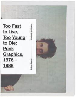
Too Fast to Live, Too Young to Die: Punk Graphics, 1976-1986
Cranbrook Art Museum, Michigan, US, 16 June-7 October 2018. Curated by Andrew Blauvelt. Catalogue by Andrew Blauvelt, $25.
More than 40 years after punk happened, the phenomenon is still being fêted as a musical, street-fashion and social spectacle with a steady stream of books and exhibitions. As commentators have often pointed out, punk’s semiotic and behavioural provocations have elements of similarity with Dada, and punk and post-punk have assumed a place in twentieth-century cultural history of comparable dimensions. As a pop culture earthquake rapidly disseminated by modern media, punk was, if anything, much broader in its immediate impact, galvanising young people with rebellious sounds and styles in small towns and suburbs, as well as big cities, in a way that metropolitan Dada never achieved in its day (see Eye 33).
London, one of punk’s epicentres, mounted a year-long programme of commemorative punk events in 2016, which included an exhibition within the venerable setting of the British Library. While punk’s lurid graphic dimension is usually central to these reminiscences and celebrations, triggering instant nostalgia among those who were there at the time, graphic design has never entirely come to terms with punk, even though a handful of lauded designers emerged from the scene. If punk was truly significant for graphic design, as some would claim, how could it be that the phenomenon was still overlooked in the third edition of Philip Meggs’s A History of Graphic Design (1998)?
Later writers of historical surveys – Roxane Jubert, Stephen Eskilson, Johanna Drucker and Emily McVarish – have rectified this oversight with cursory mentions of punk, though punk graphic styles tend to be considered within the historical span of postmodernism. I have taken this approach in the chapters on deconstruction and appropriation in my book No More Rules. The most substantial survey to date, The Art of Punk (2012) by Russ Bestley and Alex Ogg, also positions punk as ‘a formative influence within postmodern visual culture’, although this is not a major theme in their insiders’ view of the phenomenon.
The latest project to address punk’s visual dimension, ‘Too Fast to Live, Too Young to Die: Punk Graphics, 1976-1986’ at Cranbrook Art Museum, puts graphic concerns at the forefront. Museum director and exhibition curator Andrew Blauvelt acknowledges that this may seem ‘an obvious curatorial angle’, but it is both necessary and refreshing for a show on this scale to prioritise design over the usual treatment of the material as resonant subcultural ephemera and graphic stand-in for the music. Although the show’s conclusions are not as novel as Blauvelt implies – punk’s ‘intrinsic heterogeneity’ is fully apparent in recent books such as Punk: An Aesthetic; Action Time Vision and Oh So Pretty: Punk in Print (to which I contributed) and is an argument explicitly made by Bestley and Ogg – Blauvelt has demonstrated punk’s range of graphic strategies with exemplary rigour and panache.
Cover of the exhibition catalogue ‘Too Fast to Live, Too Young to Die: Punk Graphics, 1976-1986’ by Andrew Blauvelt.
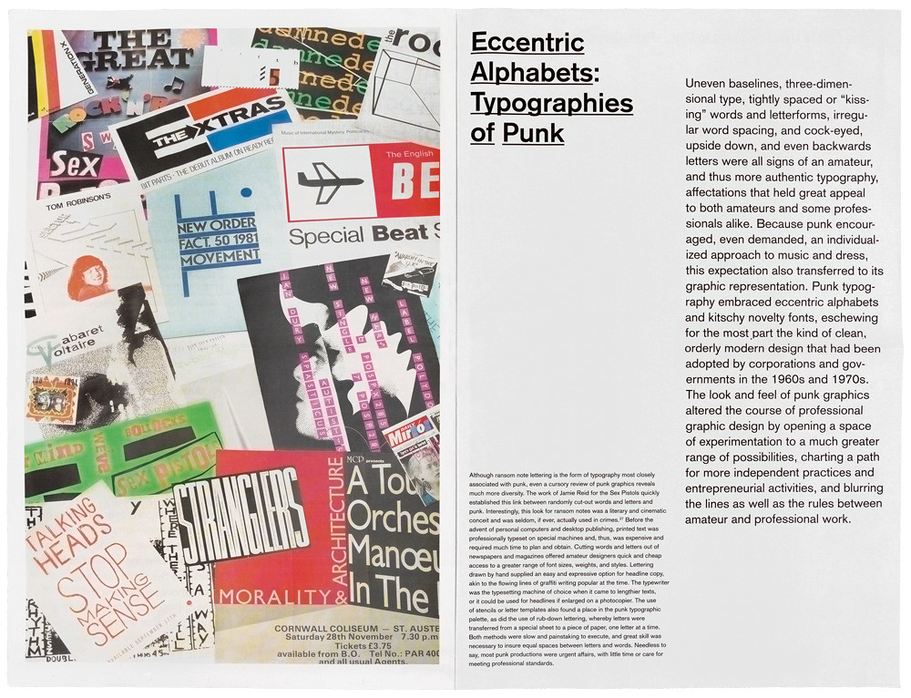
Top: Spread from ‘Too Young to Live’, part 2a of the catalogue, showing a collage of specimens by Blauvelt and Bianca Ibarlucea.
This assessment is based on a reading of Blauvelt’s catalogue combined with a viewing of the exhibition photographs. The broadsheet catalogue, printed on newsprint by The Newspaper Club, is divided into three sections, each carrying parts of an essay by Blauvelt. Part 1 is an overview tracing the origins and development of punk in America and Britain. Part 2a deals with punk’s visual strategies – appropriation, collage /bricolage, art influences, zines, flyers, typography – and 2b focuses on iconography, including hardcore punk graphics, the retro tendencies of new wave, comic-book imagery, trashy horror, and the militant gestures of agit-prop.
While the exhibition presents the work in an orderly, art gallery manner, the catalogue illustrations consist of full page collages by Blauvelt and Bianca Ibarlucea that shatter the paper exhibits into appropriately punkish overlapping fragments. Over-literal parody is avoided by employing a dourly functional sans serif – very ‘Swissted’ (see Eye 91) – and some deliberately crude single-word underlining applied to the section titles. This is livened up a little by abrupt size changes between paragraphs.
Most of the exhibits come from the collection of Andrew Krivine, a New Yorker who made many visits to the UK in the 1970s and 80s, hoovering up anything he could grab from places like Stiff Records, Rough Trade and Virgin Records’ HQ. Blauvelt had a free hand to select and organise the material according to its graphic interest, rather than by musical or celebrity criteria. His treatment of the prehistories of punk in the hippie years and the interweaving narratives of punk in the UK and US is equally judicious. What the show confirms is that punk design is notable less for moments of pure graphic innovation – far too self-conscious as an aim – than for a complete lack of concern with being controlled, decorous or tasteful in the usual manner. Punk threw any device that might work into the type and image scrambler and cranked up the volume to ‘grating’. The point was the outpouring of energy, the clash, the uproar, the howl of fury, the cackle of disdain, the thrash of exhilarating speed. Punk’s specialness lies in dragging the techniques and tropes of visual communication further than they are normally called on to go.
After an exhibition of this sweep and thoroughness, it is tempting to hope that future overviews of graphic design history will handle punk less superficially. Whether and how this will happen remains to be seen. The problem for design historians situated within graphic design as a habitus is an inevitable tendency to absorb and share the inhibiting assumptions and concerns of professional designers. Outside the music business, design’s mainstream was ill-disposed towards an amateurish DIY aesthetic that appeared, in its raw form, to have little to offer supremely refined designers. In the UK, in the 1980s, a few music scene designers with art school backgrounds – Garrett, Saville, Brody – crossed over, though it took a while. In the US, the main challenges to established practice came from highly educated designers shaped by postmodernism rather than the punk subculture. The histories of the two countries are notably divergent here and it would be interesting to discover more about possible influences of punk in the development of American design.
Rick Poynor, writer, Eye founder and Professor of Design and Visual Culture, University of Reading
Read the full version in Eye no. 97 vol. 25, 2018
Eye is the world’s most beautiful and collectable graphic design journal, published quarterly for professional designers, students and anyone interested in critical, informed writing about graphic design and visual culture. It is available from all good design bookshops and online at the Eye shop, where you can buy subscriptions and single issues. You can see what Eye 97 looks like at Eye Before You Buy on Vimeo.