
Autumn 2012
Letters from Italy
TDM 5 Grafica Italiana
Triennale Design Museum, Milan, Italy <br> 14 April 2012 - 24 February 2013 <br> Curated by Giorgio Camuffo, Mario Piazza and Carlo Vinti <br> Exhibition design: Fabio Novembre; Graphic Design: Leftloft; Sound design: Saturnino and Sound Identity.TDM 5 Grafica Italiana (catalogue)
Edited by Giogrio Camuffo, Mario Piazza and Carlo Vinti <br> Corraini Edizioni, €48, Italian / English.
Italian public buildings of the 1930s tend to be of cyclopean proportions and the Milan Triennale is no exception. The clean lines, vast internal spaces and the high ceilings of this fine piece of rationalist architecture provide the setting for TDM 5, the fifth in a series of annual exhibitions at the Triennale Design Museum. In this difficult period of recession, with political, economic and cultural wounds still festering after the end of the Berlusconi era, Italy is groping for a renewal of self-confidence and hope for the future. Considered in this context, and also within the context of the extraordinary postwar achievements of Italian industrial design, this exhibition can be appreciated as a proud and (almost) exhaustive review of the best of Italian twentieth-century graphics.
The exhibits are sorted into categories: type, books, magazines, culture and politics, advertising, packaging, corporate identities, signage and TV graphics. To make it clear that twentieth-century Italian graphics has deep ‘background roots’, the first display that hits the visitor contains a page opened from a 1501 Aldine edition of the Satires of Juvenal and Persius, showing Francesco Griffo’s original italic, a box of Giambattista Bodoni’s punches and two copies of his Manuale tipografico, posthumously published in 1818. More ‘background’ areas follow – two early twentieth-century lithographic posters, and samples of Futurist typography: Fortunato Depero’s Dinamo Azaro of 1927, famous for its nuts-and-bolts binding, and Marinetti’s Zang Tumb Tumb (1914). The importance of the latter is emphasised in a caption that quotes Jan Tschichold: ‘It is to a “non-technician”, F. T. Marinetti, the founder of Futurism, that the credit must be given for providing the curtain-raiser for the change-over from ornamental to functional typography’ (from Die Neue Typographie, 1928). Following this, TDM 5 gets down to the nitty-gritty with a section on type.
Although Aldo Novarese was the only twentieth-century Italian type designer of international repute, the Nebiolo company of Turin that employed him had two other resident designers: Giulio Da Milano and Alessandro Butti. Attractive type specimens by all three men are displayed. Along with Novarese’s popular faces, such as Eurostile (1962) and Stop (1971), Da Milano’s highly original Neon (1935) is especially noteworthy.
The Fonderia Reggiani was a small type foundry operating in Milan in the 1930s: its typefaces included Guido Modiano’s Triennale, of which a specimen is shown here – an almost forgotten but daring sans named after the 1933 exhibition for which the Triennale building was constructed.
Although one can understand that Giovanni Mardersteig’s romans are more difficult to communicate to the general public than flamboyant faces such as Stop, I felt that they deserved more attention. On the other hand, it was nice to see some digital specimens of contemporary Italian font designers.
During the twenty-year ‘interregnum’ of photosetting and Letraset that separated metal from digital type, apart from Novarese’s ‘post Nebiolo’ designs for Berthold and ITC, little was happening in Italy; designers showed little interest in type and set almost everything in Helvetica, Futura, Times or Bodoni. Things only started to change when Fontographer attracted the attention of young designers around the turn of the century. Since then, type design courses have blossomed and some talented type designers, such as Luciano Perondi, Michele Patanè and Riccardo Olocco, have emerged. What is still missing is an Italian digital foundry with an international profile.
Pino Tovaglia’s ‘Typographic experimentation’ from the late 1970s was also in the type section; this attracted my attention because at that time, hand lettering such as this was a rarity. The attitude of the Italian ‘New Typography’ of the 1930s towards ‘traditional’ typography – as represented by Raffaello Bertieri’s magazine, Il Risorgimento Grafico – is scornfully but amusingly summed up in a spread from Campo Grafico, the magazine that was the standard-bearer of creative and Modernist graphics.
The section on book jackets is chopped into subsections: typographical solutions, ‘the prevalence of images’ and illustrated covers. It is here that we see work by stars such as Bruno Munari, Albe Steiner, Max Huber, Franco Grignani, Giancarlo Iliprandi and designer / publisher Franco Maria Ricci. We are also treated to some of Germano Facetti’s covers for Penguin books of the 1960s.
The posters are divided thematically, with sections on cultural communication (A.G. Fronzoni’s acrobatic use of Helvetica), politics and advertising – this last features outstanding work for Olivetti (by Giovanni Pintori, among others) and Pirelli (Armando Testa). The political posters are dominated by clenched fists and lots of hammers and sickles; the absence of anything from the twenty years of Fascist rule is, perhaps, understandable.
Anyone who has arrived at Milan’s Malpensa airport will know how irritating an inadequate signage system can be; aside from Bob Noorda’s pioneering work for the Milan metro in the 1960s and isolated cases such as Perugia’s Minimetrò light rail system (2008) – both represented here – Italy still leaves much to be desired in this area. One explanation is that airports, transport systems, hospitals and so forth are public bodies, run by politicians for whom merit is not a prime consideration when assigning commissions.
One flaw in this exhibition is the atrocious English translations of the captions. Nevertheless, for anyone visiting Italy, TDM 5 is a must and the catalogue is worthwhile.
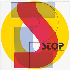
Aldo Novarese’s typeface Stop, designed for the Nebiolo foundry in 1971.
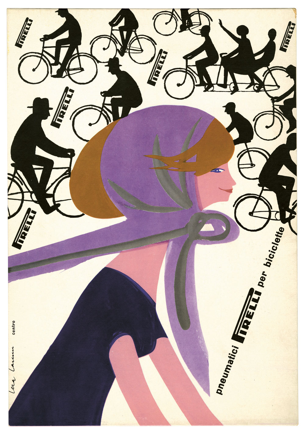
Top: Pirelli poster by Lora Lamm, 1959. Image courtesy of Fondazione Pirelli.
James Clough, writer, designer, calligrapher and lecturer, Milan
First published in Eye no. 84 vol. 21 2012
Eye is the world’s most beautiful and collectable graphic design journal, published quarterly for professional designers, students and anyone interested in critical, informed writing about graphic design and visual culture. It is available from all good design bookshops and online at the Eye shop, where you can buy subscriptions, back issues and single copies of the latest issue. You can see what Eye 84 looks like at Eye before You Buy on Vimeo.