
Autumn 2009
Transforming data into human stories
The Transformer: Principles of Making Isotype Charts
By Marie Neurath and Robin Kinross<br>Hyphen Press, £15
Modern pictograms, icons, scientific illustrations and graphic user interfaces owe a lot to the work of Otto Neurath (1882-1945). At the beginning of the twentieth century, this Austrian sociologist and economist developed a picture language he called Isotype (International System of Typographic Picture Education), and brought together a team of sociologists, artists, architects and teachers to design charts and posters. The goal was to reveal the interrelation between economics, the environment and politics, which is often (perhaps deliberately?) hidden away within statistics. Neurath believed that democratic and free access to knowledge and information could improve our society.
Neurath developed the notion of ‘the transformer’, as Robin Kinross writes in his preface, ‘to describe the process of analysing, selecting, ordering, and then making visual some information, data, ideas, implications’. I wish that all my colleagues who call themselves ‘information designers’ (or even ‘information architects’, as Richard Saul Wurman has labelled us) would read this little book, which explains and shows the principles of making Isotype charts.
One essay alone – ‘The work of the transformer’, co-written by Robin Kinross and Neurath’s widow, Marie – would make the book worth buying, but there are two more: her previously unpublished ‘Wiener Methode and Isotype: my apprenticeship and partnership with Otto Neurath’ and ‘Lessons of Isotype’ by Robin Kinross. The collection also includes a biography of Marie, who died in 1986, and a list of sources as well as an exhaustive index.
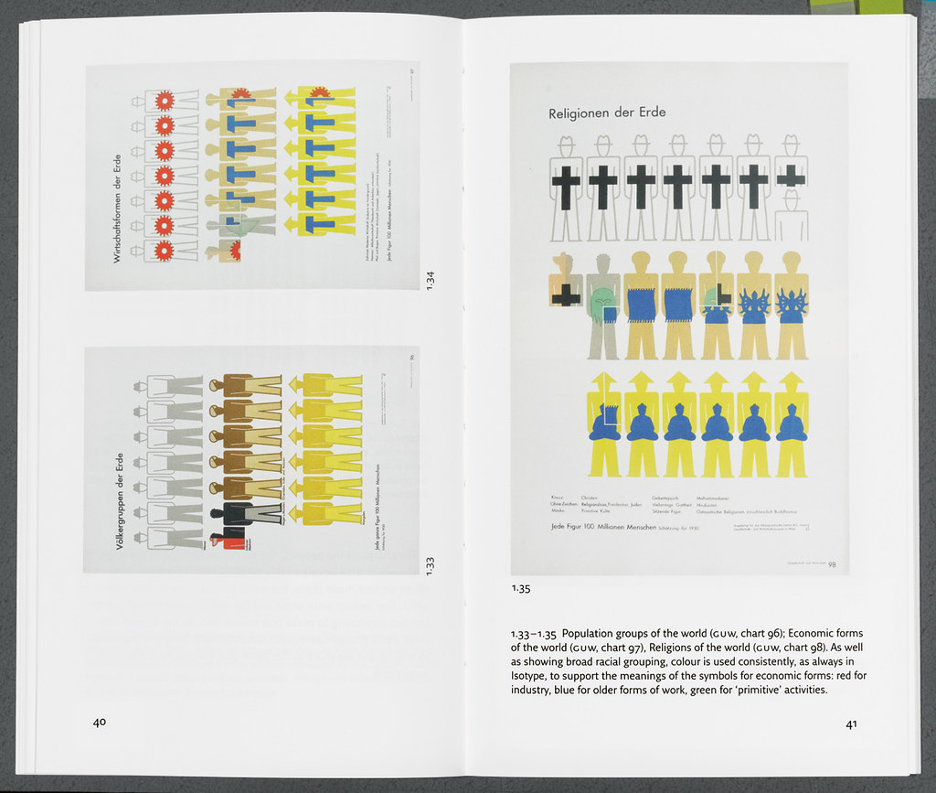
Like journalists who take facts and prepare them for their readerships, designers have always been transformers. Whatever we do to the information we shape, we influence its reception by transforming it. That goes for advertising as much as it does for hardcore information graphics. Tools are available to turn any dumb number into an equally dumb graphic, with multicoloured gradations, drop shadows and pseudo-dimensional distortion. But it only takes one little Isotype chart, called ‘Comparisons of Quantities’ to destroy the validity of most business graphics. It is a simple chart that shows how a single variable may look cool and simple, but to compare things properly we need to show the method behind a graphic: how we arrived at the numbers, what they relate to and how they relate to each other.
One chart that displays all the qualities of the Isotype method is ‘Great War 1914-18’, which shows how many soldiers were involved, killed or wounded in the First World War. The illustrations are detailed enough to show differences in the uniforms but simple enough to be able to work even when reproduced at the size of a business card (the original was 420 x 630mm). By showing the armies in parallel projection, marching away from each other, rather than as plain rows of soldiers like bars in a graph, it clearly distinguishes between the Central Powers and the Allies. This is reminiscent of old engravings with their isometric depiction of battle formations, but much more sober and dramatic at the same time. The chart can be read in three ways: comparisons between the sizes of the opposing whole groups; proportions within each group; between proportions of the same class across the two groups.
While I would love to see this larger, if only to appreciate the quality of the artwork, perhaps the tiny reproduction makes the point even better: one can almost understand the point it makes intuitively, before even reading any detail.
Kinross’s Hyphen Press publishes anything but coffee-table books. And so far, the formats and layouts of its books have been totally in tune with their contents, the design modestly stepping into the background, leaving the stage for the content. For the first time, however, I wished they had made more of a splash. Don’t get me wrong: The Transformer is a beautiful little book, carefully designed and typeset, not a widow in sight, with perfect pages and great reproductions. But, alas, the size of those reproductions…
The book (almost a booklet, at 128 pages and 125 x 210mm) has many illustrations of charts and book pages, but the best and most significant ones are reduced to ten per cent of their original size. Edward Tufte’s books on information design don’t offer half the insights that this little collection does, but their success owes a great deal to lavish production, showing illustrations as large as possible on spreads twice the size of these. Perhaps Hyphen Press could publish a luxury edition for nerds like me who want to really study every detail of the Isotype charts.
Anybody who has any interest at all in transforming information visually and in design thinking needs this book. Keep it on your desktop, show it to your students, share it with your clients.
First published in Eye no. 73 vol. 19 2009
Eye is the world’s most beautiful and collectable graphic design journal, published quarterly for professional designers, students and anyone interested in critical, informed writing about graphic design and visual culture. It is available from all good design bookshops and online at the Eye shop, where you can buy subscriptions and single issues.