Summer 2012
Ways of seeing design
Richard Hollis
Gallery Libby Sellers, London 23 March – 28 April 2012 Curated by Emily King Exhibition design: Simon Jones; graphic design by Sara de Bondt; installation photographs by Ed ReeveAbout Graphic Design
Writings by Richard Hollis. Designed by Richard Hollis Occasional Papers, £15

From the breadth and vitality of the recent densely compiled retrospective exhibition of Richard Hollis’s design work, it is clear why he is regarded as among the most influential British designers of the past 50 years. At the same time it is mystifying that this is the first serious survey of his work. This makes it compulsive viewing for designers and students of design and curating alike.
Before his seminal design for John Berger’s Ways of Seeing (1972), Hollis had mixed with some of the key designer-artists of the European avant-garde – Max Bill, Richard Paul Lohse, Karl Gerstner, Josef Müller-Brockmann – whose work generally reflected a synthesis of the plastic arts. Ways of Seeing nodded to the documentary filmmaker Chris Marker in its confluence of text and image, re-presenting Berger’s television programmes so that voice and vision are intertwined in a continuous linear narrative.
This design insisted that a book is experienced in time and not just in space – a theme that pops up frequently in Hollis’s work. It is there in the posters for the Whitechapel Gallery in the late 1970s and early 80s, designed to be seen first as folded mailouts, then reconfigured as posters. It is there again in the slim and slimmer formats of Modern Poetry in Translation (1964-2003), designed with both economy and portability in mind.
Seen together, Hollis’s works are marked by a constant intensity – engaged, direct, economical and at the same time genre-busting, undogmatic and unflashy. They seem endlessly inventive, dispatching codes and preconceptions to all corners with wit and modesty. They are driven by function and yet they are never merely functional. Hollis is clear on the designer’s role in serving the messages of a client but he is not a problem-solver in the sense of supplying dry answers. Rather, the work is continually liberating: from every question posed, many more flow.
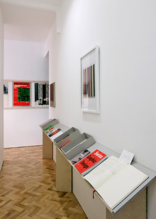
The exhibition, superbly curated by Emily King, gives a rich overview while hinting at the wealth of other material by Hollis that could not be included (even so, there are 279 works in the exhibition). Simon Jones’s exhibition design is also remarkable, presenting books and graphics without constantly restating their untouchability, using canted freestanding structures on which shallow, Perspex-lidded greyboard boxes of various sizes are configured according to their contents. This device both articulates the work and, along with a simple framing device for the posters, perfectly embodies Hollis’s central message of the beauty of material economy.
It is a testament to the enterprise of King and gallerist Libby Sellers that what is in essence a museum show is here presented in a commercial gallery space. Although it is Hollis’s achievements as a designer that are celebrated here, it is worth remembering that he is also well known as both an educator and, through his books Graphic Design: A Concise History and Swiss Graphic Design, a critical advocate of other designers’ work.
Hollis’s work for the Whitechapel was the springboard for a wider discussion of identity in the form of a conversation with Nicholas Serota (the gallery’s director during the late 1970s and early 80s), held at the gallery on 26 April 2012. This event also marked the launch of About Graphic Design (Occasional Papers), a book of collected writings by Hollis, including many texts from Eye. Hollis’s development of the language of critical reflection on design is on the same high level as the design work collected in the exhibition.
‘Richard Hollis’ at Gallery Libby Sellers. Simon Jones’s exhibition design uses shallow greyboard boxes to present the works without overstressing their untouchability.
Eye is the world’s most beautiful and collectable graphic design journal, published quarterly for professional designers, students and anyone interested in critical, informed writing about graphic design and visual culture. It is available from all good design bookshops and online at the Eye shop, where you can buy subscriptions, back issues and single copies of the latest issue.


